Team Behind the Design
Web Design Analysis
Exploring Aucam’s website feels like walking through a modern smart home.
It's organized, practical, and designed with care. It’s not overloaded with tech jargon or visual clutter.
Instead, Kreatives focused on giving users a straightforward path to understanding what Aucam offers and how to get started.
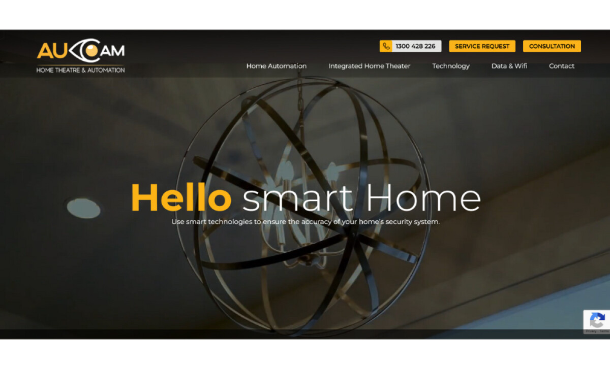
- UX Design and Structure: The homepage greets visitors with “Hello Smart Home,” instantly grounding the experience in everyday relevance. Navigation is direct, with categories like “Home Automation” and “Technology” easy to locate. The persistent “Service Request” and “Consultation” buttons provide clear pathways to action, keeping conversions within reach.
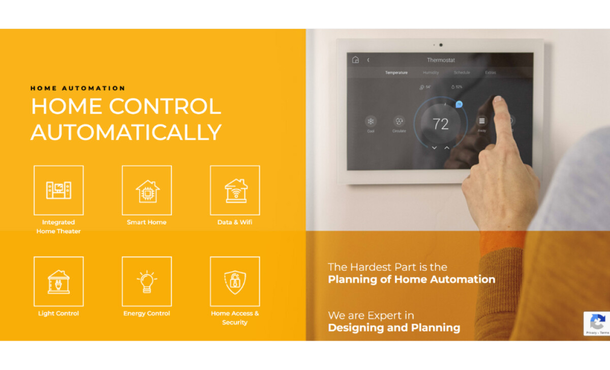
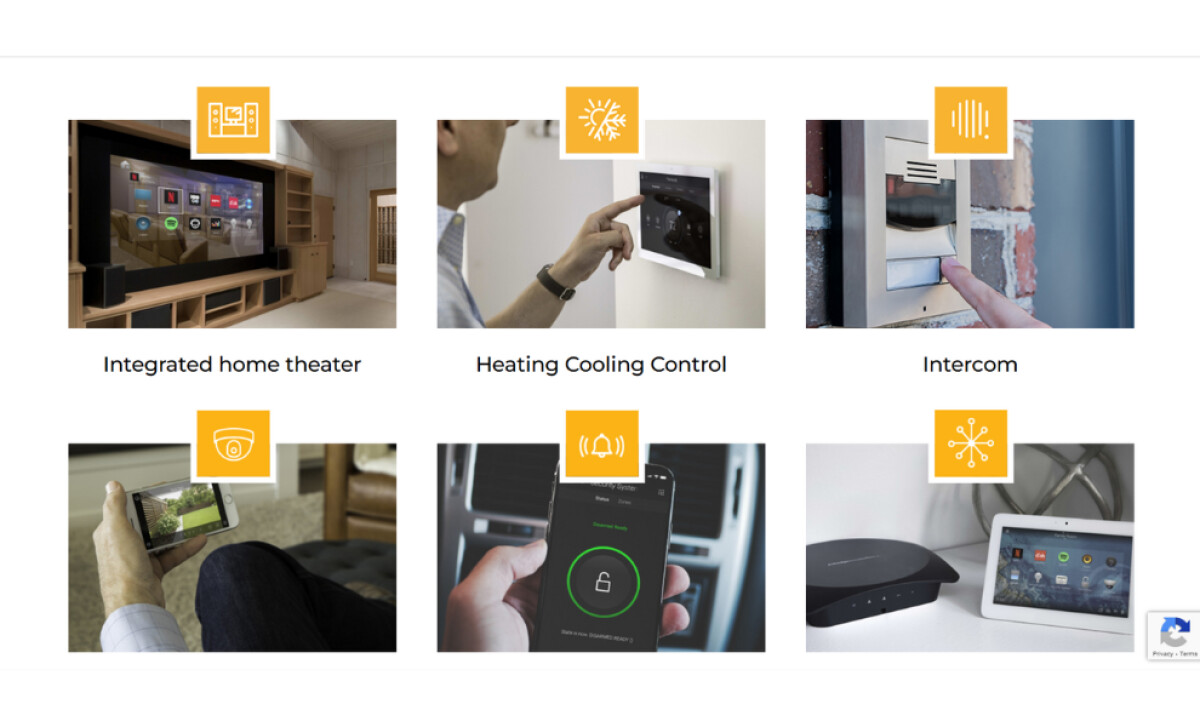
- Visual Direction and Tone: The color palette of gold, black, and white gives the site a refined, confident feel. Gold highlights draw attention to calls to action and key icons without overpowering the visuals. The use of real photography, such as close-ups of home tech installations, gives context and credibility to the product range.
- Typography and Layout: The sans-serif typography maintains balance between readability and strength. Headings stand out in bold, while generous spacing and concise content make technical details easier to follow. Each service section pairs clean icons with short descriptions, guiding the eye naturally across the grid.
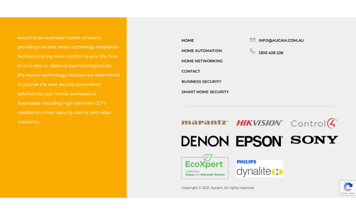
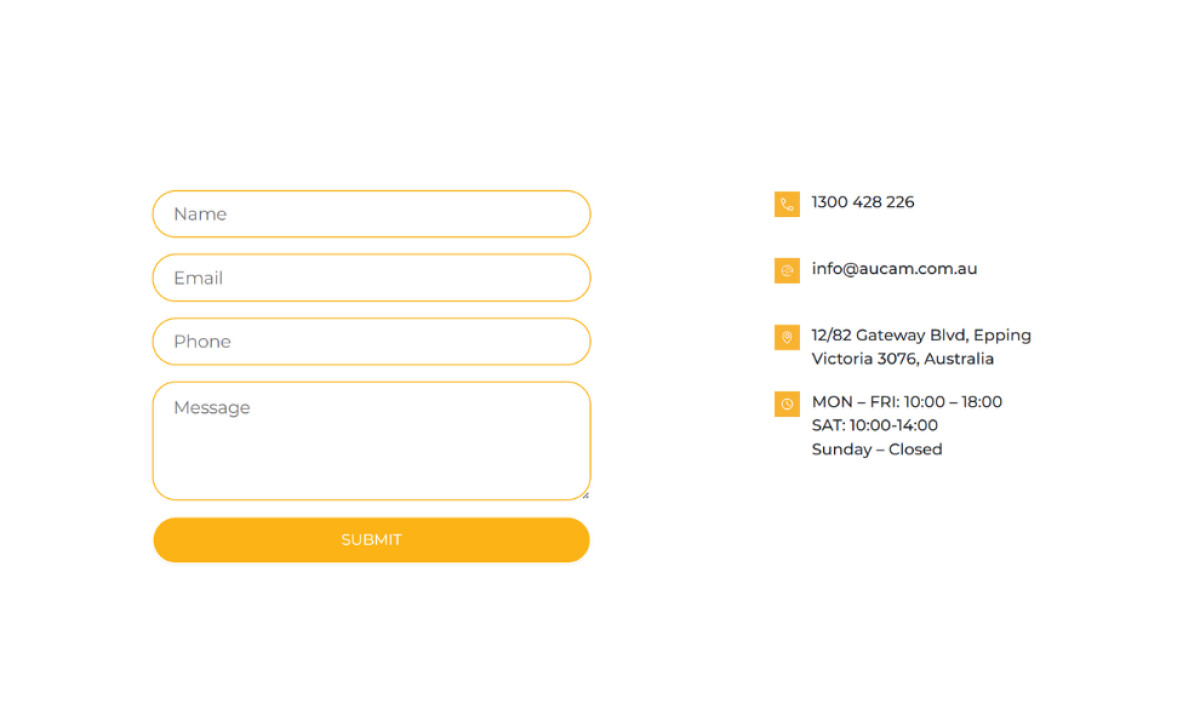
- Consistency and Functionality: Every page follows the same structural rhythm, creating a unified browsing experience. The responsive design translates well on mobile, preserving hierarchy and visual flow. The footer ties the entire design together with partner logos and contact details neatly arranged for quick reference.
What Brands & Agencies Can Learn from Aucam
Aucam’s website demonstrates how clarity and confidence can make complex technology feel effortless. Kreatives shows that great design in the tech sector is not about showing more features but about communicating them better.
1. Make Technology Feel Human
Lead with everyday language and real photography. When visitors see how products fit into real homes, innovation feels personal rather than abstract.
2. Guide Users Toward Action
Keep calls to action visible and consistent. Persistent buttons like “Service Request” and “Consultation” ensure that no matter where visitors are on the site, the next step is always clear.
3. Create Structure That Scales
Use repetition and rhythm to build trust. A consistent layout across pages makes navigation intuitive and gives the brand a sense of reliability that aligns with its promise of smart, seamless living.
About DesignRush Featured Designs
At DesignRush, we review hundreds of agency projects each month. The featured designs stand out for creativity, relevance, and execution.
The most compelling projects often advance to our Monthly Design Awards.
Explore more here:
- Best Website Designs
- Best App Designs
- Best Logo Designs
- Best Print Designs
- Best Packaging Designs
- Best Video Designs
For a full list of design agencies and related services, see our Agency Directory.


