Standout Features:
- Muted earth-tone color palette with purple contrast
- Omnipresent "MG" logo paired with thoughtful typography hierarchy
- Balanced, grid-based layout ensuring clear content segmentation
Marcelo Grecco’s cannabis industry consulting website was designed by Moroby. Recognizing that the B2B purchase journey overwhelmingly begins online, with 61% of buyers starting via general web search and 56% directly on vendor websites, the platform needed to reflect his ability to guide companies and startups.
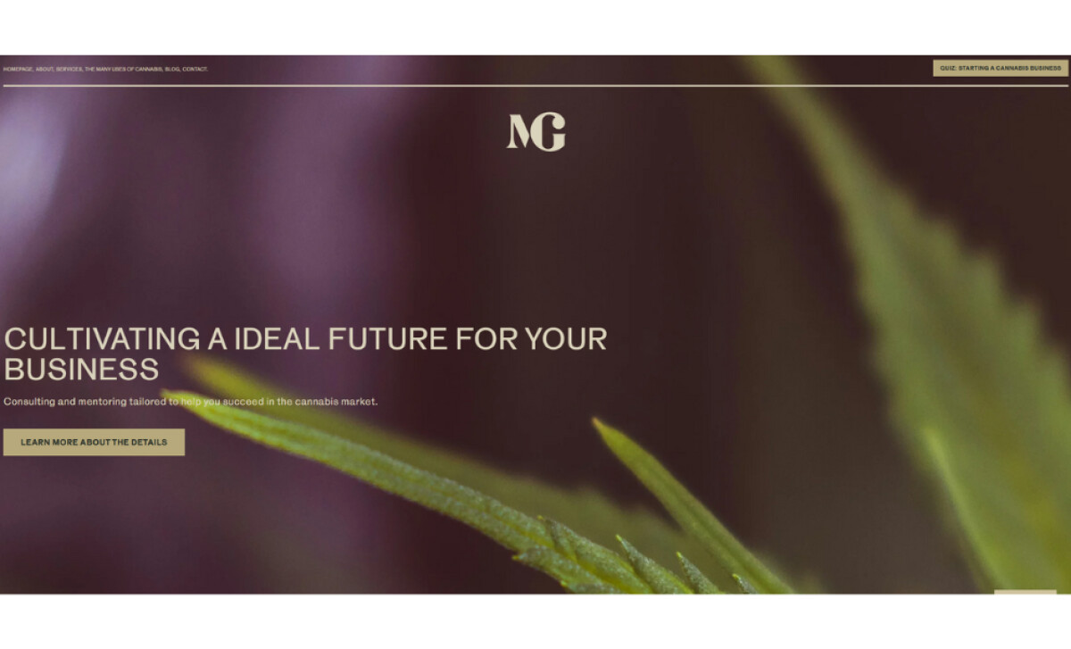
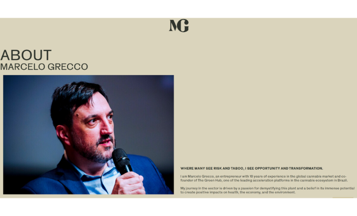
Warm beige and deep muted purple tones define the professional service website's restrained color palette. Beige backgrounds ensure a calm atmosphere, while focused purple blocks delineate content areas. This contemporary and timeless color approach aids readability and elevates brand perception to one of subtle elegance.
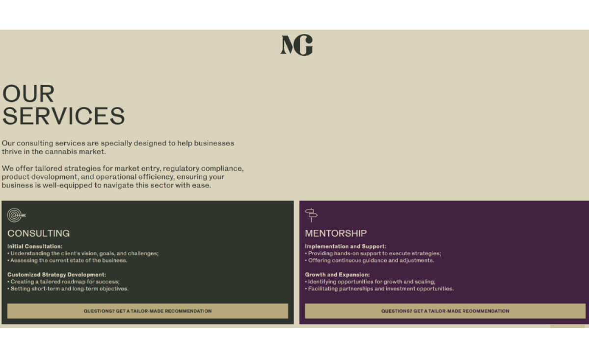
A distinctive serif "MG" logo with refined, sharp details serves as the brand's primary identifier. On the website, this is complemented by a thoughtful typographic hierarchy using bold sans-serifs for headlines and clean, readable sans-serifs for body content. This emphasizes clarity and professionalism.
The layout employs a balanced, grid-based structure. An immersive hero image with minimal overlay text and a CTA greets visitors. A two-column format is frequently used to pair images with text blocks. The services section uses distinct rectangular colored blocks, creating clear content segmentation.
Marcelo Grecco’s site effectively uses a sophisticated, non-clichéd aesthetic to build credibility. This project demonstrates how such design elements can create a strong professional brand that inspires trust and clearly communicates expertise to a B2B audience.