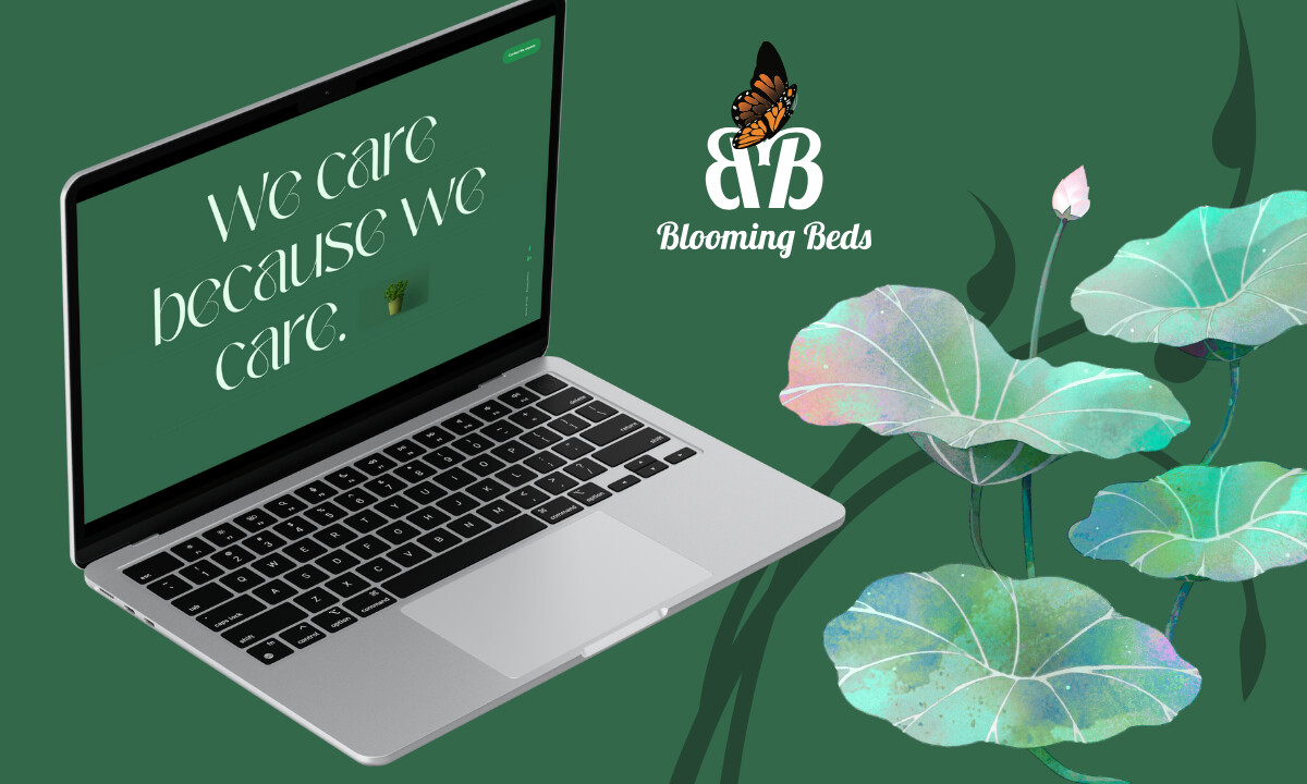
When I looked at Blooming Beds’ new website, it was clear what eDesign Interactive aimed to do: make care visible. The New Jersey–based horticultural company didn’t need a service site; it needed a digital space that reflected its values.
What emerged is more than a redesign. It’s a portrait of patience, precision, and quiet confidence, built around the simple idea of doing things with care.
Industry Insight: A 2021 UX research by Carrot found that simplifying hero sections and emphasizing a single, clear call-to-action can increase conversions by 22% to 55%. Engagement metrics like scroll depth and time on page also rise by up to 25%.
The takeaway is simple: clarity in the first visual frame directly shapes user intent and drives measurable ROI.
Layered Card Design Reflects Seasonal Rhythm and Structure
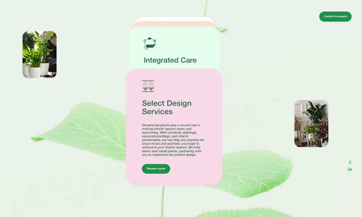
The interface feels calm and grounded. Rounded cards float over softly blended backgrounds, each tinted in seasonal hues:
- Green for vitality
- Pink for renewal
- Blue for protection
This palette does more than look appealing. It also teaches you what the brand believes: growth is cyclical and care is continuous.
The modular layout keeps content organized without losing warmth. It guides the eye naturally, allowing visitors to move through services, case studies, and brand stories at their own pace.
The overall feeling is one of calm authority. It is a site that knows what matters and gives it space to breathe.
3D Hero Animation Captures Growth Through Motion
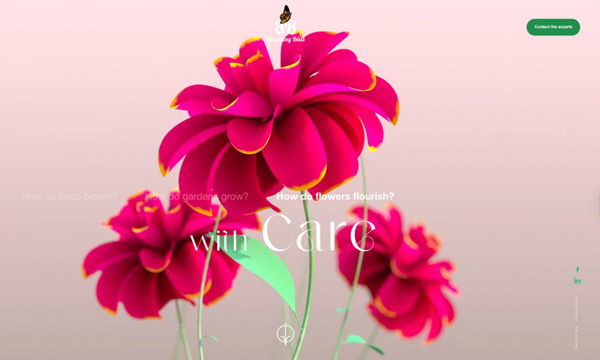
The homepage may start with words and but then it holds your attention with movement. Plants unfurl, flowers lean toward the light, and the screen settles on the phrase “with Care.”
That moment stayed with me. It’s simple, but it says everything about the brand.
The animation doesn’t try to impress us. Instead, it shows what care looks like when it’s given time and attention. It’s the kind of storytelling that doesn’t need to be loud to make its point because it just grows on you.
Learn from the top 5 video-first websites that command attention from the first scroll.
Micro-Animations Add Subtle Movement and Emotional Depth
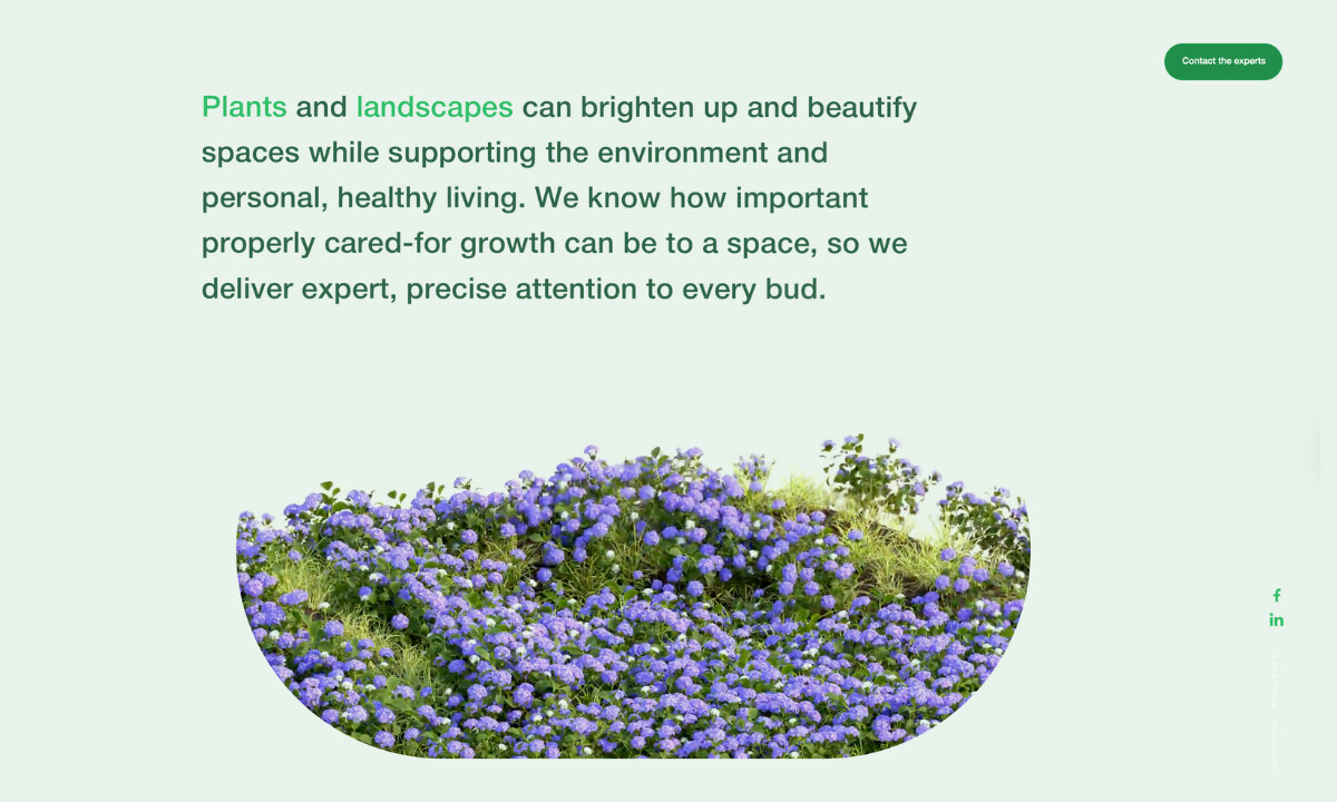
Not everything moves. But what does, matters:
- Entire flowerbeds bloom as you complete a scroll.
- Vines crawl throughout the backgrounds of pages.
- Logos glide gently across the screen.
- Text shifts just enough to keep the eye engaged.
These moments give the interface texture. They make the site feel alive without stealing focus from the content.
Each micro-animation rewards attention. The longer you stay, the more the site rewards your attention. Small shifts in motion and detail create a sense of discovery that keeps visitors curious.
It’s a smart design move for behavior. Curiosity turns into clicks, and those extra seconds spent exploring often become the difference between a visitor and a lead.
Build something your audience won’t scroll past. Check out these 9 best animated websites for inspiration.