Team Behind the Design
Web Design Analysis
As I look through the updated Midstate Independent Living Choices site, I’m struck by how gracefully it shifts from a dense, information-packed layout to something far more human and user-friendly.
The structure, spacing, and messaging now guide users naturally, giving them the clarity and confidence the previous design struggled to provide.
- Accessibility-First Structure: I immediately notice how the new hierarchy reduces cognitive load. Headings, service categories, and navigation patterns follow WCAG-friendly conventions, making the site easier to scan for people seeking specific services.
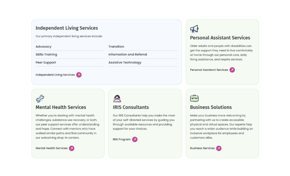
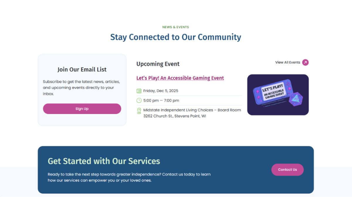
- Service Navigation That Removes Barriers: The segmented card-based layout for Independent Living Services, Mental Health Services, IRIS Consultants, and Business Solutions works remarkably well. It’s visually organized, reduces overwhelm, and lets users jump directly into the area that applies to them.
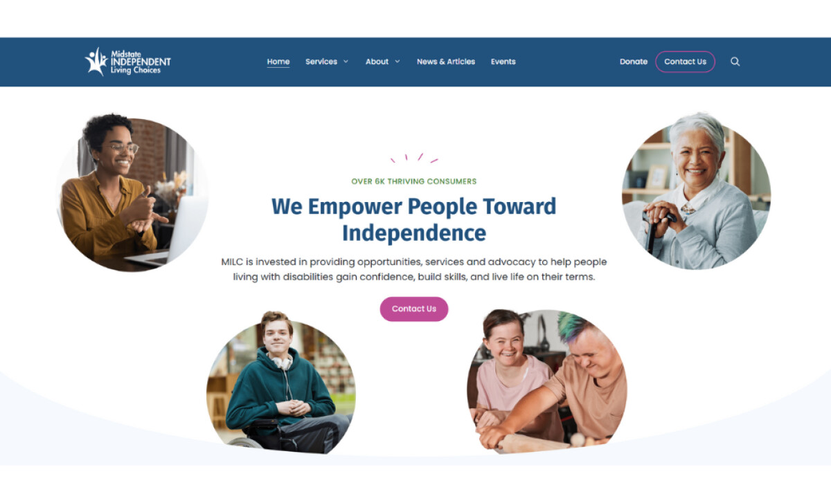
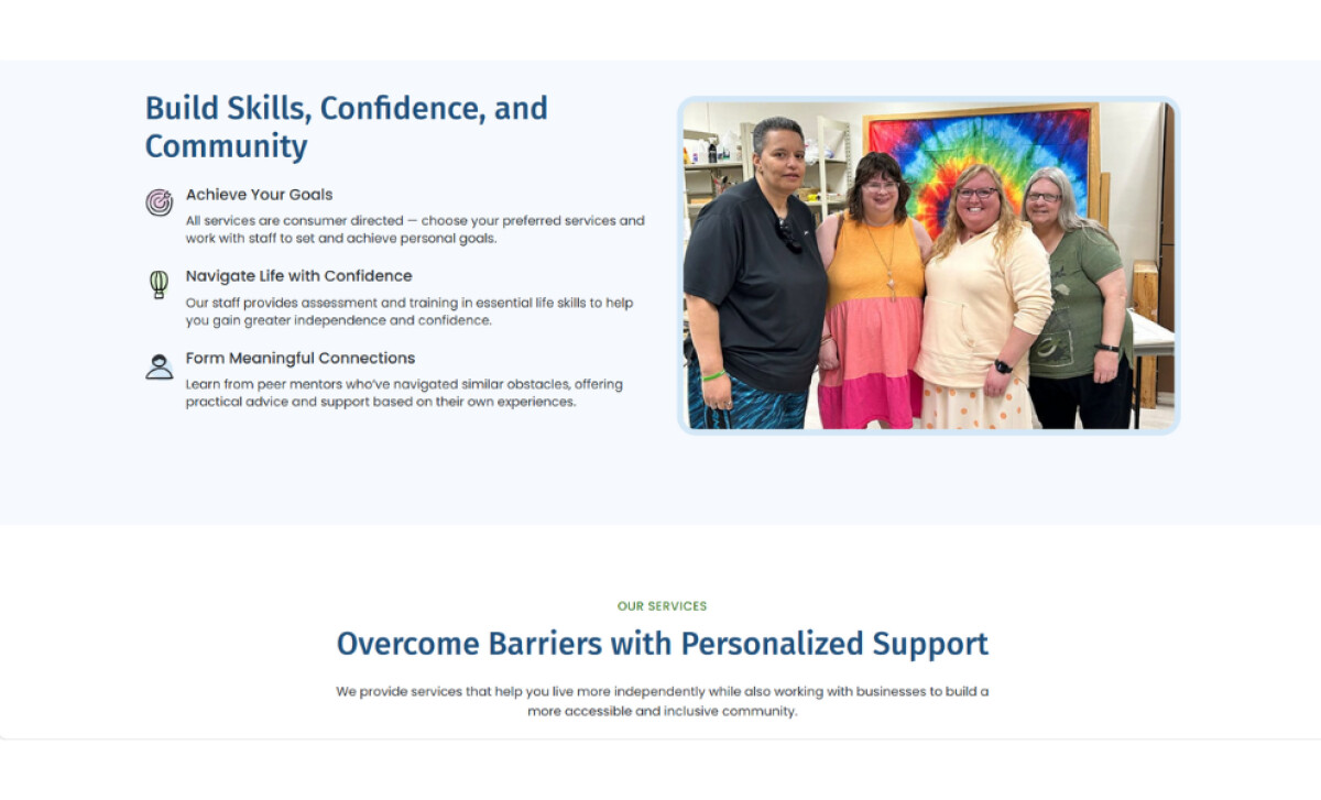
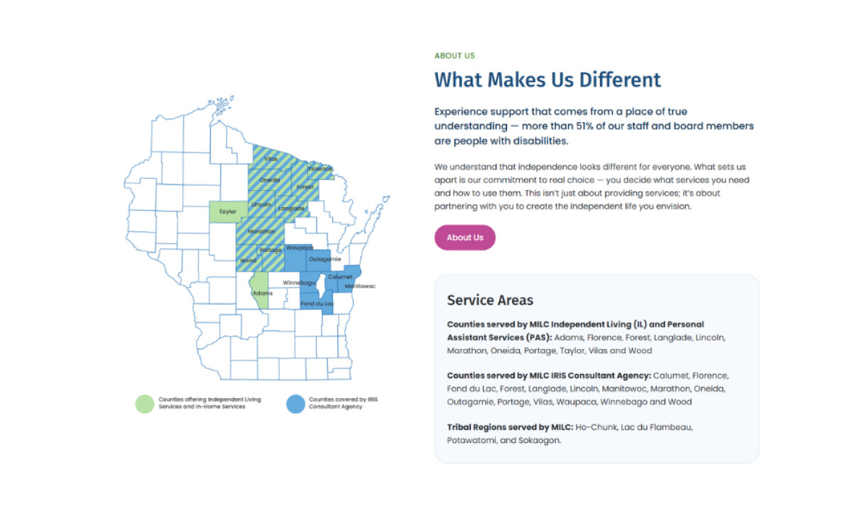
- Community-Focused Storytelling: By leading with real photos, consumer-focused messaging, and region-specific service maps, the site communicates trust and belonging. I find this particularly effective for an organization rooted in disability advocacy and community support.
- Scalable, Future-Friendly Framework: From a structural standpoint, the site is built for easy updates. Content blocks, event listings, and service descriptions are modular—ideal for a nonprofit whose offerings and resources evolve over time.
What Brands and Agencies Can Learn from the MILC Redesign
Here’s what this project shows about building an accessible, community-focused website.
1. Lead With Clarity and Emotional Context
The redesigned homepage uses real community photography and straightforward messaging to communicate purpose immediately. Users connect with the mission through familiar faces and clear intent, which builds trust from the very first screen.
2. Use Structure to Support Accessibility
The card-based service layout creates clean, easy-to-scan pathways for users with diverse cognitive and physical needs. Consistent hierarchy, spacing, and iconography reduce friction and help visitors quickly identify the services that fit their situation.
3. Make Navigation Predictable and Inclusive
The simplified menu, descriptive labels, and prominent contact options ensure visitors never feel uncertain about where to go next. Mobile-ready layouts and ADA-aware spacing reinforce inclusivity, which is essential for an organization serving people with disabilities.
About DesignRush Featured Designs
At DesignRush, we review hundreds of agency projects each month. The featured designs stand out for creativity, relevance, and execution.
Many go on to be recognized as winners of our Monthly Design Awards.
Explore more here:
- Best Website Designs
- Best App Designs
- Best Logo Designs
- Best Print Designs
- Best Packaging Designs
- Best Video Designs
For a full list of design agencies and related services, see our Agency Directory.


