
Get closer to nature. It’s a simple but powerful statement from Dome Experience. They offer comfort, minimalism, contemporary design, and a direct connection to nature - all in one convenient package. A breathtaking sunset, waves on the ocean, majestic cliffs, and a luxurious but minimalist dwelling all greet visitors immediately on the Dome Experience website. Talk about an incredible first impression. The above image dominates the entire browser window and website visitors can’t help but feel in awe. This image render perfectly employs the “rule of thirds.”
By placing the dome dwelling mainly in the bottom-right third of the image, the artist evokes a feeling of wonder and limitless exploration. The eyes of the viewer are immediately drawn to the focal point and then allowed to wander across the rest of the image, taking in every single detail.
The Dome Experience website offers an incredibly satisfying scrolling experience. It’s hard to understand until you navigate the website yourself.
The scrolling is smooth and responsive. As well, the parallax effect gives this minimalist-looking website a layered feeling. The design of the website fits well with the goals of the company. Stunning images are staggered on top of a simple white background as visitors scroll through the website.
Dome Experience is careful not to overwhelm visitors with an abundance of text. The main portions of the website are in a single-page format with buttons to subsections that contain more information.
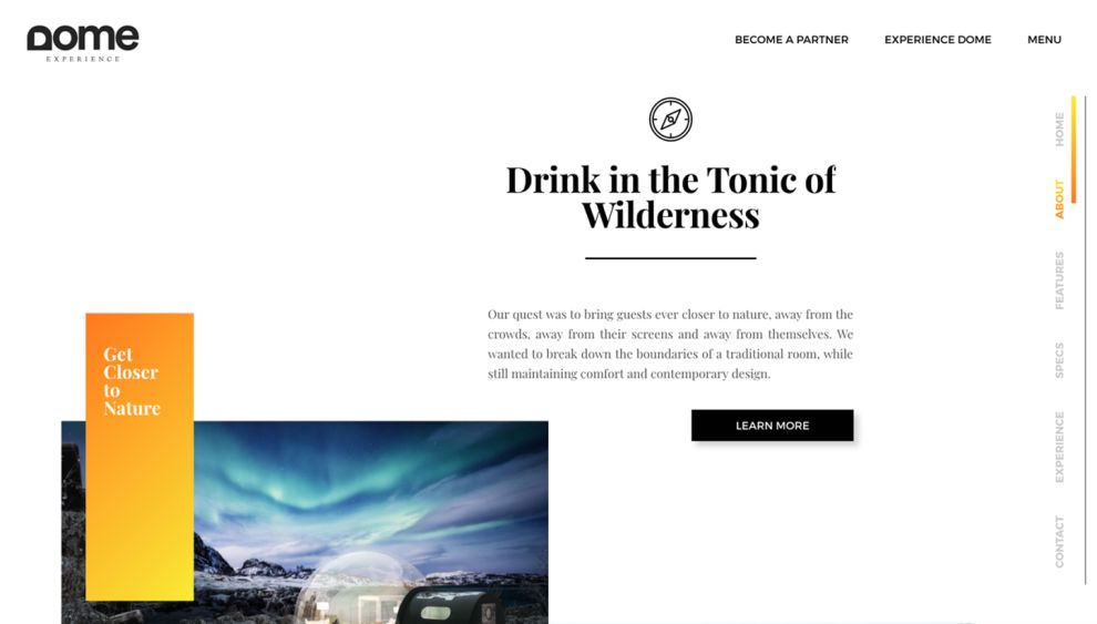
The website does a great job of maintaining consistency throughout. The orange-yellow gradient rectangles are prominent with simple statements. The scrolling bar on the right-hand side of the pages uses the same color gradient. Black buttons with a simple white text stand out but don’t overwhelm the eyes or take away from the beautiful images.
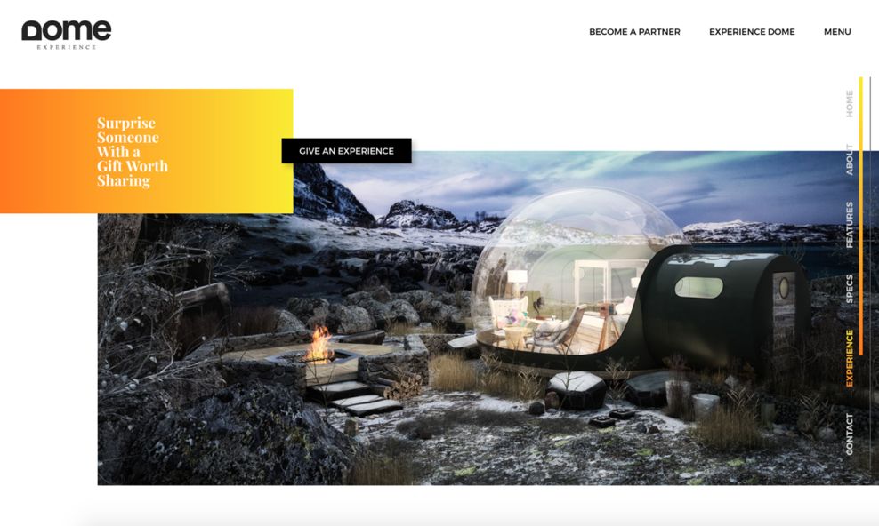
Modern design, simplicity, and a clean layout are constant no matter how far you scroll. Once again, in the above image, the rule of thirds is used very effectively. Dome Experience clearly understands that, while they are selling space in their luxury domes, the real feature is the unbeatable connection to nature that their unique design offers. It’s also reflective of an exemplary architecture firm website design — using visual harmony and clear navigation to attract clients looking for unique spatial experiences.
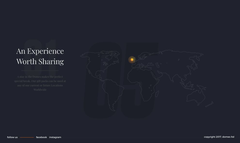
Even after clicking through to a booking page, Dome Experience is careful to maintain their design integrity by not overwhelming visitors with unnecessary information. A world map featuring that same orange color marking their locations dominates the page. There is a short description of the location with options to “Book Now” or “Give An Experience.”
The Dome Experience website is a perfect example of a website that fits well with the product or service being offered. Their luxury experiences put an emphasis on nature and minimalism so they have ensured that their website also reflects that. No matter where you navigate on the site, you never feel bombarded with information or jarring graphics.
Ready to book your experience yet?
Dome Experience is an awesome website design in the Hospitality, Luxury and Travel industries.


-preview.jpg)