When health is challenged and energy becomes depleted in recovery processes, the last thing anyone wants to deal with is an unclear, overly complicated insurance plan. Or worse… no health care at all. A fitting health care plan is one of the most important aspects of employment, and this site outlines all the options for News Corp employees. What is far too often an overwhelming and frustrating topic becomes clear and navigable on this interface that’s designed to streamline the process.
A colorful and creative theme breathes life into what is otherwise an ordinary and dull subject. Cool colors in gradients of purple and blue hues flow across the page in ambiguous shapes, creating a comforting ambiance in the backdrop. Pops of pink brighten the page in text boxes and soft watermarks. The site is full of movement and life, just as everyday health should be.

Scroll features are simple, and they bring up a blue heading with a wavy design that holds search, menu navigation, and drop-down short cuts for users to explore the multi-page site in a quicker, customized experience. For users just exploring their options, they are introduced to articles and content presenting preventative care, women’s health, dental care, therapy and injury prevention, pharmaceutical, and other forms of health guidance available.
Each section uses a colored square with rounded edges and white text against an opaque image to give users a snapshot of what other selections they can explore on the site. Keywords in light text, surrounded by white bubbles with drop shadows for visual depth and interest, direct users to search content specific to their needs. The boxes of content move up against a stark backdrop, and the white bubbles darken in response to user engagement. As wavy strips of color and images interrupt the solid white background with each scroll, the eye is constantly engaged. This design skillfully keeps user interest in otherwise extensive content.
From a single drop-down menu in the upper right corner, users can navigate a host of healthcare and employment benefit options available for their selection, including prescription coverage, vision care, family benefits, disability and commuter benefits, and parental leave options. The site even includes legal and regulatory content and new employee enrollment sections, some of which are highlighted in bold blue bubbles for easy access. All the content is arranged in clean columns with links that light up in blue when users hover.
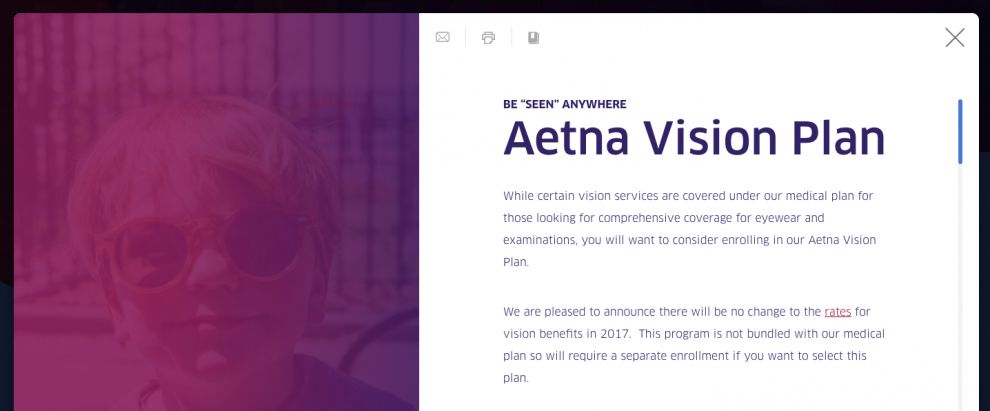
When users select an option, they are directed to pages with thorough details on each subject. On the left, a nearly transparent image is overlaid by a pink or blue color and remains static while users scroll through content on the right. Headings and text are kept in the same familiar rounded, blue or white fonts, and information is laid out in easily navigable charts to explain health benefits and options. Users can quickly exit these informational pages by using a large “X” in the upper right corner that returns them to the main menu screen. Though the site presents a significant amount of information, the design remains easy to use. It maintains the interest of users with any kind of health need.
My News Corp Benefits is an awesome website design in the Legal & Insurance and Medical & Pharmacy industries.