How would you like to find a clinic where your entire being--mind, body and soul--are taken into consideration when a care plan is developed? That’s exactly how the Benessere Clinic approaches caring for their patients, and their website showcases that.
The alignment of the homepage takes a fully-centered appearance by drawing the user’s eye to the embedded high-resolution photograph.
Geometric page accents in a triad of colors compress the page together, adding vibrancy and excitement to the simplistic slider. These accents guide the user through each photograph to introduce them to services provided.
Don’t know where to start? Making navigation a breeze, the Benessere Clinic offers up a basic hamburger menu for users. The minimalistic icon is readily viewable from any page and directs users to the simplified page.
The gray backdrop pulls forward the flat design of the menu. The use of a common, sans-serif font to spell out page titles and sub-pages is brilliant, letting users read with ease.
A creative red bar strikes through the current page so it’s impossible to not know where you are on the site, letting users interact easily with the page. With even space formatting and the use of numerical organization, the page has a clean, no-mess appearance.
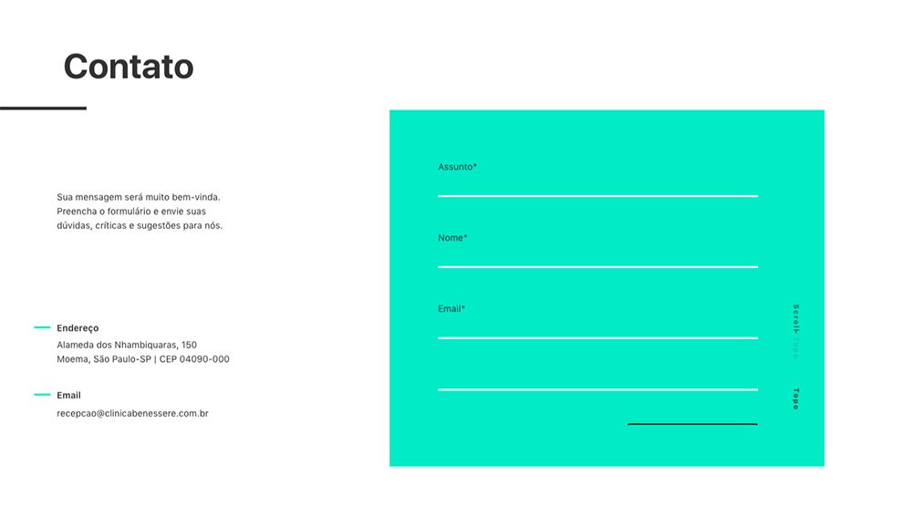
It’s vital that a site offers a way for users to contact the company. Taking an eclectic spin on their contact page, the use of a vibrant colored text box draws the eyes of the user to the right of the page and straight to the embedded plugin form.
The bold color choice is complemented by the white backdrop of the rest of the page. Creating a tie-in across the page, a matching accent with a minimal design is used within the white backdrop.

Want to meet the doctors? This is easy to do with the clinic’s About page. Image effects build the doctor profiles right before the user’s eyes. The white backdrop shows off the monochromatic theme between the embedded high-definition photograph and the text box.
The page ties each profile photo with a name in a creative manner with a brightly-colored accent line. It’s simplified, but effective as a way to bring the page around.
A dynamic site for a dynamic clinic is exactly what The Benessere Clinic employs. High-resolution photographs, bold colors and a simplistic approach creates an innovative user experience.
Benessere Clinic is a beautiful website design in the Medical & Pharmacy and Sports & Leisure industries.


-preview.jpg)