Richard Attias & Associates is a global, communication advisory firm that uses cutting-edge technology, exhaustive resources, and a comprehensive approach to help businesses communicate in the 21st century. Their style is largely informed by new tech and worldwide communication awareness.
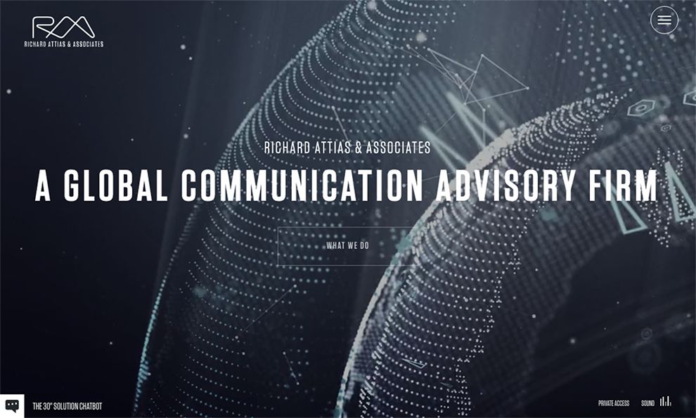
RA&A’s home page endeavors to broadcast this very particular brand by choosing a color scheme, focal image, and graphic overlay that publicizes resource, technology, and globalism in every way. The page is crowded, sleek, and constantly moving, giving users a sense that RA&A is as busy and all-encompassing as the design of their page.
Additionally, the general space age, futuristic feel of the graphic overlay tells users that RA&A is a modern company with a firm grasp on relevant technology. Lastly, the focal image of the page is an ever-rotating globe that, in tandem with the overlay, demonstrates that RA&A is globally present and powerfully in control. This page has many design elements that could easily descend into chaos. However, the talented designer was able to make these elements work together to communicate a very clear idea about RA&A.
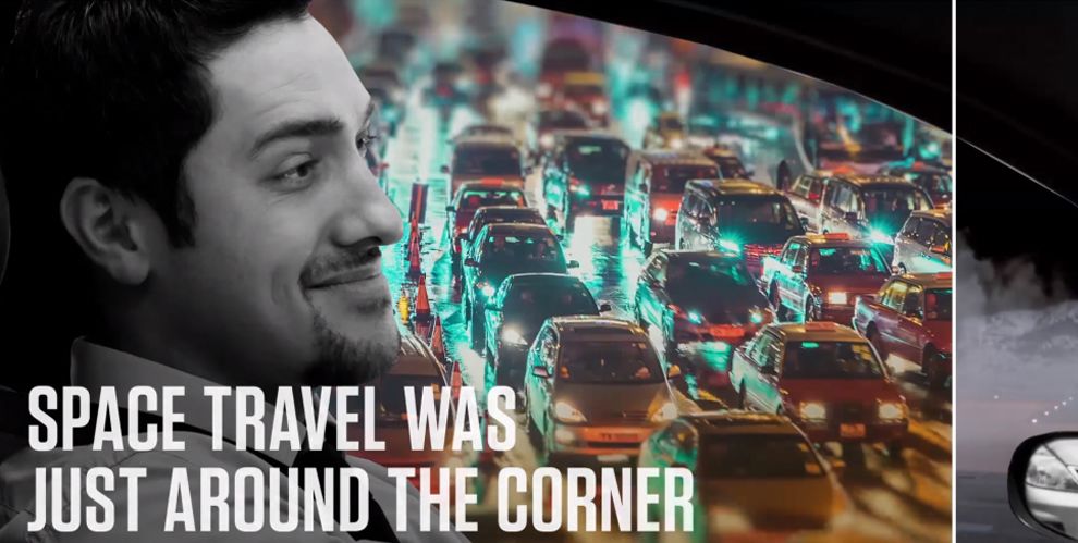
On the site’s home page, users have the option to watch an informational video that serves in lieu of an “About” page. The video is busy and graphic, displaying a variety of technologically themed clips in a fast-paced editing style, communicating the frantic process that RA&A works under. By providing an informative video that can function in place of text, the designer has not only further depicted RA&A’s brand, but they have also immersed viewers in a more dynamic experience. This is an example of how medium informs UX. The more dynamic the medium, the more engaged users will be.
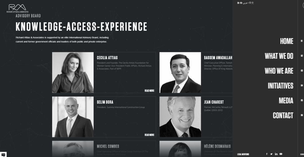
This page, an extension of the “About” page, is a section that showcases the staff and talent working on RA&A’s team. This serves to not only endorse the company, but also to showcase the individual talents of their underlying employees. Additionally, the bump-out menu on the right of the page has been opened to showcase its graphic design. The use of thin lines, sleek text, and a dark background further suggests the all-encompassing technology of RA&A’s brand. The designer has imbued every nook of the site with the same, branded aesthetic, creating a cohesive experience that paints the company in a positive light.
RAA is a best website design in the Professional Services industry.


