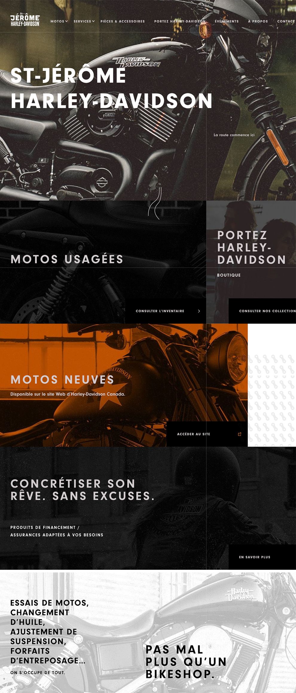
The St-Jerome Harley Davidson website is dedicated to the branch of Harley Davidson in France. The website takes on a grunge-style theme to bring out the rustic nature of the motorcycles and products the company sells. The web design utilizes high-resolution and vintage photographs of their motorcycles as a way to create a strongly impactful negative space. Bold and white sans serif font in capital lettering is left-aligned on the page to draw attention to the name of the company.
From the landing page, users have the option to scroll down to view a number of intriguing aspects presented in a grid format. The grid combines photographs with word prompts in text boxes to direct users around the site. The edges of the text boxes and photographs line up with one another to create the borders of the grid.
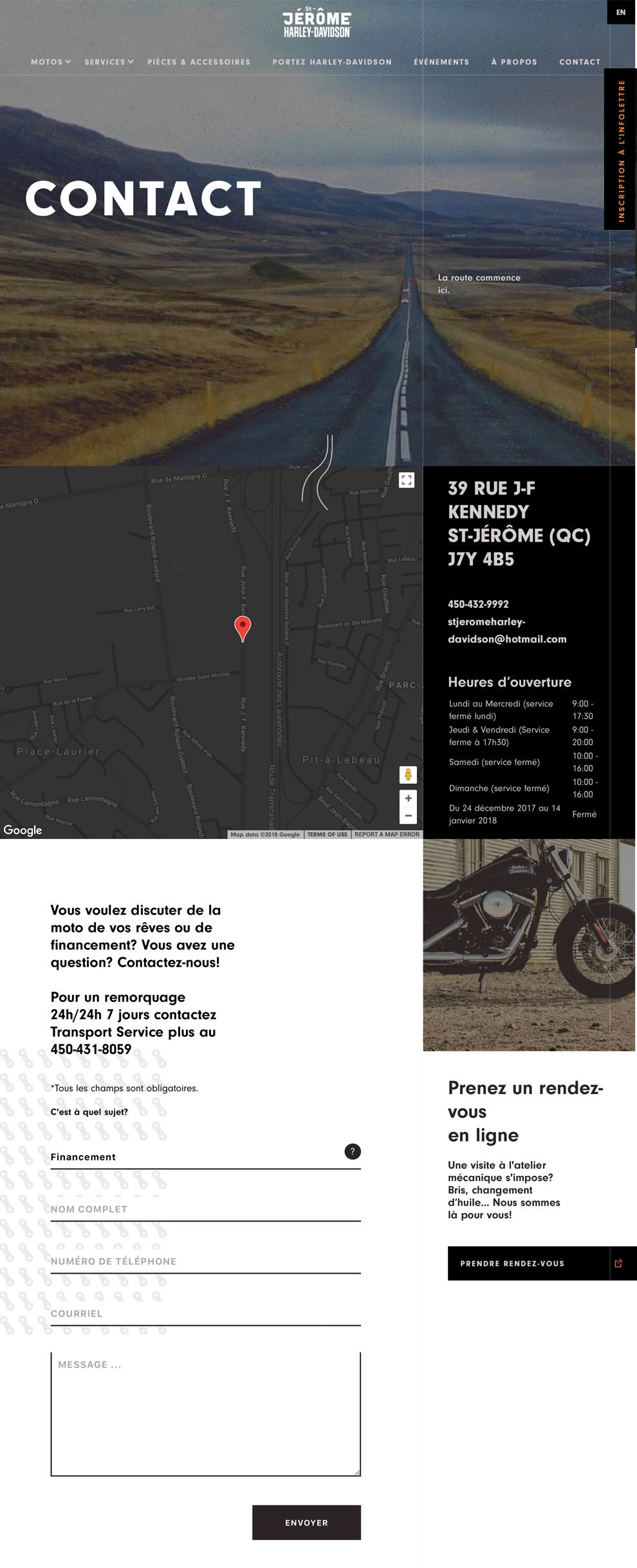
Keeping things simple, St-Jerome Harley Davidson makes use of a white negative space to have the rest of their contact page stand out, eliminating distractions. Centered in the middle of the screen, the company employs a plugin form that allows users to contact them directly. The form stands out with a bold, black sans serif black font. A high-resolution and vintage photograph is placed as a page accent in the right corner of the screen.
The website offers two different menu options. From the home page, users are given access to a right-aligned header menu. A white sans serif font makes the page titles stand out against the photographic negative space.
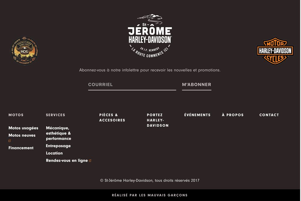
Additionally, an extensive footer menu is placed at the bottom of each page that expands on the available navigation options. The footer pulls its umber brown coloring from the vintage photographs on the page. A bold, white sans serif font is used to create a number of columns that divide the navigation options, making each segment easy to read against the dark negative space.
Hop on a Harley and disappear on the open road with the help of St-Jerome Harley Davidson. The rustic feel of the website provides an inkling of the adventure that awaits users who explore their web design.
St. Jerome Harley Davidson is a gorgeous website design in the Automotive, E-commerce & Retail and Manufacturing industries.