Talbica: Interactive Chemistry’s Website Design Presents an Immersive World of Self-Teaching Lessons
Like the periodic table, the project grew and expanded over the years. It started as a limited app, then evolved into its current comprehensive form. While its original function remained intact, the growth process slowly added new attributes that led to the stunning contemporary learning tool it is today.
Talbica: Interactive chemistry has now surpassed the basics, reaching the state of a chemical dictionary. But there’s more! It not only names elements and indexes their most significant characteristics but also provides a chemical calculator, a solubility table, a module for calculating molar mass, temperature translation, and more.
Explore more of the best educational website designs to date.
Talbica: Interactive Chemistry’s Website Design Provides Stunning Visual Adaptability and Preciseness
Love Media's genius approach was to use the website's content to create an educational experience with an immersive visual presence. The agency shied away from employing dynamic elements like these equally brilliant, vibrant website designs developed by top-rated web design companies.
You can customize the view based on your interest in up to 10 lessons. Each lesson is color-coded and represents one chemical element. A color guide below the table helps you comprehend why certain elements are painted in particular colors.
Here’s how it works: the default setting classifies the periodic table according to the element’s type (i.e., alkali metals are red, noble gases are violet.) But by clicking on the heatmap icon, you gain access to a menu of nine options that instantly recolor the entire table and add relevant numerical data on each element.
The most impressive visual is triggered once you press the middle button, "colors." The design instantly transforms from a blank dashboard with numbers and colors into an interactive outer space setting, giving you a glance at how the elements look naturally.
Make sure to look into other amazing interactive web designs here!
Talbica: Interactive Chemistry’s Website Design Mimics the Laboratory Setting, Letting You Focus on an Atom or a Compound
This design successfully reminds visitors how beautiful the internet can be when used correctly. The visuals are superb, extremely informative and thorough. Collaborating with a branding agency is an excellent move if you want to create an on-brand and visually appealing site like this.
As you hover over any element, it triggers a cursor effect, placing it in the center of the screen with an enlarged view. Apart from the label and its color, the element in focus displays its most vital characteristics, such as atomic weight, melting and boiling point and density.
After learning about elements and their characteristics, you'll wonder about their interactions with their counterparts. And the design's ready for it!
Above the periodic table, there’s a query designed to help you investigate all the known compounds and their features in a click or two. So, if you want to get beneath the surface of the H2O, the query blasts you away with valuable information through a fascinating drop-down effect.
Talbica: Interactive Chemistry’s Website Design Delivers Immeasurable Learning Opportunities Through an Impeccable User Experience
This design’s never-ending engaging properties align with the client’s purpose. Interestingly, each click on the website leads you to new findings, like how elements react to external forces!
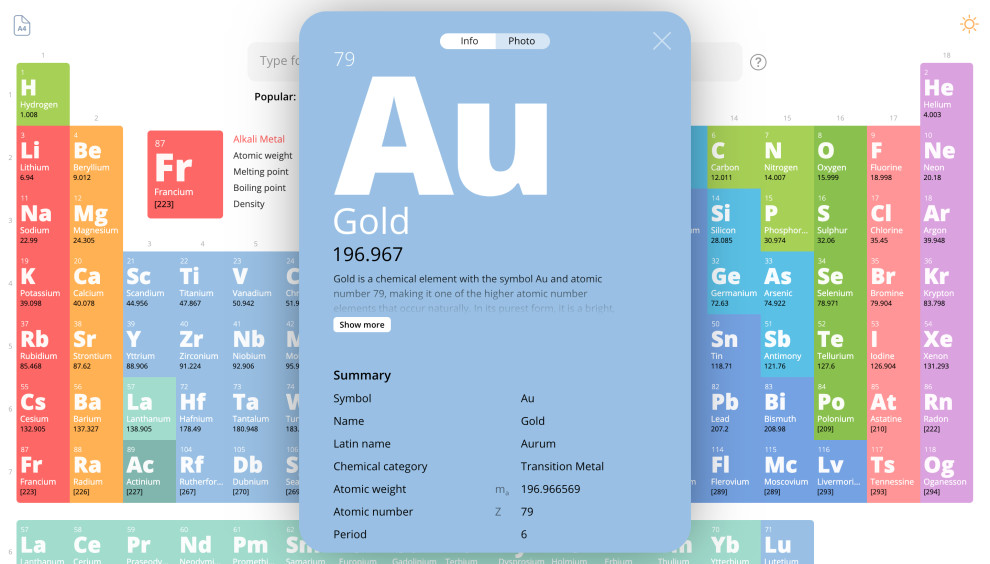
By clicking on any element, you unleash two tabs. One is the information chart that displays an in-depth analysis with dynamic visuals. The other one lets you see the element in its natural state, unobstructed by other visuals.
However, there’re lots of technical terms that a student might be struggling to understand. Naturally, the design lets you scroll down to the bottom and click on any of the words or phrases mentioned. Once clicked, the user is redirected to a dedicated Wikipedia page about the unfamiliar term.
And if the website’s functionality confuses them, all they need to do is click on an inviting question mark button next to the compound query. It will trigger a pop-up window that contains a detailed manual explaining how to use the website to its full potential!