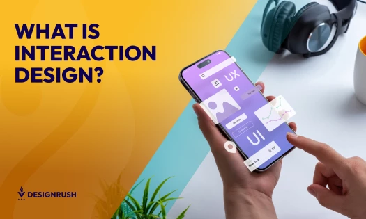
It’s simple — dynamic websites are gradually becoming THE thing of the future. But why? What makes them so appealing compared to their static counterparts?
Technicalities aside, dynamic websites are highly functional, easy to update and, most importantly, interactive. UX/UI designers put their soul into creating custom elements that not only encourage but demand user participation.
Dynamic website design may take longer to develop and are usually costly, ask any of the specialized web design companies, but they are worth it. Once a brand, any brand, successfully mashes creativity, innovation, and a good product/service together – they are bound to engage their target audience and elevate their experience beyond initial expectation.
In this article, you’re not only going to discover the best dynamic website design examples out there but witness first-hand the power of genuine user interaction.
1. EarCOUTURE by baqemono

Standout Features:
- Fluid animation
- Full-screen pop-up menu
- Smooth parallax effects
EarCOUTURE is a portable audio shop that offers a range of brands that reaffirm the wonders of music and change the value you place on sound quality. In the company’s own words: “We want to convey the joy of trembling with sound."
Now, how would they convey said feeling via a website? That’s where baqemono comes to the stage. The client had one enthusiastic request:
“We want you to create a website that has a surprising and moving effect the moment you see it.". It’s safe to say that baqemono delivered.
The design is bold, and the tuning is carefully constructed. Each step of the user journey is carefully planned. As soon as they land, visitors are met with an instant wow factor – buttery-smooth animation prevalent throughout the scroll experience.
2. Mercury Marine by Cramer-Krasselt

Standout Features:
- Exhilarating visuals
- Short, punchy copy
- Impeccable product presentation
When outboard motor manufacturer, Mercury Marine, unveiled their revolutionary, 600-horsepower Mercury V12 Verado, the industry norms were literally blown out of the water (pun intended).
You’d have to see it to believe it. Fortunately, the team from Cramer-Krasselt was in charge of the “seeing” part. They were the powerhouse behind the immersive online journey that not only educates users on the engine’s technical advancements but pulls them within the nuts and bolts, showcasing every aspect of the V12 itself.
The website or rather landing page was developed with two main objectives in mind:
- To teach people about the engineering advancements that went into developing the V12 Verado and demonstrate the functional benefits these innovations bring to the boating industry.
- To be exciting in lieu of your typical boat show (absent during the pandemic).
As the ideators noted: “We needed to get people salivating at the idea of attaching a few of these beasts onto the back of their boat without ever seeing one in person.”
The balance between these two goals is a clean, tech-inspired design aesthetic; It’s a linear journey that visually amplifies a dynamic scrolling animation of the V12 Verado while delivering bold, short, and easy-to-digest technical copy points.
3. Demilie Creamed Honey by Art. Lebedev

Standout Features:
- Colorful
- Twisting elements
- Incites curiosity
Next from our list of dynamic website examples is Demilie, a Russian honey producer that uses specialized technology to whip honey and give the traditional, millennia-old natural product a new look and taste.
You know how it goes, using honey as a dessert or infusing your tea with a more appealing flavor; we’re all used to that good ol’ turning of the wooden spoon—the brand’s website, made by Art. Lebedev is all about twirling, rotating, and mixing with an added twist (!).
It turns the familiar into somewhat of an exciting cosmic exploration. Watching everything that’s going on while scrolling makes users guess what will happen in the end. The company does not reveal technical details of creamed honey production, but those secrets only arouse curiosity.
On the product information page, the visitors find themselves in “zero gravity” with jars of various flavors flying around a huge colorful “sausage.” Catching any of the jars with the cursor presents it front and center to help recognize it on store shelves later.
The hypnotic company history page submerges visitors into the depths of details. The viewers need to go into “hyperspace” to the next paragraph by scrolling the text and pushing away incoming objects.
4. Poseidon's Moringa by Digital Present

Standout Features:
- Showcasing packaging front and center
- Deep blue color scheme
- Powerful typeface combo
Switzerland-based Poseidon’s Beverages AG created a new and revolutionary energy drink infused with Moringa Oleifera Tree that offers a slew of benefits and naturally stimulating effects.
When creating a website for the beverage, Digital Present distilled a simple philosophy – showcasing the sleek, interactive animation while bolstering the drink’s ancient roots.
The page puts packaging front and center, making it “dance” as users scroll down. The usage of Moringa in ancient herbal medicine is embodied by Poseidon’s trident (the brand’s logo). Since Poseidon is considered one of the more disruptive deities in ancient times, the website draws from his power, expressing the drink’s energy and curative traits.
Additionally, DP added various 3D motion elements to help spread Poseidon’s Moringa story.
5. NutriBird by Poppr

Standout Features:
- Custom, animated 3D models
- Play on words
- Exciting scroll features
With its wide range of pet food, treats, and nutrition formulas, Versele-Laga is present in all corners of the world. One of the company’s leading brands, NutriBird, which provides specialist bird food, enjoys a robust, global reputation.
Increased recognition demanded a readjustment - a rebranding sometime in the making. The key point, or in the marketing team’s own words: a new set of wings, was a one-pager website that highlights the brand’s new look and feel. And for this, naturally, NutriBird turned to Poppr.
Creating an attractive browser experience was not an issue for a veteran creative digital team. The task was straightforward, with one key objective: instantly communicating the new brand of NutriBird through immersive UX. Needless to say, mission accomplished, with flying colors. Literally!
6. Reflexion by Design in DC

Standout Features:
- Intro explainer video
- Clear USP
- Prominent CTAs
Reflexion is the world’s first portable neuro sports training service of its kind that helps you achieve remarkable athletic milestones.
The brand wanted to create a website that showcases their product, a cognitive training service, in a way that users can instantly understand, interact and get familiar with. While the previous website was punchy and visually impressive, it missed the mark when it comes to instant legibility.
Design in DC flexed all of its technical and creative abilities to revamp Reflexion’s entire website, assets and all.
The user journey starts with a dynamic explainer video on the home page, which uses engaging graphics to describe the science behind Reflexion’s unique product. It was created with Reflexion’s branding in mind, so it integrates seamlessly with their newly designed website.
7. Advisor by PUSH-K Solutions

Standout Features:
- Sticky CTA
- Ample negative space
- Mission-oriented
Advisor is an innovative software tool for increasing the efficiency and profitability of real estate.
When creating Advisor’s corporate website, PUSH-K Solutions didn’t want to simply fill it with the information about the service (energy saving and security management of real estate), or offer a legible catalog of related technical equipment.
While the agency did precisely that, it also implemented various non-standard, cool solutions for front-end programming. Additionally, the site has three language versions.
On the user’s side, PUSH-K Solutions shows that a corporate website doesn’t need to be cold or restrictive. In fact, they redefined the meaning of “professional” by introducing a slew of interactive elements that not only breathe life into the website but focus user attention on the key points, showing how Advisor could benefit them and solve their immediate needs. Check out some of the best IT website designs here.
8. Libenar by Della Nesta

Standout Features:
- Pastel color palette
- Mission-oriented
- Parallax effects
With its wide range of products specially tailored to “young noses,” Libenar specializes in treating and caring for babies and children.
Besides designing the website, Della Nesta’s primary goal was to position Libenar among the first Google results for all the strategic keywords in the sector. Essentially, website creation was aimed to match the brand’s historic reputation in an online environment.
However, the mission-oriented approach didn’t take anything from the visual appeal—quite the contrary. Libenar’s website is bright and comfortable to explore. The soft pastel color scheme conveys purity, elevating the brand as the go-to place for baby products.
Made with soft, pale pink and baby blue accents, the mix complements the primary messaging, making the website effortlessly stand out.
9. Propel by Check DC

Standout Features:
- Subdued color palette
- Play on “dark mode”
- Smart usage of the brand’s logo
Propel helps fast-growing, forward-thinking companies hire and onboard talent from emerging tech ecosystems, developed through an innovative CaaS (Community-as-a-Service) powered platform.
Propelling (pun intended) the future of work by building an expansive talent ecosystem, demanded an equally future-proof online presence.
The lightning-fast website, designed by Check DC, opts for highly professional aesthetics that directly communicates the level of talent Propel relies on.
All the animated elements are not there just to elevate user experience, but to point visitors to the key conversion/educational points. As the team behind Propel would say: Build, Scale and Grow without borders!
10. Fuelflip Energy by Grapdes

Standout Features:
- Animated homepage
- Streamlined technical copy
- Clear visual hierarchy
Fuelflip Energy is an impact technology startup in Delhi NCR that offers various renewable energy solutions to reduce the harsh environmental effects of using diesel gensets.
The brand wanted a website that breaks away from your typical engineering-obsessed messaging and imagery. One that makes it easy for the layperson to understand Fuelflip’s goals and solutions with ease.
The easy-to-approach tone was key in creating an association with the largest block in the target clientele.
Besides being in charge of building Fuelflip’s brand from the ground up, Grapdes developed a professional website for lead generation and brand awareness, wherein the critical focus was showcased through engaging content and copywriting. Check out the best tech startup website designs.
11. Size by EWM
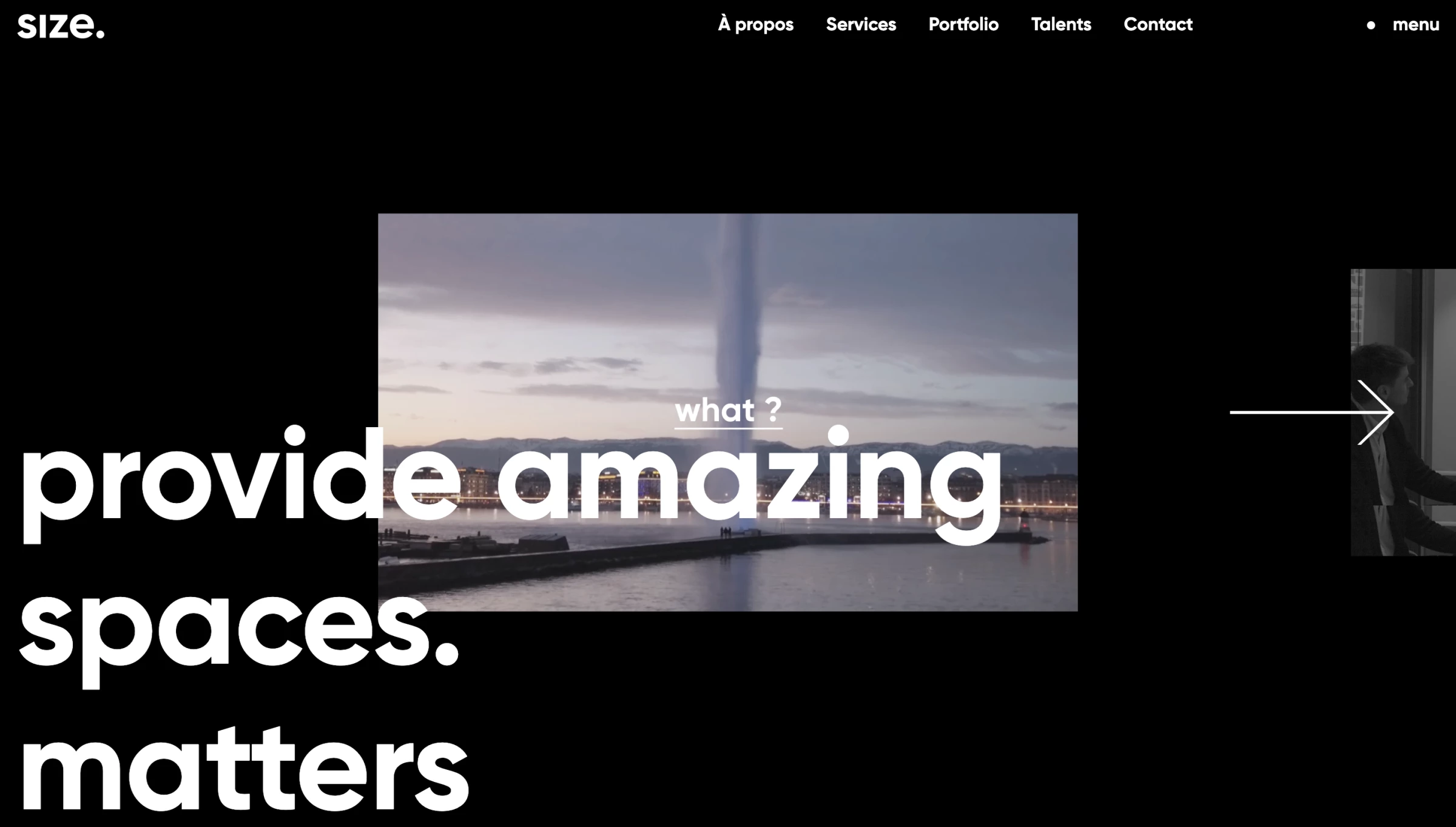
Standout Features:
- Play on Dark Mode
- Bold Imagery
- Intro Video
When designing Size's website, EWM's primary goal was to create a sleek, flexible experience with fluid navigation and a seamless user interface. The redesigned site includes several innovations based on mobile-first design philosophy.
What makes it stand out, however, is not just its responsiveness, or lightning-fast page load time, but a truly compelling site (re)design featuring bold imagery and compelling, easy-to-digest messaging.
The end result? An empowering web design for an empowering business model.
12. Kevin Bonisch
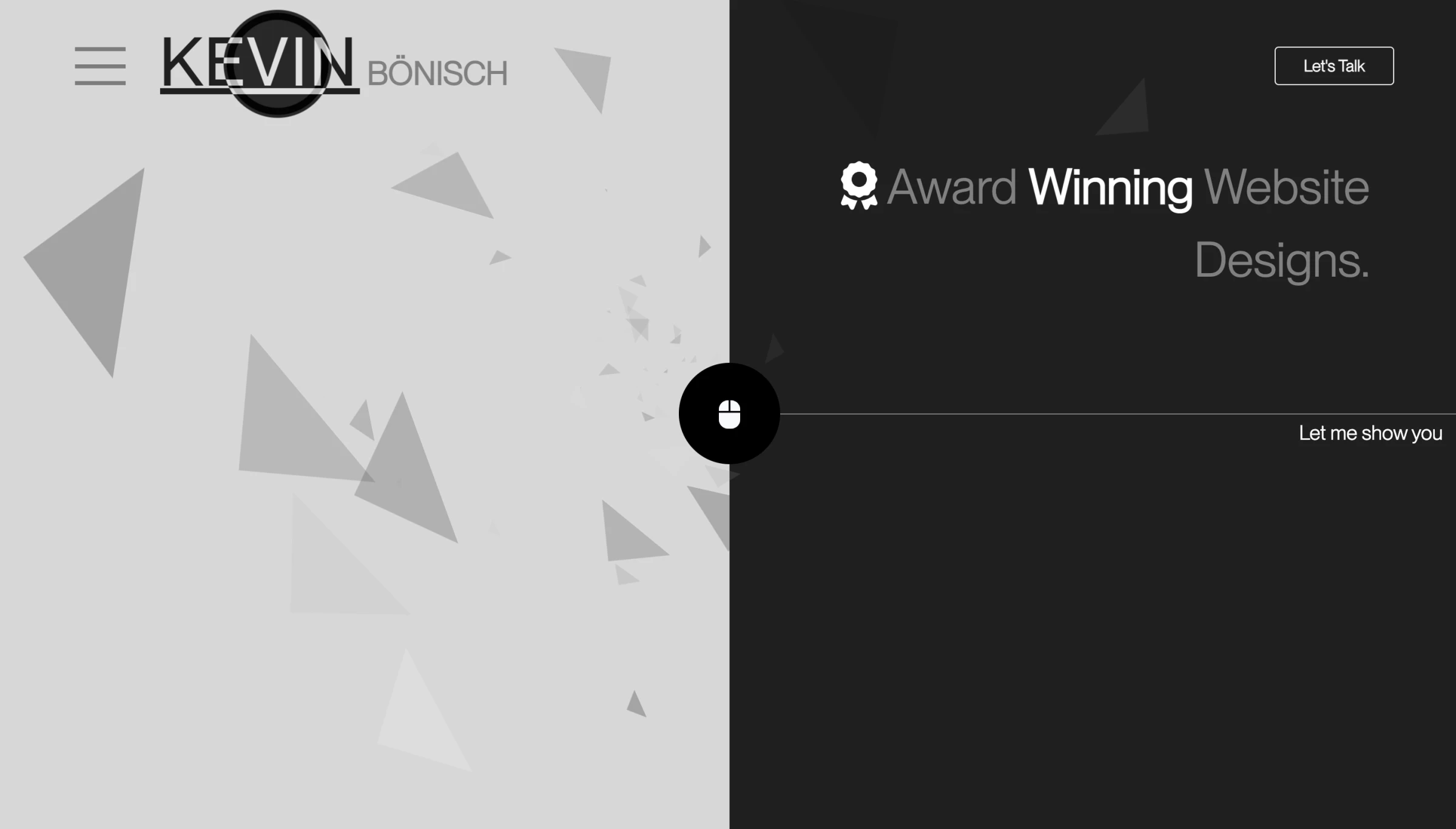
Standout Features:
- Monochromatic
- Motion graphics
- Timeline scroll feature
Uniting simplicity with cutting-edge is in Kevin Bonisch's design DNA. Drawing from a rich software development experience he almost literally used the "ones and zeros" to create a minimalist wonder.
The unusual layout is perfectly balanced by the intuitive navigation while the overall contemporary approach enhances the somewhat retro black-and-white color scheme.
It's all about the motion, however, implied or otherwise. Motion graphics amplify the experience by tenfold, enticing visitors to slide down the conversion funnel and cry out for more. This dynamic approach to user engagement, combined with a strong visual identity, are key ingredients in creating award-winning website designs that stand out from the crowd.
13. QuantBlock by Webpop Design

Standout Features:
- Helpful CTA buttons
- Streamlined layout
- Easy-to-read website content
QuantBlock comprises DEFI experts ready to provide end-to-end assistance in creating and managing blockchain. As you might expect, this process can get quite tedious. And most crypto-related websites can lean towards a messy interface loaded with too much information.
Good thing Webpop Design knows its way around a functional and practical dynamic website design!
The designers broke down the company’s technical specializations and services into several content blocks, each with concise information to make it easier for users to understand each solution.
Should they need more information, they can click the CTA button inside the block to learn more. An accessible Contact Us button also sits at the hero banner for instant assistance. These buttons are great ways to spark action and boost visitor engagement.
Injecting a pop of color in a dark-themed UI is always a great move; it creates a streamlined UI that’s relaxing and pleasing to the eyes. Simple, but definitely engaging and visually satisfying!