Buffy’s Exciting Website Changes The Way You See Comforters
Buffy is an e-commerce site that sells quality, comfortable and naturally-made bedding. They believe in comfort and sustainability, creating products that are free of a history of water waste and animal cruelty.
We believe comfy is the most important feeling in the world,because when you’re feeling comfy you’re feeling good. But we also believe the products that make us comfortable shouldn’t turn around and hurt the planet we love. That’s why we’re cleaning up textiles, one of the planet’s most polluting and wasteful industries. We're here to clean up the streets and seas. Buffy was born in a family with over 20 years of experience in textiles - and we developed a new way to rejuvenate discarded PET bottles into one of the lightest, softest textiles fibers available today. Buffy’s mission is to make comfy products using innovative materials and design—not animal cruelty or waste.This brand has a moral compass and a strong ethos that drives them forward. They care about the state of the earth and their impact as a brand on the world around us. And they want consumers to care to.But they also care about comfort. They care about feeling good, and they know that feeling good starts with a good night sleep. And you can’t get a good night sleep if you’re not comfortable — it all comes full circle as you can see. But this brand is dedicated to making sure its customers are happy, comfy and informed.
And to do that, the team utilized a creative, cool and quirky website design to highlight its products in a fun, unique and playful way. This design is hard to ignore and too easy to maneuver not to investigate.
The playful elements are apparent, but so is the professionalism and care this product emulates. There is only one product to offer, and this platform puts it center stage for all the world to see.
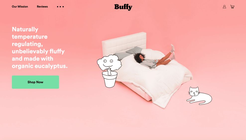
The Buffy Interface Uses Creative Colors And Animation To Add A Playful Edge
There’s an innate playfulness to this design — and it’s tangible from the moment you land on the homepage.
Subtle color gradients in bright, vivid colors get users engaged and glide them along the screen. The entire homepage is made up of blocks of bright color gradients — greens, oranges and pinks that softly fade as you scroll. This is a light and bright design element that engages on impact and creates an air of satisfaction and excitement. But it’s not just these colors that stand out.
Cute, cartoonish animations add a lightness and a personality that is extremely silly, approachable and fun. They are created as illustrations, drawn out in black and white. They remind you of your childhood drawings, bringing with them a nostalgia and a grace that is impossible to look away from.
In addition, there are clever product shots and photos. They are cut and cropped so that they fit seamlessly with the design and against the background. And they move along with the animations.
The movement as a whole is intuitive, creative and breezy — it eases and excites while simultaneously adding a soothing and nostalgic quality to the design.
It’s fun and vivacious, an indicator of a modern and fresh brand that cares about its appearance and identity, and wants its consumers to know it.
You can’t look away from a design that pops in such a way. In some designs, color can be seen as foolish, but in this one, it stands as the perfect backdrop for the singular product. And the animations and illustrations add a professionalism in a sleek and modern way. These elements elevate the design immensely.

Buffy’s Intuitive Navigation Is Elevated With Clear CTAs And Minimal Menu Options
Navigation across this site is seamless — it’s a minimal design after all, and it makes sure its consumers know at every step of the way how they can learn more, try their products and eventually buy.
Bright and bold CTAs matched with a clear and minimal menu bar makes navigating this website simple, removing any unwanted and unnecessary content in favor of product-focused images and experiences.
The menu bar offers three options — to learn about the brand’s mission, to read reviews and an ellipsis that hides other, less important info. But users can easily find it if they want.
And on the homepage, clear, bold and bright CTA buttons lead users to the product page where they can buy and try.
This takes us to the innovative, modern and informative product pages — a heavy hitter in this design.
Product pages are clear and direct — they offer few customizable options to choose from, but use most of the page to bring context to the product, highlighting materials, morals and brand integrity in a way that puts consumers at ease and gives them a larger picture about the brand itself.
And the intuitive “Try A Buffy” option is modern and forward-thinking. This brand wants to let consumers try before they buy, which creates a user experience that is exciting and refreshing. Consumers don’t have to commit to buying based on hope — they can see and feel it to believe it.
This website takes all the guesswork out of finding your next natural, exciting and comfortable bedding. It’s a simple design with a clear layout that makes for a seamless and pleasing user experience.
And user experience is key when it comes to web design. If a user isn’t happy and pleased to be working with a design, they won’t stay long enough to learn about what makes your product great, let alone make a purchase. It’s important that designers create a website with its users in mind, and this website does just that.

Buffy’s Web Page Oozes Integrity With A Focus On Authentic Customer Reviews
This is a brand with a heart and soul — that’s apparent in its mission statement and dedication throughout the site to shed light on the clever and impactful ways their products help the earth. But it also cares about the customer experience. It knows that consumers care about what other people have experienced and what they think, and it provides that information upfront.
The integrity of this design is tangible — it puts the customer experience first, providing readily-available reviews for consumers to read through, creating a more well-rounded experience and instilling trust. These quotes are given their own landing page but are also sprinkled throughout the design to add personality and compassion.
On the home page, quotes are integrated to add clarity and authority. And the dedicated review page adds even more, making it apparent that this brand knows what it’s doing and want to promote that to its audience.
These reviews are real and authentic, and align this brand as a leader thanks to them.

The Buffy Online Platform Is A Shining Example Of Consumer-Focused, Clever Design
The Buffy website is a website dedicated to comfy, all-natural bedding. It’s a website that puts its sole product center stage, revolving every design element around it ins a soft, fluid and sophisticated way.
From the second you enter the home page to the second you decide to try a product out, this intuitive and cartoonish website design pulls you in and keeps you entertained.
Bright color gradients highlight a modernism and a chicness to the page that is hard to ignore. It’s a design that lets its users know that the brand is fresh and clean and ahead of the curve. It knows what its audience wants — in products and in design — and gives it to them.
And these jumpy, cute and clever animations — created in a cartoonish, illustrated way, add a lightness and an effervescence that strikes you to your core.
Navigations is equally creative and fun. Simple, bright CTAs help users find what they're looking for and inform them of the brand, its products and its mission. A simple menu takes the guesswork out of navigating through unnecessary info, putting consumers in contact with the information they’re looking for.
This intuitive nature is also present in the product page. There’s one product, and sliding bars and clear product options let visitors see the comforter that’s right for them. It also puts a heavy emphasis on the product and its history, using the page to inform and enlighten in a light and airy way.
This brand has a heart and soul. It has an integrity, and this is seen in the focus on product reviews. It doesn’t just want to tell you for themselves why the product is as good as it is, it wants you to see it for yourself and lets you see what other customers have said.
It wants you to buy, but first and foremost it wants you to be satisfied, offering an option to try for free. This is an exciting, modern and forward-thinking feature that is ahead of its time.
This website is creative, cool and professional. It’s an ideal destination for any consumer looking for a product that shines, and a brand that cares.
For more e-commerce marketing trends, check out the best e-commerce website inspiration and business growth tips in the DesignRush Trends & Insights section.
You can also discover the top e-commerce development companies in the agency listing section.


-preview.jpg)