Developed by the Economist’s research and analyst group, this website is devoted to tracking energy consumption patterns in the U.S. Compiling more than 50 years worth of data, the site provides an interactive, in-depth look at energy demands for the state and national levels.
The site’s hero header immediately sets the scene for the dynamic user experience that’s to come. The use of rectangular text boxes and buttons conveys a sense of structure and security. What’s more, these shapes have a very mathematical and balanced feel. The user’s eye is able to read these shapes easily, and placing important text and statistics inside of them is a smart move. Slightly blurring the background image makes these text boxes stand out even more, and it adds depth to the visual experience.
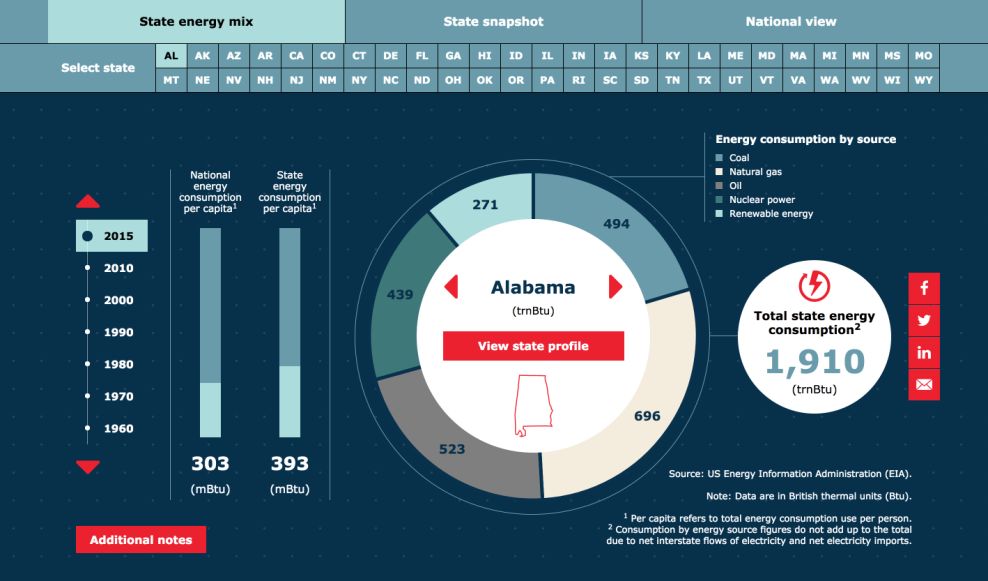
Upon scroll, the highly structured grid layout continues. A second navbar houses buttons for all 50 states, along with the three main categories of data collected. Hover animations allow the user to easily see which category has been selected. But the real star here is the use of interactive infographics to display the data.
The use of interactive buttons—hover animations and sliders—invites the user to dive deeper into the data. From here, the use of the grid to control white space and clutter, along with icons and clean typography, allow the user to make sense of more than half a century of information within seconds.
Housed within these infographics are smart animations, which heighten the overall user interactivity and function. For example, if the user is viewing the state energy mix for Alabama and then wants to check out how things compare in say, California, they can easily highlight and click the state button in the navbar. Then watch as the wheel spins and energy consumption numbers skyrocket on the screen. These graphics run the full width of the screen and remain the center focal point for the user, minimizing distraction.

After getting lost in the info graphics for a while, the user is able to continue the scroll. Here an almost undetectable use of parallax adds more depth. The architectural image in the background, set in a blue filter, is highly structured, and therefore, seamlessly blends into the page.
The image moves, but at a slower rate than the text boxes and navigation bars which are layered on top of it. Upon scroll, the user is met with yet another grid. Here the user can select one of three thumbnails—follow on social media, sign up for a newsletter, or learn more about the company.
This site is a stunning example of how structure can create tremendous visual depth for the user. And when done right, structure, and cleanliness have the ability to create a phenomenally functional site.
Tracking Energy is a best website design in the Education and Professional Services industries.