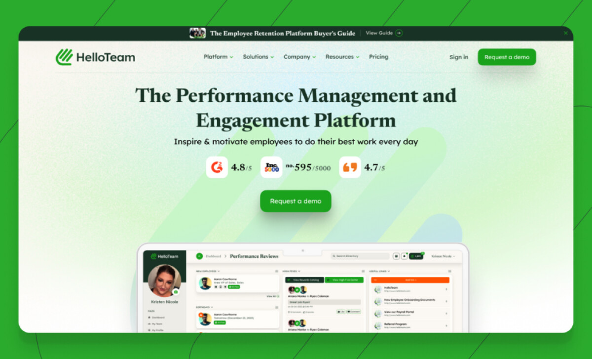
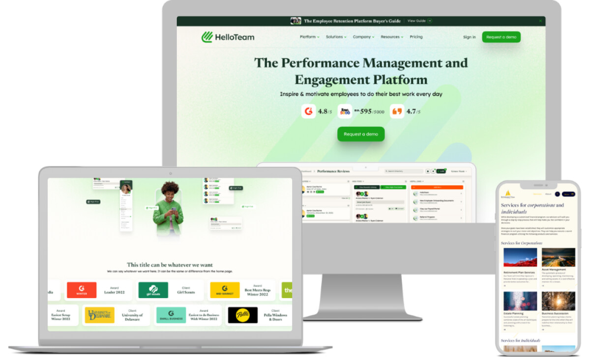
The redesigned HelloTeam B2B website by GoingClear offers a sharp, intuitive, and human-centered experience for a SaaS platform that helps companies improve employee engagement and performance. Its vibrant visuals and responsive UI patterns showcase how strong product storytelling and a clear user journey can work hand in hand to drive conversions.
Key Insights for Brands:
- Consistent illustration styles help humanize complex SaaS offerings
- Interactive pricing tools reduce friction and improve lead quality
- UI patterns built on card-style layouts improve mobile scannability
Human-Centric UI Elements Personalize the Browsing Journey
The HelloTeam homepage immediately stands out with a visual tone that feels more like a modern employee onboarding platform than a cold software tool.
Soft gradients, rounded corners, and comprehensive device mockups convey a solid message: this is tech designed for people.
Typography is carefully chosen to reinforce clarity and warmth. The use of sans-serif fonts in varying weights ensures hierarchy while remaining easy on the eyes, which is particularly critical in high-density SaaS platforms.
Navigation is sleek and fluid, with clear CTAs, such as “Book a Demo,” consistently highlighted. The site’s visual balance between product screens and brand messaging also keeps things grounded. Never too corporate, never too fluffy.
It's a polished experience that reflects what professional web designers aim to achieve: clarity and credibility in a modern interface that users actually want to explore.
Custom Imagery and Illustrations Bring the Platform to Life
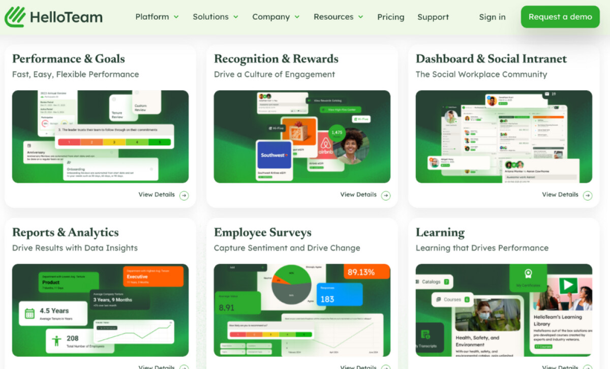
HelloTeam’s brand story is brought to life through consistent, character-driven custom imagery that depicts real workplace moments: peer recognition, team meetings, performance reviews, and more.
These aren't generic visuals. They show the kinds of interactions users will have on the platform. It’s a smart investment, too, considering 68% of companies reported that consistent branding contributed 10-20% revenue growth.
But more importantly, using branded imagery builds emotional resonance. Unlike abstract icons, these visuals let potential customers see themselves in the product. The tone is more celebratory than transactional.
One clever touch is integrating these visuals into functional UI spaces. For example, the data visualization and badges aren’t simply for decor. They’re strategically placed to help users understand the value propositions faster.
This storytelling-meets-interface approach turns the brand from a software tool into a real workplace ally.
See more examples of professional services website designs for inspiration.
Interactive Features Build Trust and Transparency
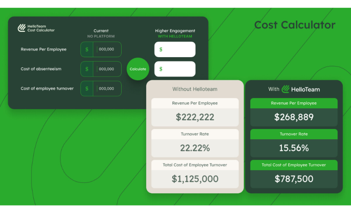
GoingClear, the B2B web design agency that created this website, included one feature that’s rarely executed this well in SaaS websites: a real-time cost calculator.
Instead of hiding pricing behind gated demos or email forms, HelloTeam offers an open, interactive way to explore pricing options based on the company’s specific needs.
The tool makes budgeting easier and builds trust before sales even enter the picture!
Design-wise, it is embedded in a clean card-style layout with intuitive fields. Visual feedback and instant calculations make it feel smooth and responsive. This is exactly the kind of web design practice that can enhance lead quality and reduce drop-off.
Plus, it’s working. Since the launch, HelloTeam’s conversion rates have increased, average time on site is up, and users are viewing more pages per session.
In a digital landscape where websites often succeed by reducing friction, this is a textbook example of how transparency drives success. Features like this demystify the customer journey, especially when 46% of consumers are willing to pay more for brands they trust.
A Responsive System Scales Well Across Devices
The entire design system for HelloTeam’s website is built with responsiveness in mind. Card-based layouts, collapsible menus, and repeatable UI components keep things consistent without feeling repetitive.
Across devices, the experience holds up beautifully. On mobile, the vertically stacked cards and icon-accompanied headings ensure no key content is lost. On desktop, there's room to breathe; wide gutters and consistent spacing maintain visual structure and legibility.
But what ties it all together is the repetition of key UI elements: CTA buttons in the same color and shape, motifs that mirror platform capabilities, and a footer that adapts content based on scroll behavior.
This is what great web designs look like: scalable, flexible, and unmistakably on-brand.
All in all, HelloTeam’s refreshed website is a blueprint for how SaaS brands can connect with real people. Through clear product storytelling, interactive tools, and thoughtful design choices, GoingClear has created a digital experience that is both capable and kind.
It’s a strong addition to our list of the best website designs, and a powerful reminder that people-first UX is always good business.