Standout Features
- Elegant two-tone color palette
- Trust-building ingredient presentation
- Lifestyle-driven brand visuals
Trophy By Leaf’s website didn’t always have its own space. It used to be tucked into a shared site with other cannabis brands that made it easy to miss.
That changed when Haiku Steps Inc. created a standalone website that finally gave Trophy the spotlight it deserved. They crafted a clean, approachable platform that speaks to both everyday users and professional buyers.
From the very first scroll, the site feels welcoming and intuitive. Inspired by the boutique storefronts and the slow-paced design of cities like Amsterdam and Paris, it uses soft gradients, plant textures, and clean spacing to instill calmness.
Every site element is well-positioned and easy to explore.
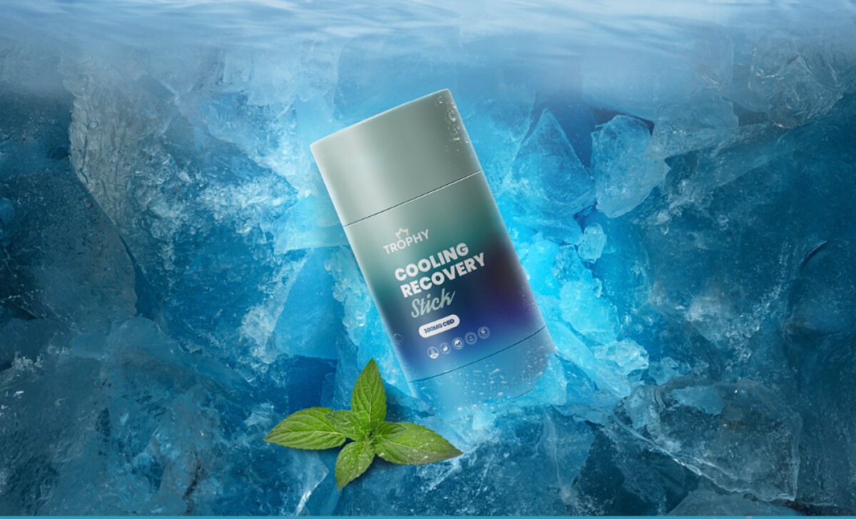
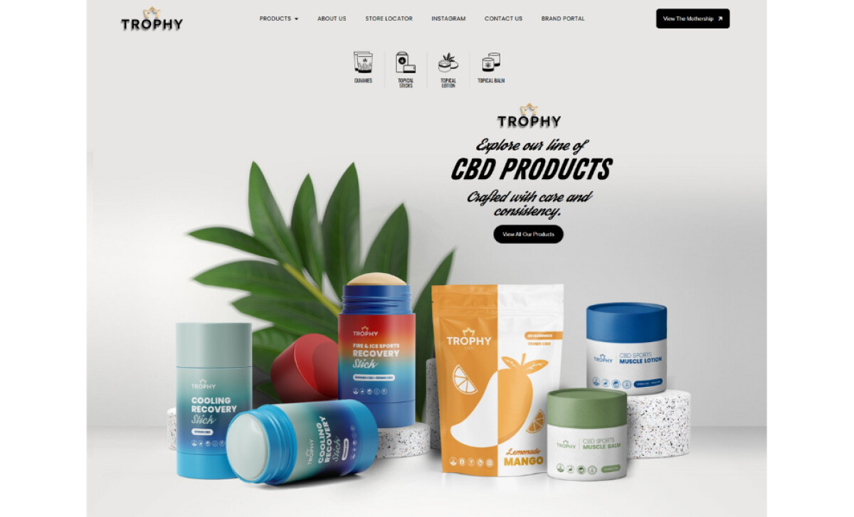
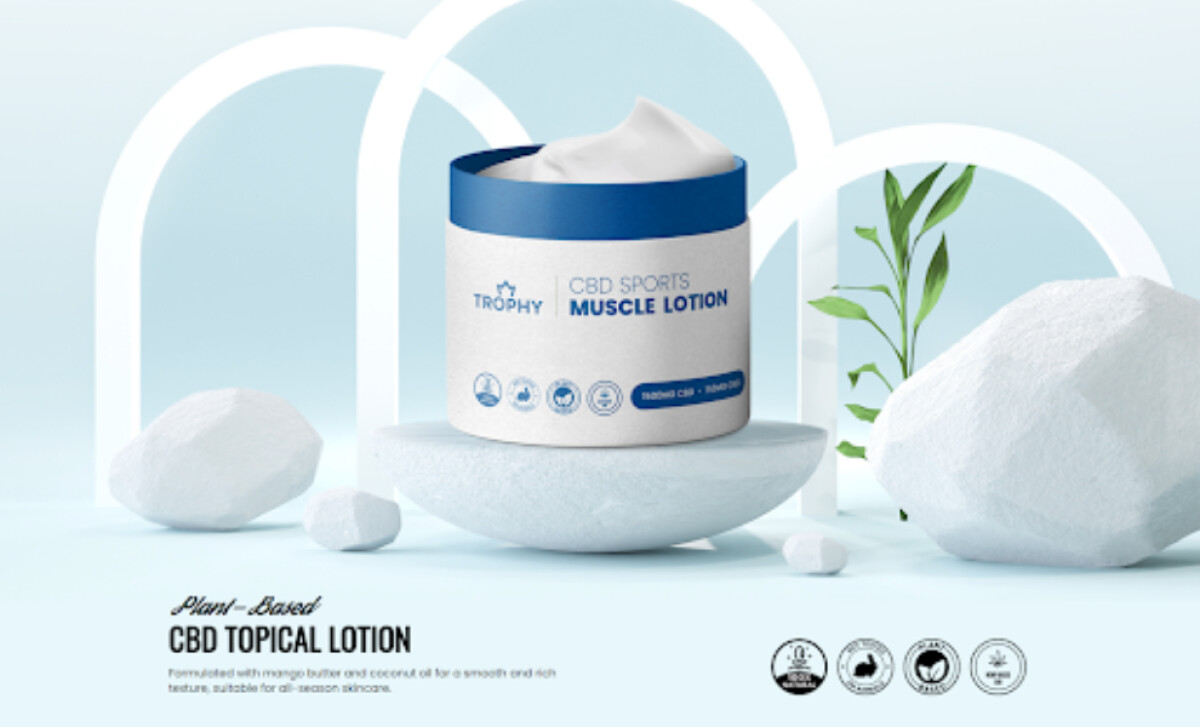
The brand’s two-tone packaging system shows up across the site in bold, vertical color blocks that bring consistency to the experience.
This is a smart choice, considering 90% of snap judgments are influenced by color psychology. Not only does the palette look good, but it also helps users remember the brand and navigate the site easily.
Additionally, the layout puts ingredients front and center. From quick callouts and icons to detailed product feature breakdowns, the site makes it easy to understand what each product contains.
This clarity helps build trust, especially in a product category where transparency matters.
The website’s design elements go beyond function.
Lifestyle cues like lush plant photography, soft lighting, and editorial product shots create an atmosphere that feels more wellness-forward than retail-heavy. More than a stunning shot, it feels like an experience.
Since the launch, Trophy By Leaf has seen stronger engagement from retail prospects and buyers, along with more traffic on educational product pages. It has also become the internal benchmark for Leaf Infusions as they scale other brands with the same level of focus and attention to detail.


