Gradient Design: Key Points
Gradients are back in style, adding depth and energy to buttons, backgrounds, and typography. We’ll look at how modern gradients differ from older styles, where they work best, and why they’ve resurfaced on designers’ radars.
How Designers Use Gradients in Modern Design
One of the best ways to understand a trend is to see it in action. We’ve gathered some strong examples of how designers and brands creatively use gradients in modern design.
Gradients also work well in logos, adding visual interest without distraction. Big brands like Instagram embraced this with their rebranding, showing how gradient shades can refresh a logo while staying true to a brand's color palette.
- Flat color gradients
- Gradients in background imagery
- Image overlays with gradients
- Gradients for UI elements
- Gradients in logos and typography
1. Flat Color Gradients

The return of gradients is closely linked to the popularity of minimalism, flat design, and bold color choices. They create a clean, modern aesthetic that pairs well with minimalist design. Gradients are now commonly seen in Material Design interfaces and as subtle enhancements in minimal projects.
For example, HR tech review site SelectSoftware Reviews uses a simple gradient effectively on its ATS systems guide. Similarly, tennis pro Marion Bartoli's Spring 2016 athletic clothing line with Fila features subtle, flat gradients layered over bold background colors for a high-fashion twist.
2. Gradients in Background Imagery

Designers increasingly use gradients in background imagery to enhance depth and realism. Color transitions break away from the flat, monotonous background and add a layer of complexity that draws the viewer’s eye.
Unlike flat designs, which often rely on solid, uniform colors, gradients mimic natural phenomena where color transitions are more prevalent, like the sky during sunrise or sunset. When paired with techniques like shadowing or layering, gradients can create a more immersive experience that flat design can't replicate.
3. Image Overlays With Gradients

Gradient overlays work particularly well for large images, especially in hero banners or headers. This technique is also incredibly effective in directing the viewer’s attention to certain design elements, improving text readability, and creating a strong call-to-action (CTA). For example, digital agency Interactive Sites uses image overlay gradients to showcase their design expertise and capabilities.
When using gradient overlays, designers should consider whether the hues complement the image’s message and whether the underlying content remains clear and legible. Effective overlays strike a balance between visual enhancement and functional clarity.
4. Gradients for UI Elements

Gradients are most effective in larger UI components, where they have enough space to create visual impact without overwhelming the design. In smaller elements, gradients can appear cluttered or reduce legibility, making them more of a distraction than an enhancement.
Used strategically in larger areas — like banners or section backgrounds — gradients can guide user focus and support key interactions. Baldor Foods, for example, uses a subtle gradient to spotlight featured produce and draw attention.
The key is restraint: gradients should complement the interface, not compete with it. Their role is to enhance the user experience by reinforcing hierarchy and focus, not by demanding attention.
5. Gradients in Logos and Typography

Designers now have the capacity to add custom gradients to icons, logos, and typography, which makes for more creative and dynamic designs. One impactful technique involves using a fixed gradient that animates or shifts as the user scrolls, adding subtle interactivity and polish to a logo or headline.
Gradients can also be used in simpler, more conventional ways, like adding depth to text and symbols against a plain background.
Gradient Design Best Practices: Tips for Stunning Visuals
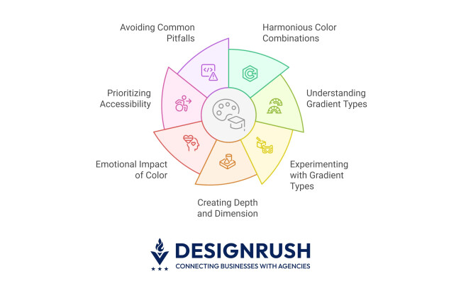
Gradients can bring depth and energy to your designs, but using them effectively takes thoughtful execution. The following best practices provide actionable tips for creating harmonious, impactful, and accessible gradient designs that elevate your project without overwhelming your audience:
- Choose harmonious color combinations
- Understand gradient types
- Experiment with gradient types
- Create depth and dimension
- Consider the emotional impact of color and gradients
- Prioritize accessibility
- Avoid common pitfalls
1. Choose Harmonious Color Combinations
Choosing harmonious color combinations is the foundation of any successful gradient design. Leverage color theory to select palettes that naturally blend together and evoke the desired mood. For example, using analogous colors — those that sit next to each other on the color wheel — can create a seamless, soothing transition, while complementary hues can produce dynamic yet balanced contrast when applied carefully.
Experiment with different saturation levels and test your combinations in various lighting scenarios to ensure that your gradient maintains visual appeal and cohesiveness across different platforms.
2. Understand Gradient Types
Understanding the various gradient types is crucial for applying the right style to each design scenario.
- Linear gradients: Transition colors along a straight line, making them ideal for backgrounds, headers, or buttons where a directional flow is needed.
- Radial gradients: Emanate from a central point outward, creating a spotlight or halo effect that effectively highlights key elements.
- Angular (conic) gradients: Rotate around a central point, offering a dynamic, rotational effect perfect for circular elements such as pie charts or custom dials.
- Custom/textured gradients: Incorporate noise, patterns, or subtle textures to add a tactile, organic feel to your design, breaking away from the uniformity of standard gradients.
By familiarizing yourself with these options, you can select and tailor the gradient type that best suits the specific visual and functional needs of your project.
3. Experiment With Gradient Types
Experimenting with gradient types allows you to discover unique visual effects that perfectly complement your project’s overall aesthetic. By varying the gradient style, you can tailor the visual impact to suit specific design elements — whether it’s creating a soft background, emphasizing a call-to-action, or adding an artistic flair to a header.
This exploration not only sparks creative innovation but also helps you determine which style best enhances user engagement without detracting from the core message.
4. Create Depth and Dimension
Using gradients to create depth and dimension can transform a flat design into a visually engaging and lifelike experience. Gradients can mimic the effects of light and shadow, lending a three-dimensional quality to otherwise two-dimensional elements.
For instance, a gradient that subtly darkens towards the edges can naturally draw attention to a central element, adding both focus and volume. This approach is particularly effective in user interface design, where adding depth enhances usability by distinguishing interactive components and creating a more intuitive navigation experience.
5. Consider the Emotional Impact of Color and Gradients
Colors carry strong emotional associations that can deeply influence how a design is perceived:
- Warm tones (reds, oranges, yellows): Create feelings of energy and excitement. A gradient transitioning from deep red to bright orange can evoke passion and vibrancy.
- Cool tones (blues, greens, purples): Convey calmness and trust. Gradients that flow from blue to green, for example, can instill a sense of serenity and reliability.
- Retro-inspired and vibrant gradients: The resurgence of vibrant, retro-inspired gradients can add a nostalgic yet modern twist, perfect for brands looking to evoke both innovation and familiarity.
By aligning your gradient choices with the emotional tone of your project, you ensure that the visual communication supports and enhances the overall message.
6. Prioritize Accessibility
Accessibility should be a top priority in any design, ensuring that all users, including those with visual impairments, can comfortably interact with your content.
- Maintain sufficient color contrast: Ensure that text and UI elements over gradient backgrounds maintain a high level of contrast for readability. Tools like contrast checkers can help validate that your choices meet accessibility standards.
- Avoid problematic color combinations: Some color pairings may be difficult for people with visual impairments (such as color blindness) to distinguish. Testing with accessibility simulators and seeking feedback can prevent these issues.
- Responsive Design: Verify that gradients scale well across devices. Adjust gradient intensity or direction based on screen size to maintain clarity and legibility.
7. Avoid Common Pitfalls
Even the most well-executed gradient designs can falter if common pitfalls are not addressed:
- Banding: The visible lines between gradient stops can break the smooth transition between colors. To minimize banding, increase the number of gradient stops or adjust the color transition settings for a smoother blend.
- Muddy colors: Overlapping hues may result in an unappealing or washed-out effect. Regularly testing your design on multiple screens and in various lighting conditions can help you spot and rectify these issues early on.
By being mindful of these pitfalls, you ensure that your gradient implementation remains both visually striking and functionally sound.
Gradient Trends: What’s Popular Now and What’s Next
The evolution of gradients continues to push creative boundaries, blending nostalgia with innovation and enhancing user experiences across digital and print media. From bold, statement-making aesthetics to subtle enhancements, these trends highlight how gradients are being used to shape modern design.
Here are some of the most significant emerging trends and predictions for the future of gradient design.
- Resurgence of vibrant, retro-inspired gradients
- Subtle textures and effects
- Gradients in dark mode design
- Duotone and monochrome gradients
- Gradients in motion and interactive UI
- AI-generated and custom adaptive gradients
- Gradients beyond aesthetics
1. Resurgence of Vibrant, Retro-Inspired Gradients
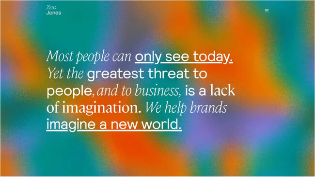
The return of bold, neon-like color transitions is redefining modern aesthetics, drawing inspiration from early digital designs and the Y2K era. These high-contrast, multi-tonal gradients create an electric, energetic feel, making them especially popular in tech branding, music streaming platforms, and futuristic web designs.
By incorporating bright, clashing hues and grainy textures, designers evoke both nostalgia and cutting-edge innovation, striking a balance between the past and the future.
2. Subtle Textures and Effects
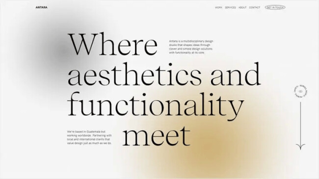
Modern gradient applications are moving beyond flat transitions, incorporating grain, noise, and soft overlays to create depth and a tactile, organic feel. These textures help break the artificial smoothness of traditional digital gradients, making them feel more natural and engaging.
Subtle shading and layered transparencies enhance realism in UI components, background illustrations, and branding materials without overwhelming the minimalist aesthetic that many brands strive for.
3. Gradients in Dark Mode Design

As dark mode becomes a standard UI feature, designers are finding new ways to incorporate gradients that enhance visibility and maintain aesthetic appeal. Instead of harsh, high-saturation color blends, dark mode gradients often rely on deep purples, blues, and muted hues that subtly transition without causing eye strain.
These gradients add sophistication and depth while maintaining accessibility, ensuring that designs remain engaging even in low-light settings.
4. Duotone and Monochrome Gradients
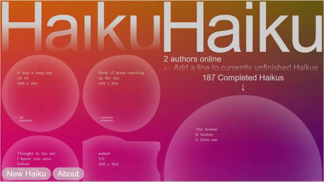
A growing number of brands are simplifying their palettes by embracing duotone or monochrome gradients. These styles create a striking yet controlled aesthetic, offering a refined look without excessive color variation.
Duotone gradients have gained popularity in editorial design, branding, and album covers, allowing designers to experiment with contrast and lighting effects while keeping visuals bold and memorable.
5. Gradients in Motion and Interactive UI
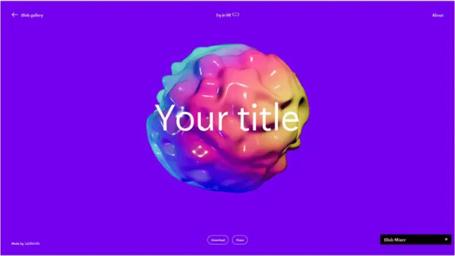
With the rise of interactive web experiences, gradients are increasingly being used in animations, hover effects, and micro-interactions. Moving gradients shift in response to user behavior, creating a sense of fluidity and engagement.
Whether applied to buttons, background transitions, or dynamic loading screens, animated gradients add a futuristic touch, reinforcing the sense of responsiveness and modernity in digital experiences.
6. Gradients Beyond Aesthetics
As design tools become more advanced, gradients will likely play a bigger role in functional UI elements, aiding navigation and accessibility. Expect to see gradients used to guide the user’s focus in augmented reality (AR) and virtual reality (VR) interfaces, as well as in data visualization, where color transitions can represent changing metrics.
The future of gradients is not just about aesthetics — it’s about enhancing usability and interaction in new and exciting ways.
Top Tools and Techniques for Creating Gradient Designs
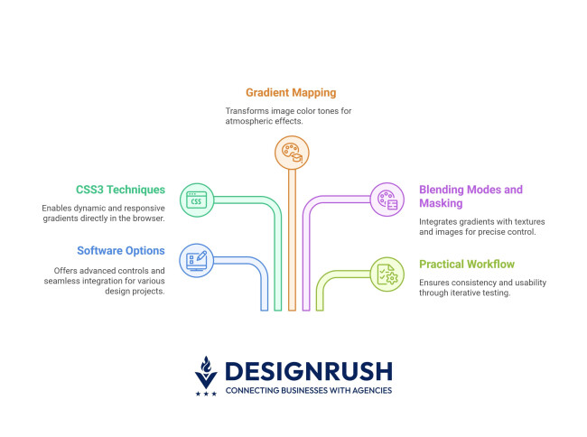
Creating stunning gradient designs requires a strategic approach that leverages the right tools and techniques. The following sections break down the essential components that empower you to bring your gradient ideas to life with precision and flair:
1. Software Options
Applications like Adobe Photoshop and Illustrator offer advanced controls, including gradient mapping, blending modes, and layer masks, allowing you to experiment with intricate color transitions. You can also use online color palette generators like Coolors to pick the best colors for your design.
Tools like Sketch and Figma are ideal for UI/UX projects, providing seamless integration into interactive prototypes. Additionally, CSS gradient generators empower developers to quickly generate and tweak code-based gradients, ensuring that your design is not only visually appealing but also optimized for web performance.
2. CSS3 Techniques
CSS3 provides powerful methods to create and animate gradients directly in the browser. With simple code snippets, you can implement linear, radial, and even conic gradients that enhance user interfaces.
CSS3 enables dynamic transitions, hover effects, and animated backgrounds that respond to user interactions, all without the need for heavy image files. This flexibility allows for rapid iteration and testing, ensuring your gradients adapt smoothly to various screen sizes and devices.
3. Gradient Mapping
Gradient mapping is a technique commonly used in image editing software to transform the color tones of an image. By applying a gradient to an image's grayscale values, you can dramatically alter its mood and visual impact.
This method is perfect for creating atmospheric effects, enhancing storytelling, or achieving a specific aesthetic that ties an image to your overall design theme. Experimenting with different gradient maps can reveal unexpected color harmonies and bring a new dimension to your visual content.
4. Blending Modes and Masking
Blending modes and masking techniques are invaluable for integrating gradients with textures, images, or layered elements. Blending modes determine how the colors of a gradient interact with those of underlying layers, allowing you to create effects ranging from subtle overlays to vivid color fusions.
Masking, on the other hand, enables you to apply gradients selectively, ensuring that the effect only appears on specific areas of your design. Together, these techniques offer precise control over the visual narrative, helping you highlight important features or create realistic light and shadow effects.
Gradient Design: The Bottom Line
Gradients have evolved from a once-forgotten trend to a versatile design tool that enhances modern digital experiences. By carefully choosing color combinations, understanding the different gradient types, and considering accessibility, designers can create visually compelling and emotionally resonant designs.
As trends continue to shift toward retro vibrancy, subtle textures, and dynamic integration with other design elements, gradients promise to remain at the forefront of design innovation for years to come. Embrace the gradient revolution — experiment boldly, design thoughtfully, and let your creativity flow seamlessly from one hue to the next.
