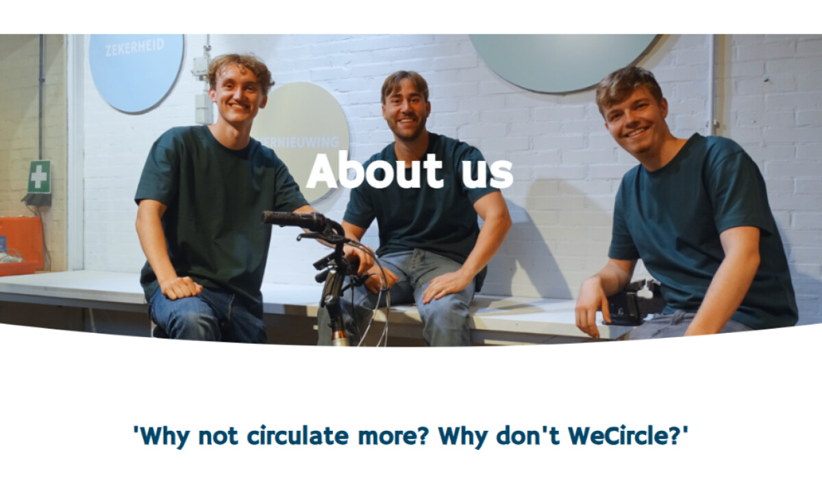
Team Behind the Design
Web Design Analysis
Julian Boijenga’s work for WeCircle turns circular sustainability into a digital form of softness, precision, and clarity.
The site goes beyond selling refurbished e-bikes, showing how design can reshape perception and behavior.
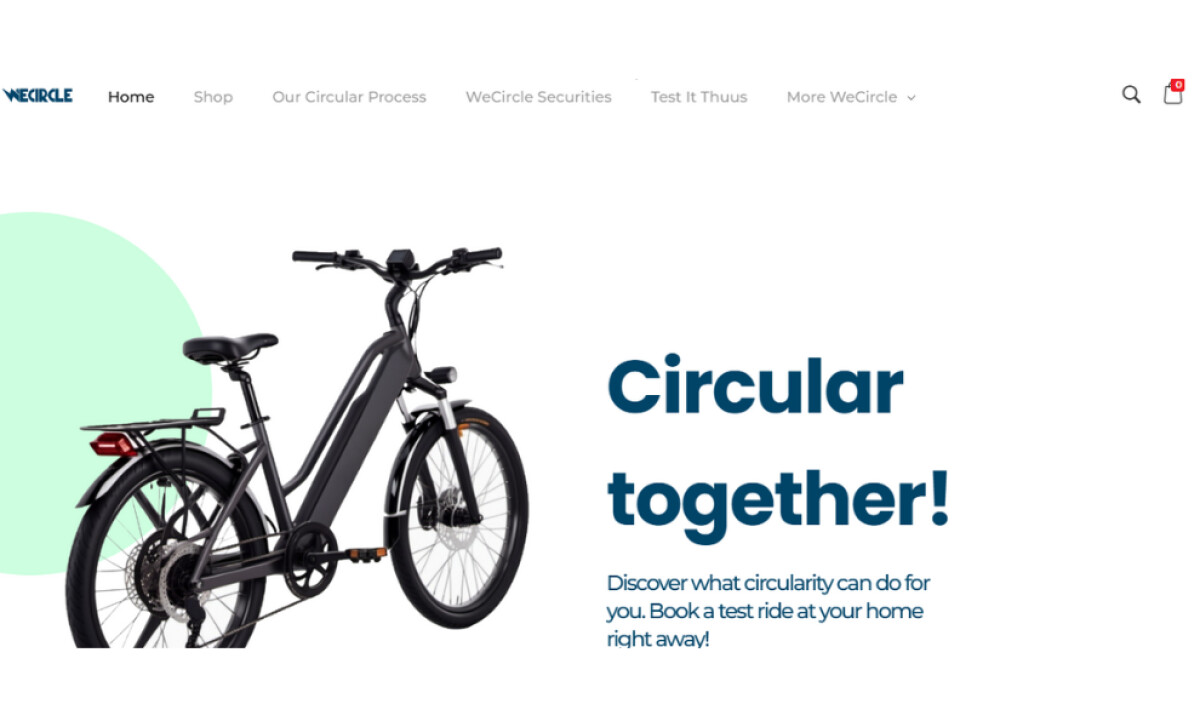
- Color and Ethos: Seafoam Green, Sky Blue, Honey Beige, and Deep Ocean Blue create a sense of balance and calm. Each hue feels intentional — green for renewal, blue for trust, beige for warmth. I like how the palette avoids typical “eco” clichés while still feeling organic and modern. It makes the site feel clean and quietly confident.
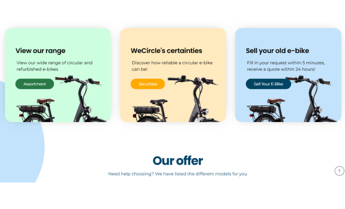
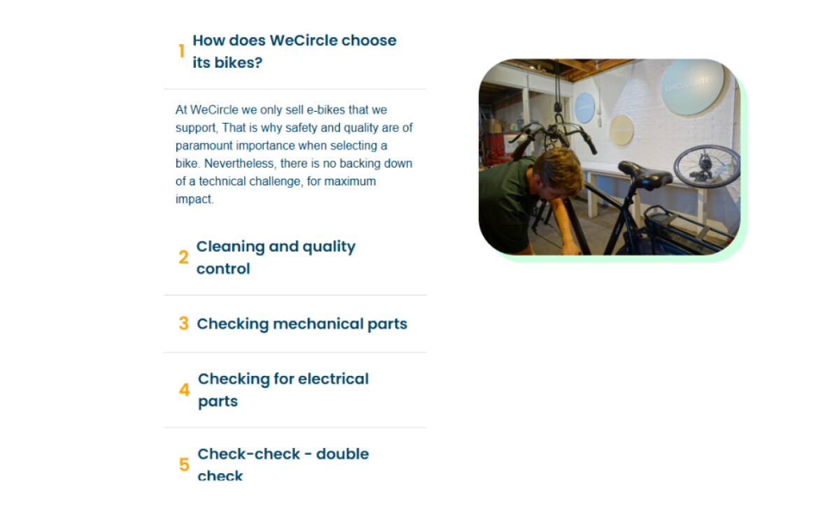
- Form and Philosophy: Rounded corners and modular layouts mirror WeCircle’s circular approach to sustainability. The interface feels soft yet structured, almost like the motion of a wheel. This design language quietly reinforces the brand’s values of continuity and care without spelling them out.
- Typography and Trust: The geometric sans serif typography brings a sense of precision and calm. Bold navy headlines grab attention while lighter text maintains space and air. I find the pacing easy on the eyes, which builds trust through readability. It’s professional but never cold.
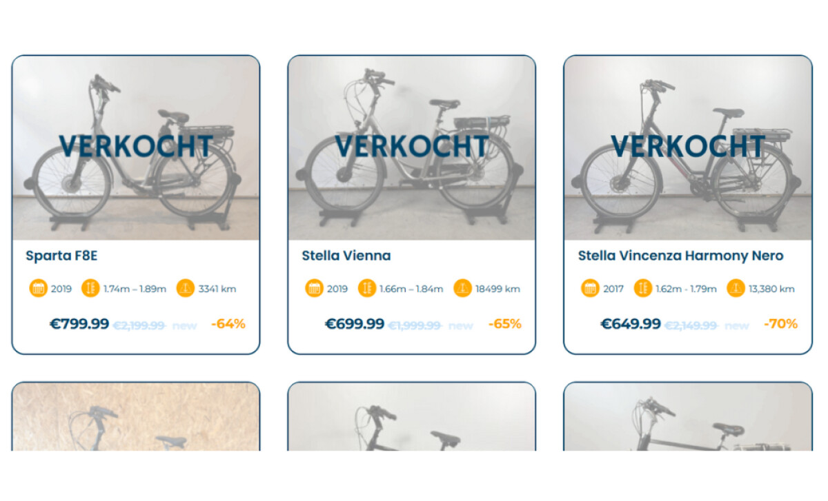
- Transparency and Function: Every product detail such as mileage, frame size, price, and battery condition is clearly visible. The semi-transparent “VERKOCHT” overlays and clear icons make the site feel open and honest, proving that transparency can be a true design feature for any ecommerce and retail website focused on clarity and credibility.
What Brands & Agencies Can Learn from WeCircle
Julian Boijenga’s WeCircle project shows how thoughtful digital design can make sustainability feel visual, tangible, and commercially strong.
1. Design with Values, Not Just Goals
When visual language aligns with brand philosophy, authenticity follows. Using circular shapes and transparent interfaces turns ethics into design choices that build trust and emotional connection.
2. Make Transparency the Hero
Clear, data-focused layouts create confidence in every interaction. In an ecommerce and retail website, openly sharing product condition and process turns sustainability into a practical advantage instead of just a message.
3. Balance Softness with Structure
Sustainable design can feel human without losing order. Rounded modules, light tones, and clean grids combine warmth and professionalism, appealing to both the heart and the mind.
About DesignRush Featured Designs
At DesignRush, we review hundreds of agency projects each month. The featured designs stand out for creativity, relevance, and execution.
Many go on to be recognized as winners of our Monthly Design Awards.
Explore more here:
- Best Website Designs
- Best App Designs
- Best Logo Designs
- Best Print Designs
- Best Packaging Designs
- Best Video Designs
For a full list of design agencies and related services, see our Agency Directory.


-preview.jpg)