Amazon’s UX Strategy: Designing for High-Volume Efficiency
Amazon’s website is not pretty. It was never meant to be.
It is designed to move products quickly, at scale, and with minimal effort from the user. In a digital environment where attention is limited, Amazon focuses on speed, clarity, and predictability instead of visual appeal.
This emphasis on functional efficiency has made Amazon one of the most studied eCommerce user experiences today. The ideas behind it, from search-first structure to one-click checkout, influence how many web design companies approach high-volume retail platforms. If you want to understand how large-scale eCommerce works, this is where to look.
Amazon Website UX Overview
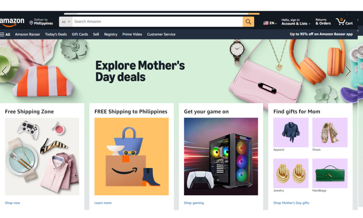
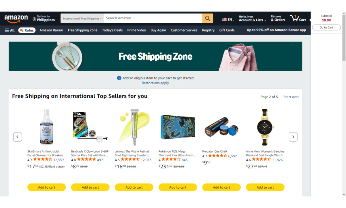
Amazon’s interface is built around utility. For a platform handling millions of SKUs, the main challenge is helping users find what they need without confusion.
Amazon follows Jakob’s Law. Users spend most of their time on other websites and expect similar behavior. The layout is dense, familiar, and consistent. This familiarity helps returning users move through the site without relearning how it works.
Amazon’s interface is intentionally dense to show more product information per screen and reduce the steps needed to evaluate options. Baymard Institute research shows that search is a primary product-finding method on large eCommerce sites, with over 50% of users refining results through search and search users converting 2–3 times more often, contributing up to 44% of revenue. This is why Amazon places search at the center of every page, enabling faster scanning and quicker decisions.
Product Discovery and Search Design
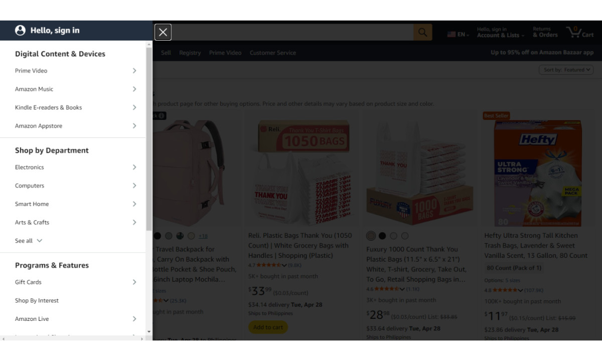
The core of Amazon’s user experience is its search-first Information Architecture (IA).
- Faceted navigation keeps users on one screen. Sidebar filters update results instantly, so users do not need to switch between product lists and individual pages.
- Auto-suggest and predictive search reduce effort. The system narrows results while the user is typing and helps them reach their goal faster.
- Key details such as price, Prime status, and ratings stand out immediately. Users can compare options at a glance without opening multiple pages.
- Buttons and filters are placed where users expect them. This reduces the time needed to move a cursor or tap on mobile.
Recommendation and Personalization Systems
Amazon’s interface doubles as a personalized dashboard powered by a recommendation engine.
- Dynamic content blocks like “Inspired by your browsing history” surface relevant products based on past behavior.
- Collaborative filtering predicts what users are likely to need next, reducing the effort required to find repeat purchases or complementary items.
- AI-generated review summaries condense thousands of user reviews into short insights, helping users understand product consensus instantly.
Top eCommerce web design companies highlight this level of personalization and efficiency as a defining characteristic of high-performing digital retail experiences.
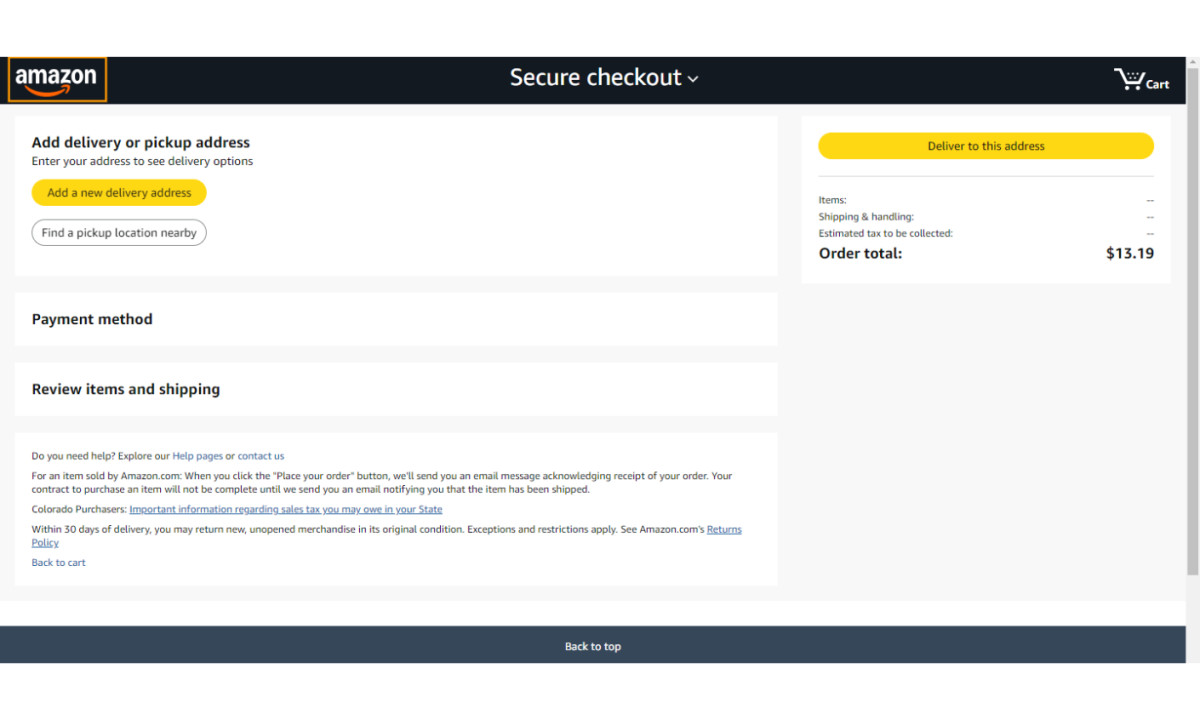
Amazon Checkout UX
- Amazon’s checkout flow is one of the most studied conversion systems in eCommerce.
- One-click purchasing removes the extra step of reviewing a cart, eliminating a common drop-off point.
- The checkout tunnel removes navigation and search, keeping users focused on completing the purchase.
- Clear trust signals — such as “Secure Transaction” labels and delivery timelines — reduce hesitation at the final step.
Visual Design and Layout
Amazon’s visual design prioritizes clarity over aesthetics. Every element supports a functional outcome.
- The orange used for “Add to Cart” and “Buy Now” appears nowhere else on the page, making purchase actions instantly recognizable.
- A slate-white background keeps attention on product images.
- Large, bold pricing ensures the most important information is processed first.
Amazon also mirrors its mobile app navigation on desktop, creating a consistent experience for users switching between devices,
Pro Tip: To see how these principles are applied across different industries, explore our curated list of top web development companies and best website UX designs for 2026 for further inspiration on balancing high-volume utility with modern design.
Why Amazon’s Website Design Works
Amazon’s competitors made different UX trade-offs. Amazon did not prioritize appeal, storytelling, or physical integration — it prioritized speed. eBay’s auction-first structure requires users to monitor bids and evaluate timing. Amazon removes that step with a buy-now model, allowing immediate decisions and faster transactions. Walmart integrates store pickup and physical retail into its UX. This adds flexibility but also introduces additional decision points. Amazon focuses purely on delivery, simplifying the path to purchase. Many Shopify stores lead with brand storytelling and visual design. This builds identity but slows down product discovery. Amazon places search and product listings first, reducing the time it takes to find and buy items.
Each competitor optimized for a different goal. Amazon optimized for speed — and Amazon remains the largest eCommerce retailer in the world.

Our team ranks agencies worldwide to help you find a qualified partner. Visit our Agency Directory for the top web design companies, as well as: