Wolfpack Website Design Shows How Exciting Visuals Can Be Used To Highlight A Brand’s Origin Story
Wolfpack Lager, a London-based brewing business stepped into the craft beer scene with a “brewtally” candid approach and passion for making quality “wallop”.
Founded by ex-professional rugby players the microbrewery's game plan was to shed the air of posh exclusivity that surrounded craft beer in the past decade.
To properly showcase this mission, Hello Square agency created the Wolfpack website design, an exciting venture for the growing brewery, setting them up as serious contenders for gold in the niche beverage industry.
“In a world where everyone wants to stand out, few really do. We create experiences.”
Hellosquare’s company credo is interweaved into every page element in the website.
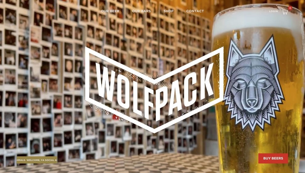
Wolfpack’s website is slick and exciting, brimming with colorful visuals, yet it remains true to what every true beer enthusiast seeks – an overflowing mug.
The brand is proud of the beer it produces and of the story behind it. The conspicuously stylish wolf logo and imagery both pay homage to the founders’ sporting days, but its sticker, almost tattoo-style quality gives every inch of the page a robust, urban appeal.
Wolfpack website design serves to proudly present the brand’s heritage and the success they have had over the years making lager and pilsner beers.

Wolfpack Website Design Uses Slick Motion Effects To Keep The Visitors Interested and Engaged
Web design professionals often use smooth movements and animation to keep visitors engaged through the single-page website and push them toward the bottom page for conversion.
Wolfpack website design uses these micro animations superbly. The website does a great job of boosting on-page session times by making users constantly wonder what comes next as they scroll down.
Dynamic visual elements, grunge effects and micro-interactions simultaneously stand out but also fit into the overall design.
Whether it’s the headers that float in and out, enlarged image marquees, high-res pictures that overlap and disperse, or appealing CTAs, these elements breathe life into the website without being obtrusive or losing consistency.
The visual boasting complements the brand’s candid nature splendidly, never slipping into arrogance or bragging, demonstrating a clear understanding of Wolfpack’s target audience.
Wolfpack’s Distinct Brand Messaging Brings The Brand Closer To Its Audience
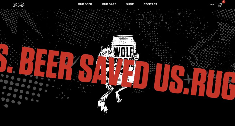
“Welcome, Ya Social Animals!”
The tone of Wolfpack’s copy is casual, unpretentious and playful, with noticeable usage of rugby lingo.
As best marketing practices dictate, sentences are short and on point, yet still highly informative with valuable bits of info. It’s the same way branding agencies go for friendlier tones and snappy messaging to resonate with the audience and make the brand approachable.
They describe different types of brews in just enough detail to clear any doubts and attract prospective buyers.
“Thirsty? Of course, you are”
Apart from educating beer enthusiasts, its unorthodox messaging blends into the design seamlessly, blurring the line between verbal and visual. It plays a major part in influencing the visitor’s buying decision, contextualizing the lifestyle appeal Wolfpack’s products emanate.
Wolfpack is not just a striking name; the founders are not your typical basement-dwelling master brewers or beer sommeliers.
Wolfpack Lager’s online HQ is more than a cool craft beer website. Fueled by a rugby narrative of blood, sweat and beer, they aim to bring their peers and like-minded people together and they have a perfect platform to share those values.
Typography is bold, non-serif and robust. It’s clear and easy to read, but it doesn’t overwhelm. Its “in your face” nature serves the purpose of a traffic sign – to remind you where you are and why you’re here.
The Wolfpack website design tells a simple and concise beer brand story. Visitors are not just readers but a welcomed part of the pack.

Wolfpack’s Single-Page Web Design And Intuitive Navigation Helps “Social Animals” Find Precisely What They Want
Pretty much everyone starts every night out asking where to and what’s on the menu?
Similarly, the user’s website journey kicks off with the same questions.
The Wolfpack website design addresses these queries instantly. As soon as the visitors land on the homepage, they’re met with the first “wow” factor, or rather, they’re welcomed with exactly what they’re looking for – a sparkling pint of beer.
Wolfpack opts for a single-page website, although the Shop and Contact Us sections have their standalone locations. To help users navigate through the website, or rather, a homepage, the menu is simple, sticky and user-friendly.
It mitigates potential misdirection by offering just enough distraction to increase on-page sessions, feeding the visitor’s attention further.
As you scroll, Wolfpack’s offering, beer dens and images slide from right to left, making you genuinely invested and excited to learn more.
Wolfpack Website Design’s Color Palette Guides Visitors Through Conversion Funnel
Ever since the craft beer industry’s explosive expansion replaced the industry branding conventions, finding an original visual identity became significantly harder.
Wolfpack Lager decided on a “third” route. The brand tackled the modern aesthetic and combined it with the British long-standing rugby culture to create something original.
The somewhat muted red, black and white color scheme combined with the highly recognizable wolf head crest became the foundation for the Wolfpack website design.
With the addition of oriental pink and subdued gold/beer hues, the whole website nailed the “craft” feel and ensured the wholesome dose of “cool” needed for such a niche.
Rather than serving as awkward, empty areas, the on-brand whites and blacks embraced the design role of “negative space”, guiding the user’s attention to the key elements and conversion points, contributing to a seamless UX.
Additionally, Hellosquare strategically placed several calls-to-action (CTAs) that propel visitors down the conversion funnel towards getting merchandise, submitting contact details and the most important one – “Buy Beers”.
The site’s CTA buttons come in various shapes and sizes. They blend into the color scheme of the page section they’re in, inverting colors or adding rounding off effects when users hover over them.
Bold and memorable messaging, striking imagery and appealing colors infuse the Wolfpack website with character, making it worthy of DesignRush’s Best Website Design Award.