Beer is a beverage of community and comradery and this feeling of community is an important sales booster: 80% of consumers consider themselves loyal to a brand after just three to five buys and a 5% boost in consumer retention can increase revenue up to 95%!
One bulletproof way to ensure optimal buyer retention in this industry is to create a beer bottle label design that consumers love and are bound to remember. Check out our article on best bottle label designs.
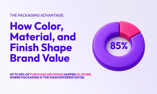
According to Nielsen’s study, for 66% of American craft beer buyers, the beer label is very or extremely important for getting them to notice the brand. And professional graphic designers are well aware of it.
This article takes a deep dive into some of the world’s most unique and inventive beer label ideas that will inspire you to go bold and make your brand stand out among the rest.
What You Need To Know Before You Begin
Before getting into designing the actual beer label, you need to define your brew’s branding. The three questions that will help you do this are:
- What is your exact product? Is it a lager, ale, or another kind of brew? Is it German, Czech, or American? What makes this beer unique so that consumers would choose it over others? Knowing the answers to these burning questions is key to developing your beer brand’s personality, which will inform what the beer design should look like and what it should communicate to target buyers.
- Who is your target audience/consumer? A beer label will communicate its message more effectively if it’s directed to a specific audience segment. Focus on meeting the needs of a smaller group of consumers. Is the beer directed at young, affluent people looking to socialize? Is it a craft beer for connoisseurs? Or is it designed specifically for concertgoers?
- How will consumers purchase your beer? Will your target customer go to a local shop to purchase your product or do they prefer ordering beer online? Are they more likely to purchase a six-pack or a single bottle?
Once you’ve nailed down the answers to these questions, you’re ready for the next step: figuring out how to communicate your brand’s complex personality in a single glance.
4 Essential Beer Label Design Elements
Let's take a closer look at some of the best label designs that incorporate the most basic elements of beer labeling.
1. Color(s)
Color is a design element that communicates brand personality and creates a specific emotional connection with the target audience. Different colors are known to evoke different emotions, which is why choosing a color for your beer label is such an important consideration.
Before choosing the color of your label, you should also consider the color of the actual beer and the color of the can or bottle. The three most commonly used colors for beer bottles are:
- Green: This bottle color has become synonymous with high-quality beer and is very commonly associated with some of the most prominent beer makers such as Carlsberg and Heineken, which is why craft brewers seldom use it.
- Brown: This color filters out the light to protect the beer and ensure its longevity and intended taste. Beers with more hops, which are susceptible to light, ordinarily use brown bottles.
- Clear: These bottles allow the color of the beer to shine through and create a background for the label design. Best practices for clear bottles include creating a label color that either matches the beer color or contrasts it.
Colors also play a role in beer can label design, as a factor that affects the way consumers perceive the brand. Unlike beer bottles that come in three distinct colors, beer cans aren’t under such restrictions. This provides an even greater realm of design possibilities.
Many of the principles that apply to beer bottles also apply to cans. But to differentiate canned products on the market, beer makers often apply striking 360-degree designs that envelop the entire can and showcase a strong brand personality.
2. Shape And Size
Depending on your brand type and budget, you should also consider the shape and size of your beer label and whether it should consist of:
- A traditional shape and size
- Custom die cut to craft a specific shape, size, or pattern
- A separate label for the front, back, and the neck
- A label that wraps around the whole can or bottle
- Standard paper or transparent background
3. Typography
Font is another design element that communicates the brand personality to the target audience. In the context of a beer label, certain typography will give your brand a specific feel: serif fonts typically provide a more classic and vintage feel, while sans-serif fonts are more contemporary.
When choosing a beer label font, it’s important to consider legibility. With your desired typography in mind, make sure it will be easy for your consumers to read and remember your brand name, the beer's ingredients, and other notable info you want to include.
4. Imagery
Craft beer labels are typically more of an art form compared to traditional labels that use one main color, a brand name in large letters, and a simple logo.
Your target audience should dictate your brew’s imagery and style. If you’re making beer with an experimental flavor targeted at younger consumers, you will likely want a more off-beat label. Beer aimed at a more classy and upscale audience may require a more intricate label.
To figure out your imagery, ask yourself these questions:
- What makes my beer brand unique?
- Do we use specific ingredients that we should show on the label?
- Is there something or someone we can incorporate into the label as a brewery mascot?
- Do we use a specific brewing technique that we want to include in our label?
- Can we create a wordplay on our name?
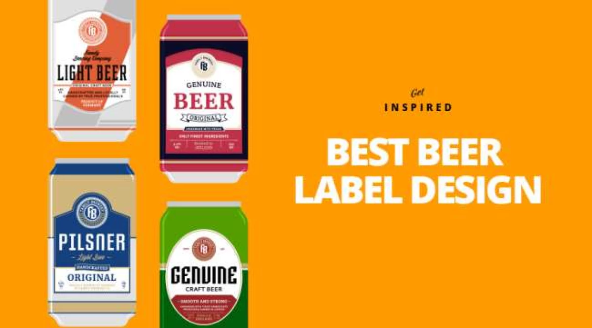
7 Best Beer Label Designs for 2026
The time has finally come to reveal some seriously memorable and inspiring beer label designs. Let's take a look!
1. Goldhawk Ale

Standout Features:
- Transparent label highlights the beer’s natural amber hue
- Bold Art Deco-inspired hawk illustration
- Minimalist style for maximum shelf impact
Goldhawk Ale doesn’t explain itself — it doesn’t have to. Don’t Try Studio strips away the excess, leaving a label that does one thing exceptionally well: it gets noticed. No text. No clutter. Just bold design choices that make the beer impossible to ignore.
Logos are meant to be instantly recognizable, and Goldhawk Ale’s Art Deco-inspired hawk nails it. Sharp, angular, and dynamic (the hawk drawn in flight); it eliminates the need for words.
Now, most beer packaging acts as barriers between the product and the consumer. Goldhawk Ale flips the script. By using a transparent label, the beer itself becomes part of the design. Its golden amber hue inevitably becomes the main attraction. It’s an inspired design move that reinforces quality, authenticity, and craftsmanship.
Good design isn’t about adding. On a shelf full of over-designed beer packaging, Goldhawk Ale stands out by doing less. The clear label merges seamlessly with the glass, making it feel like part of the bottle rather than an afterthought. Consumers don’t have to work to understand it. They just see it — and buy it.
Complexity is expensive. It costs attention, time, and clarity. Goldhawk Ale proves that great design doesn’t need embellishment. The beer is the label, and the label is the beer. No distractions. Just a clear message: this is something worth drinking.
2. Skinner’s Ales

Standout Features:
- Distinctive artist-commissioned labels
- Loud colors and varied fonts
- Visual themes of tattoo art and regional culture
UK-based brewery Skinner’s doesn’t just craft distinctive ales — it curates a gallery of design. With eight signature brews, each label is a commissioned piece, crafted by local artists, and steeped in distinct visual language. Some nod to old-school publishing and newspaper aesthetics, others pull straight from tattoo culture.
Yet, despite the variety, there’s a thread of cohesion — the brand’s signature approach to bold storytelling, unafraid to mix styles but always anchored in authenticity. Each label may have a different voice, but together, they sing the same drinking song.
Then there’s the sheer volume of the visuals. Loud colors, in-your-face typography, and clashing yet strangely harmonious fonts create a shelf presence that demands to be noticed.
There’s no subdued elegance here, no effort to blend into the craft beer minimalism trend. Skinner’s leans into the chaos, stacking typefaces and cranking up the saturation.
Skinner’s beer packaging are loud, chaotic, and absolutely unmissable. High-contrast colors, striking typography, and intricate illustrations crash together to create something that’s impossible to ignore. Whether stacked side by side in a lineup or sitting solo on a bar counter, these labels don’t just stand out. They take over.
3. Foreign Object’s New American Hoppy Ales

Standout Features:
- Watercolor-style for dreamlike aesthetic
- Poetic, enigmatic branding
- A cohesive identity through variation
Foreign Objects never played by the rules, and their packaging makes that abundantly clear. While most craft breweries lean into hop illustrations, retro typography, or sterile minimalism, Foreign Objects takes an entirely different approach — one-part existential poetry, one part fever dream, and entirely unlike anything else in the beer aisle.
If branding is about instant recognition, Foreign Objects takes the opposite approach: make people stop, stare, and wonder. These cans come wrapped in swirling, smudged watercolors that seem to move if you stare at them long enough.
The typography — delicate, almost handwritten — looks like the notes of an alchemist rather than the confident stamp of a beer brand. The names alone (The Color of Pomegranates, Saturn in Scorpio, Chaos Therapy) feel more like lost philosophical texts than beer titles.
Together, these elements reinforce the idea that a Foreign Objects beer was something to be deciphered, not simply consumed. And that was the genius of it. Instead of telling you what to expect, Foreign Objects dares that you figure it out.
Foreign Objects may be on hiatus, but its design legacy lingers. At a time when beer packaging is increasingly engineered for market research-driven appeal, this brand proved that mystery sells, too.
Its packaging didn’t just communicate flavor; it built an entire world around it — one where beer wasn’t just a product, but an experience wrapped in watercolor and riddles. And that is something the craft market won’t easily forget.

Standout Features:
- A minimal matte-black design
- Gold typography
- A subtle color-coding system
Ex Novo Brewing, in collaboration with designer Jeremy Backer, designed a beer label that doesn’t beg to be picked up. Kill The Sun simply exists, knowing full well that the right people will gravitate toward it.
There’s an intentionality to its minimalism. Instead of overwhelming the senses, it does the opposite — commanding attention through restraint. The matte black exterior, stripped of distractions, evokes the name itself — like something forged in the absence of light. The only embellishment? Gold lettering, sharp and refined.
The font choice is calculated. A classic serif typeface with elongated, slightly gothic forms, it reinforces the brand’s mystique without feeling forced. Black exudes sophistication, control, and power. The combination elevates the beer into the realm of high-end branding.
The beer label also cleverly lets the name do the heavy lifting. Kill The Sun — a phrase that instantly evokes something dark, something powerful, something beyond the ordinary. The stark, high-contrast branding reinforces the message, making it feel more like an artifact than a mere beverage container. It’s beer branding that understands the power of restraint.
While all three versions (Classic, Mocha, and Horchata) stick to the same matte black and gold motif, each one incorporates minor visual tweaks to distinguish itself. The differences are subtle: a slight shift in hue, a delicate accent, a coded design element that maintains the beer’s elegant, restrained aesthetic.
Despite its subdued nature, Kill the Sun manages to stand out in a market saturated with hyper-designed craft beer packaging. It’s proof that sometimes, the best way to get noticed is not to shout but to speak with confidence. Sometimes, darkness, quite literally, steals the spotlight.
5. Bier Bier

Standout Features:
- A stark, minimal label design
- Typography as identity
- A confident rejection of marketing fluff
Bier Bier is proof that in a world drowning in choice, simplicity can win big. The German brand’s philosophy, "No Name. Just Taste." is a rare moment of honesty in an industry obsessed with storytelling, elaborate back labels, and increasingly convoluted craft beer names.
There are no illustrations of rolling barley fields, no poetic tasting notes, no gimmicky copywriting. Just a bottle, a label, and the word bier in bold sans-serif. It’s refreshingly self-assured, a beer that doesn’t feel the need to impress you before you even take a sip.
The word bier isn’t just the name — it’s the logo, the message, and the entire brand identity rolled into one. The choice of a strong, geometric sans-serif typeface reinforces the brand’s no-nonsense approach. It’s typography used at its most powerful: not as an accessory to design, but as the design itself.
It’s no surprise Bier Bier earned a Special Mention at the 2017 German Design Awards in the Packaging category. It’s a lesson in branding through absence — letting the product do the talking rather than relying on trendy packaging.
Stripping branding down to its bare essentials is a bold move in craft beer packaging, where the prevailing wisdom suggests that consumers need to be wooed with intricate artwork or quirky typography.
Bier Bier throws all of that out the window and delivers an aesthetic that’s almost absurd in its simplicity — so much so that it loops back around to being genius. A plain white label on a brown bottle, black type, no embellishments. It’s the anti-brand, and in a crowded market, it stands out by refusing to play the game.
6. Tee Tot Ale

Standout Features:
- A bold Tic-Tac-Toe grid
- Minimalist typography and vibrant color accents
- A full-bottle wrap
Tee Tot Ale is what happens when beer branding doesn’t follow the script. Instead of watered-down versions of traditional beer labels, Erik Kirtley’s concept throws convention aside and builds a visual identity rooted in bold minimalism, nostalgia, and a nod to the straightedge movement. The result? A non-alcoholic beer that makes its stance loud and clear without saying much at all.
At first glance, this bottle doesn’t even register as beer. The design borrows the aesthetics of Tic-Tac-Toe, covering the bottle in a clean, structured grid of white Xs and Os. The use of a familiar game as a packaging motif is unexpected, instantly engaging, and entirely fitting for a beer that rejects convention. It’s fun without feeling gimmicky.
The words Tee Tot Ale (derived from “teetotalism”) are carefully placed within the grid, using a modern, thin sans-serif typeface. The contrast between the black-and-white pattern and the pops of red, blue, and yellow ensures that the branding remains visually striking while maintaining the grid’s structured, almost mathematical balance.
Most beer labels exist as small, framed patches on a bottle. Tee Tot Ale takes the opposite approach, wrapping the entire surface in its design. The result is a 360-degree visual experience that ensures the bottle is identifiable from any angle — something few brands manage to achieve in such a clean, effective way.
Unfortunately, Tee Tot Ale isn’t a real product — just a brilliant concept by Erik Kirtley. But that’s what makes it even more interesting. It proves that great beer packaging doesn’t need legacy, tradition, or even an actual brewery behind it. All it needs is a bold idea and a willingness to challenge everything we think we know about beer branding.
7. Inka Premium Beer

Standout Features:
- Thermochromic ink that reveals hidden patterns
- Three symbolic designs of Incan heritage
- Minimalist design that enhances the element of surprise
Inka Premium Beer takes a concept as old as the Andes and gives it a modern, almost magical twist. Beer branding has spent decades perfecting the art of being loud — shiny foils, neon colors, oversized typography screaming for attention on crowded shelves. But JP Arévalo Gillade’s design does something entirely different.
At room temperature, the label is stark white, its minimalism almost monastic. No distractions, no noise — just the shape of a symbol, waiting. But the moment the bottle is chilled, the design wakes up. Suddenly, vibrant reds, blues, or greens emerge, revealing intricate patterns inspired by Incan mythology.
Instead of relying on static design, this concept uses temperature-sensitive ink to reveal its full visual identity only when the beer is cold. This adds an interactive dimension to the beer packaging, reinforcing the idea that great design can be both beautiful and functional.
Most beer labels rely on color to communicate character, but Inka Premium Beer turns that expectation into an experience. The three distinct symbols (representing Earth, the Moon, and agriculture) are subtle nods to the culture that inspired the design, and the thermochromic ink transforms them into something interactive.
While Inka Premium Beer is purely a concept, it showcases how packaging design can extend beyond aesthetics into experience. This is design that turns the act of drinking into a moment of revelation.
JP Arévalo Gillade’s vision is a rare case where technology enhances tradition instead of overshadowing it. The end result is a label that invites curiosity, encourages engagement, and, crucially, ensures that this beer is never forgotten after the first encounter.
6 Beer Label Designs Best Practices
Although the creative process is generally free and unrestrained, the business aspect of creating beer labels requires some general guidelines.
These are the six best practices to always follow when designing your own beer label.
1. Research
Keep your eye out for useful resources that report on trends in beer packaging design.
These will help you stay on top of what makes a good beer label and give you tips on how to communicate your brew accurately to your ideal consumers.
Another way to keep afloat in that regard is to visit local breweries or bottle shops and look at their shelf assortment.
#2: Focus On A Specific Aspect Of Your Beer Brand
Think about which of the following types of design you want to prioritize:
- Beer style-centric label design: This label design style puts the beer type at the forefront, whether it’s a sour, ale, pilsner or any other.
- Brewery-centric label design: This centers on the brewery’s brand identity.
- Name-centric-label design: This type of label design puts the unique and memorable name at the forefront to set the product apart from others on the market.
- Art-centric label design: This is the recommended approach if you are brewing a distinctly different type of beverage to what’s already out there. 71% of craft beer buyers like to try out new brands with bold packaging.
Make sure you decide on one approach only and stick to it when designing your beer label.
3. Consider The Retail Distribution
The beer industry is highly competitive and the market is very saturated. Retail stores display beer bottles on a limited shelf space, which is why it’s important that your beer label is easily noticed.
Achieve optimal brand visibility with vibrant, bold colors, interesting graphics, minimal elements, unique font and other underused elements. Your label should stand out in a vast sea of competitors.
4. Make Your Brand Cohesive
A cohesive visual language will set you apart from competitors and build trust with consumers.
When designing your label, you should consider all the elements of a brand and include them together into one package with a cohesive identity. This includes a bottle or can design and color, logo, label, box design, messaging and so on.
5. Be A Storyteller
Focusing on telling a story is very helpful if you're designing a label for your first brew and attempting to break into a competitive market.
Think about what your label should draw on: perhaps a period of history or folklore. Physical surroundings or a brand mascot.
Whatever you choose as your label’s leitmotif, create a story around it and tell a tale that will engage consumers and be a talking point for your brand.
6. Create A Label For Multiple Audiences
Your label design should be aimed at people of all walks of life, including different ethnicities, genders, sexual orientations and races — those of drinking age, of course.
The bottom line is that while you should define your target audience, you should not design your label for one specific demographic. Think in wider terms.
Beer Label Design Takeaways
Beer label design consists of four core elements:
- Colors
- Shape/size
- Typography
- Imagery
To get the most out of your beer’s label design in terms of brand visibility and consumer retention, follow these best practices:
- Research label design trends
- Focus on one specific aspect when designing a label: beer, brewery, type or art
- Think about visibility on shop shelves
- Make your brand cohesive
- Tell a story
- Communicate to a wide audience

Our design experts recognize the most innovative and creative designs from across the globe. Visit Design Awards to see the:
- Best Logo Designs
- Best Website Designs
- Best Video Designs
- Best Print Designs
- Best Packaging Designs
- Best App Designs
Our team also ranks agencies worldwide to help you find a qualified agency partner. Visit our Agency Directory for the top Logo Design Companies, as well as:
- Top Web Design Agencies
- Top Video Production Companies
- Top Print Design Companies
- Top Packaging Design Companies
- Top Mobile App Development Companies