If there is one thing the pandemic has taught the world, it's the value of prioritizing health and wellness. Now, people consider cleaning and grooming products essential to keeping them healthy and protected.
This gives brands more reasons to make cleaning items as appealing to the market as possible!
When searching for the most high-quality soaps, sanitizers, or detergents on the shelf, consumers want brands they can rely on for long-term use. To win their trust, successful branding agencies must develop a visual identity that speaks to their needs.
To give you some great ideas, here are nine of the best cleaning visuals that use the most effective design principles in branding, packaging, and graphic design to create a trustworthy brand that stands out.
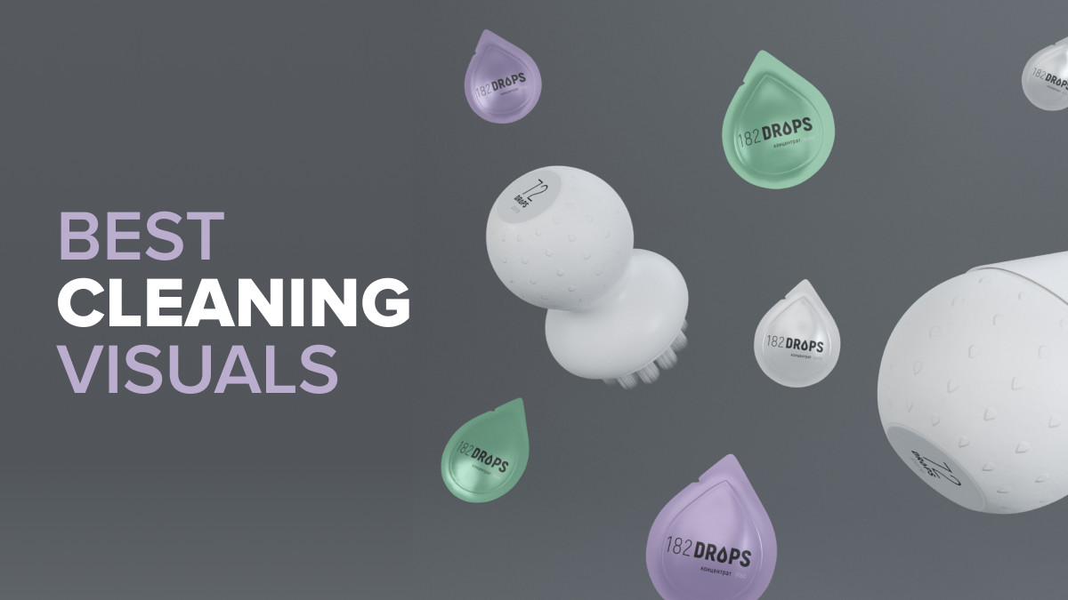
1. Drops by Ponik

Standout Features:
- Symmetrical drops layout
- Minimalist design
- Light and muted colors
Can a minimalist layout stand out in a room full of outrageous visuals, vibrant colors, and over-the-top illustrations? Of course! The visual for Drops' packaging designs created masterfully by Ponik is an obvious testament to that.
Two words: simply sophisticated.
The game plan for this dishwashing detergent brand's visual identity is to keep everything clean and pristine. If not crystal white, the product packaging comes in light and slightly muted pastel colors like mint green and lavender.
We usually see detergent packaging designs with vibrant personalities. While the agency took a left turn by going minimalist, we saw the risk paid off in the end!
Another thing that captures attention and is unique to the brand, is the patterned drop design paying homage to the brand name.
No other illustrations are in sight; these drops take up the whole space. They give the cleaning company its contemporary character. Plus, they are the perfect little representations of the Drops brand.
2. Castile Soap by WMS Design Studio

Standout Features:
- Badges for transparency
- Organized text descriptions
- Color blocks
Castile Soap is not your regular body soap. It’s pure, vegan and non-GMO. And the ultimate surprise is that it doubles as your laundry soap!
With this multi-purpose product positioning, brands like Castile Soap can easily lend themselves to a messy maximalist presentation. All qualities are cramped into one layout.
But that’s not the case here, thanks to WMS Design Studio’s visual prowess.
Even though it contains many elements, the overall layout looks streamlined and cohesive. The secret? Organized typography. The designers used content separators like frames, text blocks and badges to make all the descriptions easier to digest.
With the text department covered, visual elements come next in priority. The agency added realistic images of the main ingredient, color blocks as background, and an outlined illustration.
Despite the booming visuals, everything looked easy in the eyes!
3. Krytex by Dmitriy Ten

Standout Features:
- Dark theme
- Futuristic rebranding
- Neon glow aesthetic
Krytex, a high-tech cleaning company, needed to enter its futuristic era to welcome a newer and larger volume of consumers. To do that, they tapped Dmitriy Ten’s design expertise for a rebranding overhaul. The result? An out-of-this-world design that lures in patrons and new customers alike.
The new look took inspiration from the space Odyssey and meteorite research. The agency embraced dark aesthetics to go with the theme and added neon visuals such as stars, dots, and a stylized letter X in the background. One look is a trip to a bright color-filled night sky.
To maintain its high-end character, the designers kept the text and design elements at a minimum. No other visuals distract the consumer from reading the brand name, variant, and concise product description.
4. Moronz by Creative Banda

Standout Features:
- Home-shaped logo container
- Bullet descriptions
- Balanced color scheme
Some brands finally proceed with rebranding because of the desire to reach a new audience. This is also true with Moronz. They collaborated with Creative Banda to develop a visual design that taps into the younger generation.
And the end result? Well, a design that demands attention from anyone who sees it.
The logo received the most noticeable upgrade. The agency designed it to look way more fun, vibrant, and innovative than the previous version. The symbol-and-ensemble illustration takes the form of a house container, with the quirky brand name as its resident.
The packaging layout is such an eye-candy as well! The designers enclosed the product descriptions in different colored text blocks. These colors pop up beautifully in the packaging's mostly-white background. Some texts outside these blocks are laid out in bullet format, providing a more effortless reading experience!
5. Squeaky Clean by Apricot Branding

Standout Features:
- Fresh and bright colors
- Integrated logo design
- Simple typography
Squeaky Clean LLC is a Maryland-based local brand that focuses on residential cleaning. It’s a relatively new business that struggled with brand-building – until Apricot Branding came along.
The agency developed a visual identity that perfectly represents the brand’s top qualities: simple, straightforward, and easy to use.
The logo is a combination of a standard logotype and a key symbol. The agency leveraged this logo with a double picture. The logo icon features a small flower that also forms a cleaning sprayer with a spherical water splash that frames the image.
They went with cool colors like white and turquoise, instantly associating the company with freshness and cleanliness. To add some flare to these cool tones, the designers threw in yellow, orange, and red!
With this vibrant color story, keeping the typography simple, at a minimum, is a wise choice. The designers also went with just two variants in the typeface, making the layout look clean and streamlined.
6. Flink by IdeArts

Standout Features:
- Colorful geometric shapes
- Patterned product visuals
- Minimal product labels
In a sea of generic dishwashing sponge options, Flink stands out with its vibrant packaging design courtesy of IdeArts branding agency.
Every package bursts in full color and no two variants are similar. Each product has its unique combination of bright colors: orange, yellow, red-pink, and sky blue. Binding them together is the brand color purple.
These vibrant shades fill the stacked geometric shapes, adding an extra aesthetic value to the packaging presentation!
But that’s hardly all. The maximalist design features a realistic patterned image of the product, so consumers get a preview of what the actual sponge looks like. Additionally, a small product illustration upfront serves as a good product indicator.
With such an abundance of visual elements, the design didn’t need much text content other than the main product labels. Otherwise, the layout would have looked too outrageous, and nobody wants that!
7. Belvitur by Greco Design

Standout Features:
- Rich and bold color story
- Intricate map outline
- Sophisticated font combination
Belvitur is a high-end home spray accompanied by an exclusive fragrance inspired by the Costa Azzurra, popularly known as the extravagant and stylish region of the French Riviera.
With such premium brand positioning, Greco Design created a packaging design in purple that screams luxury and royalty.
Having purple as the key brand color effectively conveyed Belvitur’s key value propositions: exclusivity and power.
The designers added a stunning outlined image of the French Riviera as the main illustration for the packaging to showcase the fragrance’s inspiration. It extends to the rear and side profile of the box, prompting the consumer to keep exploring the package and its contents.
On the other hand, they kept the product labels simple and streamlined by placing them upfront. Fewer distractions = higher brand recognition!
8. Seepje by Flex

Standout Features:
- Soap-shaped bottle design
- Pastel color story
- Engraved brand name and icon
Liquid detergents are some of the most ubiquitous cleaning products, giving brands a difficult time standing out.
So, what did Seepje do to wow the crowd? They partnered with Flex design agency and created a packaging presentation that’s truly out of the box.
Setting the product apart is its bottle shaped like a block of soap. The brand name sits on the lower ridge in the middle. On the side is an engraved icon that determines the product variant, adding another texture to the design!
The designers wrapped the light blue bottle in pink and white cardboard bearing the logo, brand name, and essential product labels for that extra branding touch. The pastel color combination is not only refreshing and visually appropriate, but it effectively reintroduces Seepje to the contemporary marketplace too!
9. RC by Okegraphic

Standout Features:
- Symmetrical
- Charming illustration
- Clean, subtle, and minimal
The RC Glasses wipes packaging, designed by Okegraphic, is a prime example of successfully uniting shape and color palette into one clean, consistent, and appealing design.
Using just the form of the packaging, as well as the creative take on symmetry, the agency made sure the end result turns heads, although the onlookers couldn't quite put their finger on it as to why.
Without the obvious effort to seem trendy, RC is simple and minimal in the best possible way.
![]()
Our team ranks agencies worldwide to help you find a qualified partner. Visit our Agency Directory for the Top Branding Agencies, as well as:
- Top Brand Strategy Agencies
- Top Brand Positioning Firms
- Top Small Business Branding Agencies
- Top Cincinnati Branding Agencies
And don’t miss our Awards section, where we showcase the top agencies recognized for exceptional creativity and impact.


-preview.jpg)