Web design principles are the guidelines that ensure a design looks good and functions as expected. Knowing the basic principles of web design helps you make a strong first impression, which is crucial for building long-term trust with your audience.
Expert designers rely on these core principles to ensure every element on their site works together cohesively. In this guide, we’ll outline nine of the most important web design fundamentals.
1. Visual Balance
Designers often talk about visual balance when discussing how elements are arranged on a page. In general, balanced designs feel cohesive and harmonious, while unbalanced designs can come across as jarring or unstable.
There are a few different ways to achieve visual balance in web design:
- Symmetrical balance: This is the most common type. It involves using identical mirror-image elements on both sides of the page.
- Asymmetrical balance: Uses differently sized or shaped elements to create a sense of visual harmony.
- Radial balance: Uses repeating elements that radiate out from a central point. The focal point attracts the most attention and is usually reserved for high-value CTAs. Usually, designers set the radial balance in the center but that is not a rule. For instance, OptinMonster positioned the focal point to the right to cleverly suggest which pricing plan offers the most bang for your buck.
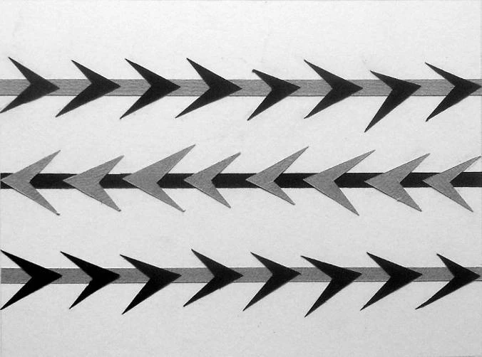
- Crystallographic balance: This is probably the least used type as it is difficult to organize. It requires giving the same weight to various elements. Since this type of balance doesn’t have any specific rules, it can easily be overdone.
Pedro Pablo Pica Montesinos, Senior Web Developer, CEO, and Founder of Makinable, suggests considering another form of balance: "Harmonious balance between aesthetics and technical aspects of the installation is essential in web design. An elegant and striking design can and should be done with a light and clean code without compromising the loading speed and security of the website."
A good example of visual balance — the crystallographic balance, to be exact — is found in certain patterns. For instance, in the image below, every line has an equal number of arrows in the same hue yet is still not entirely symmetrical.
2. Consistency
A consistent design helps create a cohesive and professional-looking website. It’s all about creating a user-friendly experience that matches your brand's vision and can be easily navigated by your audience.
But we’re not just talking about having the same images, colors, and website typography throughout your site — it also means having similar layouts, menus, and navigation.
Matthew Hunt, Full-Stack Designer and CEO of Afteractive, states: "Consistency dramatically improves the overall UX. It reinforces brand identity and helps accessibility. Standardizing elements like layout, colors, and fonts helps to make navigation and interactions more intuitive, reduces how much users need to think, and improves their experience.
Consistent design is associated with professional and high-quality brands, and it promotes brand recognition and trust, resulting in a loyal user base. Use a consistent design strategy, such as creating a style guide to define colors, fonts, buttons, and text sizes, to expedite the building process and simplify updates while maintaining brand identity across platforms. Modern websites use components, so it makes sense to design your pages based on this approach."
Consistency is important, as most users look at a website’s layout and navigational links when seeing a site for the first time. Focus on creating an absolute sense of identity across all your content and assets. You want your customers to look at your site or app and think, "This is familiar!"
To keep the design consistent, try to:
- Position the menus at the same place on each page
- Stick to the same fonts and colors across the site to create a sense of cohesion
- Set a visual hierarchy for the elements to ensure your website looks balanced and well put-together
- Include a search bar on each page at the same location
- Add your logo on each page

A good example of a consistent design is Apple. The company has been using the same logo for years and has it on every single product and webpage.
3. The F- or -Z-Pattern
The F-pattern or the Z-pattern are popular design guidelines that help visitors scan a web page more effectively.
The F-pattern is ideal for text-heavy pages, guiding readers to quickly find the key points. The main principles of this pattern are:
- The first two paragraphs should include the most crucial information, as readers tend to scan rather than read thoroughly.
- Each paragraph, subheading, and bullet point should start with critical details that grab attention when users scan the left side of the page, creating the F-pattern.
The Z-pattern, on the other hand, is more suited to pages with less text and more visual elements. It helps the reader find relevant information quickly and makes it easier to process complex information.
The pattern gets its name from the way people often scan the page in an imaginary Z shape: from the top left to the top right, diagonally down to the left side, and back across to the right. By structuring your content accordingly, you’re giving visitors a natural, intuitive reading experience that doesn’t feel overwhelming.
4. Negative Space
Another one of the top website design principles is using negative space. Web design is all about creating an environment that will draw in users and that’s exactly what negative space does.
Negative space, also known as white space in web design, is the empty area surrounding elements on a page. When used correctly, it can make a big impact on the overall look and feel of a website, helping it appear more inviting and professional.
Negative space serves several purposes: it breaks up content, directs attention to specific elements, and makes pages more visually appealing. It acts as a buffer, preventing the site from looking cluttered, guiding the reader’s eye, and ensuring your brand’s message is communicated effectively.
The goal of negative space in web design is to create an environment where your content can be displayed without any distractions. This allows for more emphasis on your copy and gives it more impact.

One example many don’t know has negative space is Van Gogh’s “The Starry Night”. The brush strokes create a swirling sky that is balanced out with the positive space.
5. Simple and Logical Page Navigation
Navigating a website should be a simple and logical process for users; hence it is a good web design principle. All the pages on your website should be easy to find, and the path between them should be clear to provide a good user experience (UX). After all, 60% of customers leave a site if the UX is poor.
Use a consistent navigation system throughout the site to enable visitors to move effortlessly from page to page.
Meg Mothershed, Co-Owner of Mothershed Design Co., agrees and adds: "No matter how great a website looks, if it’s difficult to use, isn’t mobile friendly, or poorly designed, website visitors will go elsewhere."
Using the same menu, buttons, and links on every page is key to providing users with the simplest and easiest navigation. Additionally, prominently displayed search bars can also help allow visitors to quickly find what they're looking for on your site.
You can take things a step further by using breadcrumbs. Breadcrumbs are links that show the user their current location within a website.
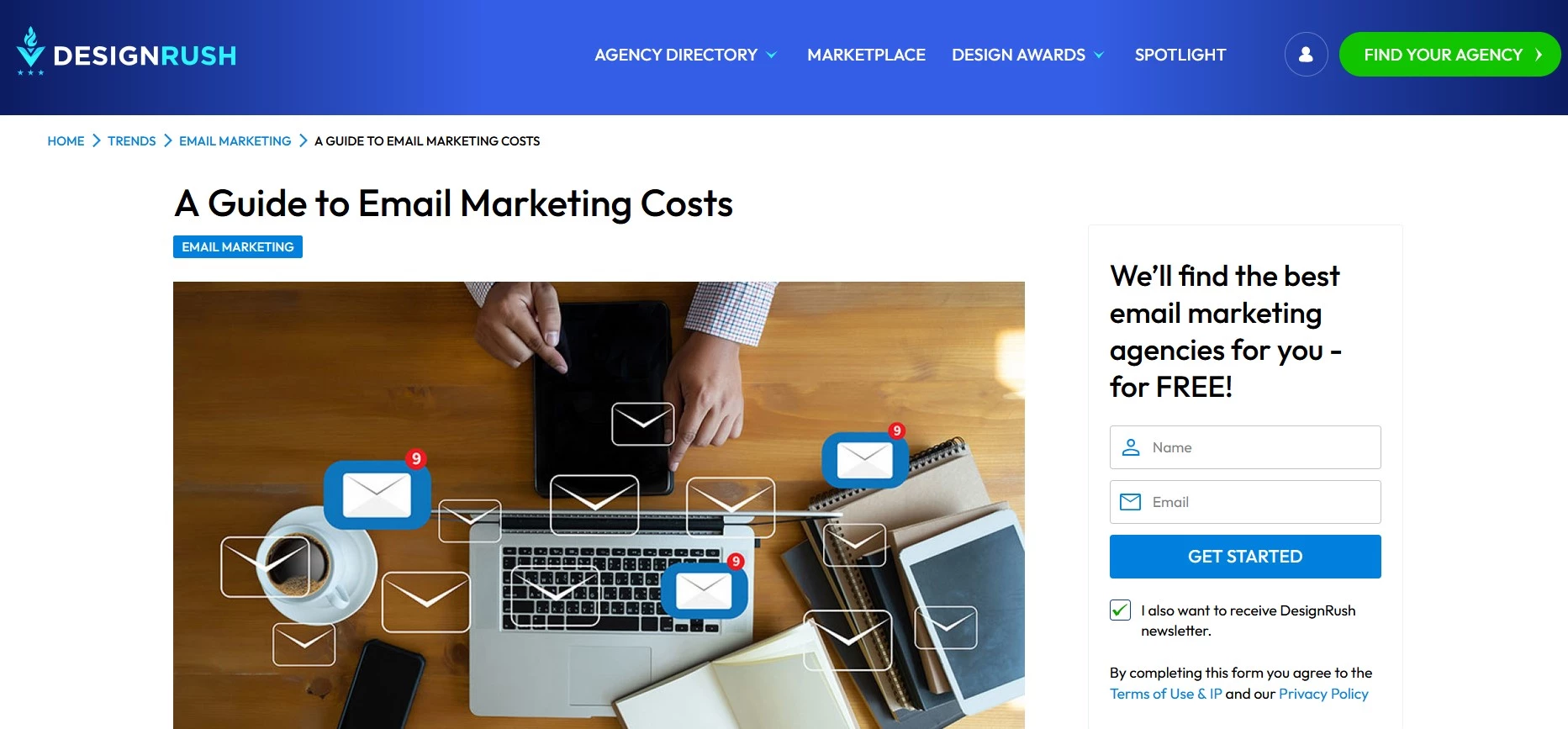
For example, if you go to our “A Guide to Email Marketing” article, you can see a line of breadcrumbs above the title. These help orient users and provide a way back to the homepage if they get lost.
6. Complementary Colors
If you're working on a web design project, one of the first things web design agencies will discuss is colors. The use of the right colors is one of the fundamentals of web design. But don’t just add colors for the sake of it. It’s essential to create a complementary color palette to maintain consistency.
Complementary colors are those directly opposite each other on the color wheel. When used together, they can create an eye-catching and visually appealing design that feels balanced and harmonious.

One classic example of complementary colors is the combination of black and white. This high-contrast duo is often used to create a dramatic effect, as seen in the classic Adidas branding, for example.
Other popular combinations include blue and orange, red and green, and purple and yellow.
Web and graphic design heavily rely on color, so experiment with different combinations to see what looks best. And don't be afraid to step outside the box — sometimes, the most unexpected combinations can create the most stunning results!
7. Mobile-Friendliness
One of the most important principles of web design is making sure your site is mobile-friendly. Considering that 60% of all website traffic comes from mobile devices, adapting your site to work on any mobile device is key to bringing in more customers.
Having mobile-friendly websites shows customers you value their time and experience on your site. With over 7.4 billion mobile users worldwide, your site needs to be easily viewed on smaller devices.
Here are a few things you can do to make sure your site is mobile-friendly:
- Use responsive design so your site adjusts to fit the screen size of any device, no matter how big or small.
- Use a separate mobile version of your site. This is a good option if you want more control over how your site looks on different devices.
- Use an app if you want visitors to access your content offline or want to provide a more immersive experience for mobile users.

Take Domino’s, for example. The pizza giant offers a website that easily adapts to any device, allowing customers to order at their convenience. Additionally, it even has a separate app.
8. Optimized Buttons and Calls to Action
Optimizing your buttons and calls to action is also an important website design best practice, yet they are often overlooked.
When designing buttons and calls to action, keep these principles in mind:
- Keep it simple: The button should be easy to understand and click. Use color and contrast to make it stand out.
- Use whitespace: This creates a sense of hierarchy and emphasizes the button.
- Use size and position to draw attention to the button: Placing the button near other elements or hiding it in the corners can frustrate customers and make them want to leave. Instead, try out different sizes and placements to see where the best position is to get the most clicks.
At DesignRush, we use this web design principle to grab users’ attention. Just look at the many buttons and CTAs on our site that help you find what you’re looking for.
9. Fitt’s Law
The final method on our list of best website design principles is Fitt’s law. Named after psychologist Paul Fitts, this law states that the amount of time it takes to reach a target is directly proportional to the distance between the starting point and the target.
When applied to web design, this means that important or commonly used elements should be placed close to where users will start their journey on your site.
Blake Nolan, Founder and Chief Strategy Officer of Storm Brain emphasizes: "The key principle of web design is to perfectly blend great UX with beautiful and memorable design. This means ensuring the website’s stunning, unique look also helps people find what they need quickly and easily."
For example, if you want people to click on the CTA button, place it in an easily visible location rather than tucking it away in a corner. Look at our example below and you’ll get what we mean!
Principles of Web Design: Key Takeaways
Web design comes down to creativity, and you can’t really put creativity in a box. These principles of web design are there to help you out, not constrict your imagination.
By focusing on elements like visual balance, consistency, navigation, and mobile friendliness, you can ensure that your website looks great, is user-friendly, and functions without a hitch. The goal is to blend these aspects seamlessly to create a smooth and enjoyable experience that encourages visitors to return.
Our team ranks agencies worldwide to help you find a qualified partner. Visit our Agency Directory for the Top Web Development Companies, as well as:
- Top Backend Development Companies
- AI Web Design Agencies
- Top Front End Web Development Companies
- Top UI/UX Design Agencies
- Top Web Development Companies in Chicago
Our design experts also recognize the most innovative design projects across the globe. Visit our Awards section to see the best in web design.