Kubo is a new app that aims to disrupt the health and fitness industry by making it easier for trainers and clients to connect with each other. By using Kubo, fitness professionals can reach a wider market, and customers can compare available training sessions or group classes to find what fits their interests, budget, and schedule.
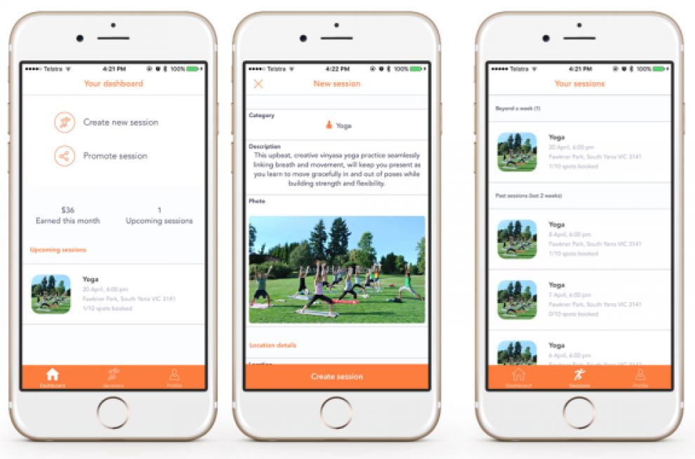
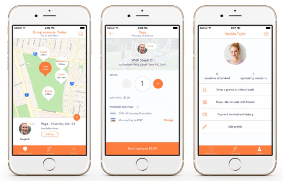
To disrupt such a powerful industry where people build strong bonds, Kubo had to create an app that made the process of finding a trainer exponentially easier. The result is a very clean, no-nonsense application. The white background is accented with orange menu bars and text, along with photos that depict the offered classes.

The app is incredibly easy to navigate. Plus, it also connects with users’ wearables to put a little extra emphasis on their fitness-minded goal. Everything is consistently designed with the brand’s orange color, which is present in every interaction.
Kubo did a fantastic job making a very uncluttered app that allows users to browse fitness classes in list or map mode. They have removed most of the barrier between customers and fitness trainers to help everyone focus on what matters most: their health.
Kubo is an amazing app design in the sports & leisure industry.