- Agency: Robin
- Client: Spectra Technology
- Category: App Design — Sports & Leisure
- Location: Los Angeles, California, United States
- Project Brief: Design a mobile app that enhances rally tracking and communication with intuitive navigation and real-time performance data.
A sports and leisure app for rally racing serves two audiences at once: drivers in dark, high-speed cockpits and support teams monitoring from remote locations. Robin's redesign of Spectra was built for both.
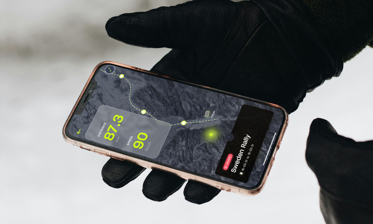
The app's map view keeps the driver's most urgent data inside the tracking context. Distance and speed are overlaid directly on the route rather than on a separate screen, so the user never needs to navigate away from the live view to get critical numbers. That single-screen decision drives the entire mobile UX.
The safety layer doesn't interrupt the experience. It lives inside it. Roadblocks and SOS confirmations appear directly on the map rather than pushing users to a separate notifications tab. When a medical emergency requires a response, it's one tap, not a workflow. In rally conditions, that gap is measured in minutes.
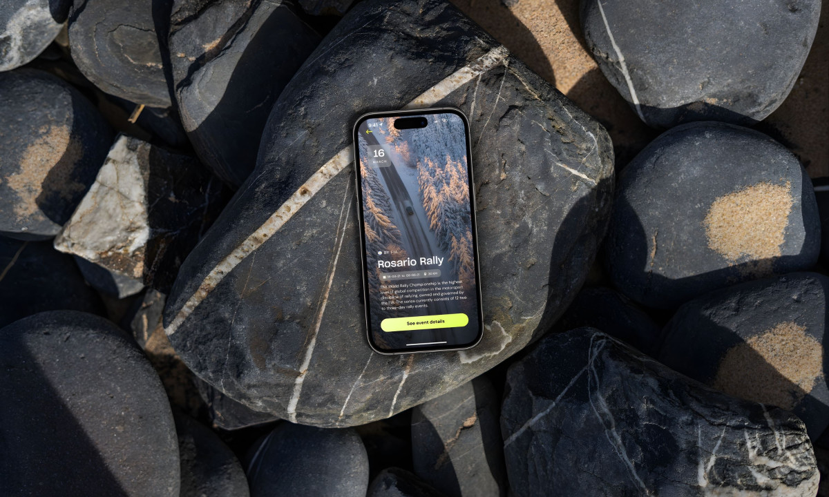
The event browser solves a scheduling problem specific to global rally operations. Events span different countries, durations, and distances. Robin organized them as scannable cards, with metadata visible before tapping, letting organizers compare logistics across five or six upcoming rallies without opening each one individually.
The desktop dashboard handles what the mobile app shouldn't. License management, user roles, and event administration all require table-based interfaces and bulk actions that don't belong on a phone screen. Robin kept both platforms on the same visual system (dark UI, neon accents) but gave each one a scope appropriate to its context.
The neon-on-dark palette is a visibility requirement for screens read inside vehicles and at outdoor support stations under variable lighting conditions. The entire color system serves function before aesthetics.
Robin gave two audiences one app without forcing either to use the other's version. That's harder than building two separate products, and it's why the design works.