Acorn Consulting provides strategic and management consulting services with a focus on navigating complex business challenges. With a vision for authority, clarity, and modern professionalism, Cubby Studio crafted a brand identity from the ground up, starting with a logo that embodies Acorn’s values.
This logo design anchors the firm’s credibility and positions it as a trusted advisor in its space.
Industry Insight: Logos with monograms boost recognition and trust. Ipsos found distinctive assets, like logos and typography, can improve marketing effectivenessby up to 80%.
Key Insights for Brands:
- Monogram-style emblem reinforces professionalism and trust.
- Classical design cues establish authority in highly regulated or advisory sectors.
- Versatile application ensures consistent brand identity across digital and print.
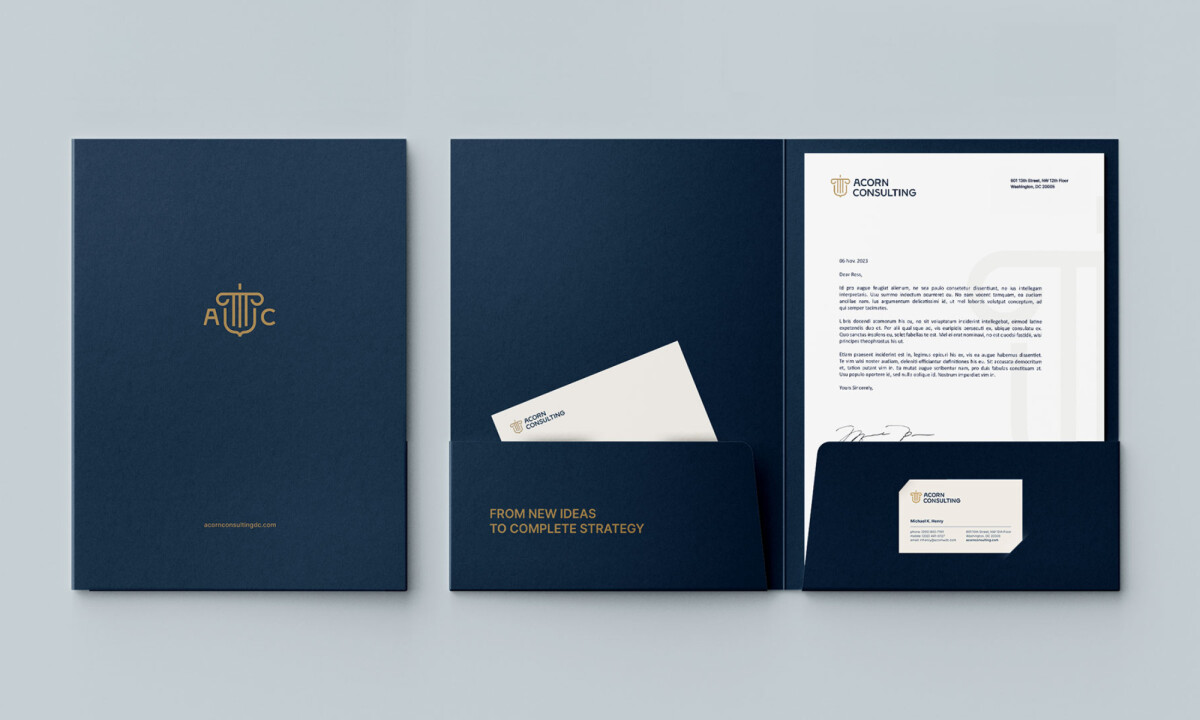
Flexible Color Palette for Adaptability
One of the strongest aspects of this identity is its color versatility. From a deep navy paired with gold to stark black-on-white executions, the logo adapts seamlessly to different contexts.
Each version maintains brand integrity while introducing subtle shifts in tone, from premium to neutral to classic.
This adaptability ensures consistent recognition while allowing the brand to feel fresh across various media.
Whether on social channels, print materials, or digital touchpoints, the identity remains intact and impactful.
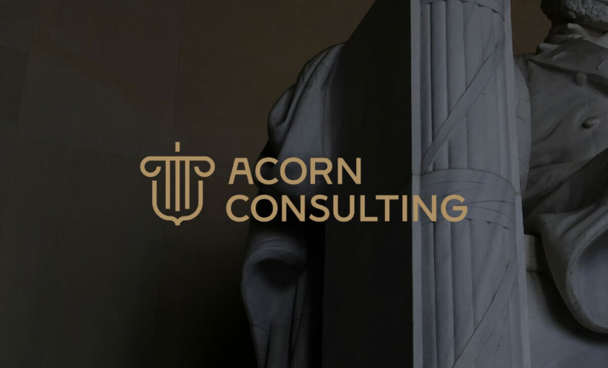
Classical Column Symbolism Enhances Brand Trust
_5c786a0bf588-desktop.jpg)
The use of a column in the logo iconography is particularly effective. It taps into a long-established visual language of strength, wisdom, and institutional reliability.
This is a clever move for a consulting firm, especially one looking to establish credibility and authority from the outset.
"[This logo stands out for its]...interesting connection between corporate core strengths and logo design, concept, and integration."
DesignRush Awards Panel
Pairing the column with the acorn symbol ties nature to structure: growth anchored by strong foundations. That duality reflects the business well: ambition backed by credibility.
In my view, Cubby Studio struck the right balance between restraint and authority, which is exactly what clients look for in a trusted advisor.
Learn how brand symbols shape recognition and give your business a lasting identity.
Monogram Emblem Fuses Heritage with Modernism
_1e3e6edddbea-desktop.jpg)
As a designer who deeply values symbolism in visual identity, Acorn Consulting's logo was one that I enjoyed analyzing for its layered approach to the design.
It begins with a monogram that elegantly integrates the letters A and C with a column motif. This fusion of type and classical imagery is subtle yet significant, signaling strength, intelligence, and legacy in one compact form.
The monogram immediately elevates the visual identity, offering both symbolic resonance and practical usability.
Its proportions are refined and intentional, making sure the emblem holds its shape across varied applications. This monogram represents the brand as much as it defines its tone and perception.Explore the different types of logos and find the right style to define your brand.
Elegant Typography for Professional Appeal
Paired with the monogram is a minimalist sans-serif wordmark that delivers clean lines and solid readability.
The font is assertive without being overpowering, reflecting clarity and composure. The spacing between letters feels deliberate, ensuring it maintains presence across web and print formats alike.
Typography is often overlooked in logo critiques, but here it’s executed with care. The contrast between the ornate icon and the simplified wordmark creates visual harmony, allowing each to complement the other without competing.
What Brands & Agencies Can Learn from Acorn Consulting
This abstract logo shows how to balance traditional symbolism with modern execution to create a timeless identity.
1. Evoke a Feeling
You can use an abstract symbol to communicate a mood without being completely literal. A mark that references classical architectural forms, for example, helps establish a tone of stability.
2. Balance Old and New
Pairing a traditional-style icon with a clean, modern typeface creates a balanced identity that feels timeless.
3. Create a Logo System
A modern identity needs to be flexible. You should design multiple versions of your logo to fit different spaces. For instance, have a simplified monogram for small applications like social media profiles.
About DesignRush Featured Designs
At DesignRush, we highlight standout projects every month. Logos like Acorn Consulting’s are recognized for their ability to balance symbolism with modern execution.
Many go on to become Monthly Design Awards winners, amplifying their visibility in the industry.
Logo design in consulting requires clarity, trust, and authority. Explore more:
- Best Logo Designs
- Best Website Designs
- Best App Designs
- Best Print Designs
- Best Packaging Designs
- Best Video Designs
For a full list of design agencies and related services, see our Agency Directory.