Denver Nuggets: Key Points
- Visual Identity Drives Value: As of 2024, the Denver Nuggets are valued at $3.9 billion, up 16% from the previous year. A key contributor? A cohesive visual brand anchored by heritage-focused logo design.
- Cultural Roots Build Loyalty: The Nuggets' current badge draws directly from Colorado’s mining past, which integrates local culture, serves to improve fan merchandise sales and deepen emotional engagement.
- Retro Sells: Throwback releases, like the Nuggets’ rainbow skyline jersey, can be leveraged for campaign-period merchandise revenue.
The Denver Nuggets logo is a long-game branding strategy. Valued at $3.9 billion, the team has grown its brand equity through smart design choices that reflect local history and modern aesthetics. From wild ABA cartoon mascots to sleek mountain crests, every version of the Nuggets logo tells a part of the story, and their latest badge, designed in-house, brings that story full circle.
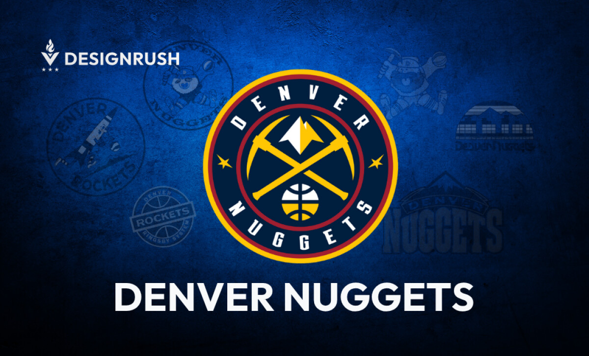
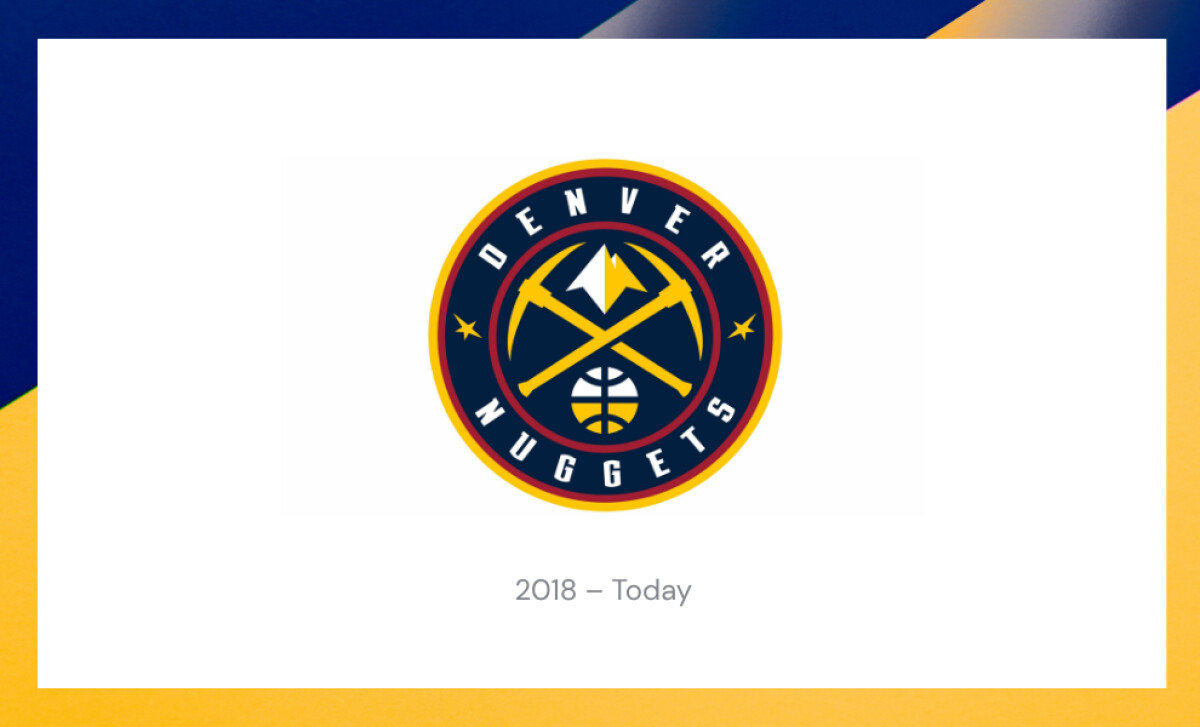
The Modern Denver Nuggets Logo: Pickaxes and Alpine Geometry
Two golden pickaxes cross beneath a jagged white summit, Colorado’s mining roots, reduced to their cleanest, boldest form. There’s no forced symbolism here. It’s a logo that knows exactly where it comes from.
Framed in a navy roundel, the design performs everywhere: painted on hardwood, scaled on screens, stitched on merch. The palette (deep navy, crimson, and gold) feels native to both the Rockies and the digital age.
While other teams chase minimalism for minimalism’s sake, Denver doubles down on meaning. Geography. History. Symbols that carry weight. It’s not just a rebrand—it’s a reclamation.
Reader Reward:Research from the International Journal of Sports Marketing & Sponsorship shows that logo redesigns that preserve legacy elements, like Denver’s pickaxes and mountain geometry, significantly improve fan merchandise purchase intentions.
Denver Nuggets Logo History
1967-1971: The Original Denver Rockets Logo – The Ringsby Era Begins

The team's first identity debuted in 1967 as the Denver Rockets, featuring a red and black circular badge with bold typography and a central basketball. This no-frills design was functional but lacked the personality fans associate with sports teams today.
The “Ringsby System” inscription referred to owner Bill Ringsby’s trucking company, blending corporate identity with team branding, a rarity in modern franchises.
Its utilitarian approach captured the industrial spirit of the late '60s, but quickly became outdated as branding began to evolve beyond practicality.
1971-1974: The Anthropomorphic Rocket Mascot
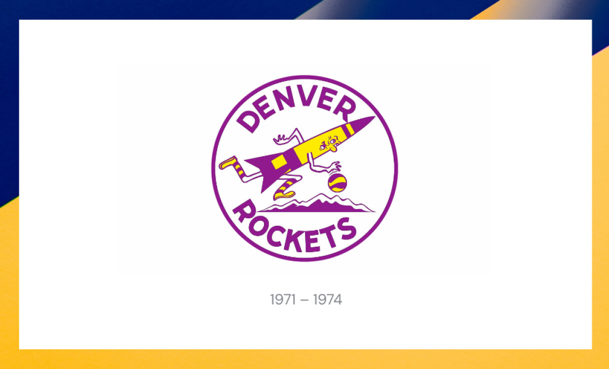
In the early 1970s, the team leaned into playful identity with a cartoon rocket character dribbling a ball over mountain peaks.
Done in purple and yellow, this iteration was more illustrative, energetic, and expressive.
It emphasized approachability and humor, appealing to younger audiences and capturing the wild, fun spirit of the ABA. Though lacking in polish, this iteration demonstrated early signs of fan-focused branding.
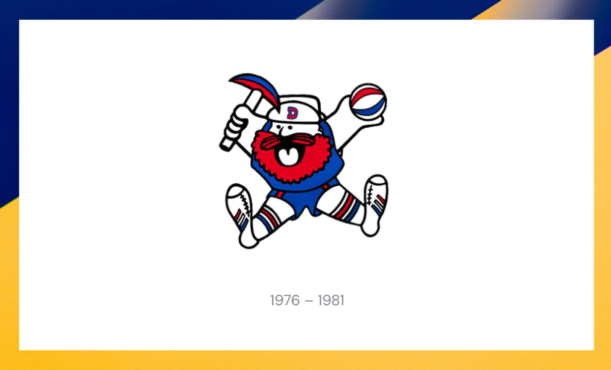
1974-1976: Enter the Denver Nuggets – Miner Mascot Takes Center Court

In 1974, the team was renamed the Denver Nuggets, and its logo followed suit with a new cartoon mascot: a bearded miner joyfully holding a pickaxe and ABA ball.
His wide grin and exaggerated limbs cemented a friendly, accessible identity that resonated with local culture.
The miner’s outfit and red-white-blue colors tied the design to both Americana and the ABA's flashier branding. The circular layout returned for cohesion, setting a blueprint for logos to come.
Mascots that move markets. See the best visual brand mascots now.
1976–1981: The Modernized Miner Icon
A more stylized version of the miner followed, removing the circular border and refining the lines.
The core imagery remained: pickaxe, beard, ball, but the black background and cleaner lines marked an early move toward versatility.
This update made the logo easier to reproduce on uniforms and merchandise, aligning with rising expectations around consistency across media formats.
1981–1993: The Iconic Rainbow Skyline
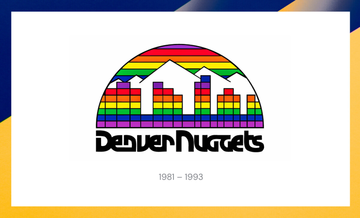
Arguably the Nuggets’ most beloved logo debuted in 1981: a geometric rainbow skyline over mountain peaks, evoking the Denver skyline in bold, Tetris-like color blocks.
This design emerged from a fan contest organized by then-GM Carl Scheer, who invited the public to submit ideas. The winning concept, selected by Nuggets staff, featured a vibrant, geometric Denver skyline set against the Rocky Mountains with a rainbow-colored backdrop — a bold tribute to the city’s energy and transformation in the 1980s.
This fan-driven emblem became a cultural marker. From 1982 to 1990, while wearing the Rainbow Skyline uniforms, the Nuggets made nine consecutive playoff appearances.
The design's uniqueness and grassroots origin gave it lasting emotional resonance with the fanbase, a connection the team continues to leverage in modern merchandise.
Reader Reward: In 2018, Denver and Nike co-developed a City Edition uniform honoring the Rainbow Skyline. The joint project balanced nostalgia with modernization and reaffirmed the value of heritage-based rebranding.
UConn’s retro rebrand saw nostalgic designs account for merchandise revenue during campaign runs, proving the long-tail economic value of beloved visuals, according to the Journal of Sport Behavior.
1993–2003: Grit and Gold – The Mountain Emblem
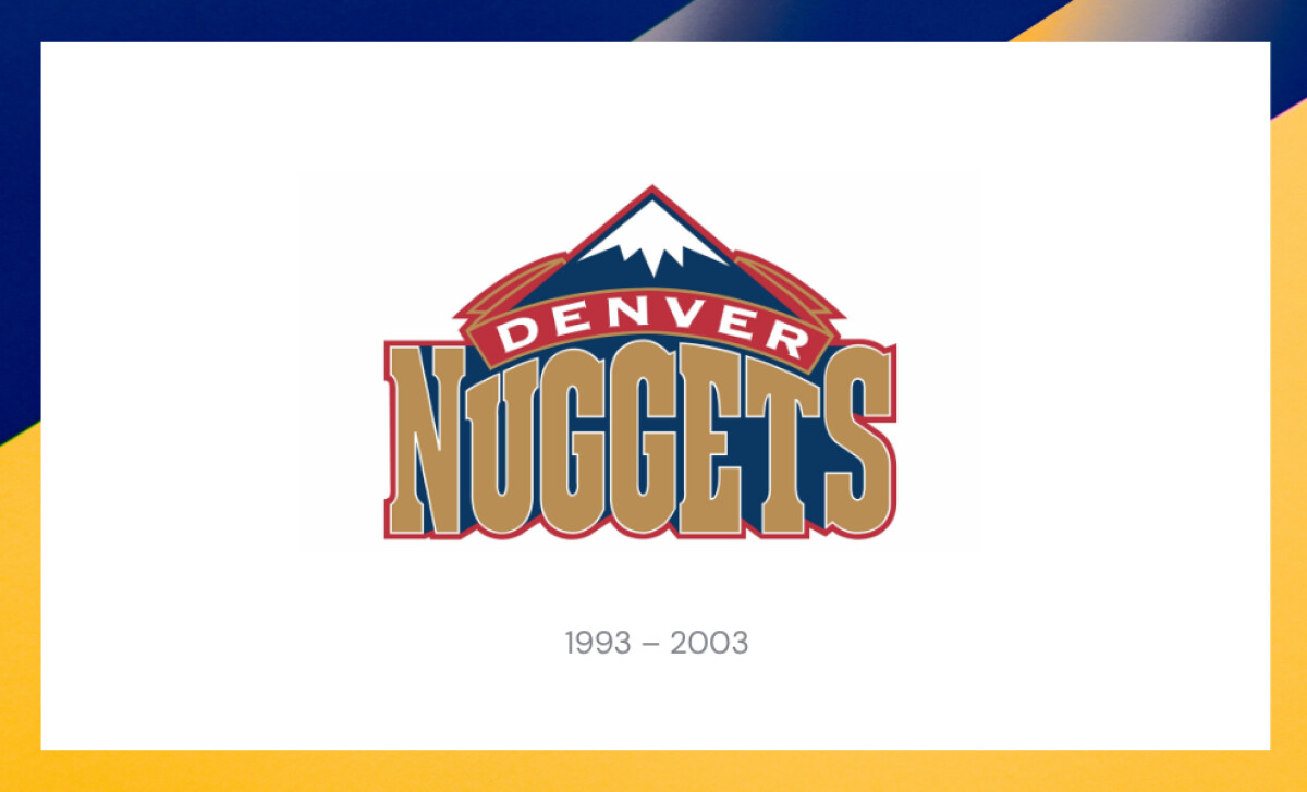
In 1993, the Nuggets dropped the rainbow in favor of a more grounded, gold-and-navy mountain crest. The word “NUGGETS” stretched large across the bottom, with "DENVER" nestled into a red banner above the stylized peaks.
This redesign marked a pivot toward a more serious and gritty team image, coinciding with the franchise’s efforts to rebuild competitiveness.
The bold typeface and shield-like structure gave the team a stronger, more professional presence.
See how top brands nailed their glow-up. Explore the best logo redesigns.
2003–2018: Palette Shifts and Precursor to Change
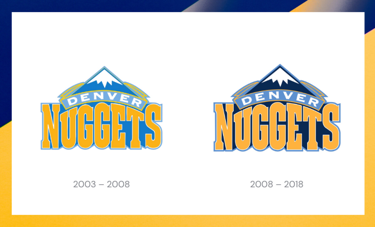
This 15-year stretch was marked by subtle evolution rather than bold reinvention.
In 2003, the Nuggets introduced a brighter, more optimistic palette (sky-blue mountains and gold-accented wordmarks), capturing the excitement of the Carmelo Anthony era. Though the core structure remained, the softened hues projected youth, speed, and approachability.
By 2008, the mood shifted. The team deepened its blues and strengthened the outlines, bringing back visual weight and clarity.
This recalibration added contrast and legibility across broadcast, digital, and apparel, modernizing the identity without abandoning its foundation.
These iterations didn’t just update the look — they prepared fans and the brand for the geometric precision and symbolic richness of the 2018 redesign.
Reader Reward: A 2024 study in Sports Marketing Quarterly found that team colors and crest geometry are among the most critical triggers for emotional loyalty and “halo effect” perception in sports branding. Brands looking to refresh should protect these visual cues—such as the Nuggets’ alpine geometry and gold accents.
The Wrap Up: From Mountains to Minimalism to Embracing Modern Identity
The Denver Nuggets’ logo evolution spans wild cartoon mascots to polished emblems rooted in local heritage. Their latest crest masterfully blends Colorado’s mining legacy with modern design efficiency: achieving clarity, symbolism, and versatility.
Final Notes
- Design for Longevity: Studies confirm that consistent visual identities foster stronger brand recall and trust. Denver’s crest demonstrates the power of structured evolution.
- In-House Teams Know the Brand Best: The Nuggets’ internal design team delivered a visual identity that respects legacy while scaling with modern demands — proof that deep brand context matters.
- Monetize Nostalgia: The economic value of legacy logos is well-documented. Denver’s strategic reissues of the Rainbow Skyline prove that when timed and marketed correctly, nostalgic visuals can drive significant merchandise spikes and re-engage multigenerational fan bases. Use limited drops, anniversary tie-ins, or collabs to unlock latent value in your brand archive.
As fans sport throwback rainbow jerseys and the team surges in relevance, the Nuggets prove that staying true to your origins while embracing innovation is a winning brand strategy.