Chicago Blackhawks Logo Evolution: Key Points
- Proof That Logos Pay Off: Nearly 20% of the Blackhawks’ $1.5B value comes from its logo. Brand consistency delivers ROI.
- Consistency Beats Change: 2025 data shows consumers recall stable logos more. Like Coca-Cola, the Blackhawks win by refining, not reinventing.
- Built for Screens, Built to Last: The 1999 redesign made the logo HD-ready, just like Google and Mastercard, digital clarity became the strategy.
The Chicago Blackhawks logo is a case study in brand longevity. As of 2024, the Blackhawks are valued at $1.5 billion, ranking them among the top NHL franchises. Their brand alone accounts for $293 million of this valuation, underscoring the economic impact of their enduring logo design.
The Modern Chicago Blackhawks Logo: Structure and Symbolism
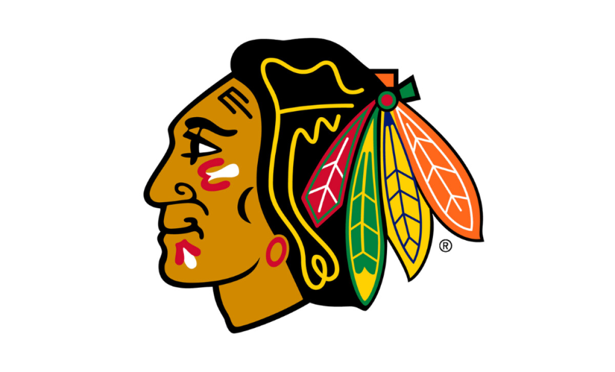
The current Chicago Blackhawks logo features a left-facing Native American profile with a striking array of multicolored feathers. Red, green, orange, and yellow hues are outlined in bold black for strong contrast and legibility.
The precision of the Blackhawks logo’s line work and color control is no accident; it ensures clarity across merch, digital touchpoints, and broadcast media, reinforcing the franchise’s visual consistency and brand equity.
This is a critical factor since, according to a Statista report, Stanley Cup Finals TV viewership in the U.S. jumped from 2.6 million in 2023 to 4.2 million per game in 2024.
Reader Reward: Invest in cross-platform clarity, more than 80% of fans may not visit a stadium. Consistent visual identity across merchandise, screens, and social feeds doesn’t just build brand equity; it also protects revenue.
Chicago Blackhawks Logo History
1926 –1934: The Monochrome Debut
The original Blackhawks emblem was a minimalistic black-and-white illustration of a Native American head, encircled by the team’s name. Designed by Irene Castle, wife of the team’s first owner, it was meant as an homage to Chief Black Hawk of Illinois’ Sac tribe.
While this early phase of the Chicago Blackhawks logo history reflected the limitations of early printing, it did eventually lay the cultural groundwork for what would be one of the most iconic logos in hockey.
Launching a new brand? Learn how to build a logo that does more than look good.
1930s – 1940s: Building a Distinct Visual Identity
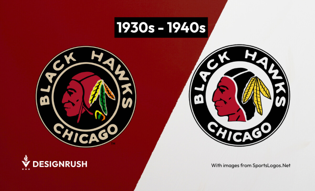
By the 1930s, the team began introducing maroon skin tones and brighter feather hues. By 1941, the linework was deeper and colors more saturated, giving the logo a distinct visual footprint.
This transition coincided with the rise of mass radio and print media, where logos needed to work in both grayscale and color, forcing designers to focus on tonal values and strong silhouettes — a design principle that still applies to responsive logos today.
1940s – 1950s: Sharpening Symbolism
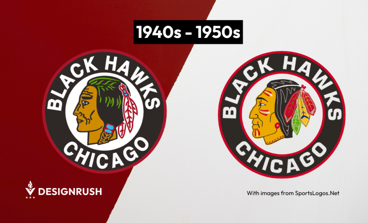
Linework was sharpened, jawlines strengthened, and facial details refined — but the core profile remained intact. These iterations weren’t rebrands, but strategic refinements built on a recognizable foundation.
Reader Reward: Similar incremental updates can be seen in Coca-Cola’s logo evolution, where micro-adjustments maintained global familiarity without eroding equity.
1957 – 1958: From Framed to Iconic
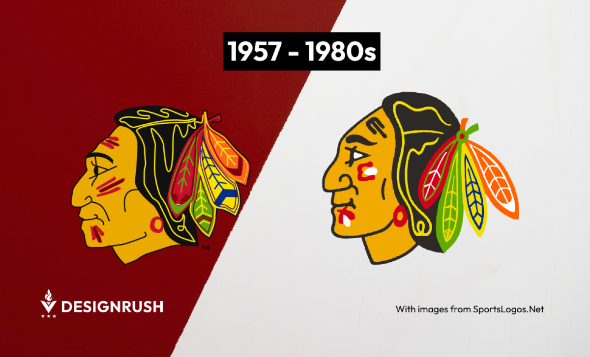
The removal of the circular text frame in 1957 marked a decisive evolution. This shift allowed the Native American profile to stand alone, transforming the sports logo design into a self-contained brand asset, while multicolored feathers (now signature) delivered instant shelf and screen presence.
Reader Reward: Removing text elements in favor of image-only logos is increasingly common. Think Apple, Shell, or Starbucks — proof that icons outlast slogans when done right.
1986 –1990s: Designed for Scale, Built for Visibility
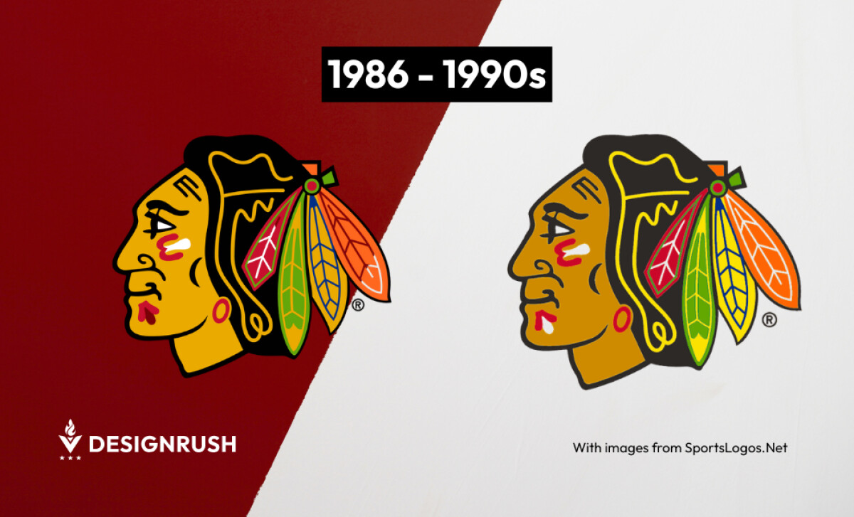
With NHL merchandise sales surging during this decade, the Blackhawks updated their logo with bolder outlines and subtle shading to improve scalability.
These changes prepped the mark for mass production, licensing, and digital scanning — critical as the league leaned into global distribution and emerging formats.
Want more examples of legacy logos done right? Explore our collection of the best logo redesigns that stand the test of time.
1999 – Now: A Digital-Ready Classic
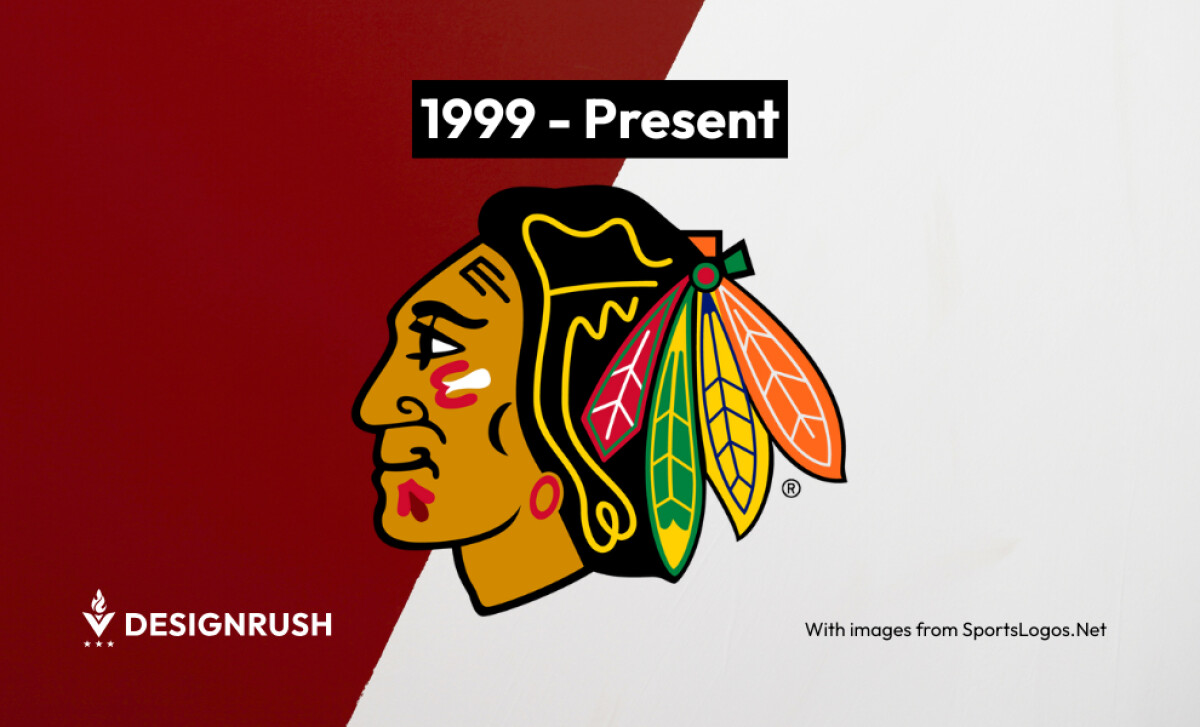
The final overhaul came in 1999 from the Blackhawks’ internal creative team. Every line, feather, and shadow was refined to maintain resolution integrity across high-definition broadcasts, e-commerce thumbnails, and vector-based applications.
Reader Reward: This mirrors moves by brands like Google and Mastercard, whose flat, scalable logo updates prioritized digital clarity over ornamental detail
The Wrap Up: Turn Consistency Into Capital
What gives the Blackhawks logo staying power isn’t novelty, it’s strategic consistency. Unlike many franchises that overhaul identities with each season, the Blackhawks have built loyalty through symbolic continuity, only making changes when function demanded it.
Final Notes:
- Design for Longevity: Logos that outlast trends build stronger brand equity. Frequent redesigns? They tank recognition and trust. A 2025 research shows consumers recall consistent, long-standing logos far more than those in constant flux.
- In-House Legacy Teams Work: The successful 1999 redesign shows that internal creative teams with deep brand knowledge can protect heritage while evolving visual relevance.
- Cultural Sensitivity Matters: Amid conversations around cultural appropriation in sports branding, the Blackhawks implemented measures like headdress bans and outreach programs to preserve respectful engagement.
Great logos don’t just survive change; they guide it. Brands with historical assets should embrace iterative design, align visuals to today’s tech and media realities, and lead with integrity in culturally sensitive contexts.
