Casa Chameleon is a boutique hotel group offering immersive, eco-conscious escapes nestled in Costa Rica’s lush landscapes. Hi Werk designed a refined visual identity system that mirrors the serenity and sophistication of the resort experience.
Industry Insight: 75% of users judge a brand’s credibility based on its logo and overall design aesthetic, making Hi Werk’s clean, nature-inspired identity crucial to Casa Chameleon’s success.
Key Insights for Brands:
- Leverage symbolic geometry to distill complex brand values into a simple yet powerful visual identity.
- Incorporate nature-inspired gradients to reinforce location-based branding.
- Establish an adaptive identity system that scales effortlessly across print, digital, and environmental applications.
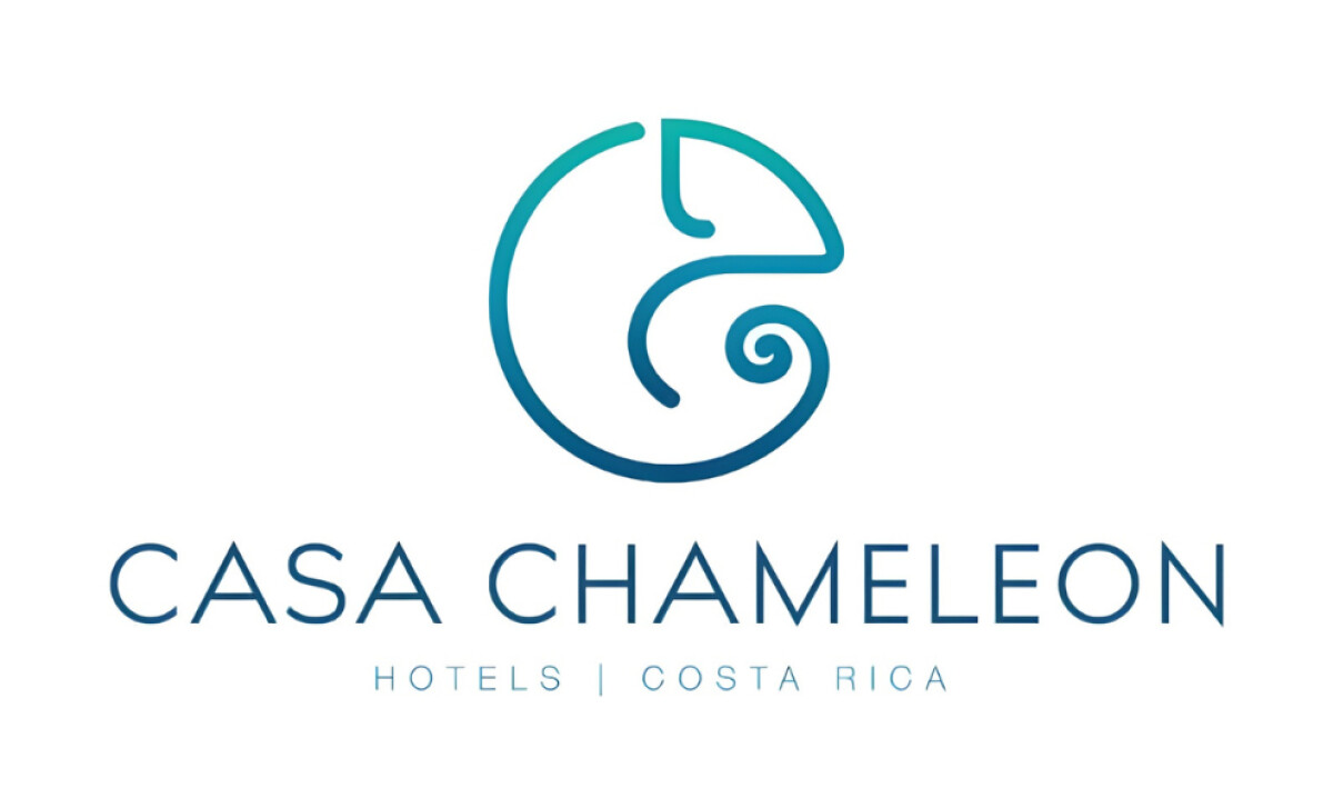
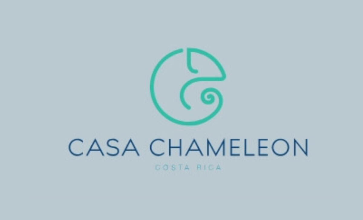
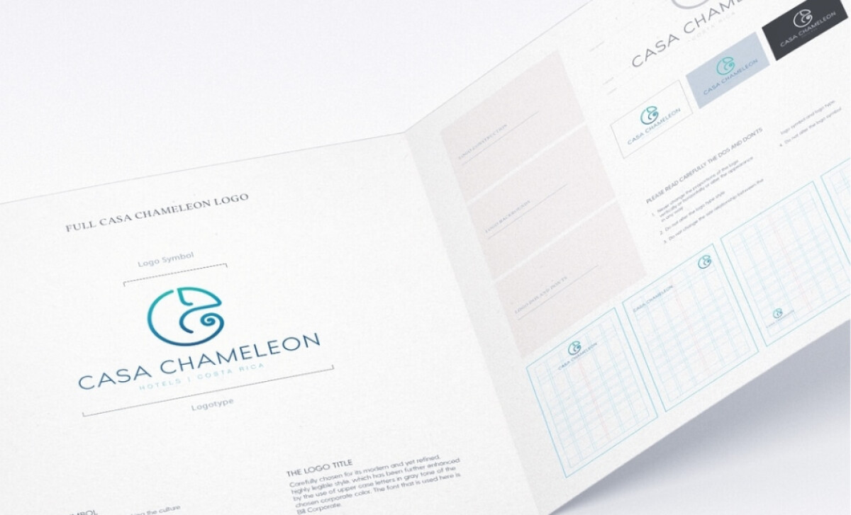
Symbolic Minimalism in The Casa Chameleon Brand Identity
At the center of the logo is a fluid, circular chameleon symbol, crafted with two smooth, continuous lines. The swirl of the tail and arched chameleon silhouette are stylized but unmistakable, resulting in a visual metaphor for adaptability and harmony with nature.
“The logo is exactly like a Chameleon — in design aesthetic, flow, function and color. Beautiful!”
- DesignRush Awards Jury Panel
Hi Werk, like many top logo design agencies, ensured its semi-abstract representation was still instant recognizable. This symbolism aligns perfectly with the immersive experience Casa Chameleon provides as well as the brand’s core identity: transformation through place.
Gradient Color Palette Inspired by Costa Rica
While there are flat color variations, the main logo features a smooth gradient that shifts from deep ocean blue to bright teal. This transition draws direct inspiration from Costa Rica’s coastal waters, tropical foliage, and vibrant ecosystems.
The use of a gradient rather than flat color allows the design to capture motion and life, symbolizing the ever-changing natural beauty that surrounds the Casa Chameleon properties.
This color treatment also increases visual flexibility across platforms, offering high impact on both light and dark backgrounds and adapting seamlessly to print and screen formats.
Did You Know? 54% of consumers cite blue as the most trustworthy brand color, making this palette ideal for luxury travel brands.
Hi Werk’s Chosen Typography is Elegant and Geometric
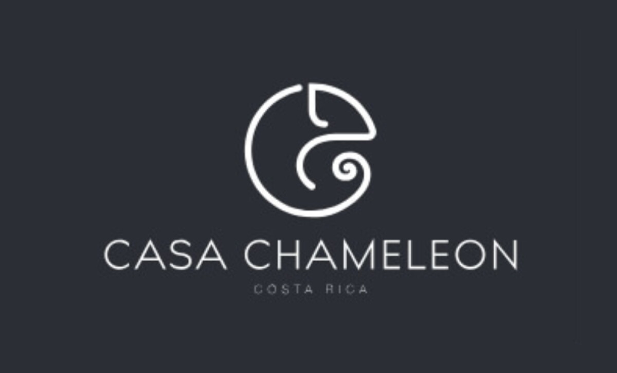
The wordmark uses a light, all-caps sans-serif font with wide spacing that feels modern and refined. Each letter carries even weight and clean geometry, echoing the chameleon’s smooth, continuous curves. The design feels open, confident, and easy on the eyes.
Beneath it, “COSTA RICA” appears in a slimmer weight and tighter width, creating hierarchy. The contrast between the two lines keeps the composition balanced.
Hi Werk’s typography choices convey calm precision, fitting for a brand that blends luxury with restraint. The type holds up across signs, menus, and digital use, maintaining clarity and elegance wherever it appears.
Discover the best fonts for logo designs that will make your creations stand out.
The Logo Translates Into Premium Stationery and Print Collateral
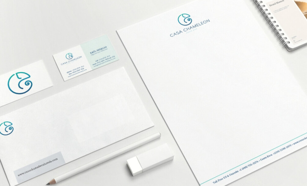
Hi Werk extended the Casa Chameleon visual identity into an elegant suite of print collateral including business cards, letterheads, envelopes and branded stationery.
The color system, typography, and iconography are applied with consistency to build visual cohesion and enhance brand recognition. Clean spacing and precise, minimalist detail lend each asset an intentional and understated feel that reflects the luxury hospitality experience.
Every touchpoint supports the Casa Chameleon guest journey by communicating care, quality, and serenity, reinforcing the brand’s identity and solidifying its place as an example of the best logo design.
Did You Know? Consistent visual branding across printed and digital platforms can boost overall revenue growth by 10-20%.
What Brands & Agencies Can Learn from Casa Chameleon Hotels
Hi Werk’s work for Casa Chameleon Hotels shows how symbolic clarity and design restraint can create a logo that feels both timeless and emotionally resonant.
Here’s what creative teams can take away:
1. Transform Symbols into Brand Stories
A strong logo can communicate a brand’s narrative without words. By using symbolism, Hi Werk demonstrated how a single mark can embody a company’s philosophy, values, and environment in one refined gesture.
2. Balance Luxury and Approachability
The right typography and form language can make a brand feel high-end yet inviting. Geometric simplicity paired with soft detailing gives Casa Chameleon a sense of modern sophistication that doesn’t alienate its audience.
3. Design for Versatility
A successful identity must adapt seamlessly across all platforms and materials. By developing an adaptive system for print, digital, and motion use, Hi Werk ensured the Casa Chameleon brand remains consistent and recognizable in every context.
About DesignRush Featured Designs
At DesignRush, we review hundreds of agency projects each month. Logo designs like Casa Chameleon Hotels stand out for their clarity, emotional tone, and attention to brand context.
The most exceptional go on to be featured in our Monthly Design Awards, celebrating creative excellence across industries.
Explore more inspiring hospitality and branding projects:
- Best Logo Designs
- Best Website Designs
- Best App Designs
- Best Print Designs
- Best Packaging Designs
- Best Video Designs
For a full list of design agencies and related services, visit our Agency Directory.