The England National Football Team logo arrives at the 2026 World Cup as the oldest symbol on any shirt in the tournament. As Thomas Tuchel's side works through Group L in the United States, having opened with a 4-2 win over Croatia on June 17 and facing Ghana next, the Three Lions on the chest carry a history that stretches back nearly 700 years before the first ball was kicked.
That gap matters.
Every other national badge at this World Cup is a designed object, drawn up by a committee or an agency to represent a federation. England's badge is something else: a heraldic inheritance.
When the Football Association wanted a crest in the 19th century, it did not commission a designer. It borrowed the imagery of the Crown, a symbol that already carried more authority than any modern rebrand could manufacture. This article traces how that inheritance became a football badge, following the visual record from the 1870s to the present.
England National Football Team Logo History
A logo usually tells the story of a brand finding itself. The England crest tells a different story, one of a brand inheriting an identity that already existed and then deciding, over and over, not to tamper with it.
The visual record runs through roughly seven recognizable versions since the start, and what stands out is how structurally similar they remain.
So let's walk through the England National Football Team logo history and see how an 800-year-old royal symbol became one of the most successful logo designs in sport.
1879 – 1950: The Crowned Shield
The earliest crest worn at the end of the 19th century and into the next set three dark blue lions on a white shield, with a crown resting on top.
Both the lions and the crown pointed straight back to royalty, with the lions also reading as symbols of courage and strength.
The navy lions sat against the white field while the crown above carried red and gold, the heraldic colors tied to loyalty, power and bravery.
This was the badge in its most literal royal form.
The crown sat above the lions because the imagery came directly from the Crown's own arms, and the FA had simply adopted it for the players who first wore three lions against Scotland in 1872. For roughly 70 years the design held without major change, which set the pattern that would define everything after it.
1950 – 1993: Roses Replace the Crown
The crest took on a more artistic look with the addition of ten red flowers placed between the lions, along with a more detailed rendering of the animals themselves.
The crown disappeared from the design in this period, and the powerful red shifted into the form of the flowers instead.
The timing lines up with a real heraldic event. The FA was granted its own coat of arms on March 30, 1949, a version with three blue lions on a white field and ten Tudor roses added between them.
Dropping the crown was the moment the football badge stopped being a borrowed royal arms and became the FA's own grant, even though it kept every structural cue of the original.
1993 – 1999: Sky Blue and a Wordmark
The lions were redrawn with far more intricate detailing and decorative swirls.
They turned a sky blue shade and gained red tongues and claws, which gave them an almost devilish look against the white shield with its black outline. Below the shield the FA added "ENGLAND" in black uppercase serif lettering, a classic touch that anchored the badge.
This version pushed the crest toward illustration.
The swirling linework and the serif wordmark belonged to early 1990s design taste, yet the bones underneath stayed exactly where they had always been: three lions, stacked, facing the viewer. The decoration changed. The structure did not.
1999 – 2003: A Bolder Blue
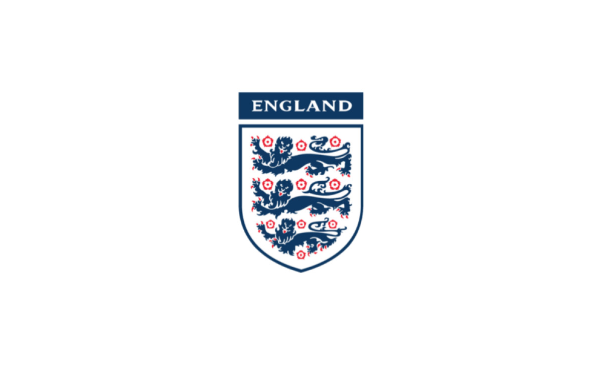
A dark blue replaced the sky blue across the lions, and the swap gave the whole crest a stronger, more confident feel. The "ENGLAND" inscription moved from beneath the shield to above it, set on a wide rectangular band in the same dark blue.
Lifting the wordmark onto its own colored bar made it part of the badge rather than something tacked on at the bottom.
The change was small in heraldic terms and large in visual terms, the kind of measured refinement that has defined the crest far more than any redraw.
For a study in how brands adjust without breaking, it sits alongside the best logo redesigns that update a mark while protecting its core.
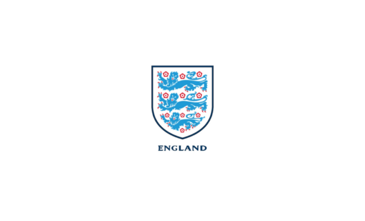
2003 – 2009: A Lighter, Simpler Mark
The FA introduced a lighter shade of blue and simplified the whole crest.
The lions were drawn with less detail, the font dropped its serifs in favor of bolder, larger letters set with tighter spacing, and even the roses took on a different look.
This was the badge moving with the times. Flatter, cleaner shapes suited the early 2000s, and stripping the serifs gave the wordmark a more modern read.
The simplification trimmed ornament rather than meaning, a discipline that skilled logo designers tend to respect when they work on marks that carry real history.
2009 – 2012: Losing the Bar
The single notable change in 2009 was the removal of the horizontal bar carrying the word "England." Every other element stayed where it was, untouched.
Taking the wordmark away returned the focus to the shield itself, the part of the badge that had never really changed.
It was a quiet edit, and quiet edits are the through line of this crest. The FA kept asking what it could remove rather than what it could add.
2012 – 2013: The Red-and-White Year
For a short stretch the FA used a red-and-white palette. White carried the background and the outlines, while the lions, the flowers and the shield border all turned red.
It was the boldest color experiment in the badge's modern run, and it made the crest look strong and direct.
The change was tonal rather than structural, since the three lions held their familiar stacked arrangement throughout. The experiment was brief, and the crest soon returned to its heraldic blue.
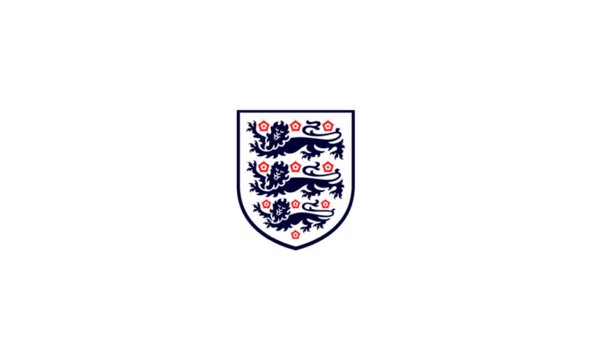
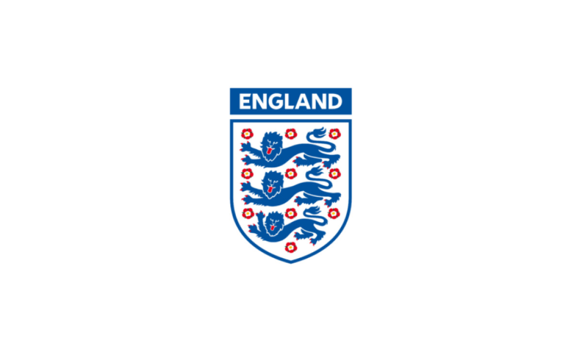
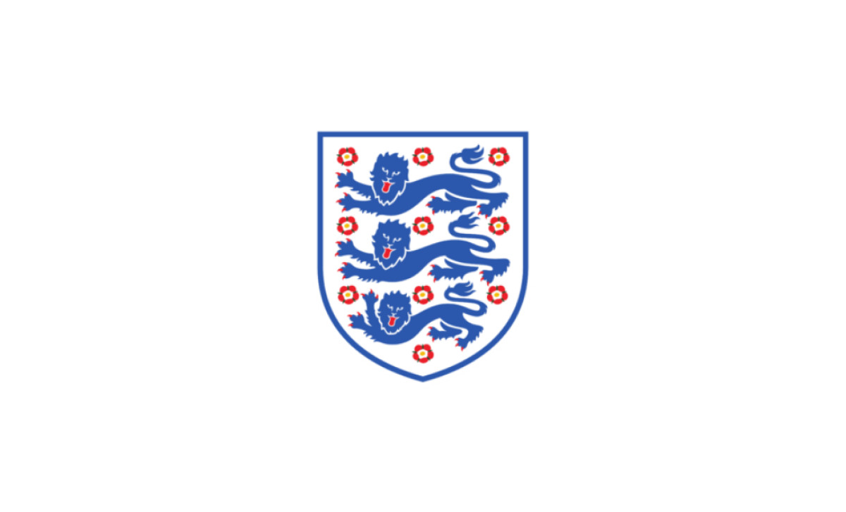
2013 – Today: The Heraldic Crest Restored
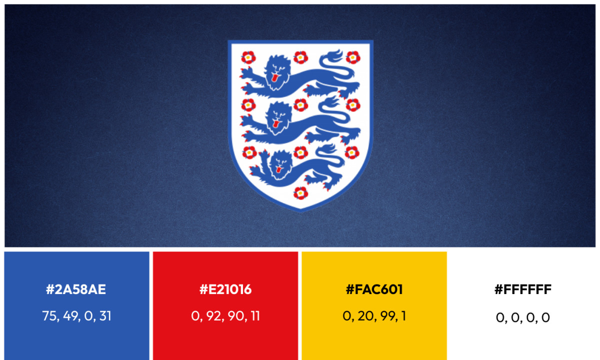
The current England National Football Team logo features a white crest with three blue lions passant guardant, placed one above another and surrounded by ten red and white Tudor roses.
The blue, white and red palette reads as a classic heraldic tricolor standing for freedom, loyalty and courage, and the Tudor roses again recall the reconciliation of York and Lancaster.
This version is the clearest statement of the whole project. The FA did not chase a trend or hire a consultancy to reinvent the mark.
It returned to the heraldic source and rendered it cleanly, which is why the badge you see on England shirts in 2026 would be instantly legible to a supporter from a century ago. The 2026 home kit even places a gold star above the crest, marking the 1966 World Cup win, the team's only one to date.
What Is in the England National Football Team Logo Today
Good logo design makes every element earn its place. The England crest passes that test because the symbol it draws on was settled centuries before the FA ever put it on a shirt.
Here is what the crest is built from:
- Three lions: three blue lions passant guardant, stacked one above the other and walking with heads turned to face the viewer, taken from the historic royal arms of England. The heraldic blazon reads "Gules, three lions passant guardant in pale Or."
- Tudor roses: ten red and white roses set around the lions, marking the union of the houses of York and Lancaster after the Wars of the Roses.
- Shield: a white shield that holds the lions and roses, the form the FA has kept since its 1949 grant of arms.
- Primary palette: Blue (Hex: #2A58AE | CMYK: 75, 49, 0, 31) and White (Hex: #FFFFFF | CMYK: 0, 0, 0, 0) carry the lions and the shield.
- Accent colors: Red (Hex: #E21016 | CMYK: 0, 92, 90, 11) fills the rose centers and the lions' tongues, while Gold (Hex: #FAC601 | CMYK: 0, 20, 99, 1) marks the championship star above the crest.
- Discipline: the FA does not redraw the lions or rework the shield from one cycle to the next. Seven versions since the 19th century hold the same structure, and that restraint is a large part of why the badge still reads as authoritative.
England National Football Team Logo: An Inheritance, Not a Design
The England crest is the rare football badge that predates football. Its lions trace to the second great seal of Richard I in 1198, nearly seven centuries before the Football Association formed in 1863 and adopted them.
That is the distinction worth holding onto: at the 2026 World Cup, every rival badge is a designed object, while England's is a symbol the federation was permitted to carry.
Read that way, the crest's extraordinary stability stops looking like caution and starts looking like fidelity. Seven recognizable versions since the 19th century, all built on the same stacked lions, add up to a federation that understood it did not own the symbol so much as steward it.
For designers studying sports and leisure logos, the lesson is simple and stubborn: when a mark already carries 800 years of meaning, the smartest move is usually to leave it alone.

Looking to apply the same approach to your growing market? We can connect you with the right creative partners.
Browse our Agency Directory to find the most capable agency that can help elevate your brand:
And if you’re curious for more inspiration, don’t miss our other features on standout logo designs in sports.