Standout Features:
- Symbolic, modular logomark
- Modern, rounded sans-serif wordmark
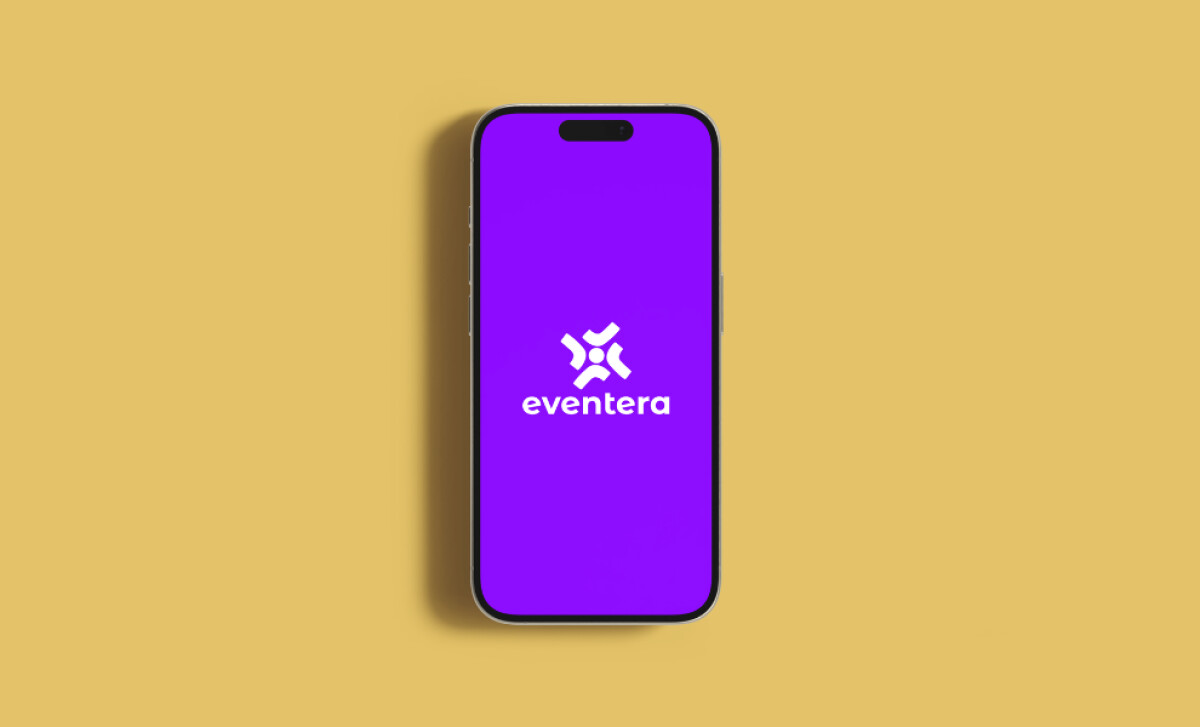
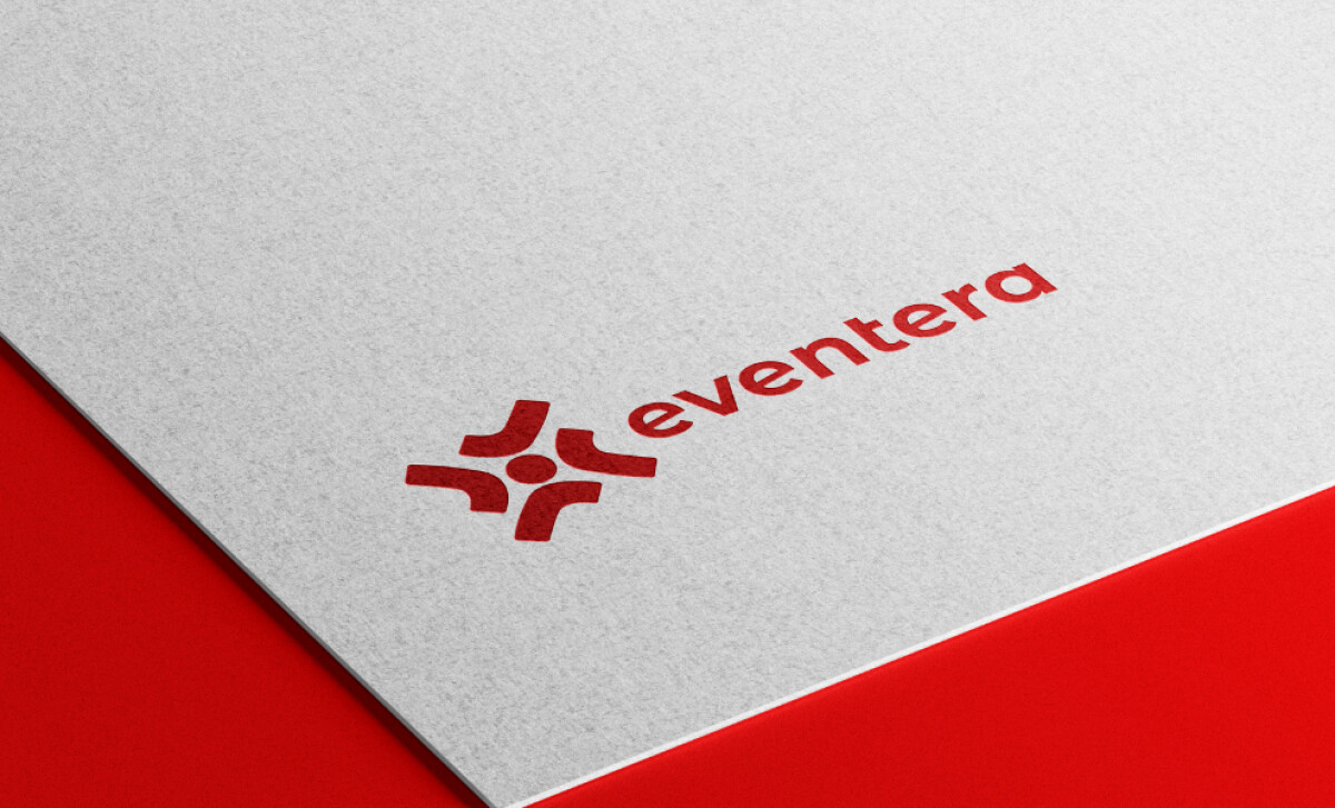
- Flexible single-color variants
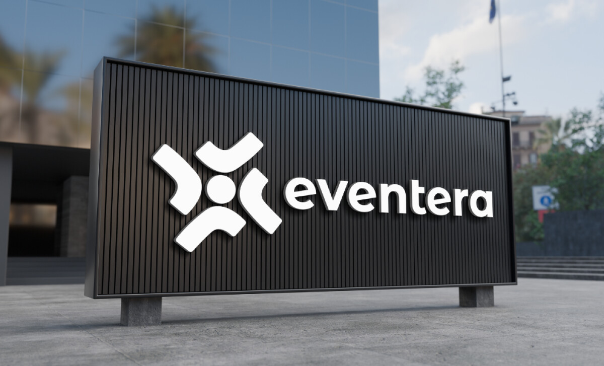
The Eventera logo is a confident and smartly engineered system. It feels both agile and grounded in purpose. It’s a great case study in how to design a modern brand that works everywhere, from an app icon to large-scale event signage.
The icon logomark immediately reads as being "in motion." The rotational design suggests energy and connectivity, which are core emotions for the events industry. Its roundedness also gives the brand a touch of warmth and accessibility that is very appealing.
The choice of a lowercase sans-serif is significant. It softens the brand's voice and makes it feel more inclusive. The typography is clear and legible, which is essential for a name that needs to be easily recognizable in any context.
Additionally, the use of a sans-serif aligns the logo with a dominant global trend, as it is currently the most popular font style for major brands (Custom Neon, 2025).
This flexibility is key for a modern brand. Using a single-color mark allows for easy application on any background without losing consistency. This future-proofs the brand for wide use, from digital app screens to printed materials like business cards.
Miella Studio's identity for Eventera is a smart system that feels both agile and purposeful. The key lesson here is that a modern logo must be a flexible system, not just a static image. This design is built for engagement in any environment.
Your logo should be designed as a flexible system, one that works clearly and consistently everywhere your brand appears.
That’s why brands need partners who blend design expertise with business insight.
Visit our Agency Directory for the Top Logo Design Companies, as well as:
Our design experts also recognize the most innovative design projects across the globe. Visit our Awards section to see the best & latest in logo design.


