Arsenal FC Logo Evolution: Key Points
- Simplification Drove Scalability: Stripping out heraldic clutter gave Arsenal a crest that holds up across kits, app icons, and stadium signage. That kind of clarity is now table stakes in a licensed sports merchandise market projected to hit $59.38 billion by 2033.
- In-House Execution Beat Trend-Chasing: Led from within the club, the 2002 redesign welded brand governance to historical sensitivity, producing a system that performs commercially while still feeling unmistakably Arsenal.
- Heritage Was Reimagined, Not Erased: The path from Victorian tri-cannon emblems to geometric monograms to today's flat vector shield is a case study in how thoughtful design adaptation can preserve emotional weight while opening up commercial flexibility.
For nearly thirty years, a trader named Matthew Reed sold unofficial Arsenal scarves from a stall a few feet from Highbury's gates. Fans loved him. Arsenal sued him.
The fight ran all the way to the European Court of Justice, rewrote UK trademark law, and quietly shaped one of the most consequential branding decisions in modern football. That decision was Arsenal's 2002 crest redesign, and it is the reason this story is more interesting than most.
Across roughly 24 iterations spanning 120 years, the club has moved from Woolwich-era munitions cannons and Victorian monograms to a vector-perfect, legally enforceable badge that holds its line on a stadium banner and a smartwatch.
The Arsenal crest is not the prettiest in football. It is the most strategic one, and that is where this story lives.
The Modern Arsenal Crest: Trademark Precision and Visual Consistency
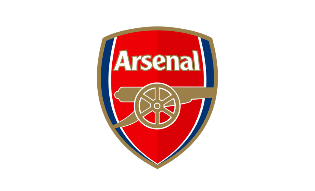
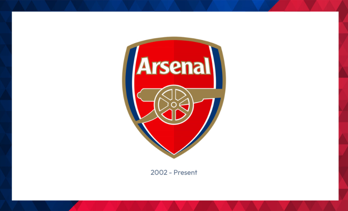
Arsenal's current crest, unveiled in 2002, was a deliberate hand-off from tradition to trademark.
The redesign answered a growing commercial problem. Ornate heraldic badges couldn't pass the modern brand-system stress tests of global IP enforcement and multi-platform reproduction.
A shield dense with ermine patterns and miniature civic crests might look stately on a 1950s matchday programme, but it doesn't render cleanly at 48 pixels wide on a smartwatch.
Discover how today’s most powerful logo redesigns balance heritage and scalability.
The crest centers on a forward-facing gold cannon, signalling momentum. It rests inside a streamlined red shield trimmed in navy and gold, with a custom sans-serif "Arsenal" wordmark above.
The typography was developed specifically so the badge could hold its line across stitched kits, broadcast supers, and smartphone screens.
This is what modern brand governance looks like in practice: clarity, scalability, consistency, and a vector-based design system built to live on every surface a football club now touches.
Business Impact:Post-redesign, Arsenal scaled its commercial licensing footprint globally, sitting alongside clubs like Juventus, Manchester City, and Inter Milan in the wave of legacy clubs that rewrote their visual identities for the digital-first fan economy.
According to the Deloitte Football Money League 2025, Arsenal generated €821.7 million in 2024/25, a 15% year-on-year jump, with commercial revenue of €314 million doing much of the heavy lifting. The crest, in business terms, became less a badge and more a balance-sheet asset.
Arsenal Logo History
1904 – 1930: Cannon Emblems
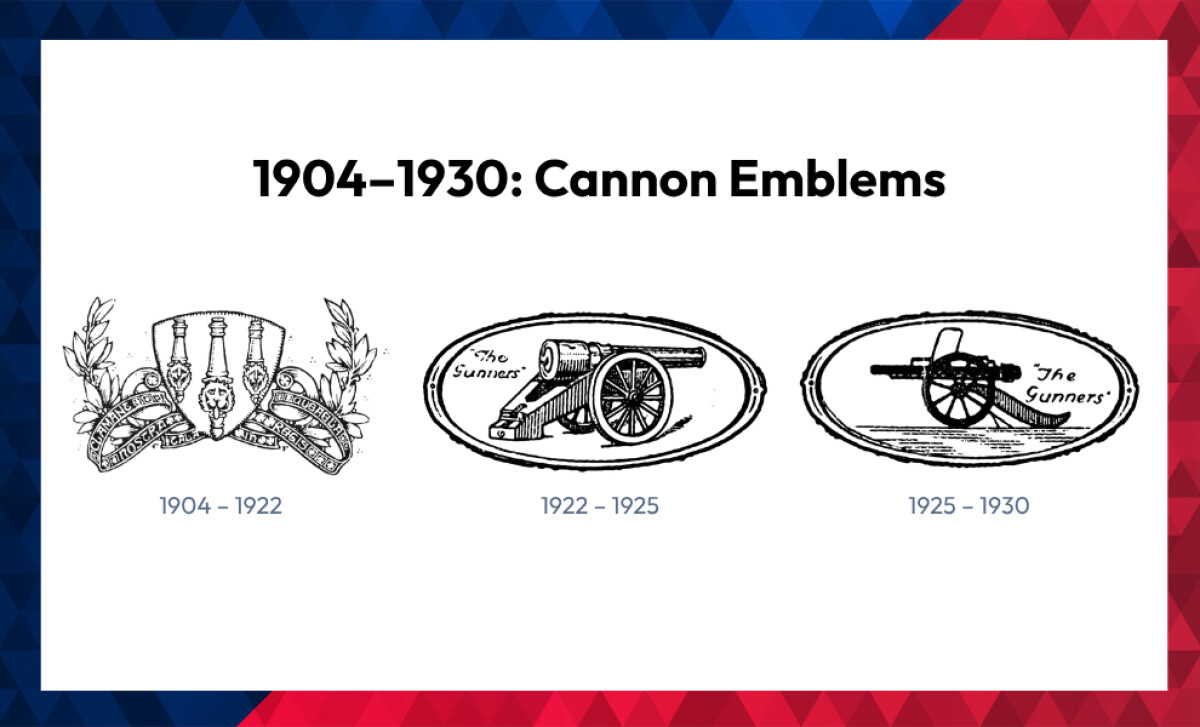
Arsenal's earliest marks orbited the cannon, a direct nod to the club's origins in the Royal Arsenal munitions works at Woolwich, as documented in Arsenal's own crest history.
- 1904–1922: Ornate Tri-Cannon Emblem. A detailed composition of three upward-pointing cannons, laurel wreaths, and flowing ribbons. Arsenal's own historical record traces this design directly to the 1901 Metropolitan Borough of Woolwich coat of arms, civic heritage borrowed wholesale and dressed up for football.
- 1922–1925: Oval Cannon with "The Gunners." A tighter composition: a single east-facing cannon framed in an oval, with the now-iconic nickname stamped across it. This was the moment "Gunners" formally entered the club's visual vocabulary.
- 1925–1930: Simplified Oval Cannon. A subtle but telling shift: the cannon now points west, with cleaner contours for easier reproduction. That directional flip would echo through future designs.
Up your emblem game. Check out standout designs that blend tradition with impact.
1927–1936: Monogram Experiments
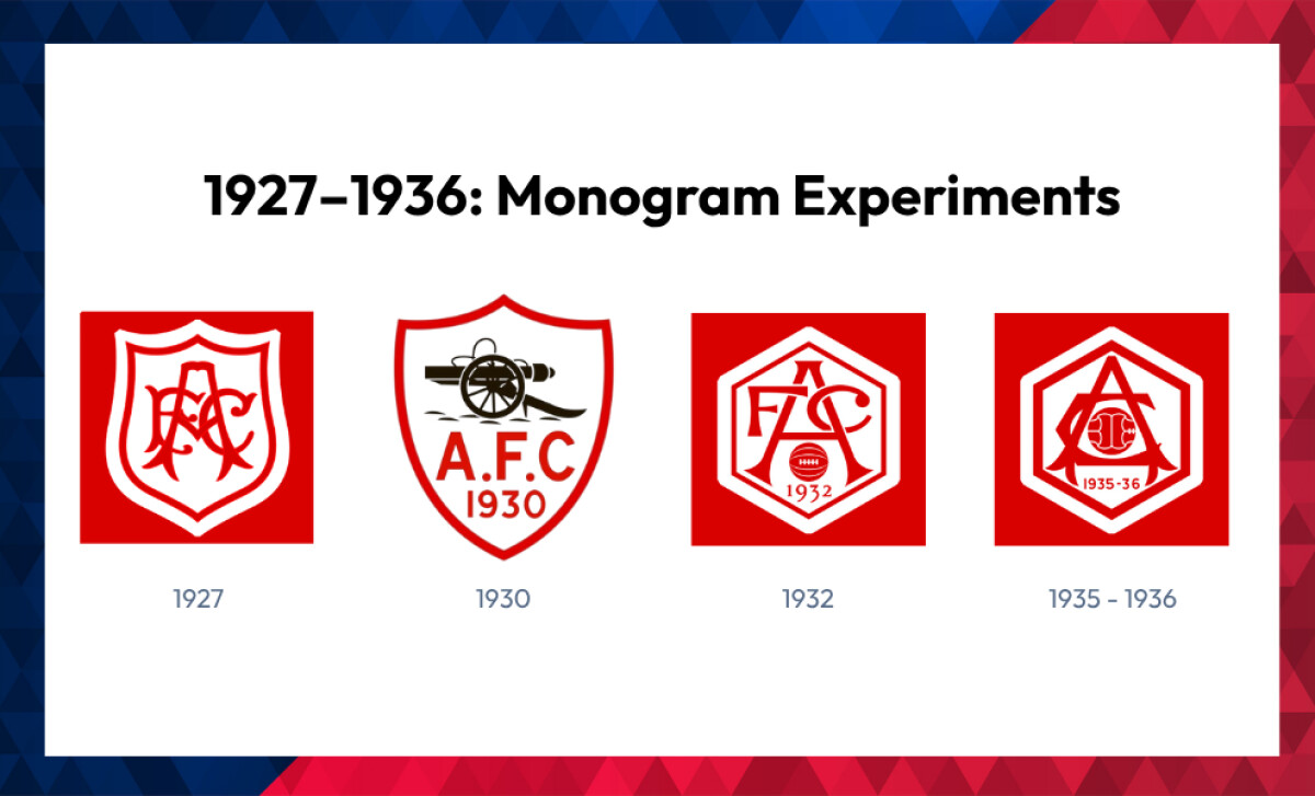
The interwar years were Arsenal's typographic period, when the club experimented with badge structures that mirrored the emerging visual language of Art Deco and early modernism.
- 1927: AFC Interlocking Monogram. An ornate red-and-white crest featuring intertwined "AFC" initials in a semi-serif script. Though unofficial, it hinted at growing interest in type-driven identity.
- 1930: A.F.C. Cannon Badge. A return to the cannon, now framed inside a red shield with "A.F.C. 1930" added. It served as a structural preview of future shield-based formats.
- 1932: Hexagonal AFC Monogram. A bold "FAC" lettering and a centered football inside a hexagonal frame, echoing the geometric rationalism creeping into corporate identity design at the time.
- 1935–1936: Refined Hexagonal Crest. A polished version of the 1932 mark with a more prominent football and tightened monogram styling. It appeared selectively on club materials.
For more inspiration, explore top-tier monogram logo designs.
Note: Arsenal reused its 1935 hexagonal monogram in both the 1949–50 and 1951–52 seasons, modifying only the datemark at the base. The red-and-white palette and central football motif stayed intact, an early example of disciplined brand consistency.
1949 – 1990: The Heraldic Crest Era
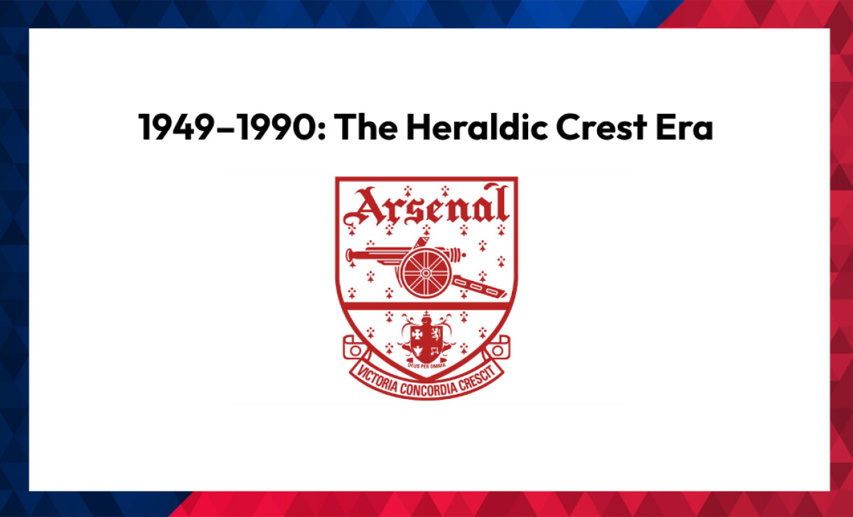
Arsenal's first officially recognized crest, unveiled in 1949, marked the club's most consequential identity decision before the 2002 reset.
The design was densely symbolic: a left-facing cannon, a red field overlaid with a white ermine pattern (a flourish traditionally reserved for nobility), the club's name set in Gothic type above, and a miniature Islington coat of arms below. Across a scroll ran the Latin motto Victoria Concordia Crescit, meaning "Victory Through Harmony."
This crest anchored Arsenal's identity for over forty years. It established the visual grammar that every subsequent redesign would either honour or selectively dismantle.
1967–1979: Cannon Revival
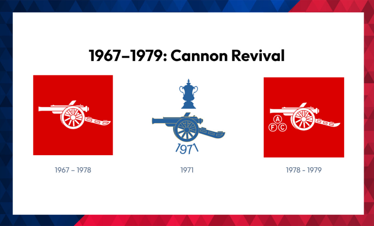
As football moved into the broadcast era and merchandising began to scale, the heraldic crest started straining under new demands. Embroidery machines, low-resolution television feeds, and retail packaging all preferred a simpler mark.
So Arsenal kept the heraldic crest for ceremonial and corporate use but introduced a parallel cannon badge for kits, screens, and product.
It's a textbook early example of what designers would later call a responsive identity system: one core brand expressed at different levels of fidelity depending on context.
The 1967–1978 version, a white cannon on solid red, was Arsenal's first truly kit-specific crest. In 1971, a special blue cannon edition celebrated the club's league-and-FA-Cup double, with "1971" set above.
By 1978–1979, the cannon returned in red, with "A," "F," and "C" subtly orbiting the wheel.
1990 – 2001: Modern Heritage Crest
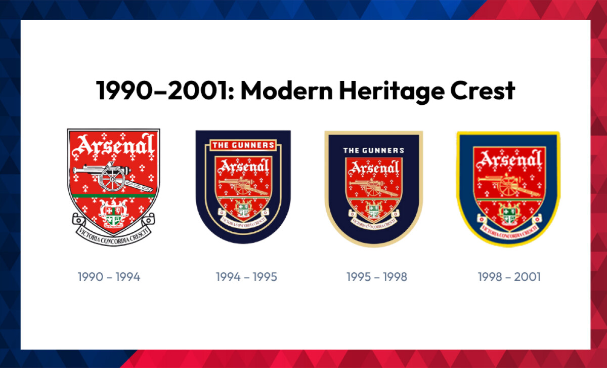
As football's commercial reach went genuinely global, Arsenal began updating its heraldic crest for merchandising, licensing, and broadcast clarity.
The bones of 1949 stayed in place (shield, cannon, motto, Gothic wordmark) but every element was sharpened for reproduction across kits, products, and international TV.
- 1990–1994: Crisper linework, a more saturated red ground, and cleaner renderings of the Islington coat of arms.
- 1994–1995: A navy-blue rounded shield with a bold "THE GUNNERS" banner across the top, the most fan-facing variation in club history.
- 1995–1998: Tightened symmetry and refined gold accents.
- 1998–2001: Further simplification, with flatter detail and polished outer contours.
Design Insight: This is the same arc that swept through global brand identity in the late 1990s and early 2000s. Nike, Apple, and Burberry all moved toward flatter, more reproducible marks.
McKinsey's research on the business value of design found that design-mature companies outperform their industry peers by roughly two-to-one on revenue growth. Arsenal's incremental simplification wasn't trend-chasing; it was the football equivalent of the same playbook.
2001–2002: Gold Gothic Crest
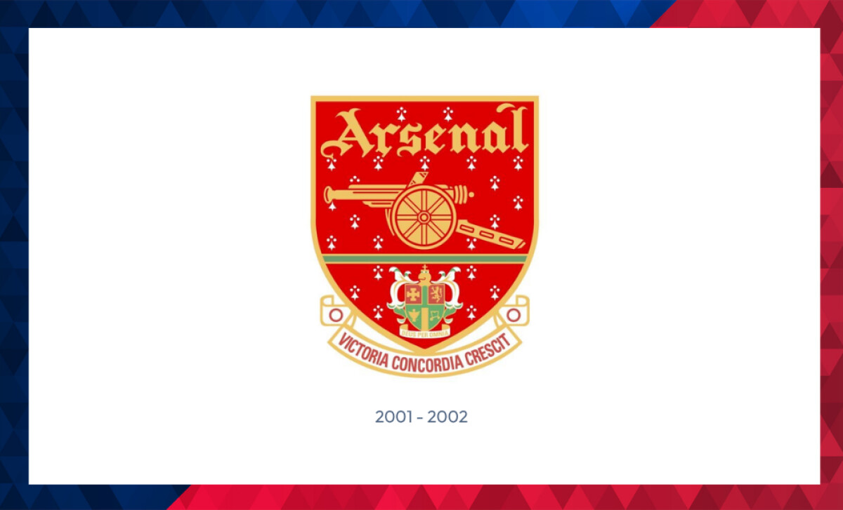
In 2001, Arsenal released a final modernized flourish on the 1949 design, a transitional crest that softened the landing before the full break.
Every legacy element stayed: cannon, Gothic wordmark, motto, Islington arms.
But the palette shifted dramatically to gold across all major elements, the cannon and inner details were enlarged for prominence, and the motto was re-set in bold sans-serif capitals on a gold-trimmed ribbon.
It was a small but telling typographic farewell to the script-style scrolls of the past.
This crest balanced reverence for tradition with forward-looking design intent. It was the visual handshake between two eras.
2002 – Now: The Modern Arsenal Crest – A Strategic Branding Pivot
"The new crest has been selected as it delivers the values of Arsenal in a clear and unique way." - Peter Hill-Wood, Arsenal Chairman
The 2002 overhaul wasn't a refresh. It was a foundational business decision dressed up as a design project.
The trigger was real-world legal pressure. Between 1999 and 2003, Arsenal was locked in a landmark trademark dispute with souvenir trader Matthew Reed, who had been selling unofficial Arsenal merchandise from stalls near Highbury for nearly three decades. The case, formally Arsenal Football Club plc v Reed, Case C-206/01, went to the European Court of Justice. The court ruled in November 2002 that even merchandise sold as a "badge of support" could infringe a club's registered trademark if it threatened the mark's role as a guarantee of origin. The English Court of Appeal upheld that principle in May 2003, reversing an earlier High Court decision and effectively establishing modern merchandising rights for sports clubs in the UK.
Against that backdrop, and with UK design registration broadening to cover graphic marks, Design Week reported in 2002 that Arsenal moved to simplify the badge into a form that could be more easily registered, enforced, and reproduced.
"...it retains the traditional features such as the cannon and the shield, which are synonymous with Arsenal Football Club...this change is an evolution, not a revolution." - Peter Hill-Wood, Arsenal Chairman
Brand Evolution by Roland Tiffany
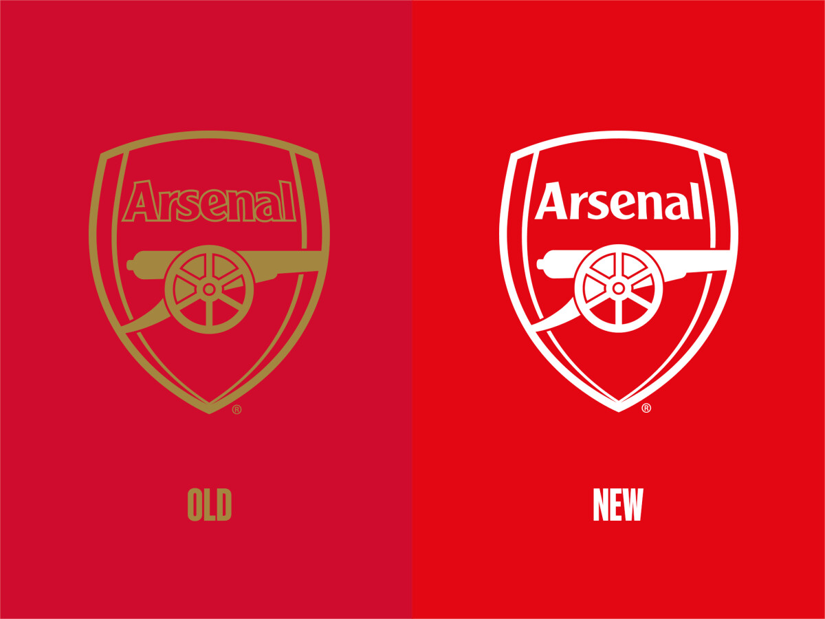
The work was led internally by senior creative Roland Tiffany, who reinterpreted the historic cannon as a forward-facing gold emblem, standardized a sleek red shield, and developed a custom sans-serif wordmark built for legibility from stadium-scale signage down to app icons.
This wasn't a logo project. It was the consolidation of Arsenal's visual assets into a cohesive identity system built for maximum legal protection, multi-platform consistency, and global durability.
In 2022, Arsenal and Adidas continued the refinement. The previously outlined wordmark was filled in, sharpening legibility at smaller sizes, and the system gained colour versatility so the badge could shift to fit different kit materials. These were vector-system tweaks: small adjustments that pay back as scale compounds.
Strategic Design Outcomes
- Trademark-ready iconography: The simplified cannon and optimized shield improved reproducibility and registration across jurisdictions.
- Global consistency: A standardized brand consistency framework kept the crest uniform across digital, broadcast, retail, and physical applications.
- Commercial utility: The streamlined crest cleared the way for international licensing, co-branding, and partnership deals at scale.
In business terms, the redesign converted the crest from a heritage symbol into an exportable, enforceable asset. That positioning set Arsenal up for the 21st-century fan economy that was about to arrive.
How Arsenal Compares: Crest Simplification Across Top Clubs
Arsenal didn't simplify in a vacuum. It was an early mover in a wave that reshaped how legacy clubs handle their visual identities.
- Juventus (2017): Interbrand-led redesign that replaced the oval crest with a stylized "J," easily the most radical simplification in modern football branding, and proof that the digital-first logic Arsenal pioneered in 2002 had become a category playbook by 2017.
- Chelsea (2005): Returned to the heraldic Cadogan lion in a cleaner circular badge for the club's centenary, a more conservative version of the same heritage-meets-clarity balancing act.
- Manchester United: Took the opposite route, keeping its existing 1998 crest largely untouched while quietly removing "Football Club" to maximize commercial flexibility.
- Manchester City (2016): A return-to-heritage circular crest in the Arsenal-via-Bayern mould, reconnecting to the pre-1997 mark for the digital era.
- Inter Milan (2021): A minimalist "IM" monogram alongside the legacy crest, openly designed for social-first consumption.
The common thread isn't a single aesthetic. It's a shared recognition that football crests now need to perform as brand systems, not just heritage symbols.
Design Lessons From Arsenal's Crest Evolution
Arsenal's evolution condenses neatly into principles any brand, sports or otherwise, can apply.
- Simplification serves scalability, not just style. Every element of the 2002 crest earns its place across the full reproduction range, from stitched kit badges to favicons. If a design detail doesn't survive shrinking to 32 pixels, it isn't a feature; it's friction.
- Preserve heritage elements selectively, not wholesale. Arsenal kept the cannon and the shield, its two strongest equity carriers, and let the rest go. Heritage isn't a checklist; it's an editorial choice.
- Let legal protection inform design decisions. A logo that can't be registered or enforced is a commercial liability. The Arsenal v Reed case showed why distinctive, trademark-ready iconography is now a board-level concern, not a footnote.
- Build a system, not a single mark. The 2002 work delivered a full vector-based design system: a primary crest, a kit-ready cannon, a custom wordmark, and consistent applications. That's the difference between a logo and an identity.
- In-house execution rewards heritage brands. Arsenal's internal team understood which sentimental elements were load-bearing and which were ornamental. Outside agencies can move faster on aesthetics, but inside teams move smarter on meaning.
- Design for responsive contexts before they exist. The 2002 system was built before smartwatches, push notifications, or short-form social video, and it still works in all of them. That's a planning horizon worth borrowing.
The Wrap Up: From Heritage to Trademark Powerhouse
Arsenal’s logo evolution was never just about aesthetics. It was about protecting commercial assets, scaling brand consistency, and staying competitive in a global market.
From military-inspired emblems to streamlined vector formats, each redesign responded to new demands in technology, licensing, and fan engagement.
By 2002, Arsenal’s shift to a simplified and legally sound identity turned the crest into a business tool.
This move reflected a broader shift across professional sports toward clear trademarks, consistent applications across media, and brand systems that could support long-term revenue growth.
Financial Context: The global market for licensed sports merchandise is projected to reach $49.02 billion by 2034.
Arsenal’s rebrand positioned the club to participate fully in that economy, supported by strong brand governance and design systems built for scale.
Final Notes:
- Design With Purpose, Not Trend: Arsenal replaced decorative complexity with clear, functional visuals. The logo now performs across retail, mobile, broadcast, and digital platforms without compromise.
- In-House Execution Sets the Standard: The internal design team understood the club’s heritage and future needs. That insight produced a result that was structurally sound, visually consistent, and commercially flexible.
- Trademark-Ready Design is a Strategic Requirement: The simplified crest cleared legal hurdles that older badges could not. It now supports licensing deals across global territories and reinforces brand ownership across every touchpoint.
A successful crest isn’t just familiar or historic. It works under pressure. Arsenal’s redesign proved that clear, enforceable, and reproducible design is a growth asset, not a cosmetic decision.
Arsenal’s evolution shows how strategic design fuels long-term brand equity.
That’s why clubs and legacy brands alike need design partners who understand both heritage and commercial growth.
Looking to modernize your brand with precision?
Our team ranks agencies worldwide to help you find the right partner. Visit our Agency Directory for top firms in:
- Top Brand Positioning Agencies
- Top Creative Agencies
- Top Sports Marketing Agencies
- Top Graphic Design Companies
You can also explore our Awards section to see award-winning and iconic sports logos.


-preview.jpg)