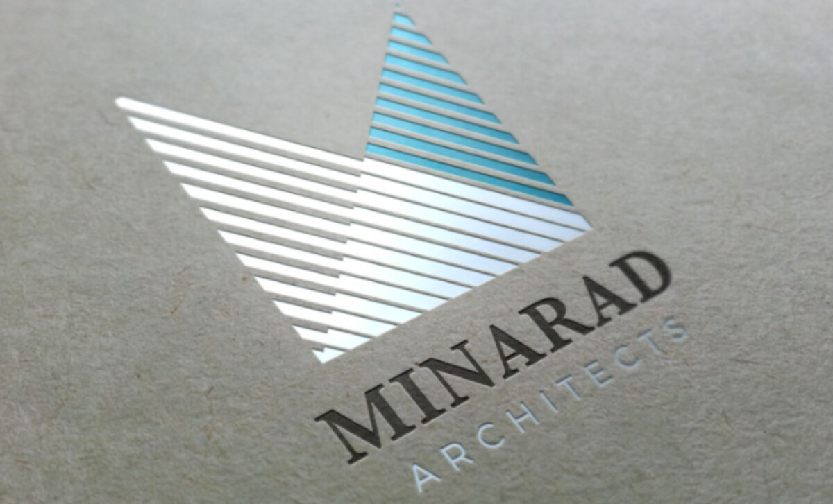
Standout Features:
- Modern, geometric emblem
- Clean and refined typography
- Balanced color palette
Minarad Architects, a cutting-edge architectural firm based in Dubai, prides itself on its commitment to precision, creativity, and innovative design. Their logo, crafted by Damir Matas, reflects these core values by seamlessly blending sophisticated elements of typography and geometric design.
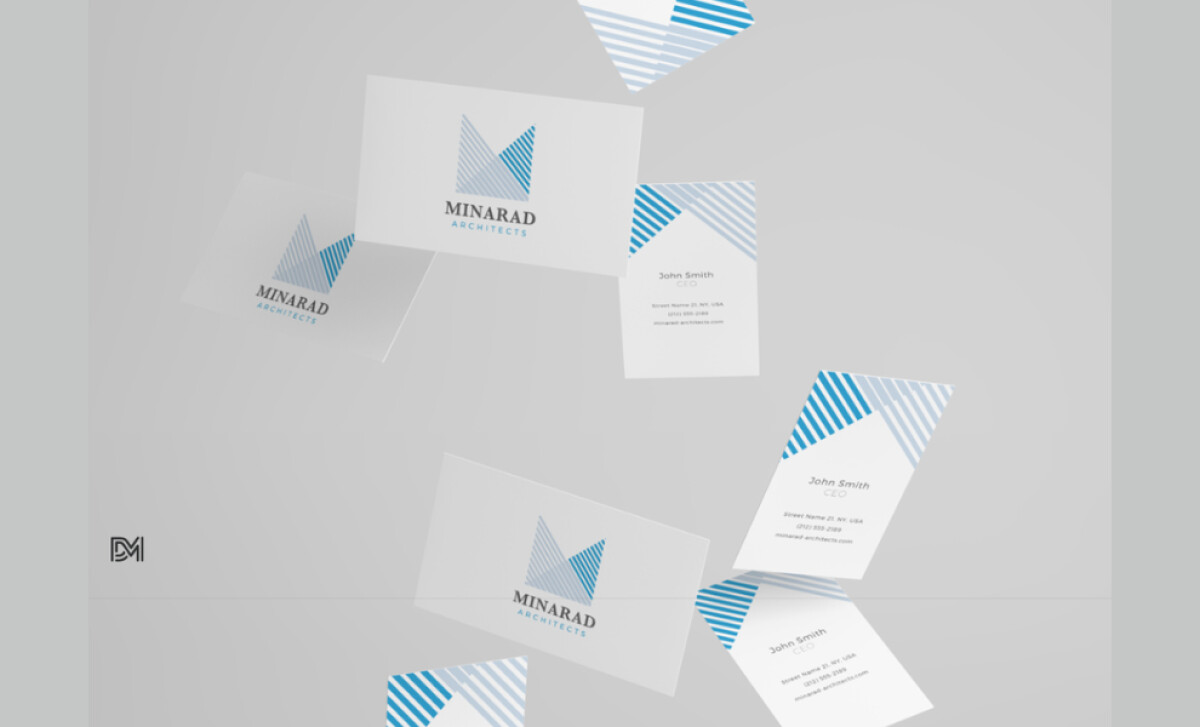
The standout feature of the Minarad Architects logo is its geometric, triangular emblem. The sharp lines and angular shapes represent the precision and structural integrity that define the company’s architectural work. The triangle, often associated with stability and balance in design, is a perfect metaphor for Minarad’s approach to creating sturdy, innovative buildings.
The typography used in the Minarad Architects logo is clean, modern, and refined. The sans-serif font gives the logo a sleek and professional feel, aligning perfectly with the company’s forward-thinking image. The letter spacing is consistent, which adds a sense of balance and stability — fitting for a company that constructs solid, enduring structures.
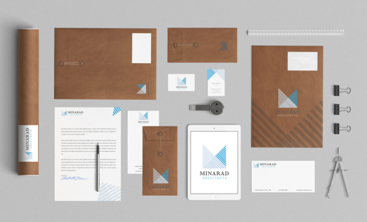
The logo’s blue symbolizes trust, professionalism, and precision, essential traits for any architect or designer. It also suggests innovation and reliability, qualities that Minarad Architects prioritizes in their projects. The white adds a sense of clarity and purity, reflecting the company’s commitment to clean, straightforward design.
This design exemplifies how a strong visual identity can accurately represent a company’s values and make a lasting impact in a competitive industry. If you're looking for one of the best professional services logo design, Minarad Architects' branding serves as an excellent example of how to combine creativity and professionalism memorably.