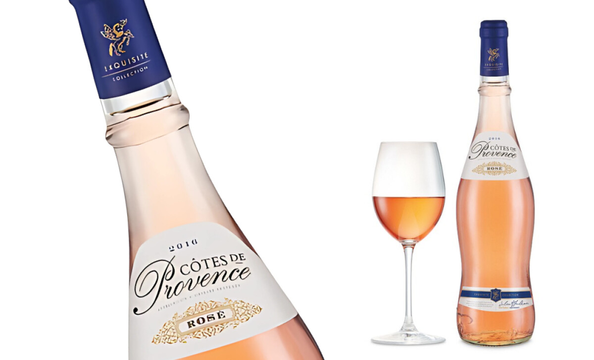
Standout Features:
- Pedestal-style glass bottle design
- Gold-ringed floral logo
- Roman-inspired typography
While its celebrity founders might attract the headlines, it’s the Miraval Rosé logo design that does the heavy lifting when it comes to visual identity. Created to reflect the wine’s lightness and sophistication, the logo balances elegance, symbolism, and heritage — all while letting the product itself shine. The logo is positioned atop the raised bottom of the bottle, visually resting like a pearl on a pedestal. This smart spatial placement gives the design a floating, jewel-like presence without crowding the bottle’s minimal presentation. It’s an example of how spatial design and branding can work together to create high-impact shelf presence without relying on loud graphics.
At the core of the logo is a delicate floral motif forming a near-complete circle, a visual metaphor for refinement and harmony. This wreath-like structure surrounds the central brand name, symbolizing the wine’s light and floral essence. The surrounding gold accents add a premium touch while reinforcing the brand’s elegant persona.
The typography in the Miraval logo design is equally thoughtful. “MIRAVAL” appears in all-caps, Roman-inspired serif type — solid, classic, and rooted in tradition. Just below, “PROVENCE” is set in a contrasting sans-serif, soft orange font, offering a modern counterpoint to the timeless form above it.
The Miraval Rosé logo design exemplifies how minimalist luxury can be communicated through thoughtful symbolism and typography. Its subtle details, paired with clever placement and restrained elegance, show how a logo can elevate a brand without ever needing to compete with the product it represents.