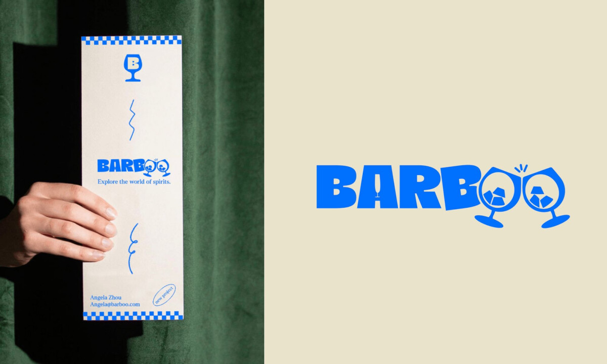
Barboo seeks to shift the narrative around alcohol by focusing on the cultural discovery of unique brands and flavors. Created by Anouchka d'Oreye, the direction utilizes a custom, heavy typeface that integrates hidden details like a champagne glass within the letterform.
These typographic elements are paired with whimsical illustrations and a vibrant checkered pattern to establish a playful, vintage aesthetic. The final work balances this experimental character with a professional execution to foster a sense of trust and discovery.
Anouchka d'Oreye is a graphic designer in Brussels, Belgium, who integrates painting and photography into her creative practice.
Her process follows a structured four-step framework of research and iterative sketching to deliver distinct visual solutions. She focuses on working closely with clients to ensure every project balances clear strategic goals with a passionate, hand-crafted aesthetic.