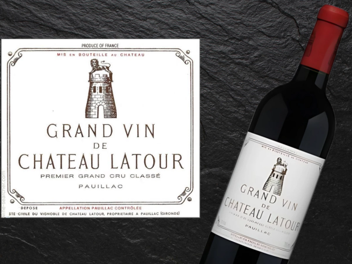
Standout Features:
- Historical tower emblem
- Minimalist layout with white space
- Heritage-style serif typography
For a wine steeped in centuries of heritage, the Chateau Latour logo design proves that legacy doesn’t need embellishment. This legendary Bordeaux producer, active since the 14th century, embraces restraint over flair — allowing a few precise visual elements to carry the full weight of its brand identity.
At the center of the logo is the famed Latour tower, a nod to the estate’s namesake. While the original structure, built around 1620, no longer stands, its image lives on as a brand totem. A lion once associated with the estate crowns the structure, adding a regal yet understated flourish.
What makes the Chateau Latour logo design so effective is its use of white space. The sparse layout directs all focus to the tower icon and the surrounding typography. There’s no excess — just a visual hierarchy that speaks to clarity, order, and confidence.
The typography complements this restraint. The elongated serif font, used in “Grand Vin de Chateau Latour,” draws from vintage French typesetting traditions. Its narrow proportions and careful weight balance echo the precision of old-world craftsmanship, reinforcing the wine’s prestige through subtlety.
The Chateau Latour logo design is not trying to impress; it’s already established. By leaning into history, symbolism, and spatial discipline, it remains one of the most quietly powerful identities in wine branding. This is what happens when a logo becomes a symbol of trust, not just decoration.