Standout Features:
- Clockwork-inspired logo symbol
- Outlined letters
- Interconnected brand name initials
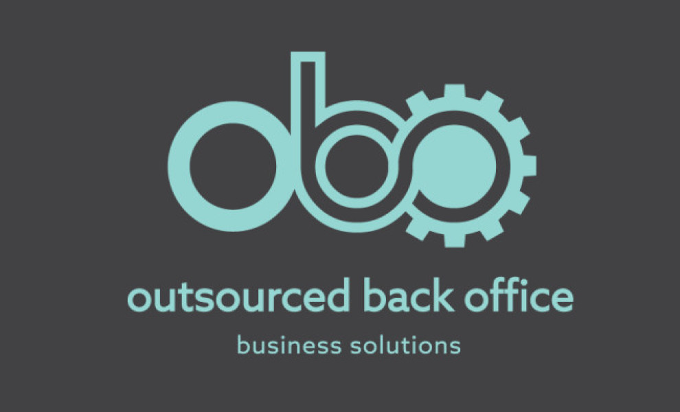
Now that remote work is the new norm, more outsourcing companies are stepping up their branding game. Exhibit A: Outsourced Back Office’s modern and industrial logo designed by digital marketing agency Very Vivid.
Going for a monogram layout was a smart move for this brand because of its long brand name, which can really be challenging for most designers.
The brand name’s three initials take center stage, each bearing a unique visual character. The letter O has a simple spherical shape, the letter B has an outlined figure, and the other letter O looks like a clockwork piece.
Altogether, these connected elements create an attractive image that conveys the brand identity effectively!
The color turquoise is a pleasant surprise in this logo design. Aside from making the whole illustration pop, it also made the brand’s character more approachable and easygoing.