Expedia’s Logo Is A Positive Symbol For Travelers Everywhere
Expedia is a global travel company that connects travelers with the hotels, modes of transportation and experiences they’re hoping to achieve on their next big solo adventure or family vacation.
The name Expedia is instantly recognizable — you hear it, and see it and know you’re going to have an adventure you’ll never forget. And you know the process of planning it will be seamless and serene.
The name itself is extremely intriguing and inspiring, deriving from the words exploration and speed.
This digital destination is known far and wide — it’s a brand that is known for its excellence and prestige. It has been in the business of travel booking for decades and prides itself on its ability to link travel destinations with the adventurers seeking them out.
It’s a modern and sophisticated website that exudes confidence, authority, and authenticity. It’s a trustworthy brand that will fulfill all your wants and needs with a few clicks and a couple quick and easy searches.
But Expedia is a brand that encompasses more than just a handful of travel booking sites. In fact, the Expedia Group consists of over 200 sites in more than 75 countries. These all run in much the same way, allowing travelers the ability to search through hundreds of sites to find the best prices for their travel needs.
And it holds that same integrity. People put their trust and faith into this brand. And it’s worth it.
But Expedia Group has been in the news much more recently, thanks to a refreshing and hip new logo and brand refresh.
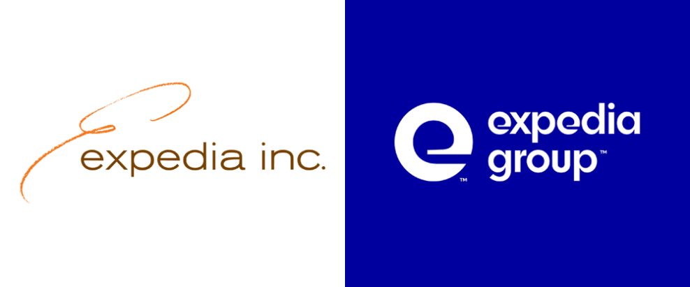
The brand changed its name from Expedia Inc. to Expedia Group, and it’s complimentary logo design certainly stands the test of time.
The previous Expedia logo was a simple, wispy design that lacked depth and weight. A swirly, orange E in a cursive font, and drawn in what looked like a crayon, sat at the beginning of the wordmark. Following this was the sans-serif, lowercase logo in a brown, dirty font.
It was old. It was outdated. It was unoriginal. It had nothing to do with a brand that was created to promote seamless travel, instead of looking like a design for a boring, lifeless brand.
But the new, bright and bold logo and brand identity is the perfect image to stand as a powerful symbol of travel excellence and authority. Expedia is a brand with a history, legacy, and prestige. Their previous logo added nothing to that message, but this new iteration takes the brand to a whole new level.

Expedia’s Creative Logo Design Uses Illustration To Promote Movement
Expedia Group’s dynamic new logo and brand identity usher the brand into the 21st century in a clean and creative way. The brand got a new name, a new logo and a whole new identity that brings the brand full circle, further solidifying its excellence in the industry of travel booking across the world.
The new logo design is made up of a monogram and wordmark. The two flow seamlessly with one another, but at the same time, stand strongly on their own as two separate, distinct and impactful designs.
The monogram is written in a fluid, smooth and curvy way. The “e” is lowercase, and move with ease. The design is a bright, clean white. It promotes movement and a dynamic nature in the different thickness — the inside of the “e” is thinner, and the outside is thicker. And on the website, this “e” swirls in.
This isn’t innately travel-related, but there’s something about the shape — the fluidity matched with the sharp lines — that makes you think travel and flight. And this is the perfect feeling to evoke.
This is matched with an equally fluid and smooth wordmark. It’s written again in a white font — this is bright and clean and focused. It reminds you of the clean airplane air. It also reminds you of the smooth and efficient process of using their websites.
It’s soft, yet to the point. It’s clear, yet fun and creative.
The wordmark typography differs from its previous version. It’s thicker, it’s brighter and it’s generally just better.
The “e” design that makes up the monogram is copied in the wordmark. This creative and innovative font is also seen across branding material, making this logo design a cohesive design symbol that ties the logo together with the brand.
This thick, bright font, paired with a sleek and fluid monogram make up a logo design that promotes movement, flight and urgency. It compels you to act. It urges you to make a decision. It’s a logo that represents a brand that lives and breathes travel, and after looking at the emblem, that’s all you’ll want to do too.
The Expedia Logo’s Soothing Blue Coloring Makes Travelling A Dream
Colors have meaning, they have depth. There’s a psychology to it, and it definitely has an impact on design. Whether we’re talking web and app design, or print and logo design — colors will make your audience think or feel a certain way, even if it’s only subconsciously. Understanding that, and being able to use that knowledge in your designs, can work out wonderfully for you in the long run.
In this design, the two colors used are white and blue. These colors are bright. They are bold. They are in your face and you can’t look away. In a world slowly going more minimal, it’s a refreshing change to see a design play with colors so masterfully, and in such a way that strikes the perfect balance between bombastic and burning.
The color blue is seen a lot in design, and there’s a reason why.
It has an extremely pleasing effect on the mind and body. It lulls people into peacefulness. It takes the edge off. It reduces anxiety and stress. This is a pleasing thing to see, especially for a travel company. Travelling is stressful enough as it is, so this blue subconsciously puts users at ease and lets them know that their service will also eliminate those anxieties.
Another reason blue is used to often is because it evokes a sense of openness. Blue is often used to represent air or water — the color of the sky and ocean. Again, this is a travel company — and people travel by air and by water. This blue represents those mediums by which its users can travel.
Blue is significant and strong and dynamic. It puts people at use but also excites. And its ability to tie in the feeling of travel through its coloring is extremely intuitive and engaging.
Similarly, the bright white color exudes a cleanliness and an airyness that can’t be ignored and further enthuses and sedates.
These colors work together beautifully to push people into using the brand and its sites to book their next trip across the world. They entice and soothe in a pleasing and captivating way that make it impossible to resist.

Expedia’s Memorable Logo Design Is Modern, Sleek And Effective
Expedia Groups’ flirty and fluid logo is a modern symbol that adds depth and a dynamic nature to the world-renowned travel brand, with hundreds of travel sites under its umbrella adding to its authority and domination.
The new logo is extremely different than its previous version, which was old, outdated and off-brand. It had nothing to do with flight or travel, and it stuck out like a sore thumb in comparison to its competition.
The new logo design, however, is bright, creative and fun. It’s a modern and clean logo design that comprises simple design elements that all work together seamlessly to create an image that stands out and inspires travel.
This logo design is made up of a clean wordmark and innovative symbol.
The wordmark diverges from the previous, one reason being the name of the brand has changed. They ditched the inc and in its place attached group to better encompass the long list of brands under its belt.
The Expedia monogram is sleek, sophisticated and suave. The “e” is lowercase and has a movement in its creation. It begins thicker and gets thinner as it swirls in on itself. It’s a white logo design that pops against the bright and exciting blue background. And this similar ‘e’ shape is seen consistently throughout the wordmark.
The new typography is sleek and stunning as a whole. These letters stand in a powerful and creative, lowercase way. The “e” design remains consistent, and this consistency is seen throughout its branding. It’s cohesive and clean, with a bright white coloring that again stands out against the background without seeming to jarring or messy.
Overall, this design is cohesive, clean and creative. It inspires movement in its fluidity and urges users to engage with the brand known for its travel bookings — specifically its flight options.
The Expedia Group logo is a new and fresh take on travel logos, and it seamlessly ushers in a new brand identity to match the innovative and modern new design.


