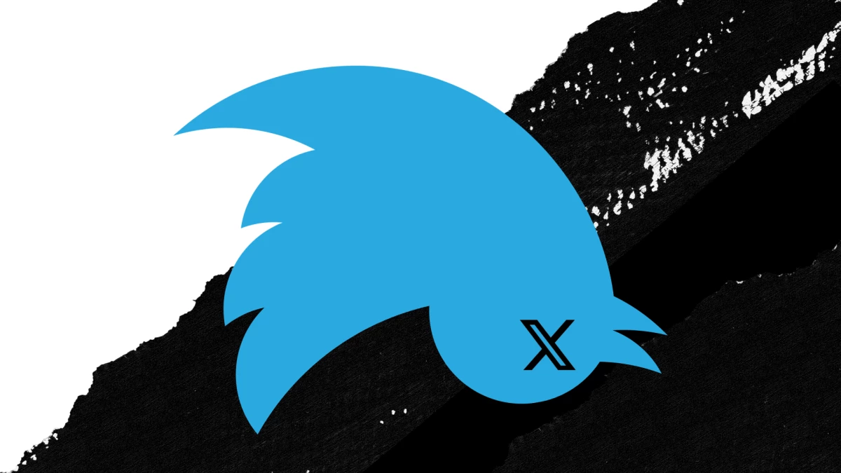
Twitter spent 17 years building one of the most recognized symbols on earth.
In a single weekend in July 2023, it was gone, replaced by a letter anyone could type on a keyboard.
The internet had opinions. But the more interesting question is not why it happened.
It is exactly which design decisions made the damage so total, and so fast.
What The Bird Actually Communicated
A logo is not just a shape. It's a compressed archive of meaning built through thousands of interactions over time.
The Twitter bird, designed by Martin Grasser from 15 overlapping circles built on the golden ratio, was one of the most efficiently constructed meaning-machines in modern brand history.
It communicated freedom of speech, lightness, speed, real-time information, and pointed upward and to the right: forward momentum, optimism, the future.
In Grasser's own words, the geometry was deliberate; the bird needed to "sit next to the most serious news that comes out on Twitter and also some of the silliness or more lighthearted moments."
It worked at every scale, favicon, app icon, billboard, and embossed on conference lanyards. By 2012, Twitter's creative director Doug Bowman put it plainly: "Twitter is the bird, the bird is Twitter."
The wordmark was dropped entirely, a rare confidence move. Only a handful of marks in history operate at that level of pure symbol recognition, needing no text, no tagline, no context to decode.
More importantly, the bird spawned a lexicon. People did not "post on Twitter." They tweeted. They retweeted. There were Twitter threads.
The creation of an internationally recognized verb from a brand name is extraordinarily rare, and it represented billions of dollars of embedded cultural equity — the kind of value that appears on no balance sheet but disappears immediately when you rename the thing.
The X Letterform: A Design Autopsy
Let’s be precise about what the X logo actually is, because the specifics matter.
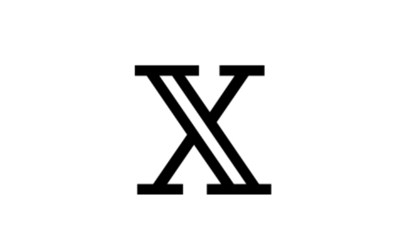
The mark bears an extremely close resemblance to Unicode character U+1D54F — the mathematical double-struck capital X — a form that has existed in mathematical typography for decades.
Whether it was lifted from an existing font or independently arrived at is almost beside the point. In either case, the result is a symbol with no proprietary structure and no claim to visual ownership.
The problem is not that the mark lacks meaning. It’s that it has too much of it, and none of it is ownable. The X is simultaneously a variable, a cross, a mark of selection, a kiss, a prohibition, a category marker. It signifies everything and therefore nothing in particular.
Strong logos resolve this tension. They are either semantically legible (the bird, the swoosh) or formally distinctive enough to accumulate meaning through repetition (the Apple bite, the Woolmark).
The X does neither.
As trademark attorney Douglas Masters put it, the logo “does not have much that is distinctive about it.” That’s not just a legal assessment — it’s the core design failure.
When a mark cannot be uniquely identified, it stops functioning as a logo and becomes something else entirely: ambient typography.
| Distinctiveness | Nearly 900 active U.S. trademarks involve the letter X, including Microsoft (Xbox) and Meta. The mark cannot be meaningfully defended in court. |
| Semantic content | None intrinsic. X connotes deletion, the unknown, cancellation, or danger — none of which are intentional brand values, and all of which operate as subconscious liabilities. |
| Color strategy | Black and white erased Twitter's signature blue overnight — one of the most recognized color-brand associations in tech. The monochromy reads as absence, not boldness. |
| Scalability | The letterform renders adequately at small sizes. That’s one small thing it does well, but a favicon that renders is not a brand strategy. |
| Process | Musk crowd-sourced the design overnight via a public post. A fan-made submission went live by Monday morning. No agency. No design sprint. No testing. |
The Rollout: How To Make A Bad Decision Catastrophically Worse
The X rollout managed to take an already weak design and strip away any remaining goodwill through a sequence of process failures that, viewed together, read as a near-complete checklist of what not to do.
- Jul 22, 2023: Musk posts: "If a good enough X logo is posted tonight, we'll make it go live worldwide tomorrow." A platform with hundreds of millions of users is crowd-sourcing its identity on a Saturday afternoon.
- Jul 23, 2023: Rebrand announced. X.com begins redirecting. The interface starts shifting — incompletely. References to "Twitter" and "tweets" remain throughout the UI for weeks.
- Jul 24, 2023: Bird logo officially replaced. Removal of physical signage from the San Francisco HQ is halted by police — no permits obtained. The building is briefly left reading "er".
- Jul 26, 2023: A thickened version of the X goes live. Musk announces publicly that he does not like it. It is reverted. The brand is being iterated in real time, in public, by the owner's aesthetic preference.
- Sep 2023: The Harris Poll finds the majority of users still call it "Twitter." Two months in, the rebrand has not publicly taken hold.
- May 2024: Domain finally switches from twitter.com to x.com — the technical capstone arriving ten months after the visual rebrand, closing nearly a year of public inconsistency.
This fragmentation is a specific design failure, not just an operational one. A coherent rebrand requires all brand touchpoints to update simultaneously, or at a minimum, according to a staged plan with clear timelines.
Instead, the platform was visually incoherent for days: X on desktop, bird on mobile, half-demolished signage in San Francisco.
Each inconsistency erodes trust. It tells users and the market that the people running this platform don't take the identity seriously enough to execute it properly.
A Logo Change Is Not A Brand Change
This is the most important design distinction that the X rebrand collapses. Changing a logo is a surface event.
Changing a brand requires aligning visual identity, product behavior, language systems, and user experience into a coherent new position.
Twitter had all of these working together. The bird, the color blue, the word "tweet," the verb "to retweet," these formed an interlocking system of meaning that reinforced itself at every touchpoint.
People still say "tweeting" and "Twitter" in everyday conversation, nearly three years after the rebrand. "Post on X" remains awkward to say out loud.
This isn't stubbornness. It's evidence of how deep the original brand had embedded itself into the language.
Twitter owned a verb, and "Google it" took decades to get there while "tweet" happened in years.
Throwing away that linguistic asset, not as part of a considered repositioning but as a weekend decision, is the kind of irreversibility no stronger logo can fix.
What X Got Right (An Honest Accounting)
Intellectual honesty requires acknowledging what the rebrand did achieve.
The X logo scales. At 16×16 pixels, it renders cleanly. The monochrome system has a disciplined severity that, in a different context with a more considered rollout, could read as intentional minimalism rather than loss of identity.
And the strategic vision, an “everything app” expanding into payments, audio, and long-form content, is not inherently incoherent. Platforms have repositioned successfully before.
But scalability is a baseline requirement, not a design achievement. And a coherent strategy executed through weak brand work results in a disconnect.
The X logo does not fail because it is a letter. Letters can be strong marks, from IBM’s monogram to FedEx’s hidden arrow and Louis Vuitton’s interlocking initials.
It fails because it is a generic letter, selected through a rapid crowd-sourced process and applied overnight to a platform whose product had not meaningfully changed.
As Allen Adamson, co-founder of Metaforce, noted at the time, “This is going to go down in history as one of the fastest unwinding of a business and brand ever.”
Our team ranks agencies worldwide to help you discover the best partners for building iconic brand visuals. Visit our Agency Directory for the Top Logo Design Companies as well as:


-preview-webp.webp)
