As a designer who's analyzed hundreds of logo redesigns over my 12-year career, I can tell you this: the Playboy bunny shouldn't work as well as it does.
A rabbit silhouette with a bow tie? On paper, it sounds like a children's cartoon character. In practice, it became one of the most profitable brand marks ever created.
The Playboy Logo: Key Findings
Here's what most people miss: this wasn't about the drawing. It was about strategic clarity.
The logo succeeded because it captured everything Hugh Hefner wanted to communicate about his brand in a single, scalable mark that could work on everything from magazine mastheads to casino chips to fashion collaborations.
Let me walk you through how this happened, and what designers and brand strategists can learn from it.
Origins of Playboy: Building an Empire from $8,000
Source: WikiCommonsHugh Marston Hefner launched Playboy in 1953 from his Chicago kitchen table with $8,000 in startup capital, $1,000 of which, he borrowed from his mother.
At 27, the University of Illinois psychology graduate had just left Esquire after being denied a $5 raise.
His concept: create a sophisticated men's lifestyle magazine celebrating sex without shame, wrapped in journalism, fiction, and cultural commentary.
It would target educated, urban men who wanted more than outdoor adventure magazines.
Originally called "Stag Party," Hefner changed the name after a trademark threat.
After brainstorming with wife Millie and partner Eldon Sellers, they chose "Playboy" — suggesting charm, sophistication, and aspirational lifestyle over just sexual content.
The First Playboy Issue
Source: BBCThe first issue (December 1953, printed without a date since Hefner doubted there'd be a second) featured Marilyn Monroe nudes purchased from a calendar shoot. It sold over 50,000 copies; astronomical for a debut with zero marketing budget.
By 1960, Playboy's circulation exceeded one million, with advertising revenue hitting $2.3 million.
By 1972, the magazine reached its peak circulation of 7.2 million copies, making it one of the most successful publishing ventures in American history.
Playboy Magazine: More Than Just Centerfolds
While Playboy became culturally synonymous with nude photography, what many people don't realize is that Hefner positioned it as a legitimate literary and journalistic platform from day one.
Over the decades, the magazine evolved in two ways:
Culturally: It became part of the 1960s sexual revolution, challenging taboos about sex, freedom of expression, and the image of masculinity.
Commercially: More than pin-ups, it published serious writers (Saul Bellow, Nabokov, Updike) and interviews with cultural figures, morphing into a “men’s lifestyle and entertainment” brand.
From a branding perspective, this editorial substance gave the Playboy name credibility beyond titillation.
It positioned the brand as intellectually curious and culturally sophisticated, which made the Playboy bunny logo mean something beyond sex. It also represented a complete lifestyle philosophy.
The Hidden Meaning Behind the Playboy Logo
"The rabbit, the bunny, in America has a sexual meaning; and I chose it because it’s a fresh animal, shy, vivacious, jumping — sexy." - Hugh Hefner
Playboy founder Hugh Hefner didn’t choose the rabbit by chance. The animal served as a visual metaphor for the brand's tone, flirtatious, confident, and slightly out of reach.
Each design element carries meaning tied to Playboy’s identity:
- Playful and elusive: The rabbit reflects the approachable yet unattainable appeal of the "girl next door" ideal, a recurring theme in the Playmate archetype.
- Comfort meets desire: Soft and fertile by cultural association, the bunny evokes both emotional safety and sexual suggestion, reinforcing Playboy's unique brand of intimacy.
- Bow tie as brand signal: The formal accessory reframes the rabbit as a lifestyle ambassador rather than a cartoon. It aligns the brand with sophistication, taste, and a sense of occasion.
The visual design reinforces that intent through subtle but strategic choices:
- High-contrast palette: The black-and-white color scheme maximizes visibility while creating tension between purity and taboo. This contrast mirrors the brand’s balance between innocence and seduction.
- Implied anatomy: The shape of the ears has been read as both phallic and yonic. One suggests virility, the other hints at feminine form, making the logo a subtle reference to sexual duality.
- Curved form: The cheek’s roundness echoes familiar contours of the body (hips, breasts, or buttocks) adding another layer of subconscious sensuality.
The logo’s power lies in how much it says with so little. It captures the full scope of Playboy’s brand message using only shape, contrast, and symbolism.
In a rush? Listen instead: How a simple bunny logo turned into a bold symbol of lifestyle and legacy.
Playboy’s Font: Elegant, Bold, and Unforgettable
Playboy’s wordmark, a custom font that Art Paul created, uses a thick, serif typeface, entirely uppercase and unapologetically bold.
The font communicates authority, elegance, and legacy. It matches the bunny’s confident minimalism and anchors the logo when used in tandem.
More importantly, it’s adaptable across physical and digital mediums, from mastheads to merch. For typography-led brands, it’s a top example of timeless type.
Even when the bunny stands alone, the font remains an integral part of Playboy’s brand recognition.
The History Of The Playboy Logo
The legendary Playboy Bunny made its first appearance in the second issue of the magazine, becoming an instant success.
But what many don’t know is that this minimalist mark evolved from a very different original. Playboy’s first draft in 1953 featured a cluttered sketch of a bunny actually wearing a tuxedo — a literal and overloaded representation.
Art Paul, the brand’s first art director, saw the need for restraint and redesigned it in just 30 minutes. What he created was a simplified icon that would become one of the most recognizable symbols in the world.
He landed on the rabbit: not overtly sexual, but cheeky and inviting. Decades later, the mark remains virtually unchanged.
Hugh Hefner: Playboy’s Legendary Founder
Playboy was founded in 1953 by 27-year-old Hugh Hefner, who built a men’s lifestyle empire that blended sex, satire, politics, and sophistication.
The first issue, famously featuring Marilyn Monroe, sold over 50,000 copies.
From there, Hefner built a world around the brand: a magazine empire, a TV show (Playboy’s Penthouse), a nationwide chain of Playboy Clubs, and of course, the Playboy Mansion.
He turned the magazine into a megaphone for sexual liberation, personal freedom, and taboo topics that mainstream media ignored, then anchored those themes with pointed political commentary.
The formula transformed Playboy into a culture-shaping force. In the process, Hefner fused his identity with the brand, and the bunny logo became his unmistakable calling card.
The Playboy Mansion: Symbol of Glamour and Controversy
Source: M/K/Camera Press/Redux via The Hollywood ReporterThe Playboy Mansion was more than just Hefner’s residence. It became the physical embodiment of the brand, a stage where fantasy, fame, and controversy played out in real life.
Located in Holmby Hills, Los Angeles, the mansion hosted A-list parties, high-profile fundraisers, and once served as a set for shows like The Girls Next Door and Entourage. For decades, it was synonymous with excess and allure, drawing celebrities, business moguls, and media attention.
But its legacy isn't without complications.
In 2015, a former Playmate publicly alleged instances of emotional manipulation and strict house rules, including curfews and surveillance.
Multiple exposés and documentaries, including A&E’s Secrets of Playboy (2022), revealed stories of coercion, power imbalance, and blurred consent behind the mansion’s polished façade.
Despite the darker accounts, the estate also played host to charitable events and art fundraisers and remained a pop culture landmark until its $100 million sale in 2016.
Source: BBCIn marketing terms, the mansion was both an asset and a liability. It amplified the brand’s mystique but also became a flashpoint for debates around gender, power, and media ethics.
For brands building immersive experiences, the Playboy Mansion is a cautionary study in narrative control. The setting elevated the fantasy, but also exposed the risk of a brand built too tightly around one man’s image.
How the Playboy Logo Shaped Pop Culture & Marketing
The Playboy brand exploded, reaching its peak of selling 7 million copies in 1972, and so did its logo. It became a symbol of sex in all forms and was used as a promotional tool on a variety of materials.
It was impossible to get away from.
By the 1990s, the Playboy Bunny had evolved from a magazine marker into a pop culture powerhouse — appearing on T-shirts, posters, and even car decals. The logo became a lifestyle symbol, widely embraced by audiences who may never have opened an issue of the magazine.
This wasn’t accidental. Playboy began diversifying beyond print as early as the 1960s and 1970s, deliberately positioning the Bunny as a symbol of sophisticated rebellion across media, entertainment, and fashion.
Expansion Beyond Publishing
Source: New York Post• 1960: The first Playboy Club opened in Chicago, launching a global hospitality and nightlife business. Staffed by iconic Bunnies, the clubs issued keyholder memberships and expanded to cities worldwide.
• 1969: Playboy launched Playboy Productions in Los Angeles, expanding into television and motion pictures.
• 1970s: The brand grew into events, licensing, and entertainment — becoming both a cultural icon and commercial force beyond its print origins.
Fashion & Lifestyle Reinvention (2010s – Today)
Since the 2010s, Playboy has redefined itself as a global fashion and lifestyle brand, particularly by leveraging the Bunny logo’s aesthetic and cultural legacy:
• Collaborations with Major Fashion Houses: Versace, Vivienne Westwood, Marc Jacobs, FILA, Supreme, Vans, and Soulland
• Streetwear & Youth Culture:Partnerships with Pleasures, DUKE + DEXTER, and MISSGUIDED• Luxury & Accessories: Jewelry collabs with Hatton Labs and The Great Frog
• Creative Icon Partnerships:Appointed Cardi B as its first-ever Creative Director in Residence in 2021. The brand also worked with fashion icons like Kate Moss, Naomi Campbell, Claudia Schiffer, and Pamela Anderson.
• New Verticals: Lingerie with Honey Birdette, sleepwear lines, and inclusive fashion collections
Playboy’s Path To Rebranding

In 2015, the brand announced that it was going to be ditching nudity in its magazines in favor of some more impactful and newsworthy content.
Of course, there was still some risque content, with women undressed and on display, but the brand shifted its focus from sex to art. And in March of 2015, the magazine that appeared on doorsteps was much more edgy, modern, and sleek than the raunchier versions of Playboy magazine past.
This was in response to dwindling sales and fewer readers. It just seemed that people weren’t in the business of reading raunchy magazines anymore, so the brand decided to do a complete overhaul of its identity, including its magazine and web presence.
But it wasn’t just a shift in imagery — it was an entire redesign. The magazine got rid of its more basic components like centerfolds and cartoons in favor of richer and impactful content and insights. The brand turned the magazine into an art piece that consumers wouldn’t be happy to learn from, as opposed to a magazine that gave them basic satisfaction.
But that lasted for about two years, because in 2017, the CCO announced that nudity was coming back.
This is still in line with the new progressive and modern branding, however. It’s just taken a bit of a different direction. Instead of the objectification that came from earlier versions, this new identity hopes to inspire and empower women and their perceptions of sex.
This magazine and brand will still hold onto that innovative and self-aware voice it had begun rolling out in years prior, but now it will try to come full circle, holding onto the beliefs of its early years while also capturing an empowered, progressive and feminist spirit.
It’s an interesting rebrand — one that definitely threw people for a loop when it was first announced, but it seems to be working. The Playboy brand is still going strong, with a readership and a following that spans the world over. And now it can open itself up to a new, younger and more socially-focused audience that wants the sex, without the guilt.
The Playboy Slogan: Evolving Message, Constant Identity
Source: iPlayboy
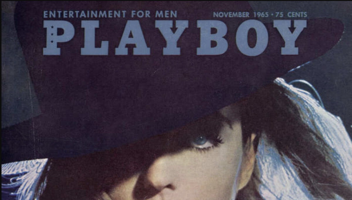
"Entertainment for Men" (1953-2017)
The original slogan was straightforward: "Entertainment for Men."
It positioned the magazine explicitly for a male audience at a time when gender roles were rigidly defined. The tagline appeared on covers and marketing materials, clearly signaling the target demographic.This messaging worked perfectly for the sexual revolution era of the 1960s and 1970s when Playboy reached peak circulation. But by the 2000s, it felt dated and exclusionary as cultural attitudes shifted toward gender inclusivity.
"Entertainment for All" (2018)
Source: MediapostIn April 2018, Playboy changed its slogan to "Entertainment for All." Cooper Hefner, Hugh's son and the company's Chief Creative Officer at the time, explained the shift:
"Playboy's content has always been and always will be created with the male point-of-view and our take of masculinity in mind. But the truth is the Playboy brand now appeals to a hugely diverse group of fans, including in a very substantive way, women who intersect with Playboy at our events, clubs and through our products and fashion collaborations."
"Pleasure for All" (Current)
The brand further evolved its messaging to "Pleasure for All," which appeared as it transitioned fully away from print publishing and leaned into licensing, fashion collaborations, and creator-led digital content.
This progression demonstrates a crucial branding principle: your visual identity can remain constant while your messaging adapts to cultural changes. The rabbit still means what it always meant, but who it speaks to and how it's positioned has expanded dramatically.
The Bold Branding Behind the Playboy Bunny
Few logos can claim what the Playboy Bunny has achieved. It’s more than a mark; it has become a cultural message. It embodies identity, lifestyle, and cultural commentary in a single, elegant silhouette.
Its genius lies in its restraint. No gradients. No clutter. Just a profile and a bowtie, and yet it sells, seduces, and signifies something bigger than itself.
This visual simplicity isn’t just aesthetic; it aligns with broader design psychology.
Studies show that first impressions are design-driven, making the logo a brand’s frontline ambassador. That insight has fueled a rise in minimal, monochrome logos that maximize recall and digital scalability, qualities the Playboy Bunny embodied decades before the trend.
Even more compelling: while rebrands may feel like the norm, the average logo lasts about 10 years.
The Playboy Bunny has remained virtually unchanged for over 70 years — proving that when form and brand DNA align, there’s little reason to update.
Its longevity isn’t an outlier; it’s a lesson in strategic consistency.
This is why, even in an age of constant reinvention, the Playboy logo remains an exemplary study in branding that endures.
The Playboy Bunny’s enduring success shows how a simple, well-aligned logo can evolve into a billion-dollar cultural asset.
For lifestyle, fashion, and heritage brands, lasting impact starts with a design partner who understands symbolism, scalability, and storytelling.
Looking to build a logo that goes beyond trends?
Our team ranks agencies worldwide to help you find the ideal creative partner. Visit our Agency Directory to explore top firms in:
You can also browse our Best Logo Designs section for more timeless and culturally resonant visual identities.

-preview.jpg)


