Whether home-baked or bought, everyone loves a quick cookie fix. That's why professional logo designers need to double up on "baking" the best logos for brands that sell these sweet treats.
This article lists the best cookie logo designs that look appetizing, much like the baked goodies they represent! From fun and funky to sassy and quirky, this article analyzes what makes each design stand out!
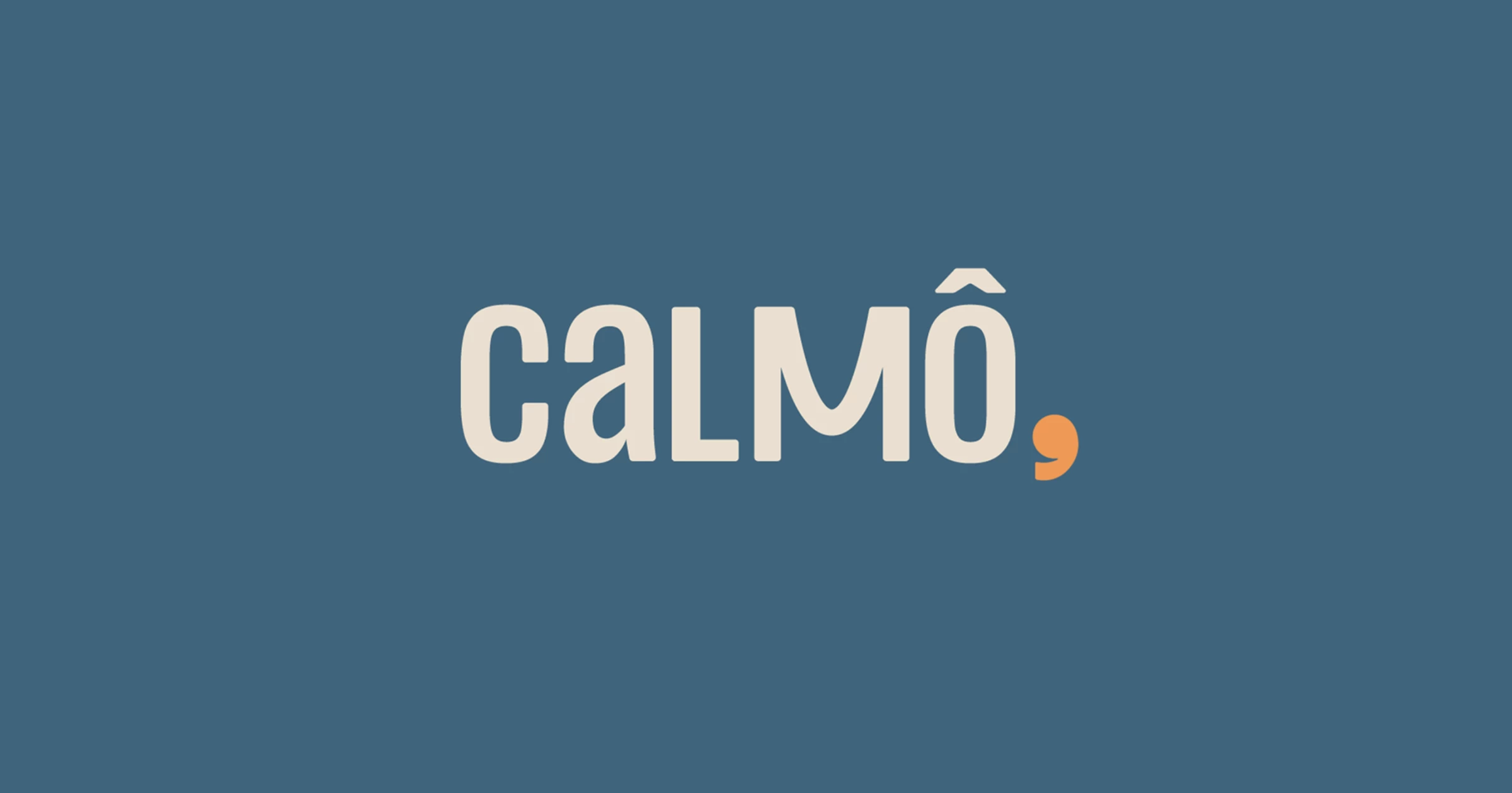
1. CALMO, by Bradda Design
Standout Features:
- Calming color story
- Fun typography
- Relaxed personality
Cookie designs typically have an image of cookies somewhere in the logo, but this first cookie logo design is an exception. This proves very effective, as the brand name CALMO is written in a calming color story with fun typography.
The logo's pleasant personality sets it apart from other designs. Bradda Design ensured that the logo would look friendly to the customers.
The calming colors of cornflower blue and sunny orange are great picks, as they can be associated with deliciousness and summery vibes. The logo also looks great in any background, giving it a lot of versatility.
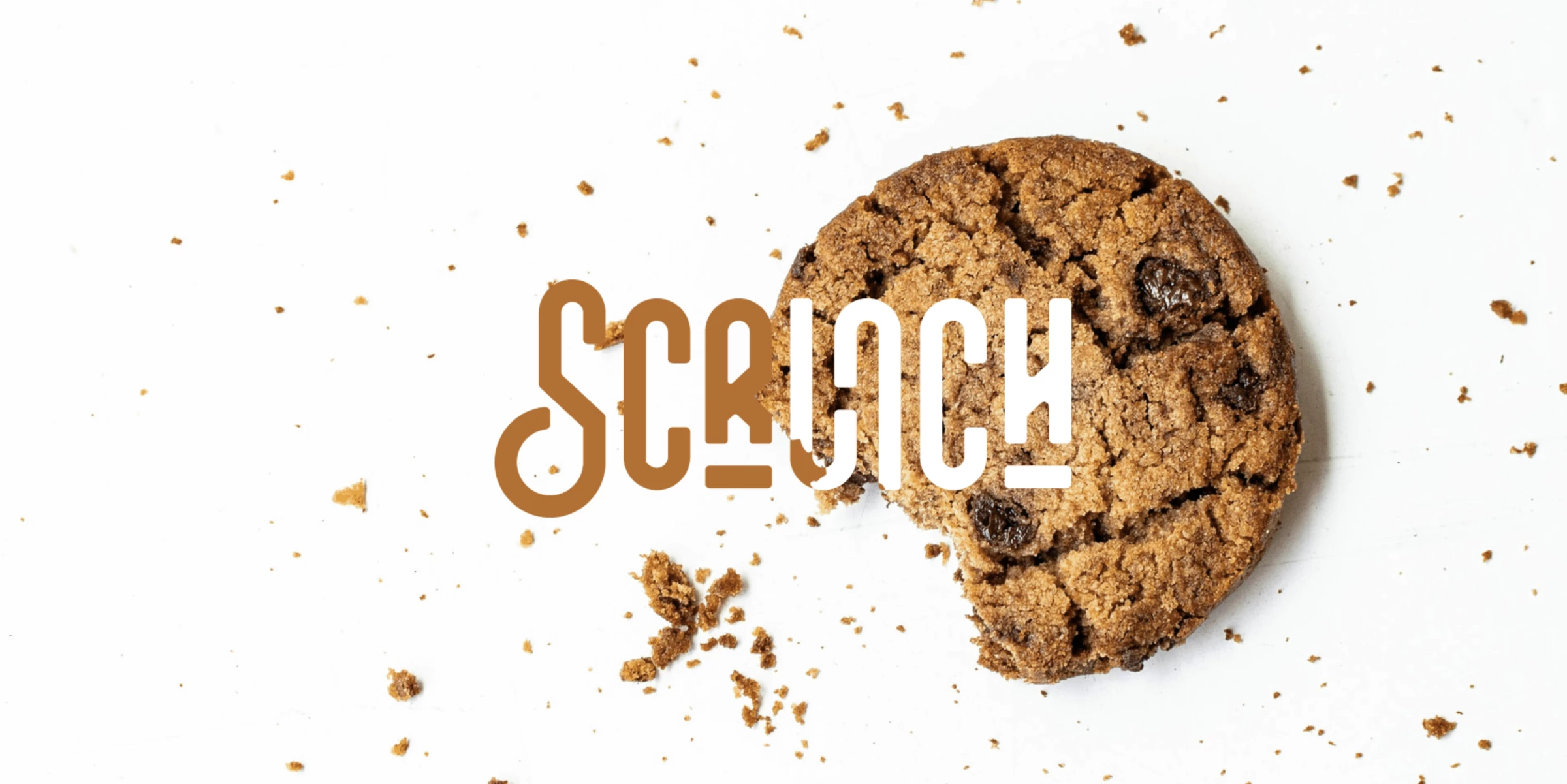
2. Scrunch by Drice Roland
Standout Features:
- Negative space logo
- Creative images
- Quirky typeface
Drice Roland used negative space and creative images in creating the Scrunch cookie logo design. The negative space has a photo of a chocolate chip cookie on it, with crumbs scattered all around to signify the lusciousness and quality of the product.
They also chose a quirky font style that best describes what desserts are all about, a perfect way to cap off every meal.
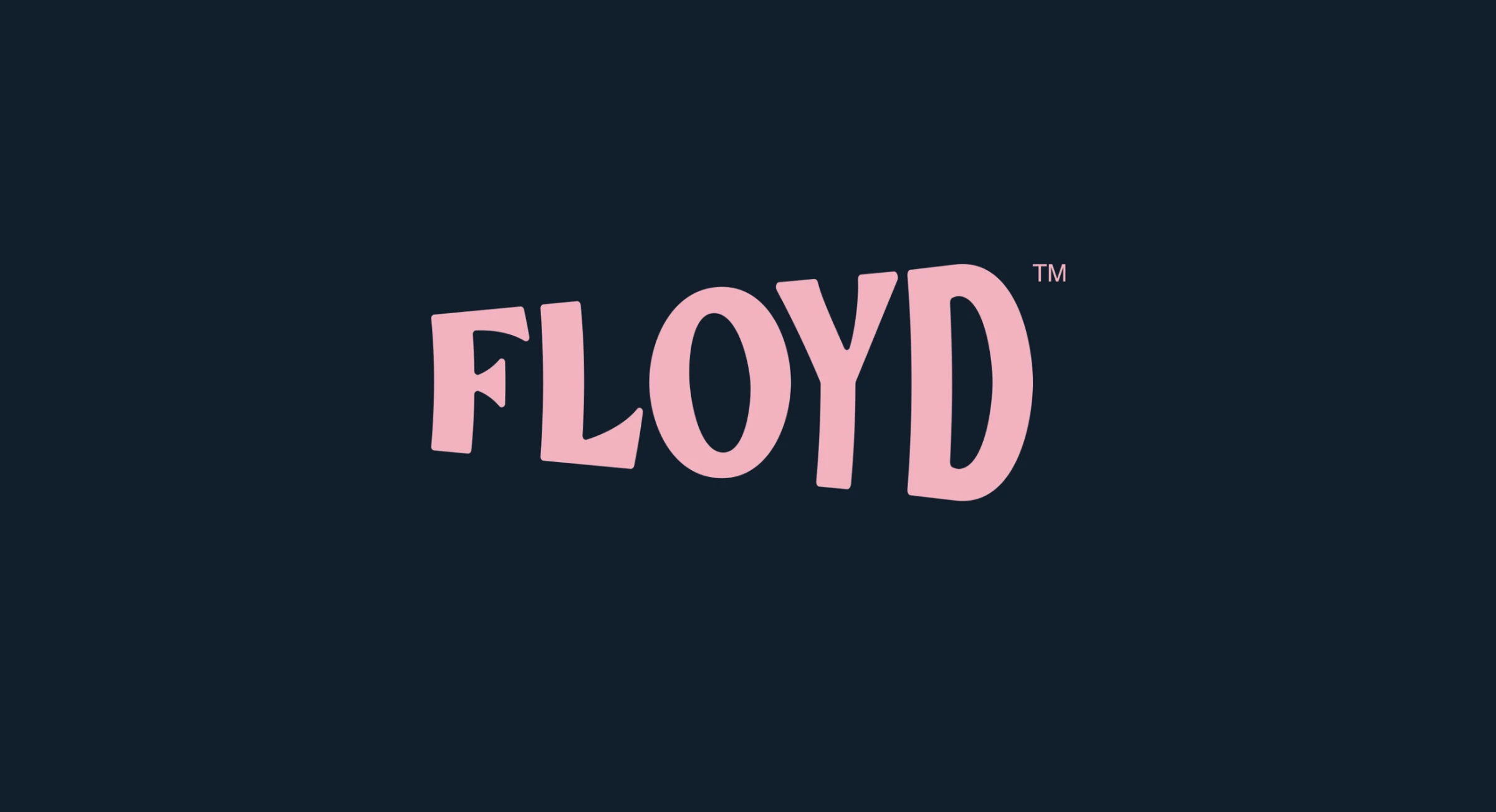
3. Floyd Cafe & Bakery by Hani Jamal Studios
Standout Features:
- Pink Floyd-inspired logo
- Rosy color story
- Pleasant layout
Pink Floyd might be the last thing you'd think of when designing a cookie logo, but this design from Hani Jamal Studios perfectly made it work.
The rosy color story is perfect for any brand offering sweet treats like cookies. It also has a light and pleasant vibe, making it eye-catching without being too overwhelming.
The typeface is bold yet expressive, matching the image of a cookie that looks like it's made to perfection. Logo designs that use bold-letter typography like this give an impressive first impression, driving more customers in the long run.
Indeed, these cookies will take you to an extraordinary gastronomical experience you will never forget.
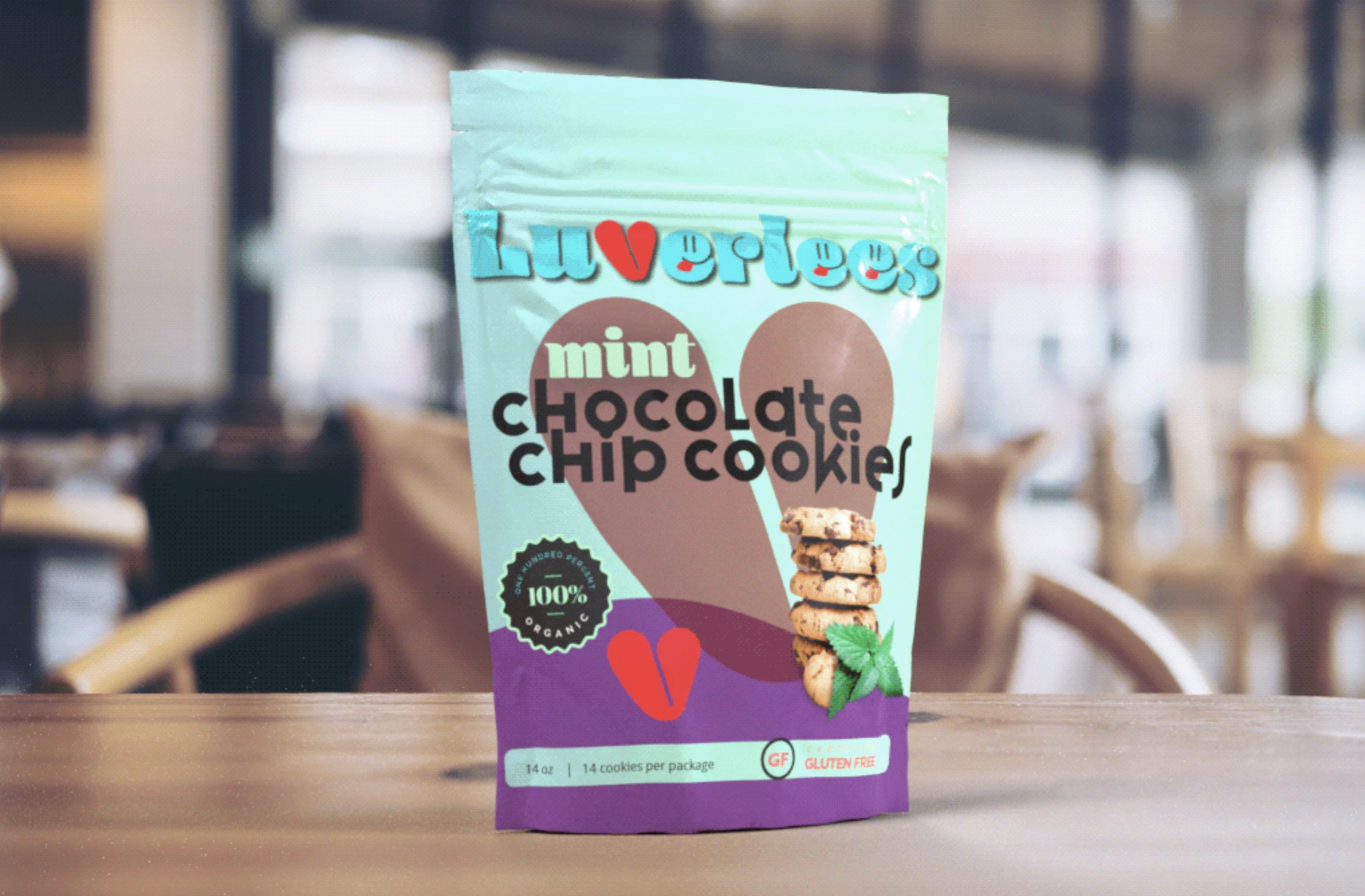
4. Luverlees Biscuits & Cookies by Betta Designs
Standout Features:
- Loopy typography
- Cool color palette
- Vintage vibes
Luverlees Biscuits & Cookies believes that cookies are a timeless treat, and this shows in its vintage-inspired cookie logo design.
Betta Designs used loopy typography to capture cookies' fun and whimsical nature. The cool color palette used is perfect for any cookie brand.
They replaced the letter V in the logo with a heart, showing their commitment and love for cookies. This small detail adds something special to the logo and makes it unique.
Overall, this cookie logo design is among the best for successfully giving off that homemade charm. One look at it reminds customers of the home-baked biscuits made with love.
5. CRUNCHY COOKIES by Las Manas
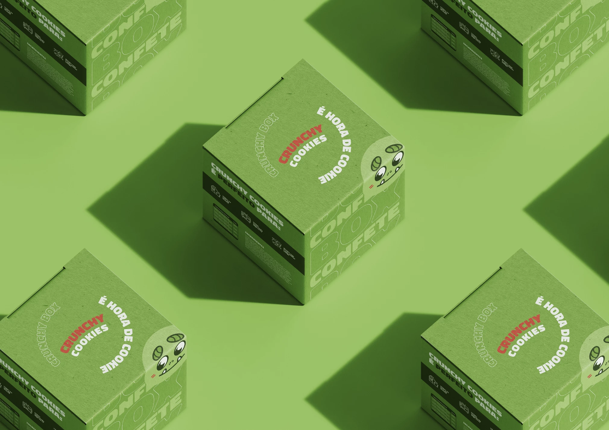
Standout Features:
- Cartoon-inspired logo
- Childlike charm
- Easily recognizable
Kids and cookies are a match made in heaven. This adorable cookie logo design by Las Manas perfectly captures that.
The cartoon-inspired logo adds a fun and childlike charm to the brand. The font style looks like it's written with crayons, making it more friendly and inviting.
The deep red color gives off a delicious look, while the yellow adds a bit of brightness to it.
The logo also has an easily recognizable shape that can be spotted from miles away. This makes it easier for customers to remember your brand and return for more!
6. Munchies Vegan Cookies by Victoria Stefania
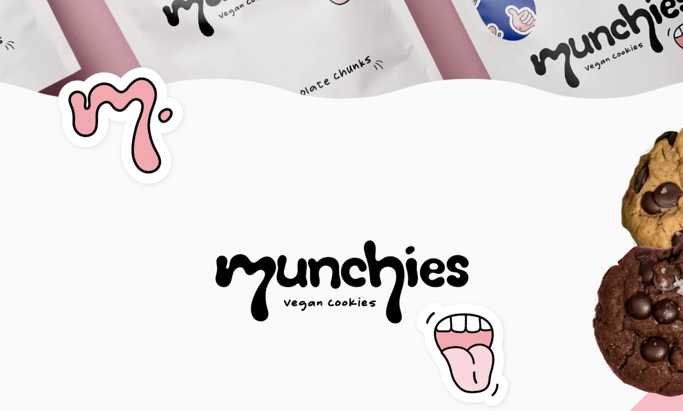
Standout Features:
- Pastel color story
- Fun cartoon images
- Exudes youth and excitement
Munchies Vegan Cookies logo design by Victoria Stefania is fun and quirky. The pastel color story looks like it was taken from a picture book. The cartoon images look fun and friendly, making the brand look more appealing to vegans.
The typeface adds youthful energy to the design, with the font style looking like chocolate dripping from Munchies Vegan Cookies. In a nutshell, this cookie logo design exudes youth and excitement.
7. Cookies With Tiffany by Brian M. Peters
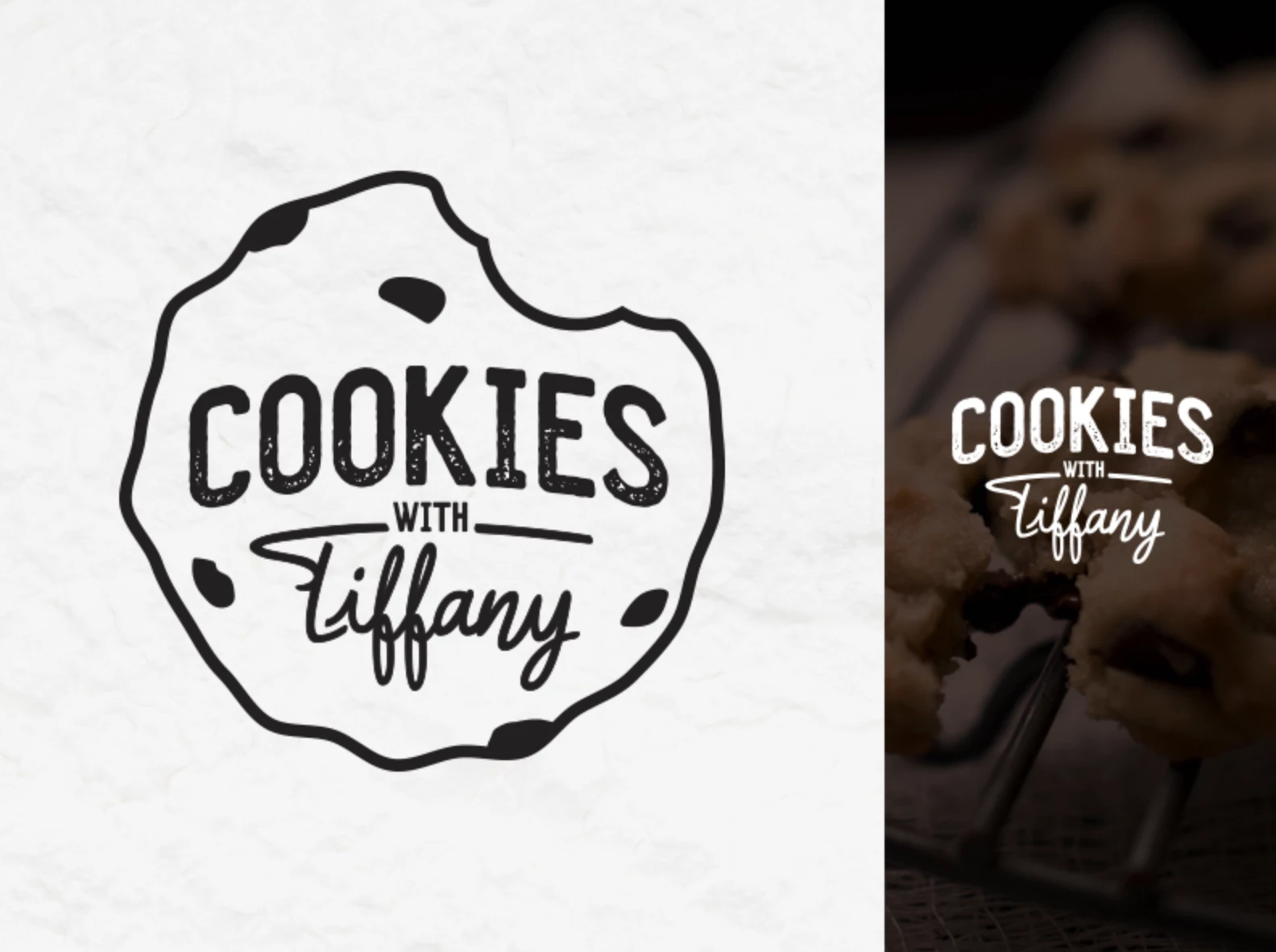
Standout Features:
- Harmonious logo design
- Hand-drawn feel
- Homemade vibe
Most of us enjoyed cookies baked in our loving ovens by our mothers or grandmothers, which endeared us to these treats even more. Cookies with Tiffany capitalizes on the homemade feels of their delicious treats, and this logo design by Brian M. Peters captures just that.
The logo is a hand-drawn cookie with all the chocolate chips and the brand name placed at the logo's center.
Everything screams homemade and nostalgic in this logo design. The designer ensured that the harmony between the cookie image and the handwritten font, coupled with the chocolate logo color, ties everything into this work of art.
Check out some of the best bakery logos here.
8. Hey Miki! by TrustUrEyes
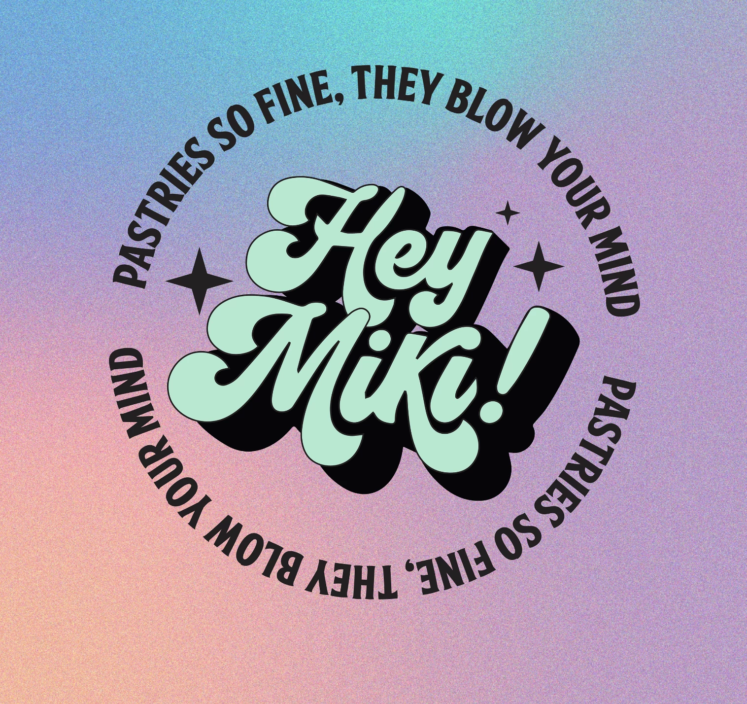
Standout Features:
- Pop culture references
- Hologram color story
- Witty catchphrases
Brands using pop culture references as part of their brand identity is not entirely new, as everyone has done it already. This next-best cookie logo design proves that this age-old trick still works.
TrustUrEyes got inspired by the famous song "Hey Mickey!" which is typically associated with the vintage cheerleaders of the 70s and 80s.
The loopy, bold typography also syncs with the theme. Adding those little stars in different directions makes it look right. The agency used colors from the hologram to symbolize youth and modernity.
The lyrics from the famous song were changed to fit the company's branding, which worked so well! Indeed, it’s so fine it blows our minds.
9. Cake & Crumb by Ellen Schlegelmilch Design
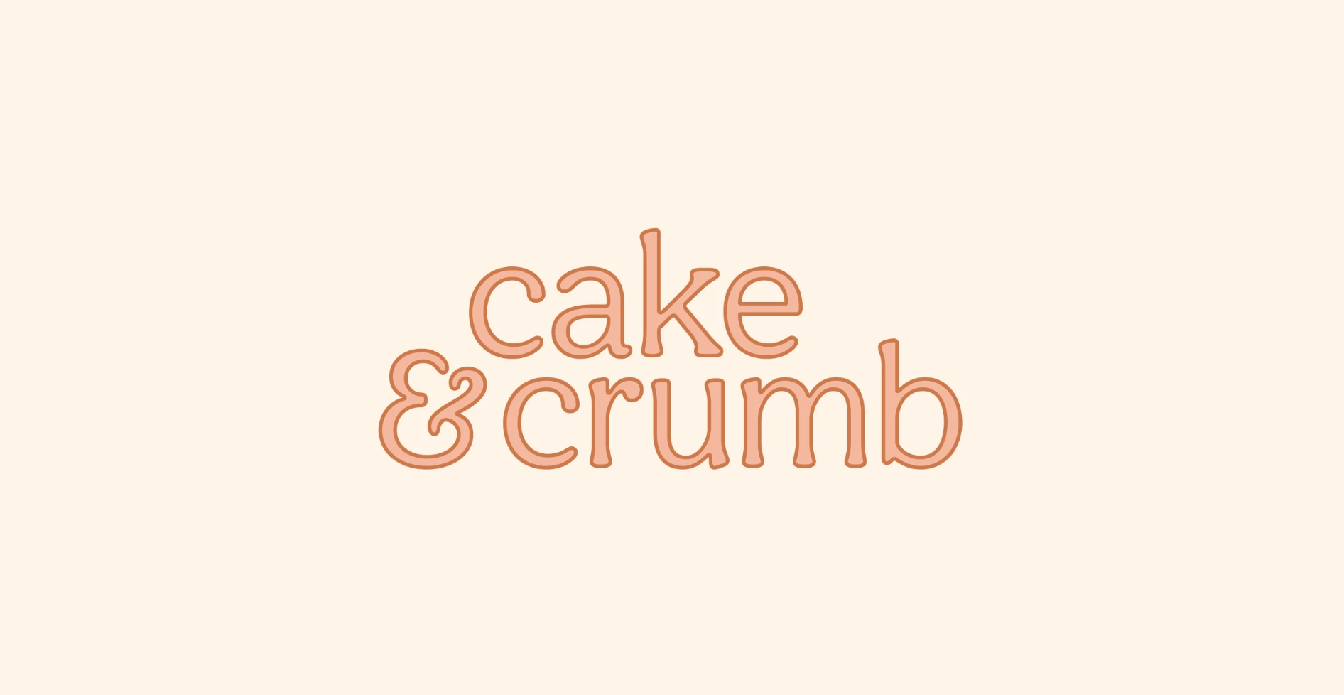
[Source: Ellen Schlegelmilch Design]
Standout Features:
- Minimalist design
- Cheerful colors
- Skinny typography
This next-best cookie logo design capitalized on the homemade goodness of cookies and pastries and how it still appeals to the public after all these years.
Ellen Schlegelmilch Design took on the challenge of balancing the homemade charms of the brand and its aim of providing the best and tastiest cookies to its customers. The result is this cookie logo design that ticks all the boxes on the checklist.
The agency used skinny font styles, perfect with the simple values often associated with home-baked goodies. It just feels so good to eat something made with love and care.
Pink is a popular color among baking enthusiasts because it looks whimsical and perfect when making dainty baked goodies. This color also appeals perfectly to the public for the same reason.
Tying all of these in a minimalist design makes everything look pleasing and easier on the eyes.
Browse other minimalist logo designs here.
10. Chere Cookies by Phil Studio
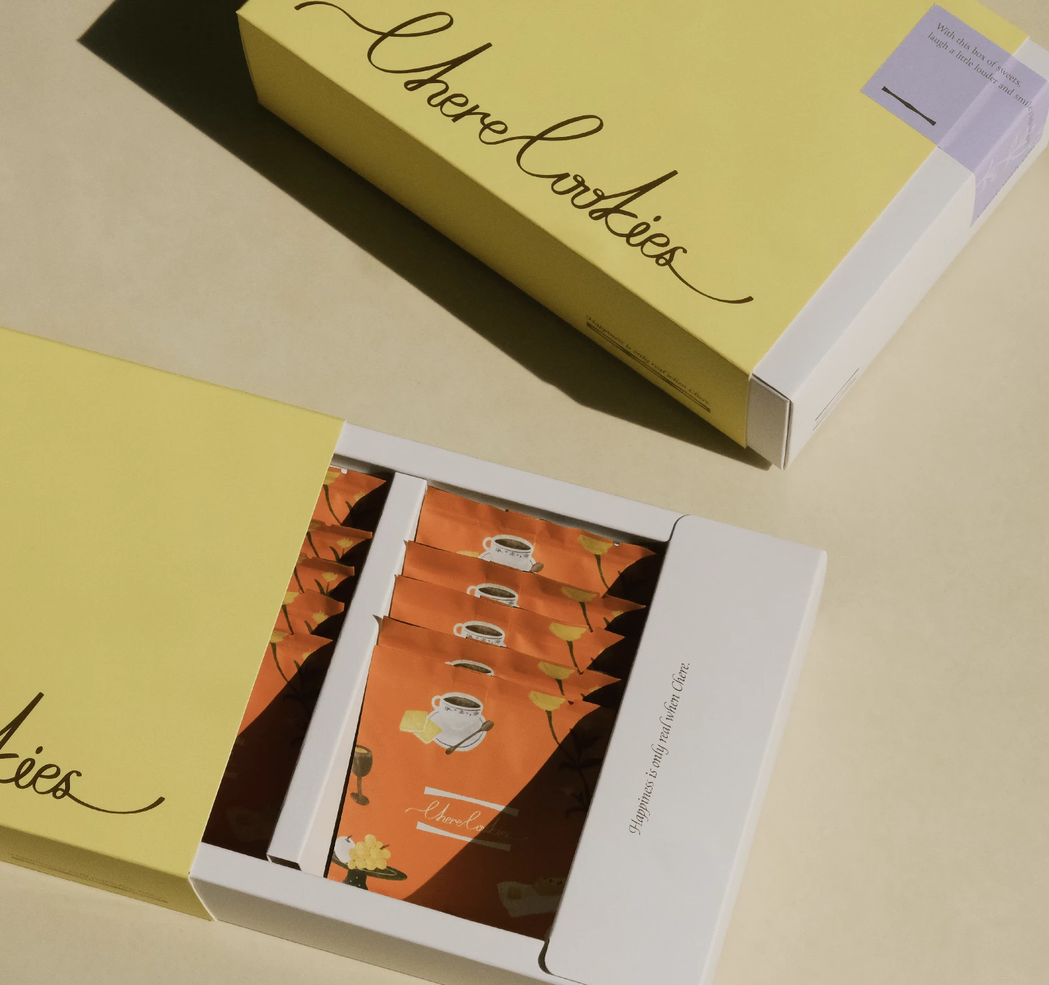
Standout Features:
- Classy and sophisticated aura
- Patterned lines
- Loopy handwritten font
Phil Studio set out to design a logo that would convey class and sophistication without going overboard with too many elements.
They achieved this by using slim lines and patterns on this cookie logo design, which created an aura of elegance. The loopy handwritten font was also an excellent choice, making the logo feel classy without being too stuffy.
The overall design feels timeless and graceful, which is excellent for the intended audience of this brand. It's subtle yet noticeable enough to make a lasting impression on customers.
11. Happy Batch Cookies by Atomicdust
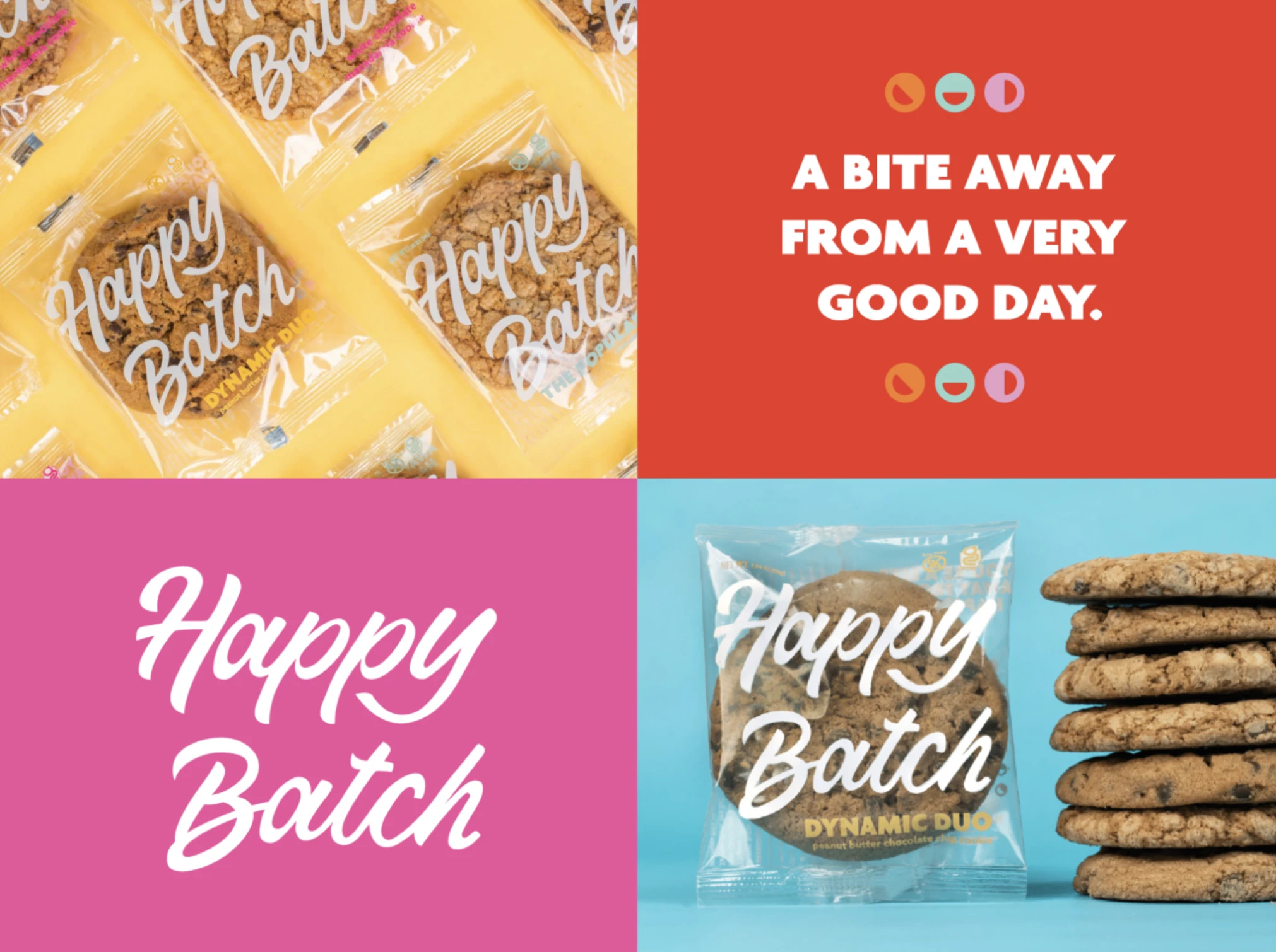
Standout Features:
- Handwritten typeface
- Versatile logo design
- Simple yet sensible
Handwritten fonts are a staple in the baking industry because of their homely and down-to-earth vibe. That’s why Atomicdust used this style to create this stunning cookie logo design.
This logo is simple, yet it still conveys a sense of comfort through its handwritten typeface, neutral colors, and simple shapes.
The Happy Batch Cookies logo design is versatile enough to fit any collateral or asset. The thoughtful design combined with a simple, yet sensible color palette makes this logo stand out.
12. Celina's Custom Cookies by Lauren Spooner
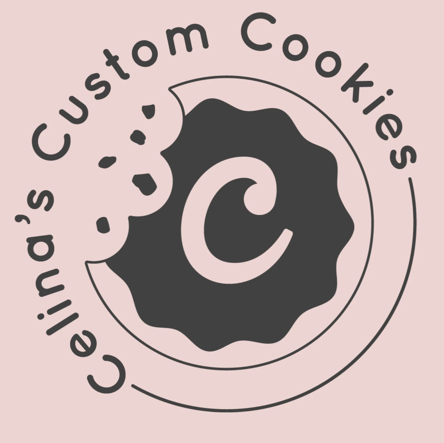
Standout Features:
- Sans-serif fonts
- Light brand colors
- Simple yet meaningful
Sans-serif fonts provide any design with a modern and contemporary feel, which makes it the perfect choice for this minimal cookie logo design.
The sans-serif fonts were paired with a light color story, appealing even to those who aren't fans of sweets yet. These colors also convey that this brand is all about fresh and delightful creations. It is simple and meaningful enough to impact the target market.
This logo design is undoubtedly suited for all those who admire the craftsmanship of custom cookies and appreciate their intricate details. Lauren Spooner deserves a pat on the back for this work of art.
13. LINDAURA DOCERIA by High Design
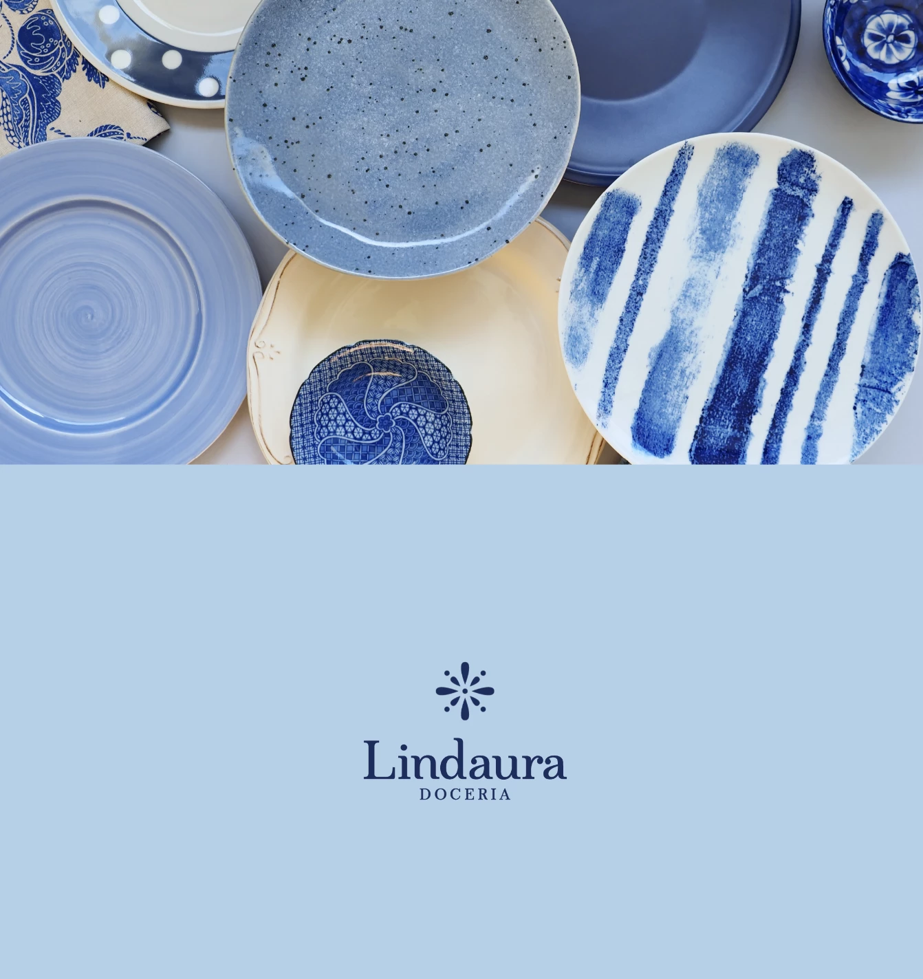
Standout Features:
- Artistic flower design
- A blend of patterns and photos
- Lively design approach
This logo design from High Design is an eye-catching work of art. The logo features a black and white flower design beautifully intertwined with various patterns and photos, creating a stunning effect.
Using such varied elements made the design look full of life and energy. The colors were also carefully selected to create a cheerful yet elegant feel.
Overall, this logo design captures the essence of Lindaura Doceria's brand: vibrant yet sophisticated. It will surely make an impression on customers who crave something different from the usual cookie-buying experience.
14. Onana Cookies by Kastil Creative
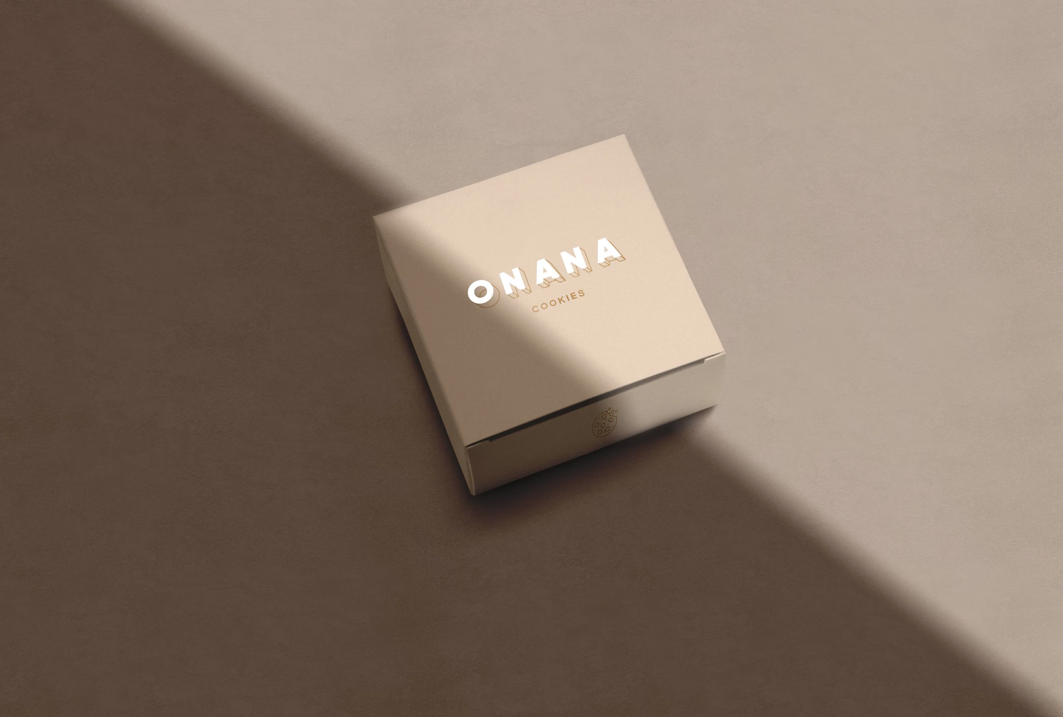
Standout Features:
- Metallic logo design
- Sleek finish
- Bold typography
Indonesian brand Onana Cookies aims to provide the best quality cookies with homemade ingredients without scrimping on the polished factor. They want a logo that can reflect their values of quality and perfection and Kastil Creative stepped up their game.
The result is a simple yet stunning cookie logo design, sleek in all aspects, and radiates a feeling of polish and quality.
The metallic font color exudes sophistication without intimidating its customers, which is a great thing because everyone deserves the best. Lastly, the bold font style adds a feeling of reliability to the brand.
15. Lola's Sweets by Lela Sarishvili
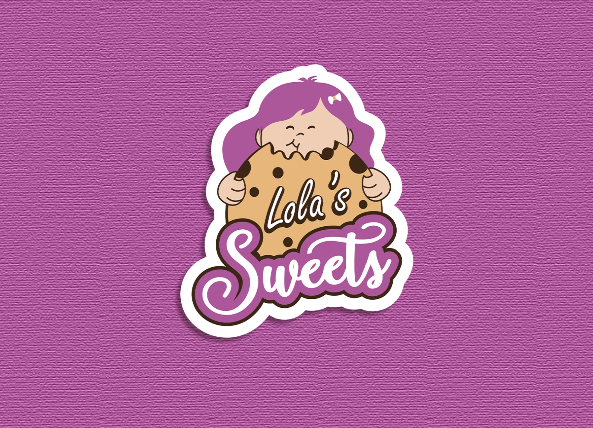
Standout Features:
- Lively pastel colors
- Animated characters
- Friendly and approachable
Lola's Sweets exudes approachable vibes with its clever cookie logo design that aims to tap into the younger audience. Lela Sarishvili capitalized on the friendliness of the cookie brand, which brought excellent results.
The designer used animated characters of a young girl enjoying a cookie in pastel colors to make it look inviting and attractive. It made the brand stand out among its competitors, instantly recognizing it as an approachable and friendly product.
The vibrant colors used in the packaging also helped create a cheerful atmosphere while highlighting their irresistibly delicious treats.
The playful font was chosen to draw attention from kids and adults alike, making them look forward to trying the cookies.

Our design experts recognize the most innovative and creative designs from across the globe. Visit Design Awards to see the:
- Best Logo Designs
- Best Website Designs
- Best Video Designs
- Best Print Designs
- Best Packaging Designs
- Best App Designs
Our team also ranks agencies worldwide to help you find a qualified agency partner. Visit our Agency Directory for the top Logo Design Companies, as well as:
- Top Web Design Agencies
- Top Video Production Companies
- Top Print Design Companies
- Top Packaging Design Companies
- Top Mobile App Development Companies


-preview-webp.webp)