Thanks to the hundreds of businesses booming left and right, Australia is fast becoming an economic powerhouse.
Australian design agencies are having a field day creating logos, websites, and other branding materials for these businesses. They are even pushing the boundaries of innovation with their creative output.
Indeed, their work makes waves in the global market and elevates Australian businesses to heights they never imagined.
Whether you're a small business, an established enterprise, or even a start-up, there's no better way to ensure your company stands out than having an expertly crafted logo designed by one of Australia's top logo design agencies.
In this article, we will look at some of the best logo designs by accomplished Australian agencies and find out what makes them unique.
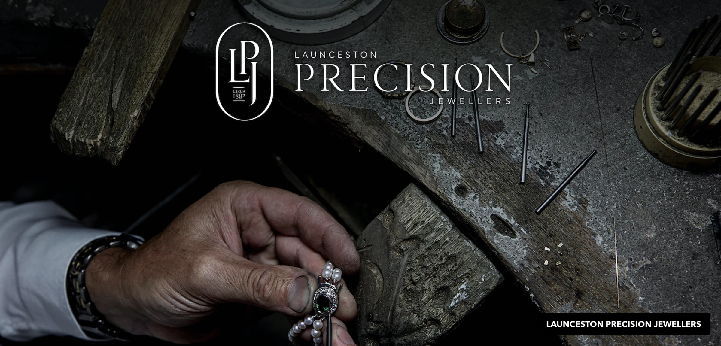
1. Launceston Precision Jewellers by S. Group
Standout Features:
- Luxurious feel
- Serif fonts
- Coat of arms shape
Jewelers often have the same branding: exclusive, elegant, and beautiful. And in a sea of tough competition, Launceston Precision Jewellers needed a logo that would differentiate them from the rest. S. Group's design team did just that with their logo.
Using an elegant serif font gives the logo an elite and sophisticated feel, while the coat of arms shape evokes feelings of trust and reliability.
This clever combination of elements makes the logo stand out and communicates a powerful message to potential customers.
The decorative serif font added an aura of elegance to this logo design. The subtle color palette in the logo also gives it a timeless feel, ensuring that it will remain relevant for years.
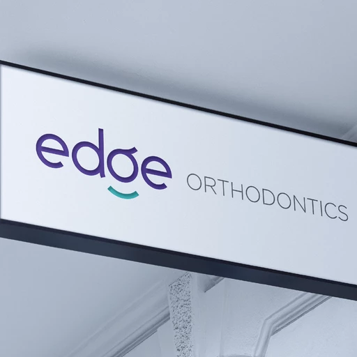
2. Edge Orthodontics by Blunt Agency
Standout Features:
- Magnetic logotype
- Exudes a friendly personality
- Fun typography
Dentists have long been associated with being formal, but Edge Orthodontics' logo design by Blunt Agency is anything but.
The agency delivered a friendly representation of the logotype that urges viewers to smile upon seeing it! It blends well with the color story’s youthful energy.
The playful nature of the logo works perfectly with Edge Orthodontics' target audience, letting them know they’ll be in good hands every time they visit.
In addition, the seeming wordplay they used in the logo design gives it a modern and hip feel commonly associated with the younger generation. Youth is greatly valued everywhere, and this logo design showcases it perfectly.
And unlike any other orthodontic logo designs, this creation screams playfulness -- an excellent magnet for clients!
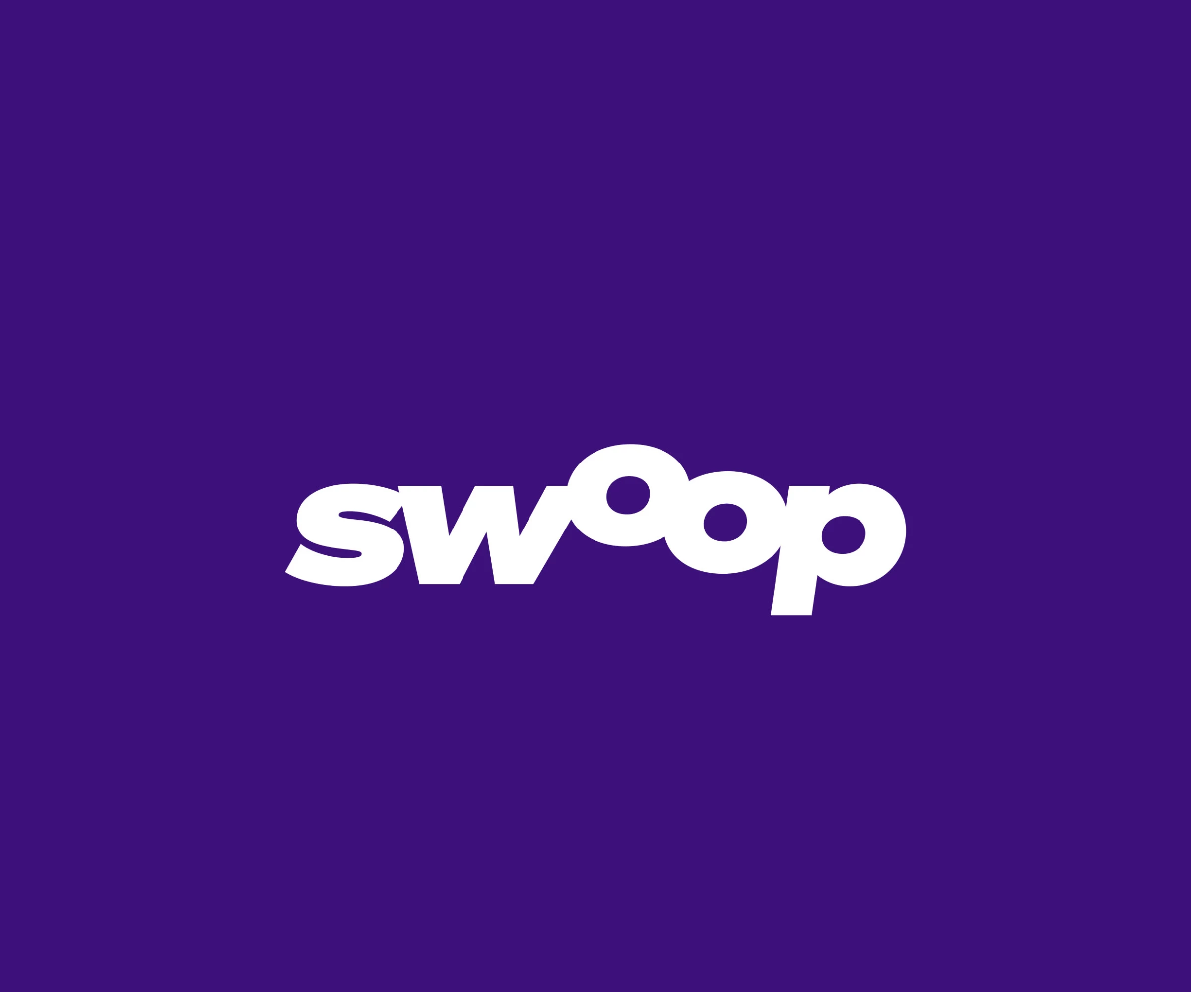
3. Swoop by Percept Brand Design
Standout Features:
- Vibrant personality
- Bold typography
- Soothing color story
The primary rule in design is always to maintain your branding. This is the main reason why Swoop's logo design is so remarkable.
Designed by Percept Brand Design, the logo features bold typography and a vibrant color story that conveys the company’s energy and enthusiasm in its work.
The colors are soothing and refreshing, creating an eye-catching design that draws people in. The font style is bold, modern, and stylish.
The swooping form of the logo further emphasizes the company’s liveliness while keeping a professional look.
Indeed, the Swoop logo design proves that brands can display their quirkiness while being professional. Kudos to Percept Brand Design for hitting the nail here!
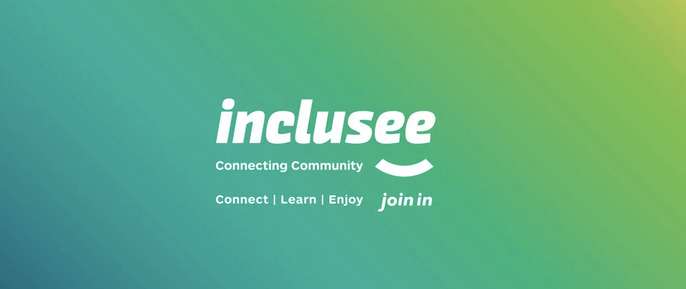
4. Inclusee by DAIS Brand Strategy
Standout Features:
- On-brand design concept
- Simple typography
- Creative letter shapes
Designing logos, in general, can take a lot of work. You cannot put 77 different visual variables in one logo design and make it make sense simultaneously.
That's why DAIS Brand Strategy has found a way to make their clients' personalities pop in their logo design for Inclusee.
The creative letter shapes and simple typography help bring an inclusive concept, which is the core of Inclusee’s values. Complementing the typography is the stunning color story. Together, these elements strengthen the brand message: everyone should be included.
The logo also balances text and graphics, creating a visually pleasing design guaranteed to draw attention.
Inclusee's logo design is the perfect example of using minimal elements to create an impactful visual identity. It is simple yet powerful.
With this logo design, DAIS Brand Strategy has successfully given Inclusee a memorable identity that elevates its brand.
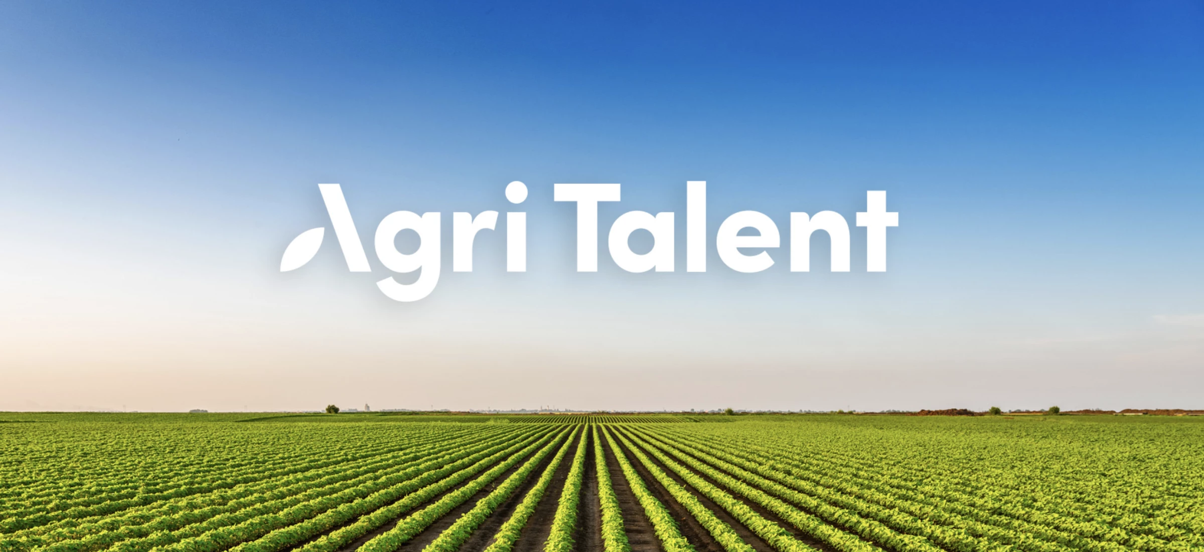
5. Agri Talent by Sketch Corp.
Standout Features:
- Minimalistic approach
- Creative swoosh
- Consistent color palette
This logo design proves once again that simplicity does wonders for a brand. The Australian agency, Sketch Corp., has done a great job making simple things work spectacularly. They employed an eye-catching design with a minimalistic approach.
The A of Agri Talent is given life from the other letters by a creative swoosh, providing an extra artistic touch.
The color palette chosen for this logo design is consistent with the brand's niche.
The color palette chosen for this logo design is consistent with the brand's niche: White represents cleanliness and purity, and green conveys freshness and nature-friendliness.
The agency used white and green interchangeably in the logo design, showing how these values represent the company.
6. Legacy Livestock by Brother & Co.
Standout Features:
- Impressive artistry
- Serif fonts that display security
- Trustworthy feel
Who knew that the small dot on top of the lowercase letter I could be an art of its own? This is what Brother & Co. has been able to accomplish with the logo design for Legacy Livestock.
The agency used serif font in the logo design, giving it a sense of security and trustworthiness, perfect for the livestock industry.
The level of artistry in this logo design, making the little dot part of the bigger picture, is nothing short of impressive.
The colors used in the logo are also great. The dark blue gives it a classic and professional look, while the orange adds a touch of warmth that makes it inviting.
Overall, this logo design captures all of the core values Legacy Livestock wants to convey to its clients and the competition.
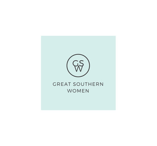
7. Great Southern Women by Synergy Graphics
Standout Features:
- Simplistic iconography
- Straightforward design concept
- Women empowerment focus
Our next best logo design on the list oozes with female energy: beautiful, empowering, and impactful. Let's dive into Synergy Graphics' logo design for Great Southern Women and everything that makes it one of a kind!
The simplistic iconography is an excellent representation of female empowerment. And the straightforward concept makes it easy to understand and remember.
This design is more straightforward than some of the entries in this list. It follows a minimalist style like these best minimal logo designs. This move adds to the impact that Great Southern Women want to deliver.
The colors used for the logo are also very appropriate and effective. The pale mint and charcoal evoke a sense of authority and dependability, making it even more impressive.
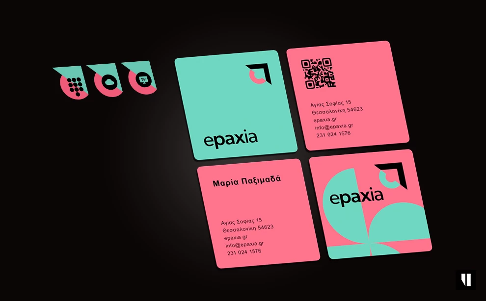
8. epaxia by Unovation Branding & Design
Standout Features:
- Innovative use of shapes and letters
- Dynamic color story
- A youthful and hip vibe
The youth is the hope of our future, as the saying goes. And Unovation Branding & Design has managed to create a logo design that captures this sentiment perfectly with Epaxia.
Their innovative use of shapes and letters makes the logo look attractive, youthful, and hip. Adding to that is the dynamic color story of blues, blacks, and pinks, making it stand out from the crowd.
The font choice also adds to the overall youthful feel that Epaxia wants to project. It looks classic but edgy.
Overall, this logo does a fantastic job of connecting with its target audience and conveying its message without going overboard.
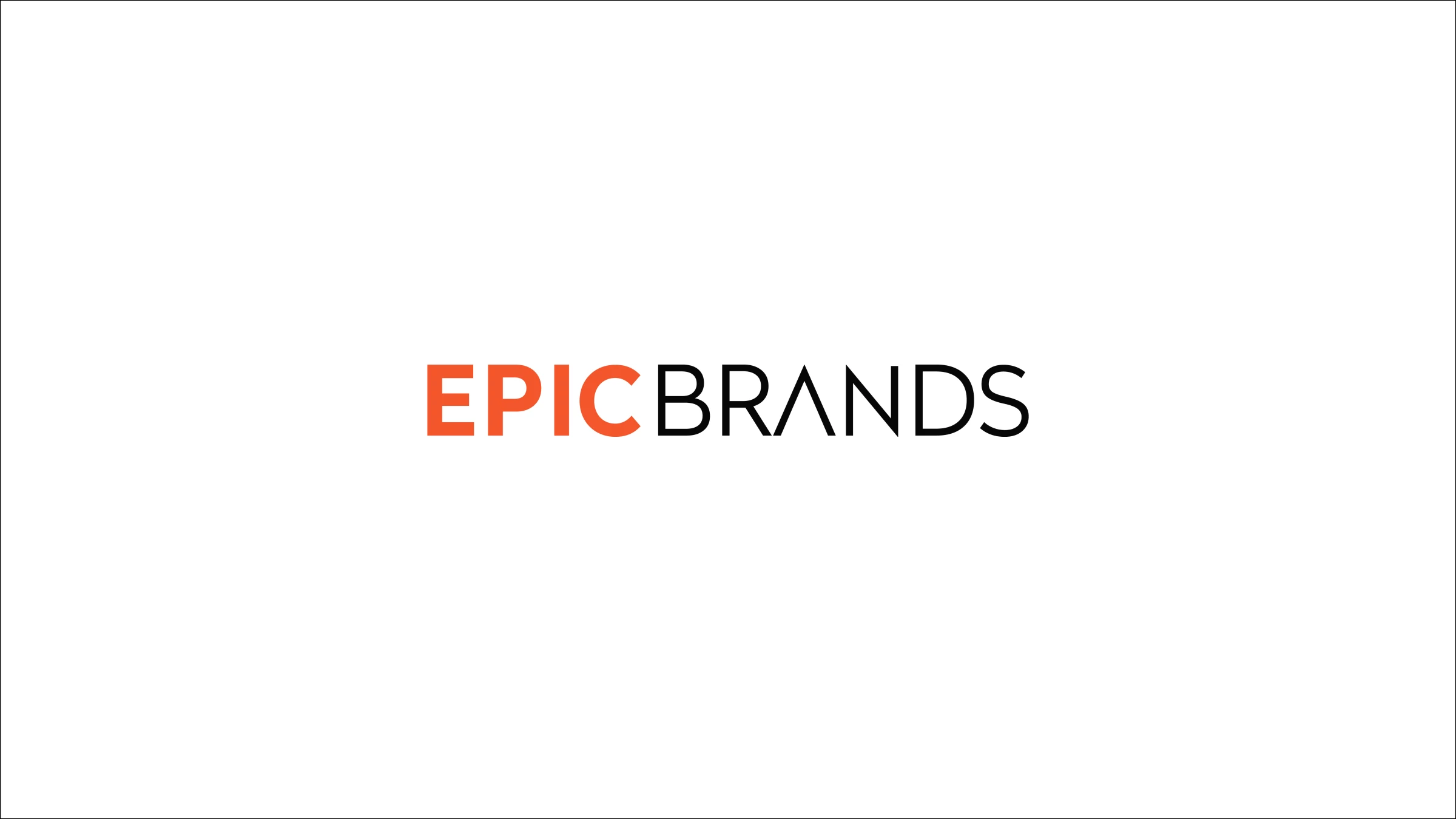
9. Epic Brands by MuseofDesign
Standout Features:
- Negative space design
- Energetic color palette
- Bold and confident typography
Epic Brands' logo design looks too epic not to be included in our list of best logo designs by Australian agencies.
When someone wants to make an epic impact, no one does it better than MuseofDesign's logo design for Epic Brands.
Using negative space makes this logo look more exciting and adds more depth to its design concept. The colors used have a vibrant, energetic vibe. The bold typography used further emphasizes the confident nature of the brand (Get inspired by these logo designs with bold letters on your next logo design project!).
The logo looks straightforward, but that’s what makes it great. It conveys a strong message without having to rely on too many elements.
10. Luxcon by TOAST
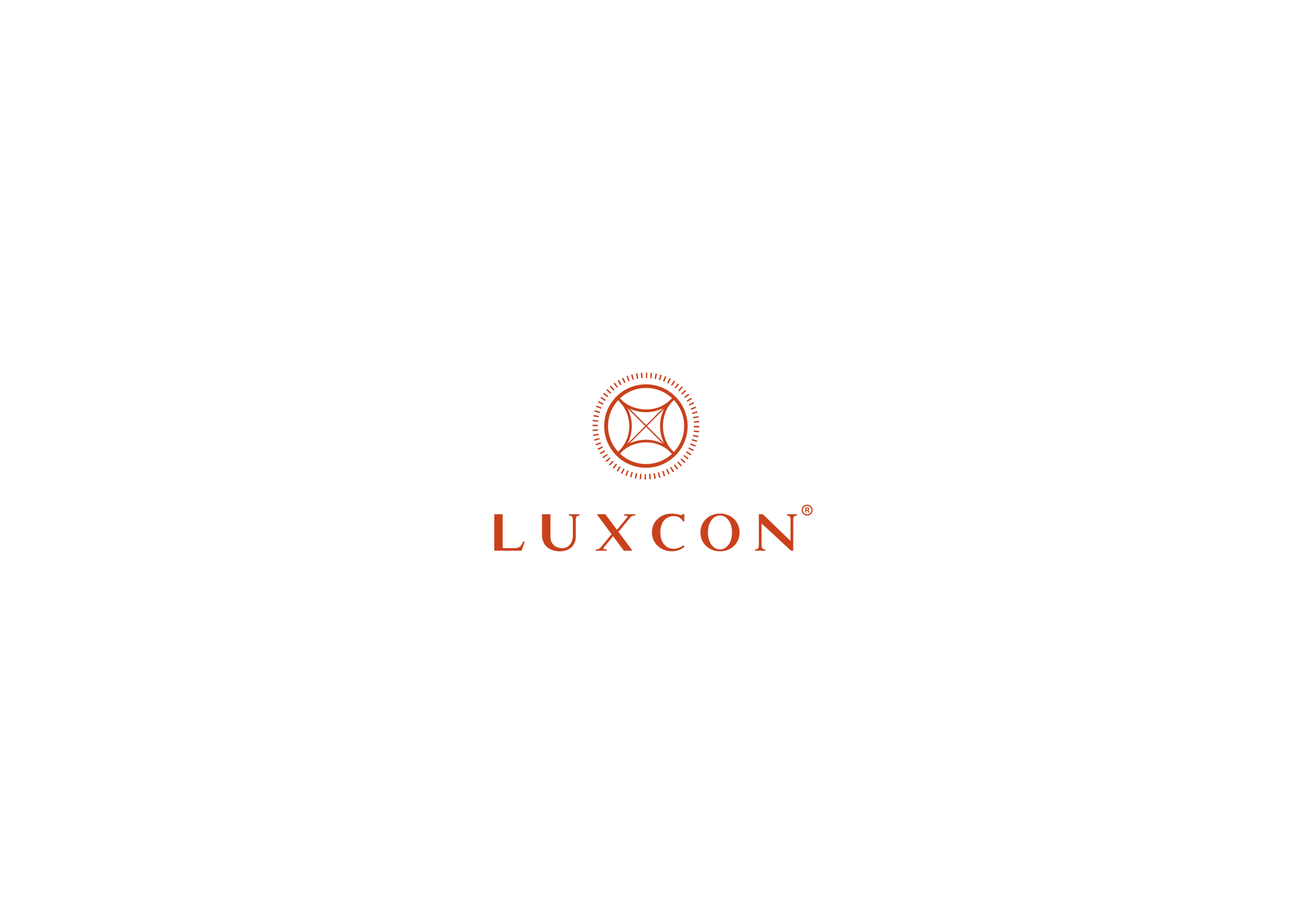
Standout Features:
- Symbolic images
- Metallic finish
- Sophisticated feel
One surefire way to make a logo design stand out is to use symbolic imagery, and TOAST has done that for Luxcon.
The sleek image of the tires used, combined with the metallic finish, makes it look genuinely sophisticated and memorable. The colors are also brand-appropriate and upscale.
The font choice also adds to the luxe feel that Luxcon wants to achieve. It looks modern and clean, yet professional enough for a luxury brand.
Overall, this logo design is the perfect choice for any company that wants to convey class and sophistication in its branding. Undoubtedly, a well-deserved mention in our list of best logo designs by Australian agencies!
11. ReTHINK by The Animals
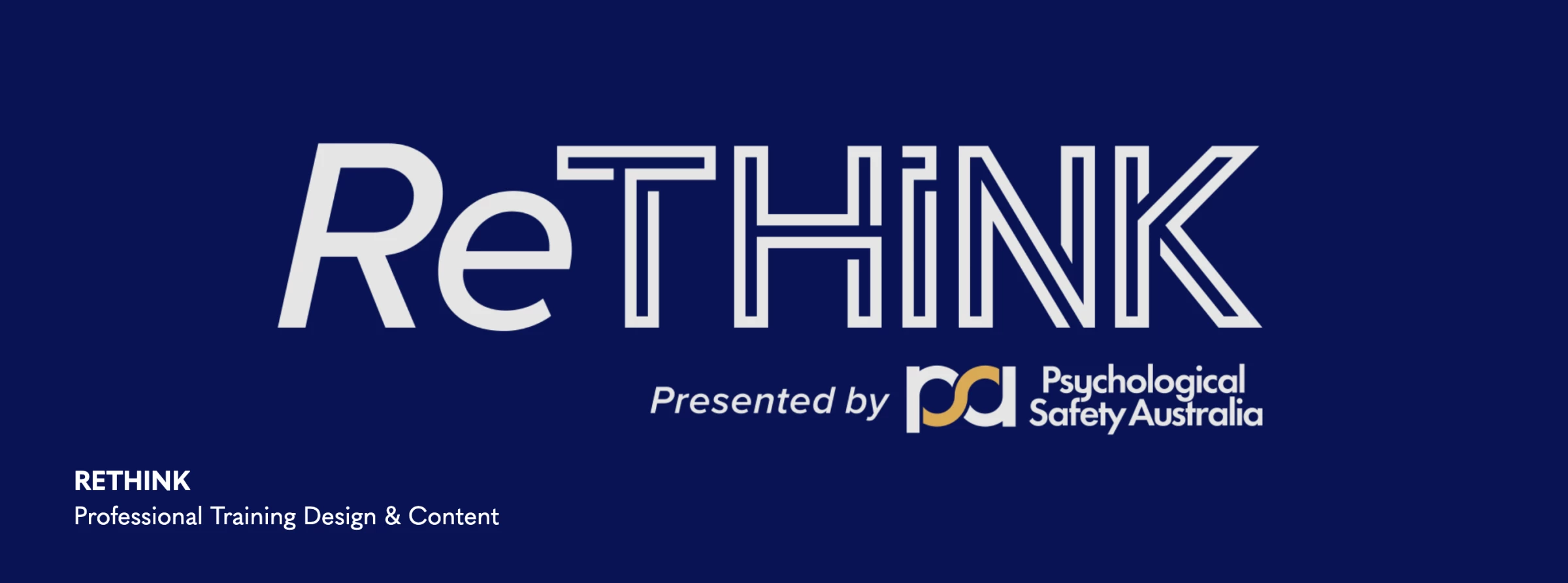
Standout Features:
- A unique combination of fonts
- Calm and composed colors
- Simple yet impressive feel
Capping our collection of Australian agencies' best logo designs is ReTHINK.
The Animals' logo design for ReTHINK makes an excellent combination of font styles that look modern yet professional. The agency presented "Re" in a slanted, bold font while "THINK" captures attention with its stencil style.
The subdued yet calming colors also add to this balance perfectly.
The overall feel of the logo is simple but impressive. It's memorable without being too flashy, which is precisely what a logo should be.
ReTHINK’s logo looks simple yet impressive.
12. Watersedge by The X/OVER Agency
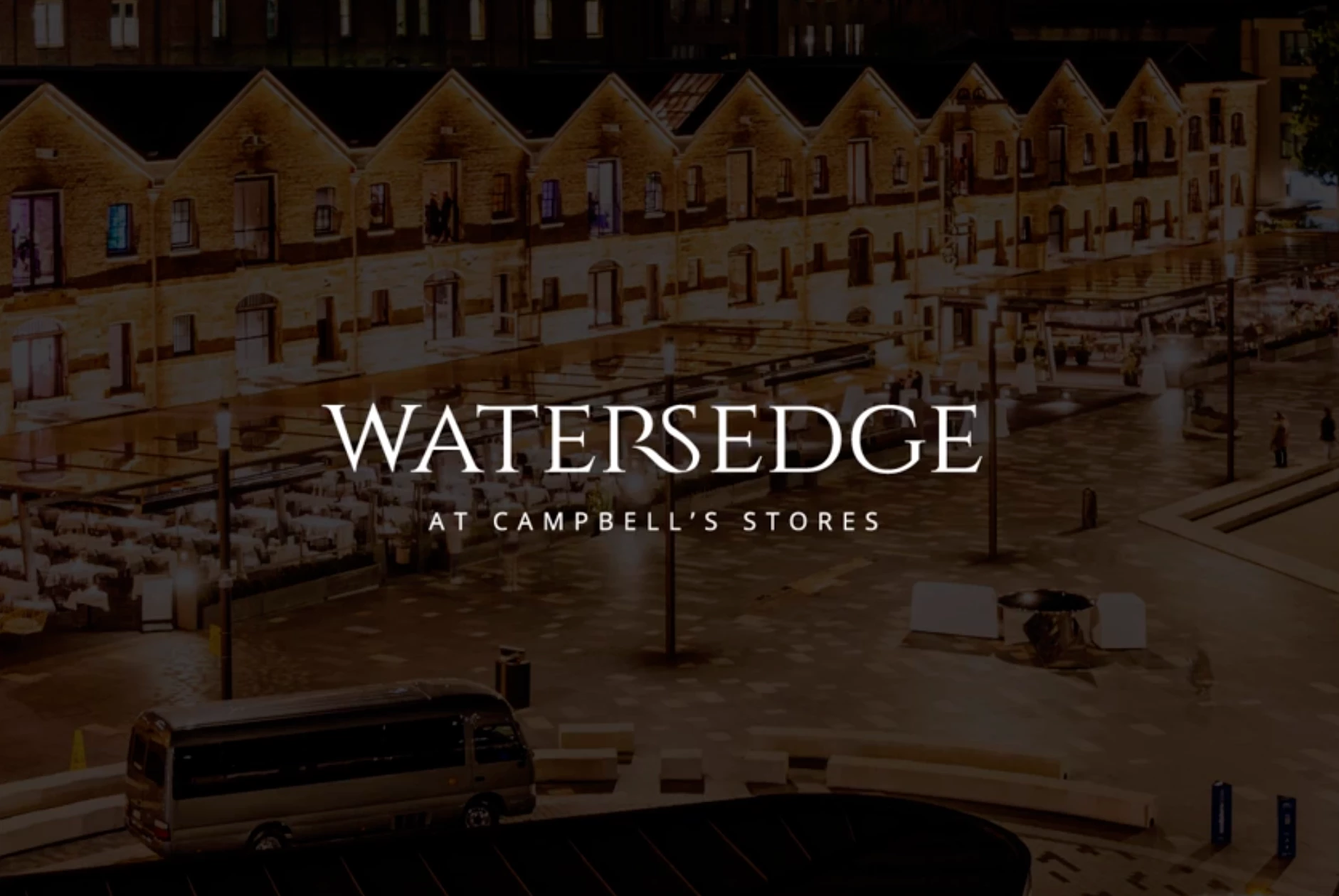
Standout Features:
- Emphasis on accessible luxury
- Classy serif typography
- Flexible design
Watersedge is a premium event space, located within the iconic heritage building, Campbell's Stores. Overlooking the world-famous Sydney Harbour, Watersedge became the perfect destination for any event that invites luxury and a flair for good taste.
Developing a consumer-facing identity that essentially focuses on harnessing the combined heritage of both the brand name and location's iconic history, whilst simultaneously providing a functional approach to identifying the events space, The X/OVER Agency crafted a foolproof visual solution that is sure to wow as much as the space it represents.
The goal was to portray accessible luxury, for every market and not flaunt pointless opulence. The logo marks the brand's exquisite service, high-quality food, and beverage, as well as effortless organization delivered by teams of highly trained staff. Speaking to both corporate and social markets, the agency custom-tailored a brand that invites class and is fluid to the needs of the client.
Our design experts recognize the most innovative and creative designs from across the globe. Visit Design Awards to see the:
- Best Logo Designs
- Best Website Designs
- Best Video Designs
- Best Print Designs
- Best Packaging Designs
- Best App Designs
Our team also ranks agencies worldwide to help you find a qualified agency partner. Visit our Agency Directory for the top Logo Design Companies, as well as:
- Top Web Design Agencies
- Top Video Production Companies
- Top Print Design Companies
- Top Packaging Design Companies
- Top Mobile App Development Companies


-preview-webp.webp)