1964 Coffee Packaging Design by Fungi Dube Is Wrapped in a Classic Heritage Look
Coffee lovers care about presentation just as much as they value their daily caffeine fix. That’s why coffee brands strive to create the best packaging design. 1964 Coffee is among those that did it right.
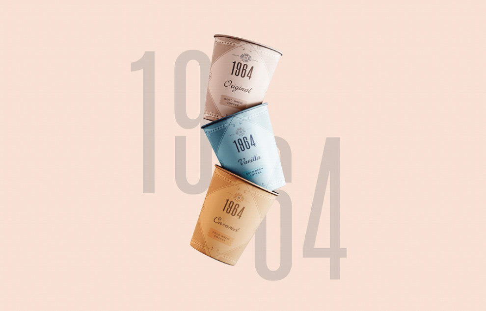
True to its name, 1964 Coffee's aesthetics feel like a trip through the decades. The packaging design boasts a timeless vintage beauty, taking its viewers back to the old times.
The crowd favorite: the architectural patterns framing the package, almost reminiscent of the Art Deco style that sprung during the early 20th century. Packaging design agencies meticulously take these iconic style elements to represent a sense of timeless elegance and sophistication.
But the trip to the classics doesn't stop there. The designers perfectly captured the vintage era by incorporating typography with heritage written all over it. The mix of handwritten and sans serif fonts are instant design indicators of a specific time.
Nothing like a good cup (or can) of joe to bring a rush of nostalgia!
A Trio of Contemporary Colors Add Sophistication to 1964 Coffee’s Packaging Design
The usual route for coffee brands when deciding on color palettes for their products is to stay loyal to the ingredients. This means shades of brown, beige, and other deep and rich colors within the same color spectrum dominate the packaging.
But this wasn't the case with 1964 Coffee. The designers surprised customers by going for delicate pastel colors and using each to represent the brand's big three flavors: white for Original, gold for Caramel and sky blue for Vanilla.
These fresh colors immediately set them apart from the competitors on the shelf!
Besides that, it’s also a great juxtaposition of the brand’s vintage character with contemporary qualities. Incorporating those modern colors in vintage aesthetic links the brand's history to the present and ensures the visual language stays relevant in the future.
It exemplifies how branding professionals balance tradition and innovation, maintaining the brand's heritage while appealing to contemporary audiences.

1964 Coffee Packaging Design Offers Immense Functionality Through Varied Containers
More than style and aesthetics, packaging should focus on functionality. Packaging presentation must provide an easy and smooth experience for the consumer, and such principle plays greater importance for coffee brands.
For example, the last thing people who go on quick coffee runs want is to have their coffee spilled on their clothes during their morning commute. Or they want something they can easily throw in their bag after stepping out of a convenience store.
The packaging designers for 1964 Coffee took that principle by heart. The caffeine fix comes in two forms: in a can and a cup. Canned coffee is great for mobility, while the coffee cup encourages customers to sit back and indulge.
1964 Coffee Packaging Design Offers a Stylish On-the-Go Experience
1964 Coffee’s unique aesthetic is carried through across all its packaging presentations.
Can or cup, coffee lovers get to bask in that same nostalgic feeling brought about by the brand’s classic and timeless character infused with modern sensibilities. That’s a big YES to consistency in branding and visual identity!
And most importantly, it achieves the ultimate goal of great packaging. That is, to create a seamless and hassle-free experience for the consumer. This reason alone solidifies 1964 Coffee as the best packaging design on our list.


