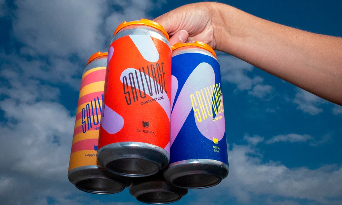
Brasserie Sauvage’s identity draws from Quebec brewing culture to build a bold, unrestrained visual world fit for a brand rooted in freedom. The inclined logotype reinforces this sense of motion and character, while the Lynx symbol introduces a wild, Canadian-inspired emblem that appears on every can with playful flavor descriptions.
Because the brewery releases new beers monthly, Studio Lèso developed a flexible yet instantly recognizable system — an ever-shifting mix of abstract shapes and limitless color palettes that keeps the brand fresh without losing coherence.
Based in Marseille, Studio Lèso brings brands to life through crafted, expressive visual universes. Working with a network of designers, photographers, architects, writers, and strategists, the studio builds comprehensive 360° identities across hospitality, beverages, fashion, wellness, and cultural projects.