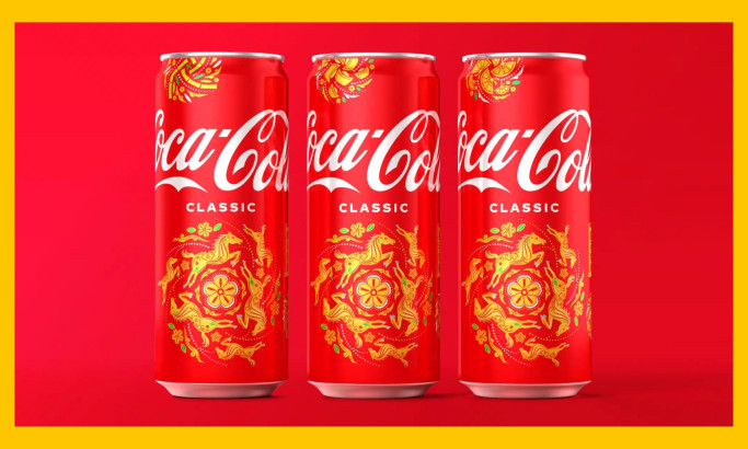
_ef4683462159-desktop.jpg)
Standout Features:
- Characteristic design
- Gold accents
- Ambiguous
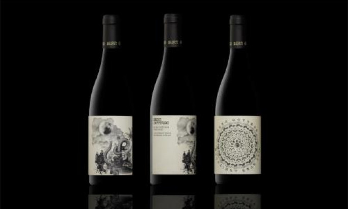
Brutia is a special kind of wine from Pinea Wine. Its name was inspired directly by the pines (Pinus Brutia) surrounding the vineyards and the winery in the heart of Spain’s legendary Ribera del Duero region.
Pinea founders realized that their true calling was to use nature and the magnificent characteristics of the land to produce one of the best wines in the world. For Brutia to become worthy of this title, they approached Miguel Diez to "vinify" the perfect identity poured into striking packaging that pulls from the same renowned roots.
The agency imagined and designed a crafted “B” letter by cutting and molding small pieces of pine bark. The crafted design of the label communicates the raw essence of the pines and the spirit that intoxicates every single grape.

-preview.jpg)
-preview.jpg)
-preview.jpg)
