Standout Features:
- Georgian maritime-inspired design
- Illustrations inspired by fine etching
- Color-coded labels for easy distinction
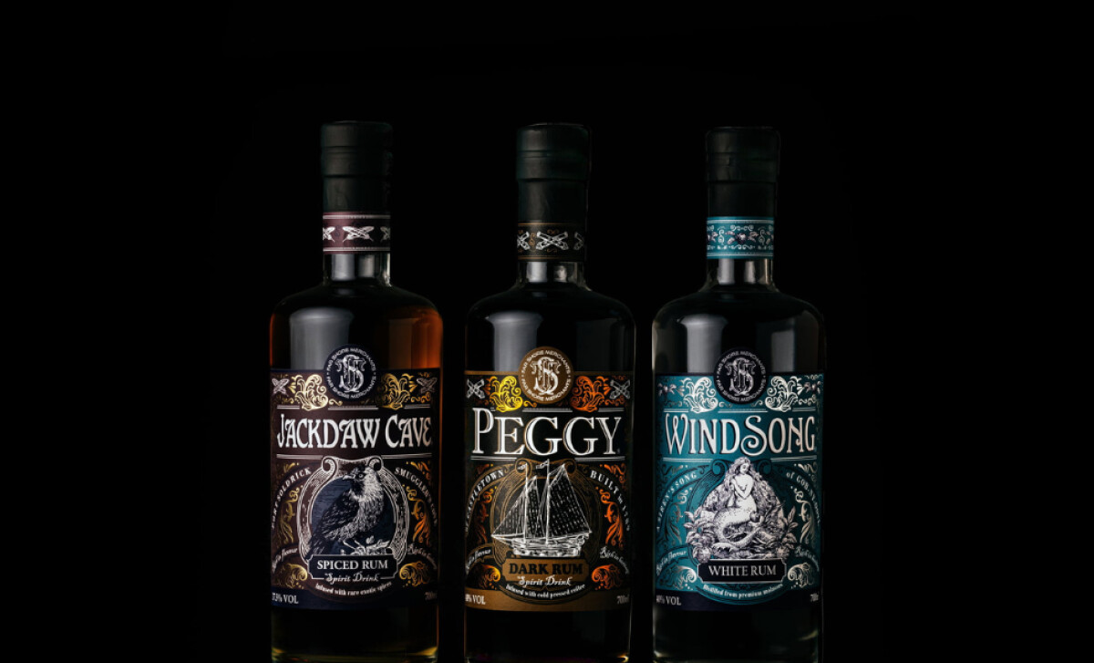
The Far Shore Merchants packaging by Ashgrove Marketing delivers a design that is as rich in history as it is in visual appeal.
Drawing inspiration from Peggy of Castletown, an original schooner built in 1789, every package channels the elegance of the Georgian maritime era.
Every bottle becomes a little time capsule that tells the story of exploration, craftsmanship, and seafaring adventure.
The labels are adorned with foiled flourishes that catch the light and elevate the rum’s premium look. These embellishments are then paired with fine etching-like illustrations, recreating the artistry and intricacy of Georgian-era engravings.
This technique adds visual depth and reinforces the authenticity at the heart of the brand’s storytelling.
Typography is central to the bottle label’s character. The serif fonts mirror the lettering styles one might find on old ship manifests or trade ledgers, a callback to the maritime narrative.
The layout also balances ornate detailing and clear legibility, ensuring that while the bottle is visually intricate, the brand name and product type are still recognizable.
Color is used both strategically and symbolically. Each rum variety is distinguished by its own color-coded label:
- Amber for Jackdaw Cave Spiced Rum
- Gold for Peggy Dark Rum
- Teal for Windsong White Rum
These hues aid quick product identification and reflect the spirit’s unique profile and personality. It adds an extra layer of meaning to the whole packaging.
From the ship illustrations to the ornamental borders, every design decision reinforces a storied past brought into the present.
It’s a visual language that blends time-honored artistic styles with modern design sensibilities, which creates a connection that feels authentic and contemporary.
Overall, this packaging goes far beyond simply holding a product. It transports the consumer into an era of daring voyages.
Its cohesive, immersive brand identity positions Far Shore Merchants as a rich, historic maritime experience in a bottle.
Great packaging tells a story. For spirits brands, it can capture history, culture, and craftsmanship in a single glance.
That’s what Ashgrove Marketing achieves with Far Shore Merchants. Inspired by Georgian maritime design, the bottles feature etching-style illustrations, foiled flourishes, and color-coded labels that bring a seafaring past into the present.
Visit our Agency Directory for the Top Packaging Design Companies, as well as:
Our design experts also recognize the most innovative design projects across the globe. Visit our Awards section to see the best & latest in packaging design.


-preview.jpg)
-preview.jpg)
-preview.jpg)

-preview.jpg)
-preview.jpg)