Team Behind the Design
Agency: Tuerca Studio
Client: Desertor del Tiempo
Category: Packaging Design (Food & Beverage)
Location: Rosario, Argentina
Project Brief: Design packaging that strengthens Desertor del Tiempo’s artisanal gin identity, balancing citrus freshness with premium shelf appeal.
Packaging Design Analysis
Related Articles:
When I review packaging, I like to look at structure, shelf presence, information hierarchy, and sustainability.
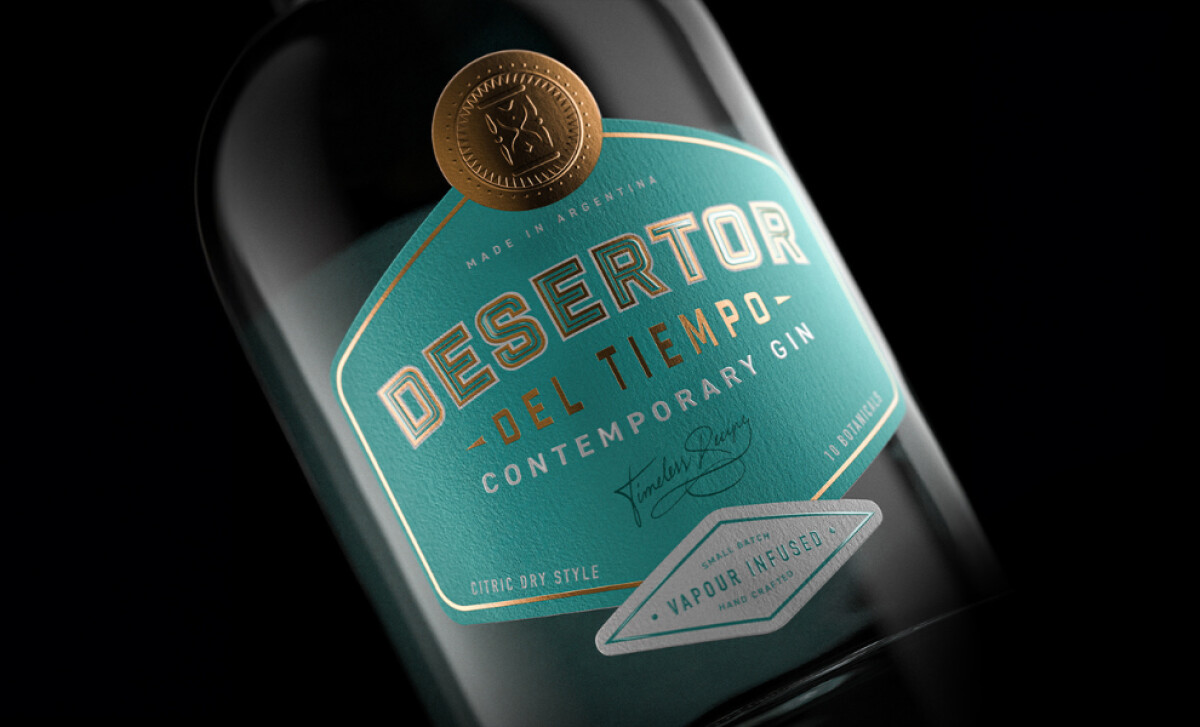
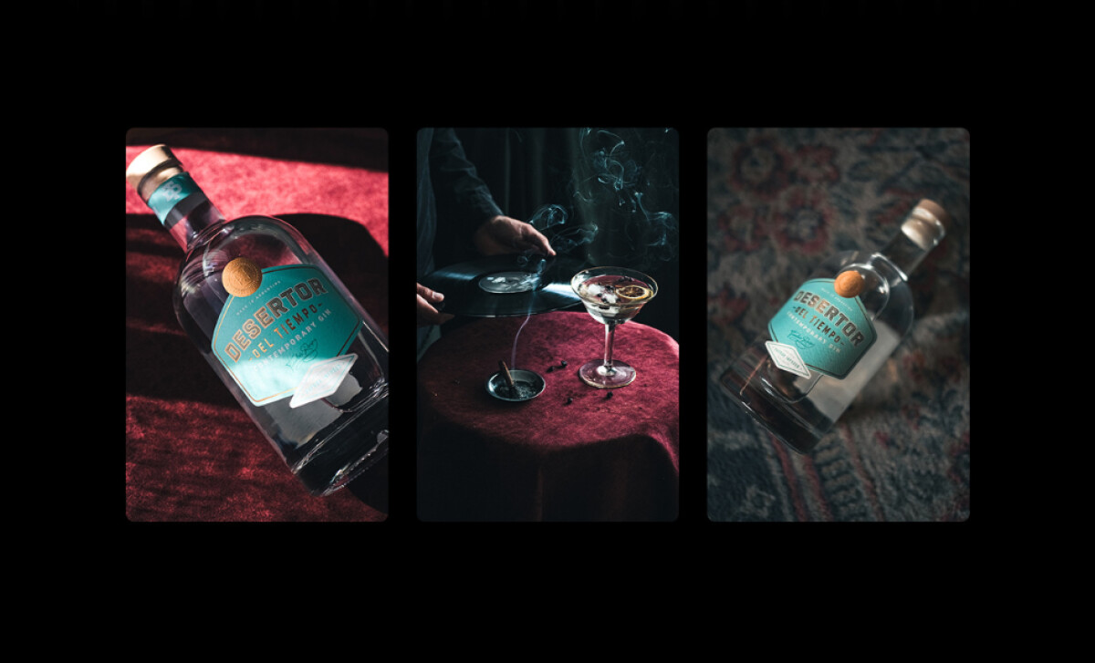
This gin bottle design for Desertor del Tiempo is a great example of how details on food and beverage packaging can elevate perception.
- Structure: I like the solid glass bottle choice — it feels sturdy and premium, while its clear, simple shape allows the label to take center stage.
- Shelf Impact: The teal and gold palette stands out. Strong contrast ensures visibility and memorability in retail settings.
- Information Hierarchy: Product details are well organized. From the bold wordmark to secondary descriptors, the label guides the eye with ease.
- Sustainability: The glass construction adds durability and reusability, aligning with modern eco-conscious consumer values.
Get connected with the right packaging design agency for your project.
GET STARTEDAbout DesignRush Featured Designs
At DesignRush, we review hundreds of agency projects every month. Among them, Desertor del Tiempo’s packaging stands out for its clarity, premium structure, and branding consistency.
The most compelling designs often move forward to become Monthly Design Awards.
Packaging design in the food and beverage industry is vital for drawing the eye and earning consumer trust. Explore more standout work here:
- Best Packaging Designs
- Best Website Designs
- Best App Designs
- Best Logo Designs
- Best Print Designs
- Best Video Designs
For a full list of design agencies and related services, see our Agency Directory.
Get a chance to become the next Design Award winner.
SUBMIT YOUR DESIGN 
-preview.jpg)
