Team Behind the Design
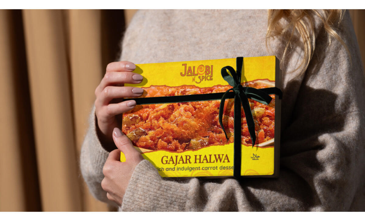
Jalebi n Spice wanted packaging that communicated authentic Indian flavor without feeling dated or visually overwhelming. Their previous designs blended into the competitive landscape, missing the opportunity to attract new customers or convey the brand’s personality.
Innovative Igloo created a modern, culturally grounded packaging system that blends bold colors with clean structure and a signature Jalebi-inspired swirl. The result is a warm, unified identity that captures attention and elevates the brand in retail spaces.
Packaging Design Analysis
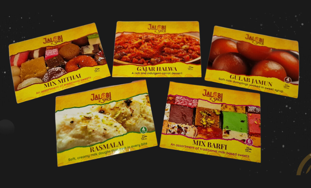
What I love about the Jalebi n Spice packaging system is how it captures the warmth of authentic Indian flavours while still feeling fresh and modern.
The design speaks through three core ideas:
- vibrancy,
- structure, and
- cultural character.
Together, they create a visual language that stands out instantly while staying true to the spirit of the cuisine.
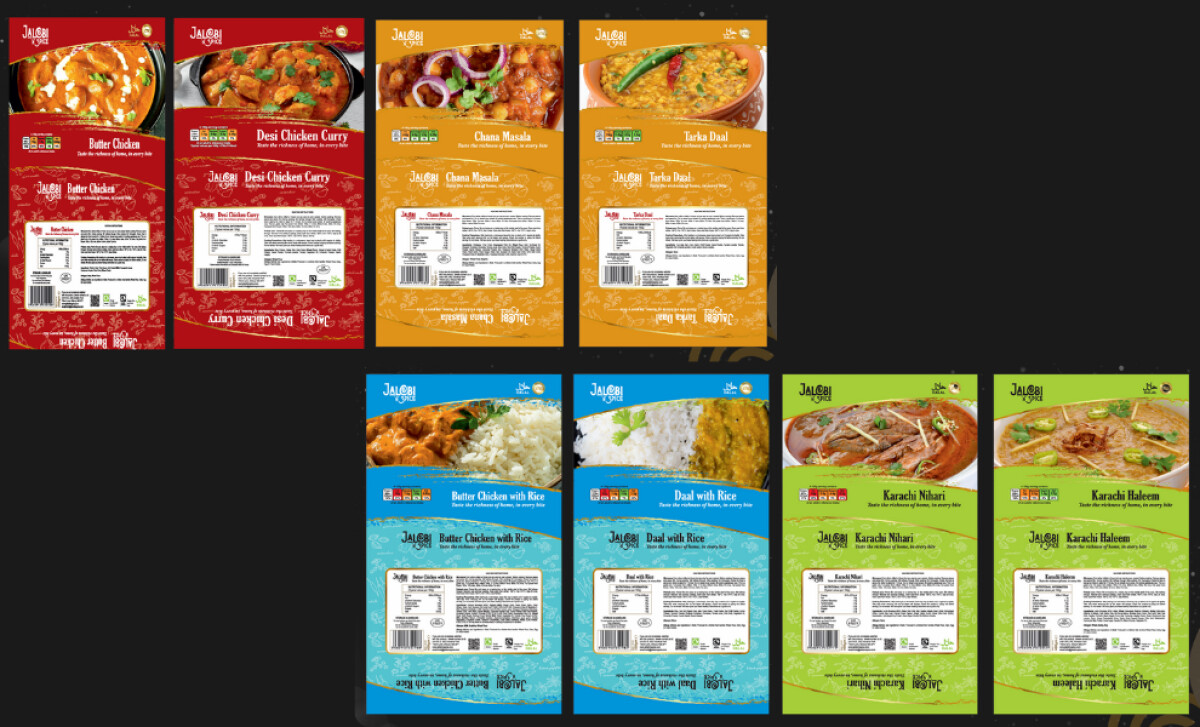
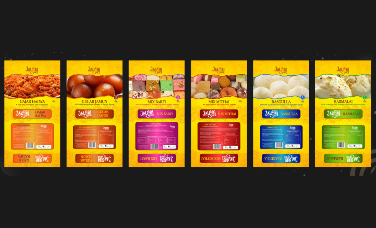
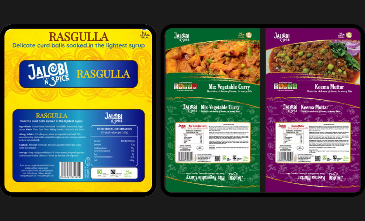
- Color & Flavor Signaling: Rich, saturated colors were selected to echo the warmth and indulgence of traditional Indian sweets and curries. Each hue helps visually differentiate SKUs while keeping the range cohesive and easy to navigate on the shelf.
- Signature Swirl Motif: The swirling pattern, drawn directly from the Jalebi in the logo, acts as a brand-wide identifier. It introduces cultural texture without clutter, creating a consistent visual thread from desserts to curries.
- Clear, Structured Layouts: Clean typography and organized hierarchy ensure ingredients, imagery, and nutritional details remain readable—even when paired with bold color palettes and complex food photography.
- Appetizing Product Photography: Large, close-up food imagery centers the product experience, helping customers quickly recognize each dish and feel confident in their purchase.
Impact
- Boosted visibility at Asda and attracted interest from customers discovering Indian sweets for the first time.
- Drew frequent compliments from staff and shoppers about the bright, eye-catching packaging.
- Strengthened Jalebi n Spice’s professional presence and helped the counter stand out from competing food brands.
What Brands & Agencies Can Learn from Jalebi n Spice
Jalebi n Spice shows how culturally rooted food packaging can feel both expressive and contemporary. The system balances bold flavor cues with disciplined structure, creating a brand presence that feels energetic, premium, and unmistakably tied to its culinary heritage.
1. Use Color to Signal Flavor, Not Chaos
The vibrant palette brings excitement and appetite appeal, but it stays controlled enough to keep text readable and hierarchy clear. This demonstrates how brands can use bold color strategically rather than decoratively.
2. Balance Energy with Structure
Consistent layouts prevent the packaging from feeling crowded. This is a key lesson for food brands working with strong cultural visuals: structure can amplify vibrancy instead of muting it.
3. Build Identity Through Modern Cultural Touches
The Jalebi-inspired swirl motif adds storytelling without falling into cliché. It’s a reminder that cultural elements work best when they feel intentional and ownable, giving the brand authenticity and continuity across the range.
About DesignRush Featured Designs
At DesignRush, we review hundreds of agency projects each month. The featured designs stand out for creativity, relevance, and execution.
Many go on to be recognized as winners of our Monthly Design Awards.
Explore more creative work here:
- Best Packaging Designs
- Best Website Designs
- Best App Designs
- Best Logo Designs
- Best Print Designs
- Best Video Designs
For a full list of design agencies and related services, see our Agency Directory.