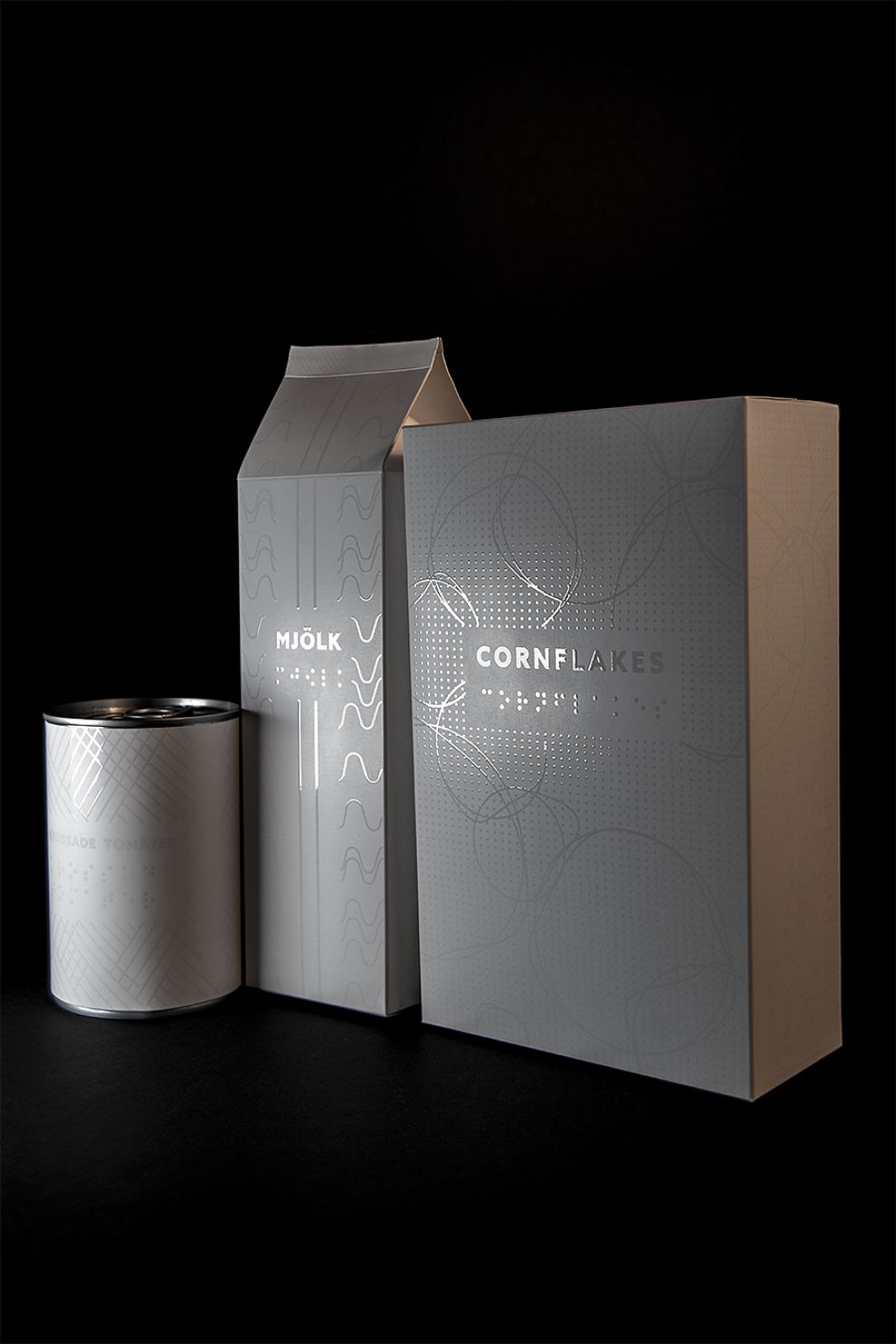
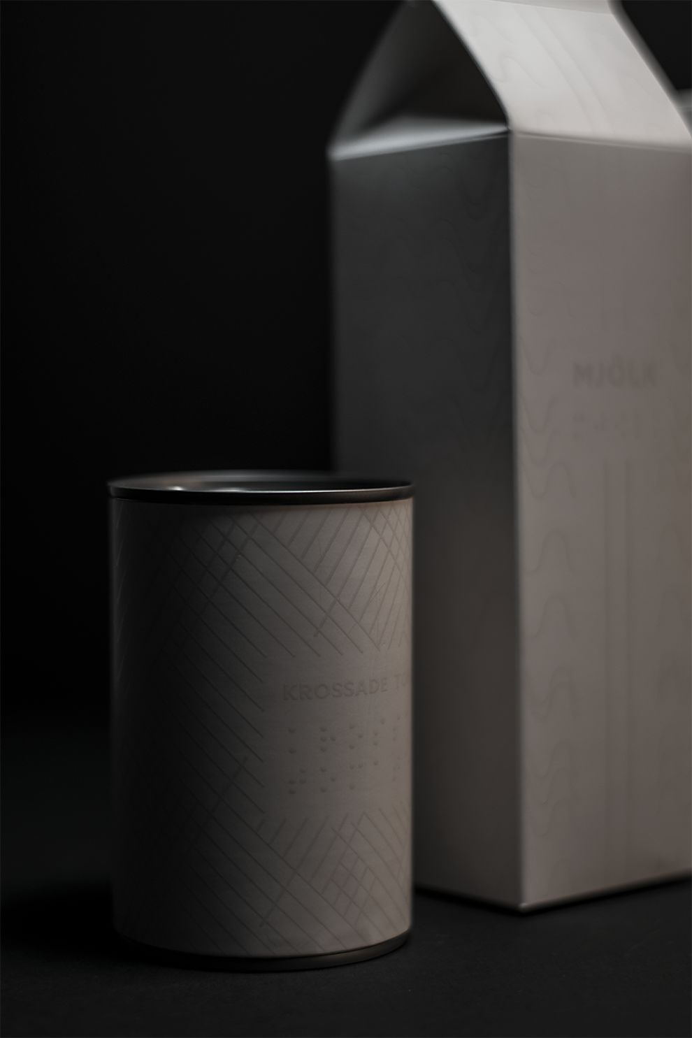
For her graduation project at Forsbergs School of graphic art and advertisement, designer Alexandra Burling created Color Me Blind, a packaging design for the sightless. Her idea was to give the sightless the same experience as people with vision.
Burling started the project by getting to know her audience so she could appropriately design keeping their needs in mind. She chose to design packaging for groceries since she realized there was an extreme lack of information written in Braille on these kinds of packages.

Although the packaging has been designed to appeal to the sense of touch, it is also visually attractive. Groceries like milk, cornflakes, and canned tomatoes have been packaged in stark white containers, with Braille lettering on them, also in a milky white embossed texture.
The design focuses on feeling the aesthetical designs, and the content is well-informed and includes instructions on how to open the packages.

The unique packaging has been designed as an experience in itself. At the school’s graduation exhibition, Burling presented her design in a small room which had been transformed to resemble a supermarket.
One person at a time was then invited inside the make-shift grocery store, and the door was closed and the light switched off after twenty seconds. The person was then left alone inside to experience the packaging in the way a visually impaired individual would experience it: by touching the packages in complete darkness surrounded by the sound of cash registers beeping and other such supermarket background sounds.
The cleverly designed packaging is unique, has audience appeal, is informative, well-branded, and connects well with emotions. The idea was to create something that goes beyond merely visual qualities, appealing to the senses of touch and sound as well. This design aims to arouse discussion for innovative thinking about how packaging design can appeal to more senses than sight.
Color Me Blind is a smart package design in the E-commerce & Retail, Food & Beverage and Hospitality industries.


-preview.jpg)