Team Behind the Design
Packaging Design Analysis
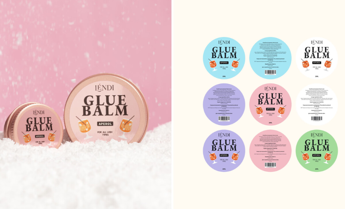
For fashion and beauty packaging projects like this one, I often look at how form, structure, color, and typography work together to support clear product usage while strengthening brand character.
Lendi’s system achieves this balance with a calm visual personality and highly functional organization.
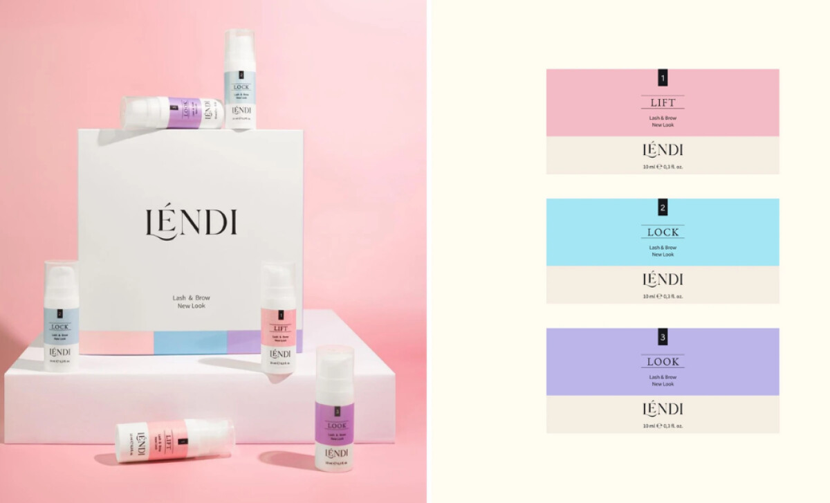
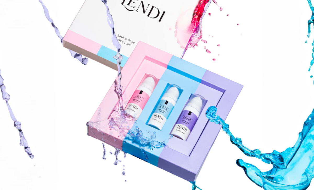
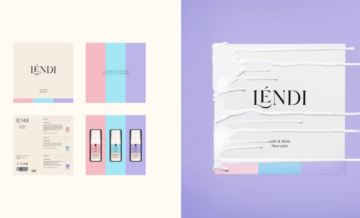
- Color Coding: The pastel “Lift, Lock, Look” system is instantly understood. I like how each step owns its color block, making it easy for technicians to navigate products quickly and confidently.
- Typography: The elegant serif logotype paired with minimal sans-serif details gives the line a premium feel. I appreciate how the typography stays restrained, letting color and structure lead usability.
- Layout Structure: The horizontal banding system organizes every SKU with predictable hierarchy. This consistency is especially effective for professionals who rely on fast visual scanning.
- Functional Details & Packaging Engineering: Transparent windows and precise dielines add utilitarian value. I find these details particularly helpful because they prevent guesswork and keep workflows efficient.
What Brands & Agencies Can Learn from LENDI
Here are a few lessons from how this packaging system approaches beauty product design:
1. Use Color Systems to Improve Professional Workflow
Clear chromatic stages help users move through multi-step routines with confidence. This improves accuracy and enhances brand memorability in fast-paced environments.
2. Pair Soft Aesthetics with Structured Typographic Rules
Pastels become premium when balanced with disciplined serif and sans-serif pairings. This approach often appeals to beauty audiences seeking both warmth and expertise.
3. Build Packaging Frameworks That Scale Across Categories
Modular banding, consistent dielines, and unified typography allow brands to expand product families without fragmenting visual identity. This creates long-term cohesion as the line grows.
About DesignRush Featured Designs
At DesignRush, we review hundreds of packaging and beauty projects every month. These featured works stand out for clarity, creativity, and strong alignment with brand purpose.
Only the most compelling submissions advance to our Monthly Design Awards, celebrating excellence and craftsmanship.
See more creative projects across categories:
- Best Website Designs
- Best App Designs
- Best Logo Designs
- Best Print Designs
- Best Packaging Designs
- Best Video Designs
For a full list of design agencies and related services, see our Agency Directory.