Team Behind the Design
Packaging Design Analysis
Looking at food and beverage packaging, I pay close attention to how these three things work together to shape expectation before consumption:
- concept
- illustration
- material choices
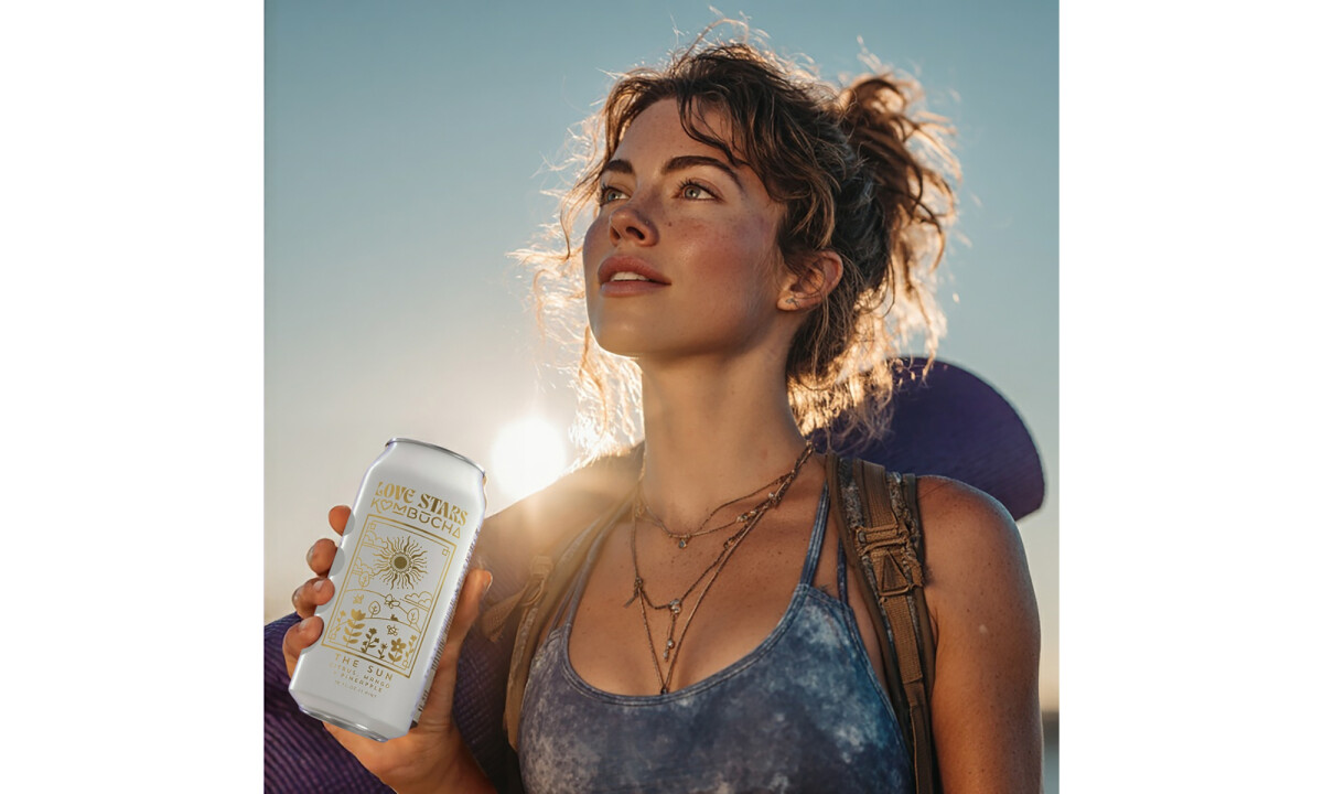
Love Stars Kombucha demonstrates how a strong narrative framework can guide flavor perception while creating a premium, shelf-ready presence.
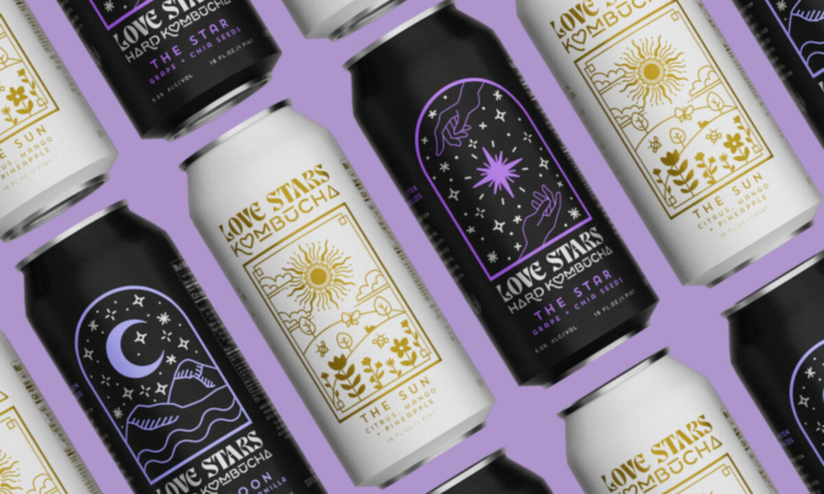
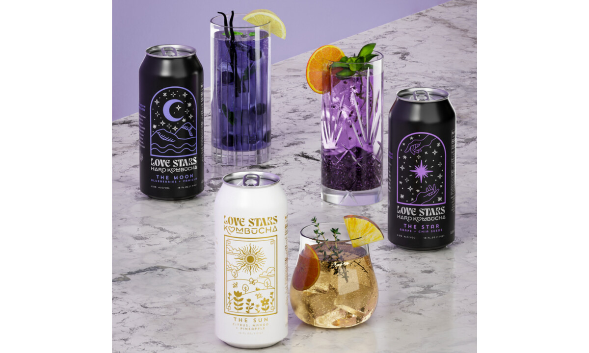
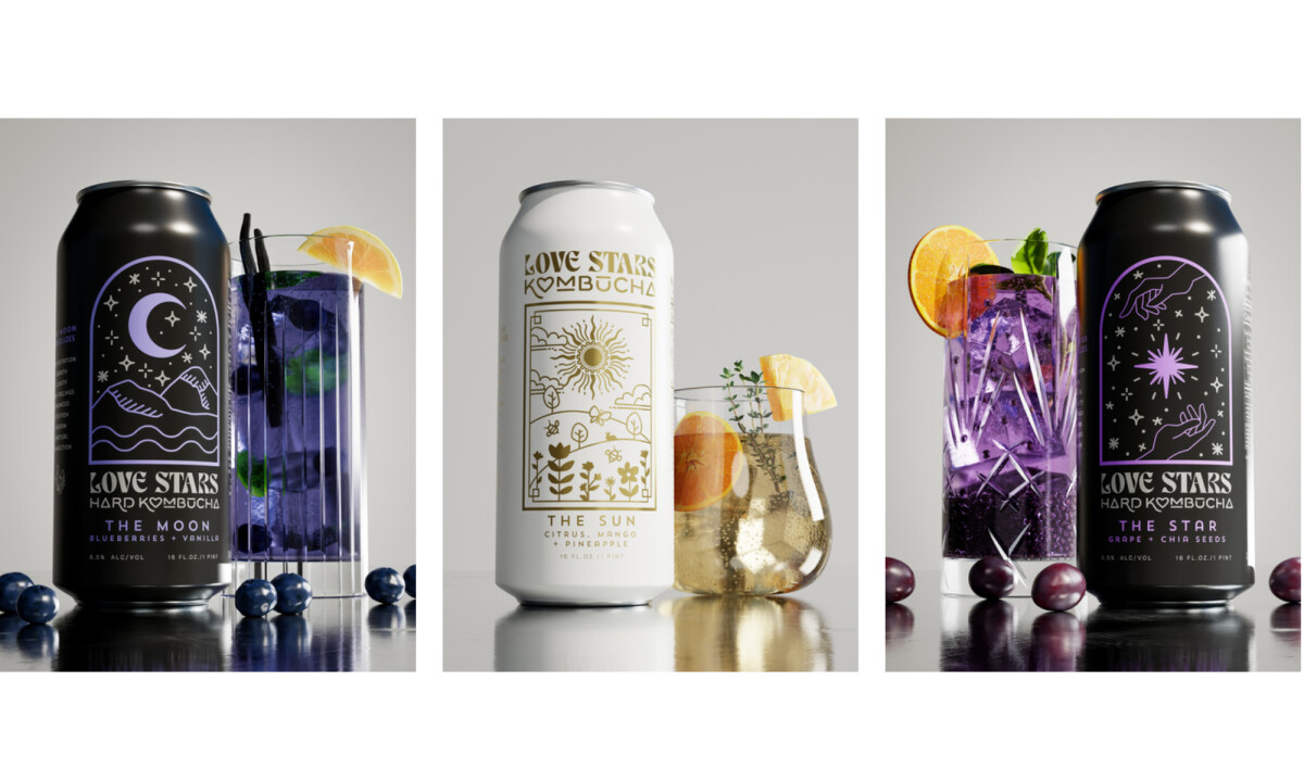
- Visual Language & Illustration: Celestial iconography, framed illustrations, and minimal linework give the cans a sense of mysticism without overwhelming the shelf presence. The contrast between light and dark palettes reinforces flavor intent and helps consumers intuitively navigate the lineup.
- Color System & Shelf Impact: Warm golds and whites signal brightness and energy for The Sun, while deep blacks and purples establish a calming, introspective tone for The Moon and The Star. I appreciate how the restrained color system allows the illustrations to remain the focal point while maintaining strong retail visibility.
- Typography & Information Hierarchy: The typography blends decorative character with legibility, striking a balance between expressiveness and clarity. Product names, flavor profiles, and alcohol content are clearly prioritized, which is especially important in food and beverage packaging.
- Materials & Sustainability: Using 100% recycled aluminum and eco-friendly UV inks aligns the packaging with the brand’s values of balance and responsibility. I see this as a strong example of sustainability being integrated into the design narrative rather than treated as an afterthought.
What Brands & Designers Can Learn from the Love Stars Kombucha
1. Start with a Clear Narrative Framework
Basing the system around celestial archetypes gives each flavor an emotional role before it’s tasted. A strong concept helps guide perception and makes product choice feel intuitive.
2. Use Illustration and Color to Signal Flavor Intent
Minimal, symbolic illustrations paired with light and dark palettes help consumers navigate the lineup at a glance. When visuals align with mood and taste, packaging becomes a form of storytelling.
3. Integrate Material Choices into the Brand Story
Recycled aluminum and eco-friendly inks reinforce the brand’s values without added messaging clutter. Sustainability is most effective when it’s embedded directly into the design decisions.
About DesignRush Featured Designs
At DesignRush, we review hundreds of agency projects each month. The featured designs stand out for creativity, relevance, and execution.
Many go on to be recognized as winners of our Monthly Design Awards.
Explore more creative work here:
- Best Packaging Designs
- Best Website Designs
- Best App Designs
- Best Logo Designs
- Best Print Designs
- Best Video Designs
For a full list of design agencies and related services, see our Agency Directory.
-preview.jpg)
-preview.jpg)